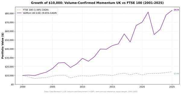
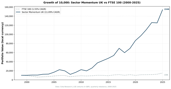
P/E Mean Reversion Across 13 Global Markets: The Benchmark Decides the Answer
Sector-relative P/E mean reversion across 13 global markets, 2000-2025. Four beat the S&P 500 (UK +3.23%, Germany +2.73%, India +2.62%, US +2.61%). Nine beat their own local index. Only Korea and Taiwan fail on both measures.

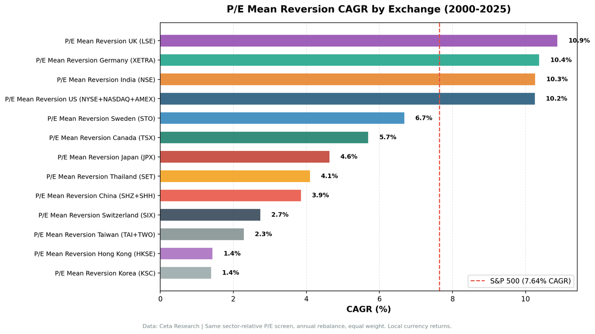
We tested sector-relative P/E mean reversion on 13 global stock markets from 2000 to 2025. The signal: buy when a stock's P/E drops below 60% of its sector median, filtered for quality (ROE > 8%, D/E < 2). Against the S&P 500 the answer looks geographic: four markets beat it, all of them Western apart from India, and every Asian market loses. Against each market's own index the answer is almost the reverse. The strategy adds value in 9 of the 13, including Hong Kong, Japan and China.
Contents
- Method
- Full Results: 13 Exchanges
- The Four That Beat the S&P 500
- Asia: Two Real Failures, Not Six
- Korea: the chaebol discount is real
- Taiwan: the screen barely fires, and misses when it does
- Hong Kong: a bad market, not a bad screen
- China: zero cash, and roughly a wash
- Japan: quietly one of the better results
- Thailand: a coin flip
- The Middle Group: Sweden, Canada, Switzerland
- Key Patterns
- What the signal needs
- Cash rate is the better predictor
- Listed universe vs domiciled universe
- The sector median anchor test
- Limitations
- Conclusion
- Detailed analysis by market
Both statements come from the same backtest. The gap between them is the single most useful thing in this study, because it separates "the strategy worked" from "that market went up". Only two markets fail on both measures: Korea and Taiwan.
Data: FMP financial data warehouse, 2000–2025. Updated August 2026.
Method
Data source: Ceta Research (FMP financial data warehouse) Signal: Stock P/E < 60% of sector median P/E, P/E 3-50, ROE > 8%, D/E < 2.0 Portfolio: Top 30 by discount depth, equal weight, annual rebalance (January) Period: 2000-2025 (25 years) Benchmarks: each market's own index, plus the S&P 500 as a uniform cross-market yardstick Execution: next-day close after the signal date Cash rule: Hold cash if fewer than 10 stocks qualify
Market cap thresholds vary by exchange (US $1B, UK £500M, India ₹20B, etc.) to reflect local liquidity conditions. Returns are in local currency. Every market is screened on the companies listed on that exchange, which outside the US is often mostly foreign secondary listings. That choice matters more than it sounds, and the Germany section below shows how much.
Explore the current global sector discount landscape: cetaresearch.com/data-explorer?q=0ML8jzulrK
These benchmarks leave dividends out. Portfolio returns here use dividend-adjusted prices, so they include dividends. Most of the indices we measure against do not. The FTSE 100, Hang Seng, KOSPI, Nikkei 225, OMX Stockholm 30, SET Index, SMI, SSE Composite, Sensex, TAIEX and TSX Composite are price indices, so excess return against them is overstated by roughly the local dividend yield, which has run between about 1.3% and 3.5% in these markets. Those comparisons are like for like: the S&P 500 figure runs through SPY, which is dividend-adjusted; the DAX is a performance index. Treat any edge thinner than the local yield as a tie rather than a win.
Full Results: 13 Exchanges
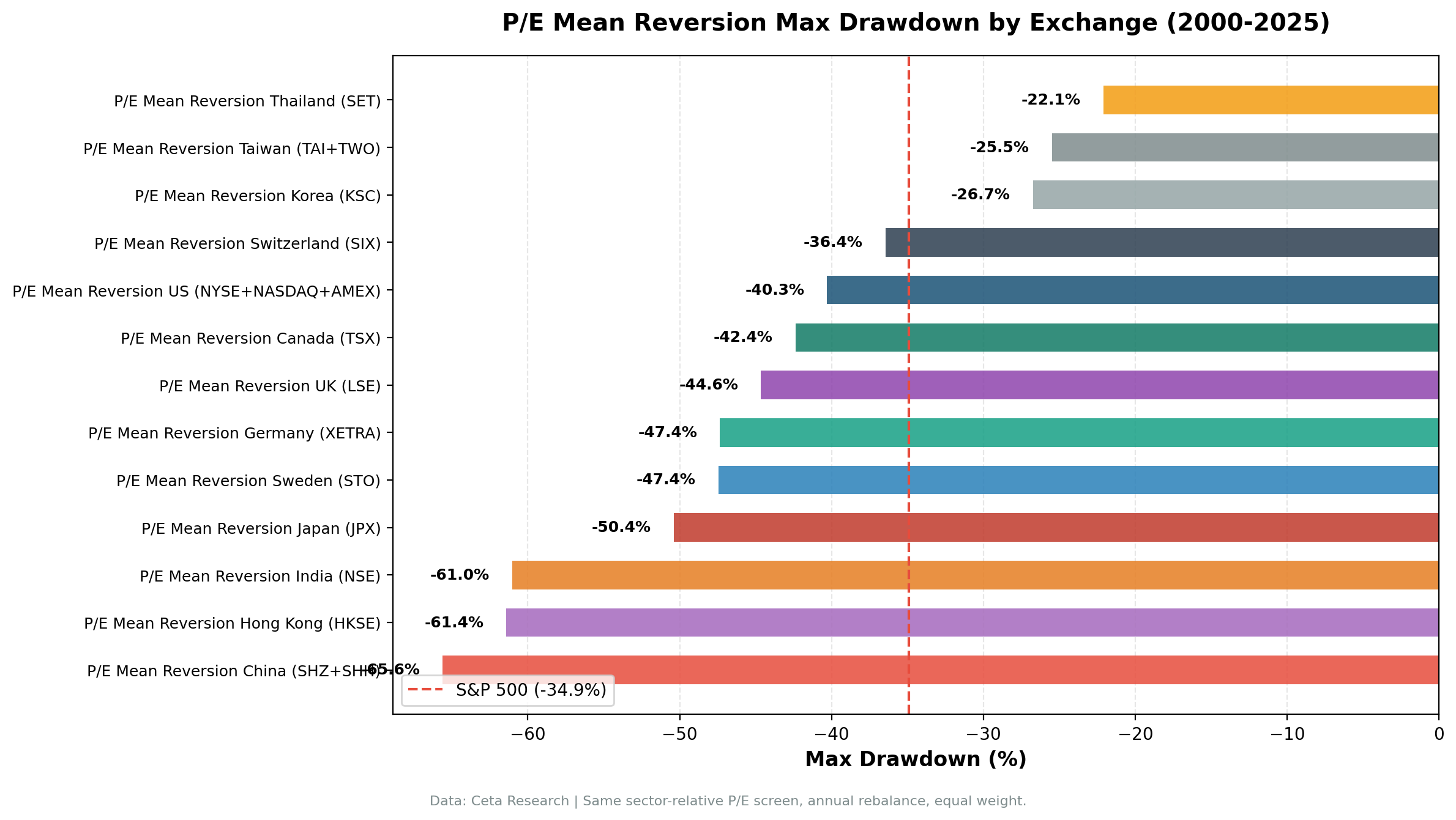
| Exchange | CAGR | vs S&P 500 | vs local index | Local index | Sharpe | MaxDD | Cash% | Avg Stocks |
|---|---|---|---|---|---|---|---|---|
| UK (LSE) | 10.87% | +3.23% | +10.00% | FTSE 100 | 0.353 | -44.65% | 0% | 11.8 |
| Germany (XETRA) | 10.37% | +2.73% | +5.92% | DAX | 0.413 | -47.35% | 0% | 16.7 |
| India (NSE) | 10.26% | +2.62% | -1.15% | Sensex | 0.110 | -61.01% | 24% | 24.1 |
| US (NYSE/NASDAQ/AMEX) | 10.25% | +2.61% | +2.61% | S&P 500 | 0.371 | -40.29% | 0% | 20.4 |
| Sweden (STO) | 6.68% | -0.96% | +3.72% | OMX Stockholm 30 | 0.197 | -47.44% | 40% | 13.7 |
| Canada (TSX) | 5.69% | -1.95% | +1.25% | TSX Composite | 0.168 | -42.38% | 20% | 16.6 |
| Japan (JPX) | 4.63% | -3.01% | +1.68% | Nikkei 225 | 0.248 | -50.37% | 28% | 21.3 |
| Thailand (SET) | 4.10% | -3.54% | -0.05% | SET Index | 0.125 | -22.10% | 52% | 13.2 |
| China (SHZ/SHH) | 3.85% | -3.79% | +0.31% | SSE Composite | 0.032 | -65.60% | 0% | 21.8 |
| Switzerland (SIX) | 2.74% | -4.90% | +0.84% | SMI | 0.130 | -36.44% | 12% | 9.0 |
| Taiwan (TAI/TWO) | 2.29% | -5.35% | -1.62% | TAIEX | 0.101 | -25.48% | 60% | 16.4 |
| Hong Kong (HKSE) | 1.43% | -6.21% | +0.94% | Hang Seng | -0.068 | -61.41% | 24% | 22.3 |
| Korea (KSC) | 1.39% | -6.25% | -1.94% | KOSPI | -0.100 | -26.73% | 44% | 20.0 |
S&P 500 benchmark: 7.64% CAGR, -34.90% MaxDD
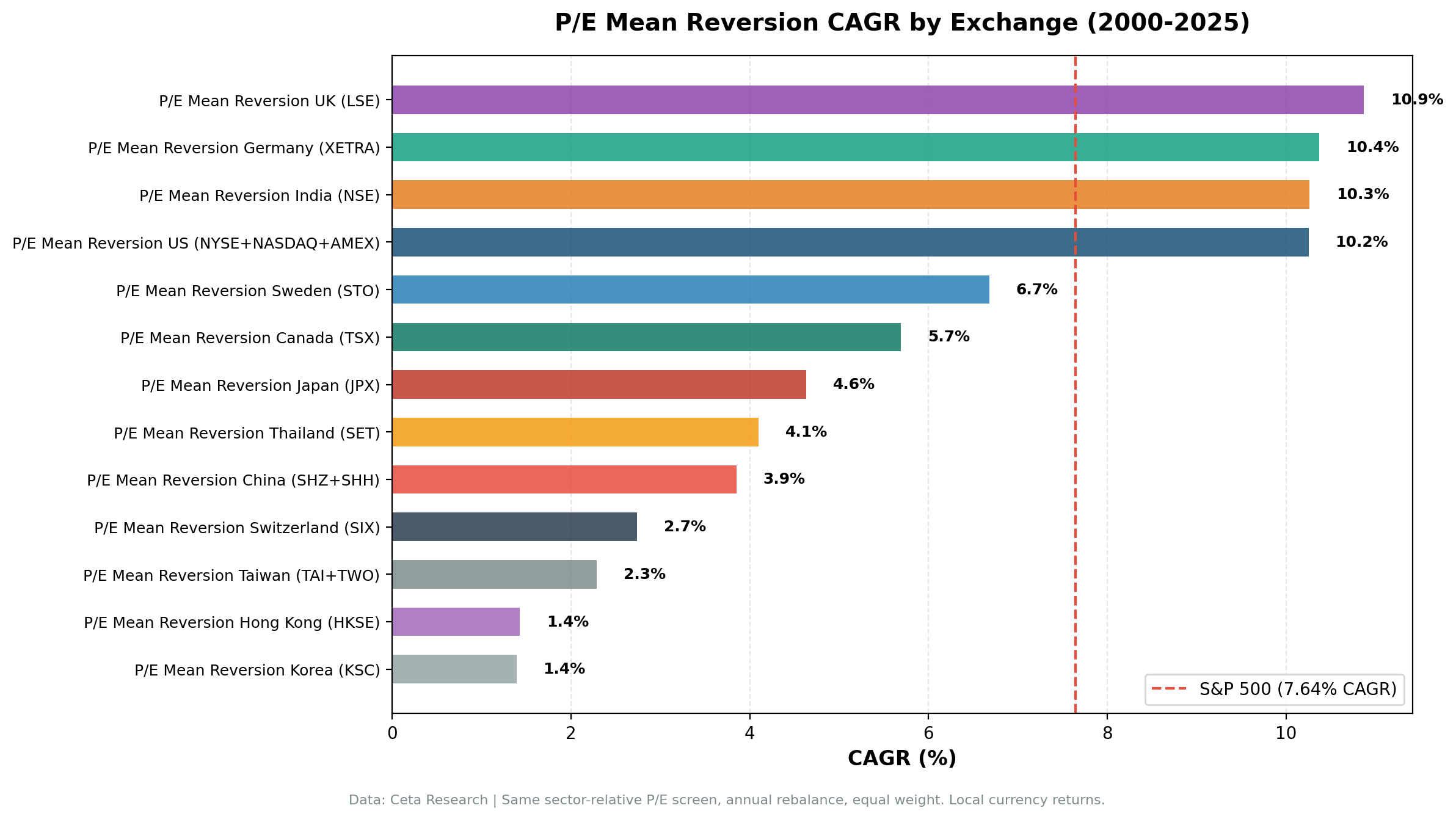
Read the two excess columns together. The "vs S&P 500" column answers "would a dollar have done better here than in US index funds", and it's dominated by how each market performed, not by the screen. The "vs local index" column answers "did the screen beat the market it was actually picking from", which is the question about the strategy. Hong Kong is the clearest example: it's the third-worst market against the S&P 500 and still slightly ahead of its own Hang Seng.
The Four That Beat the S&P 500
All four are in the West, or India. Three of the four have zero cash periods, meaning the signal always finds qualifying stocks. The UK leads at +3.23% vs the S&P 500, Germany at +2.73%, India at +2.62%, the US at +2.61%.
XETRA delivers the highest Sharpe (0.413) of any exchange tested, better than the US (0.371) and UK (0.353), and it beat the DAX by 5.92% a year with no cash periods in 25 years. That number needs a large asterisk, and it's the most important methodological finding in this study. The screen selects companies listed on XETRA, not German companies. Re-run on German-headquartered names only, the same screen returns 4.11% with -0.34% excess, and it can only fill a portfolio in 9 years out of 25 instead of 25. Frankfurt doesn't list enough domestic names that clear a 40% sector discount plus the quality and size filters. So the German result is real as a statement about a venue and unsupported as a statement about German business. We checked the UK the same way and it holds up: UK-domiciled only still returns +6.47% excess with 22 of 25 periods invested.
India is the outlier in the other direction. It beats the S&P 500 by +2.62% but trails its own Sensex by 1.15%, because the Sensex itself compounded at 11.4% over these 25 years. It also carries the study's worst volatility (Sharpe 0.110, MaxDD -61.01%) and 24% cash periods, largely because FMP coverage is sparse before 2006. India is where the two-benchmark distinction bites hardest: it looks like one of the four winners and is actually the only one of the four that lost to the market it was picking from.
Asia: Two Real Failures, Not Six
Every Asian market loses to the S&P 500, which is what makes the geographic story tempting. But most of those markets also lost to the S&P 500 on their own, without any strategy applied. Once you ask whether the screen beat the market it was picking from, only Korea and Taiwan fail.
Korea: the chaebol discount is real
Korea is the worst result in the study on both measures: 1.39% CAGR, -6.25% vs the S&P 500, and -1.94% vs its own KOSPI, with 44% cash and a negative Sharpe. Korean chaebols (Samsung, SK, Hyundai, LG group companies) structurally trade at a discount to their sector peers. This is the "Korea discount" that institutional investors have discussed for decades. Buying into it doesn't generate alpha because the discount doesn't close. The signal reads it as an opportunity. The market says it's not, and here the market is right.
Taiwan: the screen barely fires, and misses when it does
Taiwan spends 60% of all periods in cash, the highest in the study. When it does deploy it returns 2.29% CAGR and -1.62% against the TAIEX. The Taiwanese market is dominated by the semiconductor ecosystem, which creates an unusual valuation hierarchy. TSMC trades at or above sector median by design. Smaller fabs and component suppliers trade at persistent discounts because TSMC's premium is structural and permanent. The sector median P/E gets anchored by TSMC, making everything else look cheap, but that relative cheapness doesn't revert.
Korea and Taiwan are the two cases where the structural-discount explanation survives contact with a local benchmark. The rest of Asia tells a different story.
Hong Kong: a bad market, not a bad screen
Hong Kong looks catastrophic against the S&P 500 at -6.21%, and it has the study's second-worst drawdown at -61.41% and a negative Sharpe. But the Hang Seng compounded at just 0.49% over these 25 years, and the strategy returned 1.43%, so it finished +0.94% ahead of its own index. The honest reading is that Hong Kong was a poor place to own equities at all, not that the sector-discount signal broke down there. If you needed HKSE exposure, this screen would have been a marginal improvement on the index. Neither fact makes it a good place to deploy capital.
China: zero cash, and roughly a wash
China has 0% cash periods, meaning the signal always finds qualifying stocks, and it returns 3.85% CAGR against an SSE Composite at 3.54%, so +0.31%. The Sharpe of 0.032 is close to zero and the drawdown is the worst in the study at -65.60%. The signal fires constantly and produces almost nothing. China's A-share market is heavily retail-driven and policy-sensitive: sector-relative valuation plays a smaller role in price discovery than government announcements, retail sentiment, and liquidity cycles. The signal is measuring something real, but it isn't the thing that drives Chinese stock prices.
Japan: quietly one of the better results
Japan returns 4.63% CAGR, which is -3.01% against the S&P 500 and +1.68% against the Nikkei 225, with the best Sharpe (0.248) of any Asian market. Japan's keiretsu system creates structural cross-holdings and sector discounts that sometimes do resolve, particularly post-2012 during the Abenomics corporate governance reform era. The 28% cash rate limits how much of that it captures. Japan is the clearest illustration of why the benchmark choice matters: on the S&P 500 yardstick it reads as another Asian failure, and against the index a Japanese investor would actually have held, it's a modest, real win.
Thailand: a coin flip
Thailand returns 4.10% against a SET Index at 4.16%, so -0.05%, which is a rounding error. It sits in cash 52% of the time. The one distinctive number is its drawdown: -22.10%, the shallowest of the 13, mostly because the strategy was out of the market during the worst stretches.
The Middle Group: Sweden, Canada, Switzerland
These three lose to the S&P 500 and beat their own indices. The strategy isn't destroying value here, it's operating in markets that trailed the US.
Sweden (STO) is the best of them and the best local result outside the top four. 6.68% CAGR against an OMX Stockholm 30 at 2.95%, so +3.72% excess, with a -47.44% drawdown against the index's own -57.52%. The constraint is deployment: 40% of periods generate no portfolio at all, including a scattered run of cash years in 2010, 2011 and 2013 rather than one early gap. When the signal fires in Sweden it works well. It just doesn't fire often, and you can't compound what you aren't holding.
Canada (TSX) returns 5.69%, or +1.25% over the TSX Composite, with 20% cash. Canadian sector composition is the likely drag. Energy and materials dominate, and sector-relative P/E signals in resource-heavy sectors are noisy. When oil prices crash, the entire Energy sector compresses together. A stock at 60% of sector median during an oil crash isn't necessarily cheap relative to its peers. It might just be the one with worse reserve quality.
Switzerland (SIX) is the thinnest test in the study and should be treated as inconclusive. It returns 2.74% against an SMI at 1.90%, so +0.84%, on an average of just 9.0 stocks per year, below the strategy's own 10-stock minimum. Restricted to Swiss-domiciled companies the screen can only fill a portfolio in 4 years out of 25. There aren't enough qualifying Swiss names for this signal to say anything, in either direction.
Key Patterns
What the signal needs
A quality stock trading at a 40%+ discount to sector peers is usually a temporary situation in a market with deep institutional participation. Analysts notice it. Fund managers look at it. The gap closes via either price appreciation or a catalyst (earnings beat, dividend increase, management change).
The key condition: sector median P/E functions as a genuine anchor. When it does, the discount signals an anomaly. When it doesn't, because the sector is structurally weird, dominated by one company, or not a real peer group, the signal misfires. That's a statement about market microstructure, and it doesn't map onto geography as neatly as the S&P 500 column suggests. Japan clears the bar. Korea doesn't.
Cash rate is the better predictor
Cash rate turned out to separate the results more reliably than region does. It's a direct measure of whether the market contains enough qualifying names for the signal to mean anything:
- 0% cash (US, UK, Germany, China): broad, diversified exchanges with enough sector depth to always find qualifying stocks
- 12-28% cash (Switzerland, Canada, India, Hong Kong, Japan): moderate universe constraints
- 40-52% cash (Sweden, Korea, Thailand): too few sectors, thin universes, or sectors without enough peer stocks for meaningful medians
- 60% cash (Taiwan): the signal barely applies
High cash periods aren't just a performance drag. They mean the sample is small, so the measured excess deserves less weight. Switzerland is the caution here: it reads as a mild positive, on an average of 9.0 stocks a year.
Listed universe vs domiciled universe
The single largest methodological effect we found isn't a market at all, it's a definition. Screening "companies listed on exchange X" is not the same as screening "companies from country X", and outside the US the two can differ enough to reverse a result. XETRA goes from +5.92% vs the DAX to -0.34% when restricted to German-headquartered companies, and its invested periods fall from 25 to 9. The LSE survives the same test (+10.00% to +6.47%, 25 periods to 22) and Switzerland can't be tested at all (4 invested periods). Every number on this page uses the listed universe, consistently, so the cross-market comparison is like-for-like. Just don't read the German row as a claim about German companies.
The sector median anchor test
The strategy works when sector medians are stable, competitive anchors. It struggles when:
- One dominant company skews the sector median (Taiwan: TSMC, Korea: Samsung)
- The market is policy- or sentiment-driven rather than fundamentals-driven (China A-shares, where the signal fires every year and returns almost nothing over the index)
- Resource concentration means sector-wide discounts, not stock-specific ones (Canada energy)
- The universe is too thin to fill a portfolio (Switzerland, Taiwan, Thailand)
Limitations
Two benchmarks, two answers. The "vs S&P 500" column compares local-currency returns to a USD index, so FX movement is embedded in it and it conflates the strategy with the market. The "vs local index" column is the cleaner test of the signal. Where the two disagree, prefer the local one for judging the strategy and the S&P 500 one for judging the destination.
Local indices aren't all total-return. The FTSE 100, Sensex and several others are price-only in this data, while portfolio returns include dividends via adjusted closes. That inflates the local excess in those markets, and it's the main reason the UK figure is as large as it is.
Survivorship bias. Current exchange profiles are used. Delistings and bankruptcies aren't fully tracked, which slightly flatters all results.
Sector granularity varies. Markets with fewer listed companies have thinner sector peer groups. A sector median built from 5 stocks is less reliable than one built from 30.
Post-2020 data. Only 5 years of post-COVID data. Some regime shifts may not be fully reflected.
Conclusion
Sector-relative P/E mean reversion is a more durable signal than the headline geography suggests, and a less useful one for picking a country.
The results across 13 exchanges: - 4 markets beat the S&P 500 (UK +3.23%, Germany +2.73%, India +2.62%, US +2.61%) - 9 markets beat their own index, including Hong Kong (+0.94%), Japan (+1.68%) and China (+0.31%) - Only 2 markets fail on both measures: Korea (-1.94% vs KOSPI) and Taiwan (-1.62% vs TAIEX) - Best Sharpe: XETRA (0.413), US (0.371), UK (0.353) - Best local excess: UK (+10.00%), Germany (+5.92%), Sweden (+3.72%)
Two practical conclusions. If you want the strategy to add value on top of exposure you already hold, it does that in most markets we tested, and the exceptions (Korea, Taiwan) are identifiable in advance from the structure of the market rather than after the fact from the returns. If instead you're choosing where to put money, the local excess is mostly irrelevant: a screen that beats the Hang Seng by 0.94% a year still compounded at 1.43%.
The other conclusion is methodological. Cash rate and universe definition explained more of the variation here than geography did. A market where the screen sits in cash 60% of the time isn't giving you a verdict on the signal, and an exchange whose listings are mostly foreign companies isn't giving you a verdict on that country.
Detailed analysis by market
Each of these covers the screen, the year-by-year record, the local benchmark and the market-specific limitations in full:
- United States: 10.25% CAGR, +2.61% vs the S&P 500
- United Kingdom: 10.87% CAGR, +10.00% vs the FTSE 100
- Germany: 10.37% CAGR, +5.92% vs the DAX, and why the domicile test matters
- India: 10.26% CAGR, but -1.15% against the Sensex
- Sweden: 6.68% CAGR, +3.72% vs the OMX Stockholm 30, with cash in 10 of 25 years
Data: Ceta Research (FMP financial data warehouse). Local-currency returns measured against both the local index and the S&P 500. Universes are exchange-listed companies, not domicile-filtered. Past performance does not guarantee future results. This is not investment advice. Full methodology: github.com/ceta-research/backtests