P/E Mean Reversion (Sector-Relative): 10.25% CAGR Over 25 Years of US Stock Data
We tested a sector-relative P/E mean reversion screen on 25 years of US stock data. Buy quality stocks trading 40%+ below their sector's median P/E. The strategy returned 10.25% annually vs 7.64% for SPY, with 2.61% excess return and zero cash periods across 25 years.

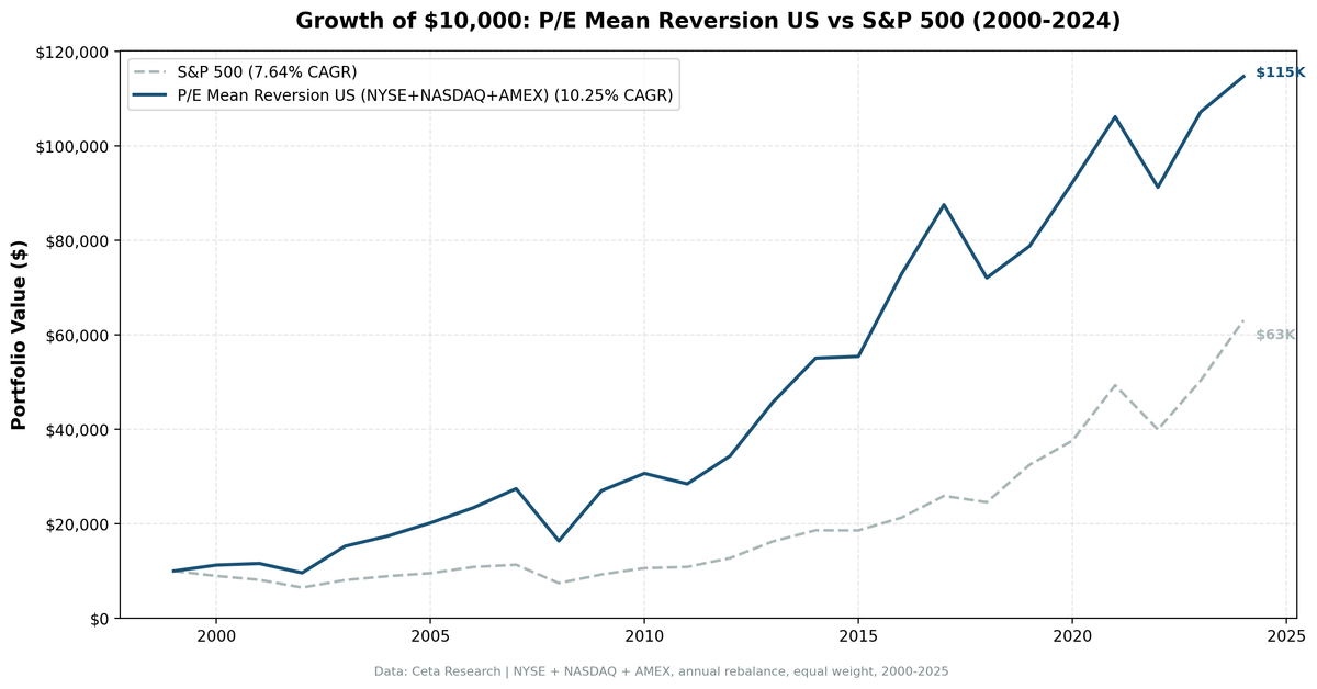
We tested a sector-relative P/E mean reversion screen on 25 years of US stock data from NYSE, NASDAQ, and AMEX. The signal triggers when a quality stock's P/E ratio falls below 60% of its sector's current median, meaning it's trading at least 40% cheaper than its peers right now. The strategy returned 10.25% annually vs 7.64% for the S&P 500, with 2.61% excess return, zero cash periods, and consistent recovery after value selloffs.
Contents
- Method
- Why Sector-Relative P/E?
- The Screen
- P/E Mean Reversion Screen: US Stocks (SQL)
- What We Found
- 25 years. 2.61% annual alpha. Consistent value recovery.
- Year-by-year returns
- 2000-2007: the strategy's best stretch
- Crisis comparison
- 2016: post-election value rotation
- 2019, 2021, 2024: growth regime drag
- Sector-Relative vs Own-History Signals
- Geographic Pattern
- Backtest Methodology
- Limitations
- Conclusion
Data: FMP financial data warehouse, 2000–2025. Updated August 2026.
Method
Data source: Ceta Research (FMP financial data warehouse) Universe: NYSE + NASDAQ + AMEX, market cap > $1B USD Period: 2000-2024 (25 years, 25 annual periods) Rebalancing: Annual (January), equal weight, top 30 by lowest P/E-to-sector ratio Benchmark: S&P 500 Total Return (SPY) Cash rule: Hold cash if fewer than 10 stocks qualify
The backtest reads annual (FY) filings from financial_ratios for P/E and debt ratios, key_metrics for ROE and market cap, and profile for sector classification, with a 45-day lag on every filing to prevent look-ahead bias. Trades execute at the next day's close after the signal date, so no position is entered at a price that was already known when the signal fired. The live screen published below uses the TTM tables instead, because it's showing today's candidates rather than a point-in-time history.
Why Sector-Relative P/E?
A 14x P/E stock in Technology is cheap against a sector that trades in the mid-20s. A 14x stock in Utilities is unremarkable, because utilities have traded in the 12-18x range for decades. Absolute P/E thresholds ignore this structural reality. Different sectors trade at different multiples for good reasons: growth rates, capital intensity, competitive dynamics, and interest rate sensitivity all push sector valuations apart.
Sector-relative P/E solves this by asking a different question: is this stock cheap relative to its own industry? Not cheap versus some universal threshold, and not cheap versus its own past, but cheap versus what similar companies trade at right now.
This is a cross-sectional signal. The sector median is computed fresh at each rebalance using all qualifying stocks in the universe. There's no historical P/E data required. If Technology stocks broadly reprice from 25x to 35x median P/E (a secular regime shift), the signal adapts. Stocks are still ranked relative to the new median.
Signal: P/E mean reversion (sector-relative) - P/E range: 3-50 (profitable, not speculative) - Stock P/E < 60% of sector median P/E (40%+ discount to peers) - Minimum 5 stocks in the sector to compute a reliable median
Quality filters:
| Criterion | Metric | Threshold |
|---|---|---|
| Profitable | Return on Equity | > 8% |
| Manageable debt | Debt-to-Equity | < 2.0 |
Size:
| Criterion | Metric | Threshold |
|---|---|---|
| Institutional grade | Market Cap | > $1B USD |
Stocks must pass all filters. The top 30 by lowest P/E-to-sector ratio are selected each year, equal weighted. No sector cap.
The Screen
P/E Mean Reversion Screen: US Stocks (SQL)
WITH universe AS (
    SELECT k.symbol, p.companyName, p.exchange, p.sector,
           fr.priceToEarningsRatioTTM AS pe_ttm, k.returnOnEquityTTM AS roe,
           fr.debtToEquityRatioTTM AS de, p.marketCap,
           ROW_NUMBER() OVER (PARTITION BY p.companyName ORDER BY p.averageVolume DESC) AS listing_rank
    FROM key_metrics_ttm k
    JOIN financial_ratios_ttm fr ON k.symbol = fr.symbol
    JOIN profile p ON k.symbol = p.symbol
    WHERE fr.priceToEarningsRatioTTM BETWEEN 3 AND 50
      AND k.returnOnEquityTTM > 0.08
      AND (fr.debtToEquityRatioTTM IS NULL OR (fr.debtToEquityRatioTTM >= 0 AND fr.debtToEquityRatioTTM < 2.0))
      AND p.marketCap > 1000000000
      AND p.sector IS NOT NULL
      AND p.exchange IN ('NYSE', 'NASDAQ', 'AMEX')
),
primary_listing AS (
    SELECT * FROM universe WHERE listing_rank = 1
),
sector_medians AS (
    SELECT exchange, sector,
           PERCENTILE_CONT(0.5) WITHIN GROUP (ORDER BY pe_ttm) AS median_pe,
           COUNT(*) AS n_sector_stocks
    FROM primary_listing GROUP BY exchange, sector HAVING COUNT(*) >= 5
)
SELECT u.symbol, u.companyName, u.exchange, u.sector,
       ROUND(u.pe_ttm, 2) AS pe_ttm, ROUND(sm.median_pe, 2) AS sector_median_pe,
       ROUND(u.pe_ttm / sm.median_pe, 3) AS pe_ratio_to_sector,
       ROUND((1 - u.pe_ttm / sm.median_pe) * 100, 1) AS discount_pct,
       ROUND(u.roe * 100, 1) AS roe_pct, ROUND(u.de, 2) AS debt_to_equity,
       ROUND(u.marketCap / 1e9, 2) AS mktcap_b
FROM primary_listing u JOIN sector_medians sm ON u.exchange = sm.exchange AND u.sector = sm.sector
WHERE u.pe_ttm / sm.median_pe < 0.60
ORDER BY u.pe_ttm / sm.median_pe ASC LIMIT 30
Run this query on Ceta Research
Live screen note: the query keeps one listing per company (the most liquid share class) and sizes on profile.marketCap, which is denominated in the listing currency. The backtest applied neither adjustment, so its holding counts include separate share classes of the same company.
What We Found
25 years. 2.61% annual alpha. Consistent value recovery.
| Metric | P/E Mean Reversion (US) | S&P 500 |
|---|---|---|
| CAGR | 10.25% | 7.64% |
| Total Return | 1,047.02% | 530.71% |
| Sharpe Ratio | 0.371 | 0.322 |
| Sortino Ratio | 0.768 | 0.556 |
| Max Drawdown | -40.29% | -34.90% |
| Up Capture | 117.68% | 100% |
| Down Capture | 74.17% | 100% |
| Win Rate vs SPY | 64% | - |
| Avg Stocks per Year | 20.4 | - |
| Cash Periods | 0 of 25 | - |
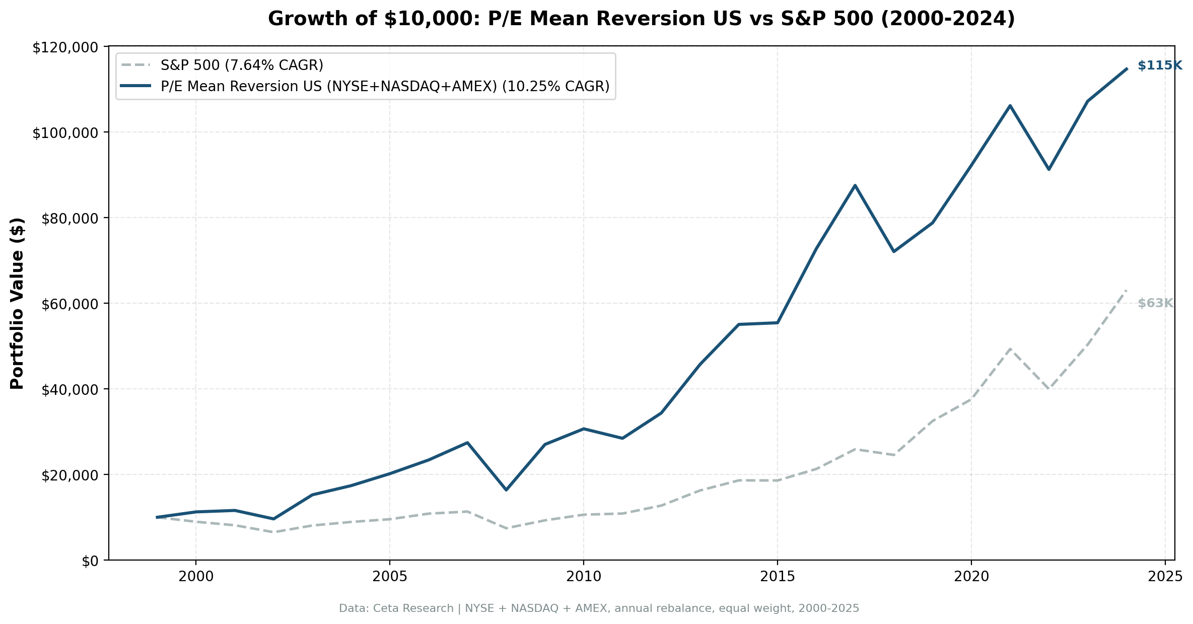
$10,000 grew to $114,702 vs $63,071 for the S&P 500. The Sharpe ratio improved from 0.322 to 0.371, and the Sortino ratio from 0.556 to 0.768. The down-capture of 74% gives back less than a typical deep-value screen, and 25 consecutive invested periods with a 64% win rate against SPY are a solid foundation.
The asymmetry here is different from longitudinal P/E compression. Up-capture is 118%, meaning this screen participates strongly in bull markets. Down-capture at 74% means it sheds meaningfully less than the index in downturns, though it still doesn't protect like a defensive screen.
Zero cash periods means the sector-relative signal always finds eligible stocks. At any point in the cycle, some sectors are compressed relative to their peers and some stocks within them are trading at deep discounts.
Year-by-year returns
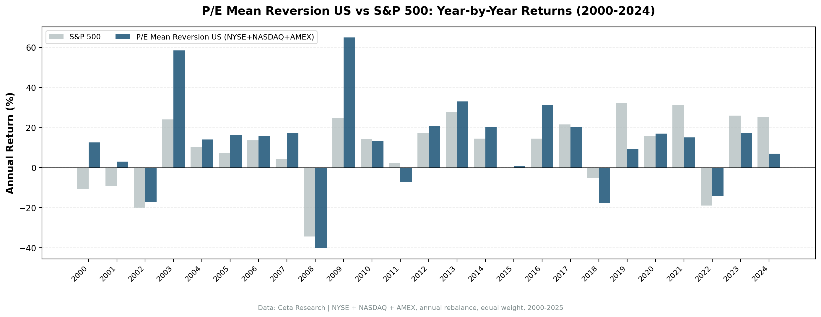
| Year | P/E Mean Reversion | S&P 500 | Excess |
|---|---|---|---|
| 2000 | +12.5% | -10.5% | +23.0% |
| 2001 | +3.0% | -9.2% | +12.2% |
| 2002 | -17.0% | -19.9% | +2.9% |
| 2003 | +58.6% | +24.1% | +34.5% |
| 2004 | +14.0% | +10.2% | +3.8% |
| 2005 | +16.1% | +7.2% | +9.0% |
| 2006 | +15.9% | +13.7% | +2.2% |
| 2007 | +17.2% | +4.4% | +12.8% |
| 2008 | -40.3% | -34.3% | -6.0% |
| 2009 | +65.0% | +24.7% | +40.3% |
| 2010 | +13.5% | +14.3% | -0.8% |
| 2011 | -7.2% | +2.5% | -9.7% |
| 2012 | +20.8% | +17.1% | +3.7% |
| 2013 | +33.1% | +27.8% | +5.3% |
| 2014 | +20.4% | +14.5% | +5.9% |
| 2015 | +0.7% | -0.1% | +0.8% |
| 2016 | +31.3% | +14.5% | +16.8% |
| 2017 | +20.3% | +21.6% | -1.3% |
| 2018 | -17.7% | -5.2% | -12.5% |
| 2019 | +9.3% | +32.3% | -23.0% |
| 2020 | +17.1% | +15.6% | +1.4% |
| 2021 | +15.1% | +31.3% | -16.2% |
| 2022 | -14.0% | -19.0% | +5.0% |
| 2023 | +17.5% | +26.0% | -8.5% |
| 2024 | +7.0% | +25.3% | -18.3% |
2000-2007: the strategy's best stretch
The period from 2000 to 2007 generated the bulk of the long-run alpha. In 2000 and 2001, the screen avoided overvalued tech while owning sector laggards with depressed relative multiples. In the recovery from 2003 onward, those sector discounts closed and the portfolio captured the full rally.
The two standout years in this period are 2003 (+58.6% vs +24.1%) and 2009 (+65.0% vs +24.7%). Both are classic value recovery years. After a broad market selloff, the most discounted stocks in each sector bounced back hardest as investors moved down the quality-valuation stack.
Crisis comparison
| Event | P/E Mean Reversion | S&P 500 | Gap |
|---|---|---|---|
| Dot-com bust (2000-2002) | -3.8% cumulative | -34.9% | +31.1% |
| Financial crisis (2008) | -40.3% | -34.3% | -6.0% |
| COVID (2020) | +17.1% | +15.6% | +1.4% |
| 2022 bear market | -14.0% | -19.0% | +5.0% |
2008 is the weak point. When a crisis is sector-wide and correlated across all industries, sector-relative signals stop helping. If the entire Financial sector collapses together, a Financial stock that was trading at 40% below its sector median is still a Financial stock in a systemic crisis. The discount narrows but the absolute loss is severe. The -40.3% in 2008 was worse than SPY's -34.3%.
The dot-com contrast is sharp. From 2000 to 2002, the screen held up because the crash was sector-specific. Technology multiples collapsed, but the signal had already pointed away from the most inflated names toward the sector laggards trading at deep discounts. Stocks with P/E at 60% of their sector peers weren't the ones priced at 100x earnings.
2016: post-election value rotation
2016 produced a +16.8% excess return, +31.3% vs +14.5% for SPY. It's the largest gap in the series that didn't come out of a crash: 2009 (+40.3%), 2003 (+34.5%) and 2000 (+23.0%) all beat it, and all three were recovery or bear-market years. The post-election rotation into cyclicals and financials aligned perfectly with the sector-relative signal. Stocks that had been depressed relative to peers in Energy, Materials, and Financials captured a sharp rerating.
2019, 2021, 2024: growth regime drag
Three years of painful underperformance: 2019 (-23.0% excess), 2021 (-16.2% excess), 2024 (-18.3% excess). These years share a common feature: market returns were driven by a narrow group of high-multiple technology and growth stocks that the sector-relative screen structurally avoids.
A stock trading at 60x P/E doesn't qualify. Its sector peers at 80x don't either. The signal never touches those names. When those names dominate returns, the screen lags badly. This is the standard weakness of any value-oriented approach, and sector-relative P/E is no exception.
The quality filters (ROE > 8%, D/E < 2) don't prevent this underperformance. They screen for stable businesses, not for growth momentum.
Sector-Relative vs Own-History Signals
The P/E compression approach (stock vs its own 5-year average) and this sector-relative approach are measuring different things. Both are mean reversion signals, but they operate on different axes.
| Dimension | P/E Compression | P/E Mean Reversion (Sector-Relative) |
|---|---|---|
| Baseline | Stock's own history | Sector peers today |
| Data needed | 3-5 years of historical P/E | Current cross-section only |
| Adapts to regime shifts | Slowly (5-year average lags) | Immediately (median recalculated each year) |
| Catches | Stocks that de-rated vs themselves | Stocks cheap relative to current peer pricing |
| Miss risk | Stocks in permanently re-rated sectors | Entire sectors that are structurally cheap |
Neither is strictly better. A stock could qualify under both signals (compressed vs own history and vs sector peers) or under only one. A sector that has broadly re-rated upward over five years produces stocks that look expensive vs their own history but cheap relative to peers who moved the same way. The sector-relative signal catches those; the longitudinal signal misses them.
The cross-sectional approach also sidesteps a practical limitation: some companies lack enough P/E history for a reliable 5-year average. Sector-relative works for any stock with a current P/E and at least five sector peers.
Geographic Pattern
Measured against each market's own index, this screen adds value in most places we tested. It clearly fails in only two: Korea (-1.94% vs the KOSPI) and Taiwan (-1.62% vs the TAIEX), where stocks that screen as cheap relative to sector peers tend to stay cheap. Corporate governance, capital allocation practices, and entrenched cross-shareholding structures mean those discounts don't close on Western timelines, if they close at all.
The US result here (+2.61% vs the S&P 500) sits mid-pack. The UK is far stronger (+10.00% vs the FTSE 100) and the XETRA-listed universe stronger still than the US (+5.92% vs the DAX). India is the notable miss among the large markets: it beats the S&P 500 but trails its own Sensex. The comparison blog covers all 13 exchanges and explains why the choice of benchmark changes the ranking so much.
Backtest Methodology
Full methodology documentation: backtests/METHODOLOGY.md
| Parameter | Choice |
|---|---|
| Universe | NYSE + NASDAQ + AMEX, Market Cap > $1B USD |
| Signal | Stock P/E < 60% of sector median, P/E 3-50, ROE > 8%, D/E < 2.0 |
| Portfolio | Top 30 by lowest P/E-to-sector ratio, equal weight |
| Rebalancing | Annual (January) |
| Cash rule | Hold cash if < 10 qualify |
| Benchmark | S&P 500 Total Return (SPY) |
| Period | 2000-2024 (25 years) |
| Data | Point-in-time (45-day lag on FY financial statements) |
| Execution | Next-day close after the signal date |
| Transaction costs | 0.1% one-way (size-tiered by market cap) |
Limitations
Down capture of 74%. This screen offers partial downside protection at best. The 74% down-capture means when SPY loses 10%, this portfolio loses about 7.4% on average. That's better than a typical deep-value screen, but it isn't a defensive strategy: the sector-relative signal doesn't inherently select for defensive characteristics, and the average hides the years that matter most.
2008 full participation. In systemically correlated selloffs, sector-relative positioning doesn't help. The -40.3% in 2008 was worse than the index. When every sector drops together, being the cheapest stock in a sector doesn't cushion the fall.
Severe underperformance in growth regimes. 2019, 2021, and 2024 saw excess return gaps of -23.0%, -16.2%, and -18.3%. An investor who held this strategy through 2019-2024 would have experienced three separate years of severe lag inside a six-year stretch. That requires patience.
Smaller portfolio. Averaging 20.4 stocks per year is reasonable but not highly diversified. Sector concentration can occur in years when one industry has an unusually large number of discounted names. There's no sector cap in this implementation.
Sector median quality. The sector median is calculated from the same filtered universe (profitable, quality-filtered stocks). If a sector has fewer than five qualifying stocks, it's excluded from the signal that year. Thin sectors drop out.
Survivorship bias. Exchange membership uses current profiles, not historical. This is a standard limitation in this backtest approach.
Conclusion
Sector-relative P/E mean reversion delivered 2.61% annual alpha over 25 years of US data, growing $10,000 to $114,702 vs $63,071 for the S&P 500. The 64% win rate against SPY and zero cash periods show it's a consistent signal, not a one-era phenomenon.
The strategy thrives in value recovery years and post-crisis rebounds. It struggles in growth-dominated markets where narrow, high-multiple leadership drives index returns. That's the structural trade-off of any sector-discounting approach.
The key advantage over absolute P/E thresholds: the signal adapts automatically to sector re-ratings and regime shifts. There's no need to decide what constitutes "cheap" for Technology vs Utilities vs Healthcare. The market's own current pricing defines the benchmark, and the screen finds the names trading far below it with quality fundamentals intact.
For investors already holding market exposure, this screen identifies names likely to mean-revert toward their sector's valuation, with the quality filters ensuring the cheapness isn't purely justified by deteriorating fundamentals.
Data: Ceta Research (FMP financial data warehouse). Past performance does not guarantee future results. This is not investment advice. See full methodology at github.com/ceta-research/backtests.