Does the PEG Ratio Beat the Market? We Ran 25 Years of US Data
Peter Lynch's PEG ratio underperforms the full US exchange universe by 0.91%/yr over 25 years. Here's what works, what doesn't, and why universe selection changes everything.

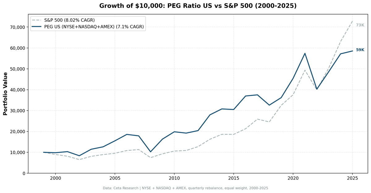
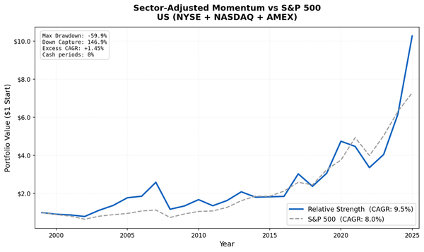
We tested Peter Lynch's PEG ratio across the full US equity universe, NYSE, NASDAQ, and AMEX, from 2000 to 2025. The result: 7.10% CAGR vs S&P 500's 8.02%. The strategy underperforms by 0.91% per year.
Contents
- The Strategy
- Methodology
- What We Found
- Why the Full Universe Tells a Different Story
- When It Works
- When It Struggles
- Run It Yourself
- Limitations
- Part of a Series
That's a meaningful finding, and it comes with important context: the version of PEG ratio that most people cite (the one "proven" to work) was tested on S&P 500 members only. In that constrained universe, it outperforms by ~3.3%/yr. The difference isn't noise. Universe selection matters as much as factor selection.
Data: FMP financial data warehouse, 2000-2025. Updated May 2026.
The Strategy
Peter Lynch coined the PEG ratio in One Up on Wall Street (1989). The idea: a stock's P/E ratio should equal its earnings growth rate. A PEG below 1.0 means you're paying less than growth warrants. Lynch used this at Fidelity Magellan to generate 29% annual returns over 13 years.
The screen we ran: PEG below 1.0, P/E between 8 and 30, ROE above 12%, debt-to-equity below 1.5, and market cap above $1B. We take the top 30 stocks by lowest PEG, equal-weight them, and rebalance quarterly in January, April, July, and October.
GARP, Growth at a Reasonable Price, is the idea that combines Lynch's growth instinct with a value discipline. You want growth, but not at any price.
Methodology
Universe: NYSE + NASDAQ + AMEX (full exchange, no index constraints) Period: 2000–2025 (25.8 years, 103 quarterly periods) Portfolio: Top 30 by PEG ASC, equal weight. Cash if fewer than 10 qualify. Costs: Transaction costs applied (size-tiered model by market cap) Execution: Next-day close (market-on-close) for all entries and exits Point-in-time: 45-day lag on financial data to avoid look-ahead bias Data: Ceta Research (FMP financial data warehouse)
Signal SQL:
SELECT f.symbol, p.companyName, p.exchange,
    ROUND(f.priceToEarningsGrowthRatioTTM, 3) AS peg_ratio,
    ROUND(f.priceToEarningsRatioTTM, 2) AS pe_ratio,
    ROUND(k.returnOnEquityTTM * 100, 1) AS roe_pct,
    ROUND(f.debtToEquityRatioTTM, 2) AS debt_to_equity,
    ROUND(k.marketCap / 1e9, 2) AS mktcap_b
FROM financial_ratios_ttm f
JOIN key_metrics_ttm k ON f.symbol = k.symbol
JOIN profile p ON f.symbol = p.symbol
WHERE f.priceToEarningsGrowthRatioTTM > 0
  AND f.priceToEarningsGrowthRatioTTM < 1.0
  AND f.priceToEarningsRatioTTM BETWEEN 8 AND 30
  AND k.returnOnEquityTTM > 0.12
  AND f.debtToEquityRatioTTM BETWEEN 0 AND 1.5
  AND k.marketCap > 1000000000
  AND p.exchange IN ('NYSE', 'NASDAQ', 'AMEX')
QUALIFY ROW_NUMBER() OVER (PARTITION BY f.symbol
    ORDER BY f.priceToEarningsGrowthRatioTTM ASC) = 1
ORDER BY peg_ratio ASC
LIMIT 30
What We Found
The strategy had two very different halves.
From 2000 to 2010, PEG worked. It outperformed during the dotcom bust (2000-2002), captured the value recovery (2003-2006), held up in the financial crisis, and bounced hard in 2009. The annual returns for those years:
| Year | PEG Portfolio | S&P 500 | Excess |
|---|---|---|---|
| 2000 | -1.9% | -10.5% | +8.6% |
| 2001 | +5.3% | -9.2% | +14.5% |
| 2002 | -19.0% | -19.9% | +0.9% |
| 2003 | +37.0% | +24.1% | +12.9% |
| 2004 | +10.1% | +10.2% | -0.1% |
| 2005 | +22.9% | +7.2% | +15.7% |
| 2006 | +19.8% | +13.6% | +6.2% |
| 2009 | +59.3% | +24.7% | +34.6% |
From 2011 onward, the picture changed. The strategy kept up in some years but badly underperformed in the growth-driven periods that defined the 2010s and early 2020s.
| Year | PEG Portfolio | S&P 500 | Excess |
|---|---|---|---|
| 2017 | +1.5% | +21.6% | -20.1% |
| 2019 | +11.0% | +32.3% | -21.3% |
| 2021 | +26.5% | +31.3% | -4.8% |
| 2023 | +20.7% | +26.0% | -5.3% |
| 2024 | +17.6% | +25.3% | -7.6% |
Full 25-year summary:
| Metric | PEG Ratio | S&P 500 |
|---|---|---|
| CAGR | 7.10% | 8.02% |
| Sharpe Ratio | 0.204 | 0.361 |
| Max Drawdown | -52.11% | -43.86% |
| Annualized Volatility | 24.98% | 16.68% |
| Total Return | 485% | 628% |
| Beta | 1.32 | 1.0 |
| Down Capture | 135% | - |
The strategy takes more risk than the S&P 500 and delivers less return. That's the honest summary.
Why the Full Universe Tells a Different Story
The S&P 500-constrained version of this backtest shows +3.3%/yr excess return. The full US exchange version shows -0.91%/yr. Both are run with the same signal. What explains the gap?
S&P 500 membership acts as a pre-filter. Every company in the index is already large-cap, already profitable, already established enough to survive index inclusion criteria. When you screen for PEG < 1 within that universe, you're finding genuinely cheap quality growth within a pool of quality companies.
In the full universe of NYSE+NASDAQ+AMEX, the pool includes thousands of mid-cap and smaller companies. PEG < 1 in this wider universe picks up several problem types:
Cyclicals at earnings peaks. A steel company with a P/E of 8 and 30% earnings growth (PEG = 0.27) looks very cheap. But cyclical earnings peak near commodity cycle tops. The "growth" is temporary. The P/E will expand as earnings fall, not because the stock is cheap.
Smaller companies with unreliable growth data. Analyst coverage drops sharply below $3B market cap. The earnings growth estimates embedded in PEG ratios are less reliable for less-covered companies.
Value traps. Low P/E + apparent growth can mean a company is declining but had one good year. The quality filters (ROE > 12%, D/E < 1.5) help, but don't fully solve this.
The post-2017 underperformance is particularly severe. The US market was driven by mega-cap tech (Microsoft, Nvidia, Apple, Meta, Alphabet) through the 2010s and 2020s. These companies had very high P/E ratios, so they never appeared in a PEG < 1 screen. A strategy that systematically excludes the best-performing cohort of the market will underperform.
When It Works
Value cycles (2000–2006, 2022): When growth stocks sell off and value stocks recover, low-PEG companies tend to do well. The strategy had its best periods during the dotcom bust and early recovery.
Post-crash recoveries (2009, 2020): The portfolio held stocks with real earnings. When markets recovered, low-PEG companies bounced. In 2009, the strategy returned +59.0% vs S&P 500's +24.7%.
Bear markets (partially): The strategy outperformed in 2000 and 2001. But in 2008 it underperformed (-42.7% vs -34.3%) because mid-caps fell harder than mega-caps in the financial crisis.
When It Struggles
Growth-led bull markets (2017, 2019, 2021): The strategy systematically misses the highest-growth cohort of the market, which drove US returns through the late 2010s and early 2020s. The -20.1% excess in 2017 is the clearest example.
Rising rate environments affecting growth: PEG < 1 companies often have less pricing power than high-growth tech companies. In regimes where nominal growth expectations matter (2021–2022), the strategy whipsawed.
Run It Yourself
# Live screen (current US stocks)
python3 peg-ratio/screen.py --preset us

# Historical backtest
python3 peg-ratio/backtest.py --preset us --output results/us.json --verbose
Limitations
Universe selection is the biggest variable. This backtest uses the full NYSE+NASDAQ+AMEX universe. The popular version (S&P 500-constrained) shows different results. Neither is "wrong." They're testing different things. The full-universe result tells you whether PEG ratio works as a standalone factor. The S&P 500-constrained version tells you if it adds value within large-cap quality stocks. Both are valid questions with different answers.
The strategy can underperform for extended periods. From 2011 through 2019, the cumulative gap between PEG and the S&P 500 was large. An investor following this strategy through the 2010s needed to tolerate decade-long underperformance versus a simple index fund.
Survivorship bias: The backtest includes delisted stocks, which is the correct approach. Some strategies look better than they are because they only test companies that survived.
Transaction costs are real. We apply a size-tiered cost model. Quarterly rebalancing with 30-stock portfolios means turnover costs add up over time.
Point-in-time data: We use a 45-day lag on financial data. This avoids look-ahead bias from using data before it was publicly available.
Part of a Series
This is the flagship post in the PEG Ratio series. We ran the same strategy across 16 exchanges globally:
- PEG Ratio in India → (+0.99%/yr vs Sensex, NSE)
- PEG Ratio in Japan → (+3.07%/yr vs Nikkei 225)
- PEG Ratio in South Africa → (low beta, downside protection)
- PEG Ratio in Canada → (+4.59%/yr vs TSX, zero cash periods)
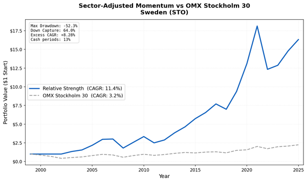
- PEG Ratio in Sweden → (+7.54%/yr vs OMX30)
- 19-Exchange Comparison →
Data: Ceta Research (FMP financial data warehouse), 2000–2025. Full methodology: METHODOLOGY.md
Past performance does not guarantee future results. This is educational content, not investment advice.