Sector Momentum Rotation: 26 Years of Chasing Industry Trends in US Markets
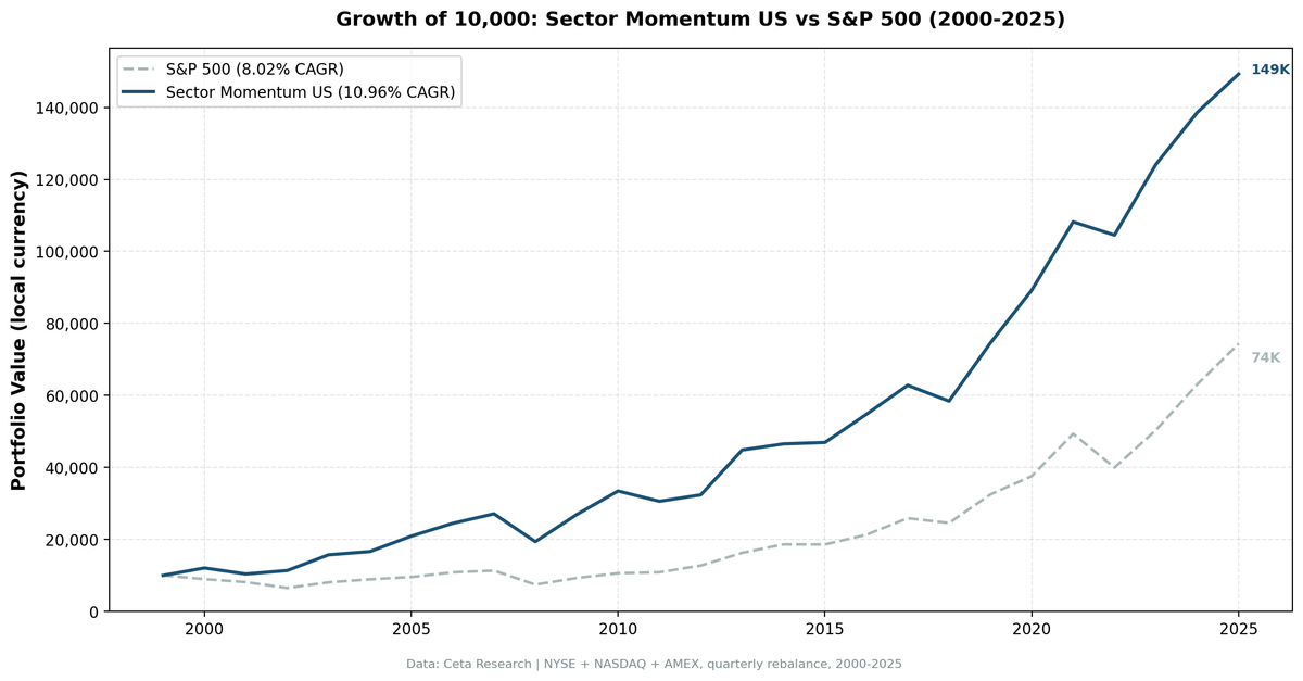
We ran sector momentum rotation on US markets from 2000-2025. Top 2 sectors by 12-month equal-weighted return, held quarterly. Result: 10.96% CAGR vs 8.02% SPY, 79.18% down capture, +3.08% Jensen alpha. Full methodology and SQL included.

Sector momentum is one of the few quantitative signals that has survived decades of academic scrutiny and real-world testing. The idea: industries that outperformed recently tend to keep outperforming. Buy the winners. Let the losers sit.
Contents
- The Strategy
- Results
- Which Sectors Drive the Rotation
- When It Works
- When It Struggles
- Full Annual Returns
- Run It Yourself
- Limitations
- References
We ran this strategy on US markets (NYSE, NASDAQ, AMEX) from 2000 to 2025. The result: 10.96% CAGR versus 8.02% for SPY, with a shallower maximum drawdown. Over 26 years, $10,000 grew to $149,285 in the portfolio versus $74,342 in SPY.
The real story isn't the average outperformance. It's when the strategy wins and when it doesn't.
Data: FMP financial data warehouse, 2000-2025. Updated August 2026.
The Strategy
Each quarter, we rank all 11 GICS sectors by their equal-weighted 12-month trailing return. We buy stocks from the top 2 sectors. Holdings are equal-weighted within the portfolio, rebalanced quarterly. Stocks must meet an exchange-specific market cap threshold to be included.
The academic foundation comes from Moskowitz and Grinblatt's 1999 paper, "Do Industries Explain Momentum?" Their answer was yes. Industry-level momentum is persistent and partially explains the broader momentum anomaly documented by Jegadeesh and Titman (1993). When an industry catches a tailwind, whether a commodity supercycle, a regulatory shift, or demographic demand, that tailwind tends to last more than one quarter.
| Parameter | Value |
|---|---|
| Universe | NYSE, NASDAQ, AMEX |
| Period | 2000-2025 (26 years) |
| Rebalance | Quarterly |
| Signal | Equal-weighted 12M sector trailing return |
| Sectors held | Top 2 each quarter |
| Stock weighting | Equal weight within portfolio |
| Market cap min | $1B (exchange-specific threshold) |
| Execution | Next-day close after each rebalance date |
| Transaction costs | Size-tiered: 0.1% (>$10B), 0.3% ($2-10B), 0.5% (<$2B), one-way |
| Cash rule | Cash if fewer than 5 sectors qualify or fewer than 10 stocks pass |
| Cash quarters | 0 of 104 |
| Avg stocks held | 308.4 |
Entry prices use the close of the trading day after each rebalance date. Ranking on a close and buying at that same close isn't executable, so the backtest gives up a day. On the US run that delay moves CAGR by less than a tenth of a point, but it's the executable version, so it's the one we report.
Results
| Metric | Portfolio | SPY |
|---|---|---|
| CAGR | 10.96% | 8.02% |
| Total return | 1,393% | 643% |
| Final value ($10k) | $149,285 | $74,342 |
| Max drawdown | -39.05% | -43.86% |
| Annualized volatility | 20.43% | 16.60% |
| Sharpe ratio | 0.438 | |
| Sortino ratio | 0.675 | |
| Calmar ratio | 0.281 | |
| Up capture | 108.20% | |
| Down capture | 79.18% | |
| Beta | 0.977 | |
| Alpha (Jensen) | +3.08% | |
| Win rate vs SPY (quarterly) | 50.96% |
Down capture of 79.18% is the key number here. When SPY fell, this portfolio fell less on average. Not dramatically, but consistently. Over 26 years, that consistency compounds, and it shows up in the drawdown: -39.05% against SPY's -43.86%.
The quarterly win rate of 50.96% tells you this isn't a strategy that beats SPY reliably. It won 14 of 26 calendar years. The edge comes from the magnitude of wins versus losses, not from frequency.
Excess return and alpha agree here. The +2.94% excess is not a beta artifact: at a beta of 0.977 the portfolio carried slightly less market risk than SPY, so Jensen alpha comes in at +3.08%, marginally above the raw excess.
Which Sectors Drive the Rotation
Some sectors dominated the top-2 rotation over the full 26-year period.
| Sector | Quarters in Top 2 |
|---|---|
| Energy | 33 |
| Healthcare | 31 |
| Basic Materials | 26 |
| Technology | 24 |
| Consumer Cyclical | 20 |
| Utilities | 17 |
| Communication Services | 15 |
| Consumer Defensive | 15 |
| Real Estate | 15 |
| Industrials | 12 |
| Financial Services | 0 |
Energy, Healthcare, and Basic Materials each appeared in a quarter or more of all rebalances. These aren't random. Healthcare benefits from persistent demographic demand and multi-year drug approval cycles. Energy and Basic Materials track commodity supercycles that play out over 5 to 10 years. When oil runs, it tends to run for a while.
Financial Services never once made the top 2 in 26 years. That's worth pausing on, because it's partly a data artifact. FMP files closed-end funds and ETFs under Financial Services, and they outnumber the operating companies in that sector several times over. Their pooled returns cluster near the market average, which drags the sector's equal-weighted score toward the middle and keeps it out of the top 2. A US investor running this screen never sees the sector, so the contamination doesn't reach the portfolio, but it does mean the Financial Services row is measuring funds more than banks.
Technology appeared in 24 quarters but delivered most of its rotation signal in the post-GFC era and again in 2020-2021. The 2019-2024 period saw tech dominate index returns through market-cap concentration rather than sector-level momentum, which created drag for this strategy.
When It Works
Early in commodity cycles. The 2000-2002 period is the clearest example. While the dot-com bust crushed SPY (-10.5%, -9.2%, -19.9%), the portfolio returned +20.6%, -13.9%, +9.2%. Energy and Basic Materials carried the rotation as commodity demand from emerging markets began building. Those two years produced the largest excess returns in the whole US series: +31.10% in 2000 and +29.14% in 2002.
Post-crisis recoveries. 2009 through 2010 showed the strategy at its best: +38.9% and +24.3% versus +24.7% and +14.3% for SPY. Momentum carried beaten-down sectors that had lagged through the GFC back into leadership.
Rate hike environments. 2022 is the standout recent year. SPY fell 19.0%. The portfolio fell 3.4%. Energy was rotating into the top-2 signal as oil prices climbed, and the sector delivered while everything else sold off. That single year produced 15.6 percentage points of relative outperformance.
Early 2000s overall. The strategy's two best relative years, 2000 and 2002, both landed in the dot-com bust. Those years defined the long-term relative return. Without them, the CAGR gap narrows considerably.
When It Struggles
The AI era (2019-2024). Four of six years underperformed SPY, with 2020 and 2022 as the exceptions. The market rewarded a handful of large-cap technology companies through passive index flows rather than broad sector rotation. Energy and Healthcare kept appearing in the top-2 signal, but their returns didn't keep up with an index being pushed higher by mega-cap tech.
| Year | Portfolio | SPY | Excess |
|---|---|---|---|
| 2019 | +27.65% | +32.31% | -4.66% |
| 2020 | +19.70% | +15.64% | +4.07% |
| 2021 | +21.24% | +31.26% | -10.03% |
| 2022 | -3.40% | -18.99% | +15.59% |
| 2023 | +18.76% | +26.00% | -7.24% |
| 2024 | +11.64% | +25.28% | -13.64% |
2024 is the worst relative year in the entire 26-year series: +11.64% against SPY's +25.28%, a 13.64-point shortfall. 2025 extended the pattern with another 10.16-point gap. The 2022 result partially offset the drag, but the net over the AI-era bull market is a significant undershoot.
2012. The portfolio returned +5.87% while SPY gained +17.09%, an 11.22-point gap. A post-crisis mean reversion year where SPY caught up quickly while the momentum basket was still positioned in the prior cycle's leaders.
2011. The portfolio returned -8.55% while SPY gained +2.46%. European debt crisis contagion hit Energy and Materials. When global macro events create sharp, correlation-driven selloffs, sector momentum signals can carry you directly into the fire.
Full Annual Returns
| Year | Portfolio | SPY | Excess |
|---|---|---|---|
| 2000 | +20.59% | -10.50% | +31.10% |
| 2001 | -13.88% | -9.17% | -4.71% |
| 2002 | +9.22% | -19.92% | +29.14% |
| 2003 | +38.48% | +24.12% | +14.36% |
| 2004 | +5.81% | +10.24% | -4.42% |
| 2005 | +25.78% | +7.17% | +18.61% |
| 2006 | +17.01% | +13.65% | +3.37% |
| 2007 | +10.79% | +4.40% | +6.39% |
| 2008 | -28.52% | -34.31% | +5.79% |
| 2009 | +38.88% | +24.73% | +14.15% |
| 2010 | +24.30% | +14.31% | +9.99% |
| 2011 | -8.55% | +2.46% | -11.01% |
| 2012 | +5.87% | +17.09% | -11.22% |
| 2013 | +38.48% | +27.77% | +10.70% |
| 2014 | +3.77% | +14.50% | -10.73% |
| 2015 | +0.87% | -0.12% | +0.99% |
| 2016 | +16.63% | +14.45% | +2.17% |
| 2017 | +14.75% | +21.64% | -6.89% |
| 2018 | -6.99% | -5.15% | -1.85% |
| 2019 | +27.65% | +32.31% | -4.66% |
| 2020 | +19.70% | +15.64% | +4.07% |
| 2021 | +21.24% | +31.26% | -10.03% |
| 2022 | -3.40% | -18.99% | +15.59% |
| 2023 | +18.76% | +26.00% | -7.24% |
| 2024 | +11.64% | +25.28% | -13.64% |
| 2025 | +7.71% | +17.88% | -10.16% |
Run It Yourself
This query ranks current US sectors by 12-month equal-weighted trailing return. The top 2 are where the momentum signal points today.
WITH prices AS (
    SELECT e.symbol, e.adjClose, CAST(e.date AS DATE) AS trade_date
    FROM stock_eod e
    JOIN profile p ON e.symbol = p.symbol
    WHERE p.sector IS NOT NULL AND p.sector != ''
      AND p.marketCap > 1000000000
      AND p.exchange IN ('NYSE', 'NASDAQ', 'AMEX')
      AND CAST(e.date AS DATE) >= CURRENT_DATE - INTERVAL '400' DAY
      AND e.adjClose IS NOT NULL AND e.adjClose > 0
),
recent AS (
    SELECT symbol, adjClose AS recent_price
    FROM prices
    QUALIFY ROW_NUMBER() OVER (PARTITION BY symbol ORDER BY trade_date DESC) = 1
),
year_ago AS (
    SELECT symbol, adjClose AS old_price
    FROM prices
    WHERE trade_date <= CURRENT_DATE - INTERVAL '365' DAY
    QUALIFY ROW_NUMBER() OVER (PARTITION BY symbol ORDER BY trade_date DESC) = 1
),
stock_returns AS (
    SELECT r.symbol, pr.sector,
           (r.recent_price / ya.old_price - 1) * 100 AS return_12m
    FROM recent r
    JOIN year_ago ya ON r.symbol = ya.symbol
    JOIN profile pr ON r.symbol = pr.symbol
    WHERE ya.old_price > 0 AND r.recent_price > 0
      AND (r.recent_price / ya.old_price - 1) BETWEEN -0.99 AND 5.0
)
SELECT
    sector,
    ROUND(AVG(return_12m), 2) AS avg_return_12m_pct,
    COUNT(DISTINCT symbol) AS n_stocks,
    ROW_NUMBER() OVER (ORDER BY AVG(return_12m) DESC) AS rank
FROM stock_returns
GROUP BY sector
HAVING COUNT(DISTINCT symbol) >= 5
ORDER BY avg_return_12m_pct DESC
Run this query on Ceta Research: cetaresearch.com/data-explorer?q=XWQD6e9yhy
For the stock screen (top stocks in momentum sectors): cetaresearch.com/data-explorer?q=yxcz_GHqZL
Note the n_stocks column when you run it. Financial Services will show several thousand names against a few hundred for every other sector. Those are closed-end funds and ETFs, which FMP files under that sector. This matches how the backtest ran, so the screen and the results agree, but read that row as a fund average rather than a bank average.
Limitations
Concentration risk. Equal weighting across 300+ stocks provides diversification, but holding only the top 2 sectors means concentrated sector exposure. In 2012 and 2011, that concentration cost more than 11 points relative to SPY in a single year each.
Momentum crashes. Academic literature documents momentum crashes during sharp reversals, especially post-crisis. When sectors that led into a downturn become the laggards out of it, the signal points in the wrong direction at the worst time. The 2008-2009 transition is a partial example.
AI-era underperformance. The 2019-2025 period reflects a genuine structural challenge: passive index flows into mega-cap tech drove returns independent of sector rotation dynamics. 2020 and 2022 were exceptions, but 2021, 2023, 2024, and 2025 all saw significant underperformance, and 2024 was the worst relative year in the entire series. If this pattern persists, the strategy's edge versus SPY may be smaller going forward.
Win rate. A 50.96% quarterly win rate means you'll regularly experience multi-year underperformance streaks. The 2019-2025 run required conviction to stay with. Most investors won't.
Market cap filter. The $1B minimum excludes small and mid-cap stocks. The strategy captures sector trends at large-cap scale, not the full sector universe.
Fund contamination in one sector. FMP classifies closed-end funds and ETFs as Financial Services. In the US that sector is mostly funds by count. It never reached the top 2 over 26 years, so no fund ever entered this portfolio, but a version of this screen run on a market where that sector does rank would be buying pooled vehicles rather than operating companies.
Transaction costs. The model uses size-tiered costs (0.1% for large-cap >$10B, 0.3% for mid-cap, 0.5% for small-cap), one-way. Actual costs depend on execution quality and position sizes. The tier is a one-way rate and the model charges a full round trip every quarter, on every holding, even when a sector stays in the top 2 and the position carries over untouched. That's deliberately conservative: real turnover is lower than the cost model assumes.
References
- Moskowitz, T. J., & Grinblatt, M. (1999). Do industries explain momentum? The Journal of Finance, 54(4), 1249-1290.
- Jegadeesh, N., & Titman, S. (1993). Returns to buying winners and selling losers: Implications for stock market efficiency. The Journal of Finance, 48(1), 65-91.
Data: Ceta Research (FMP financial data warehouse), NYSE/NASDAQ/AMEX, 2000-2025 Backtest: 26 years, 104 quarters, size-tiered transaction costs (0.1-0.5% one-way), equal weight, next-day-close execution Past performance does not guarantee future results. This is educational content, not investment advice.