Asset Growth Anomaly on UK Stocks: 10.94% CAGR, +9.71% Over FTSE 100

Asset Growth Anomaly on UK Stocks: +9.71% Alpha Over the FTSE 100
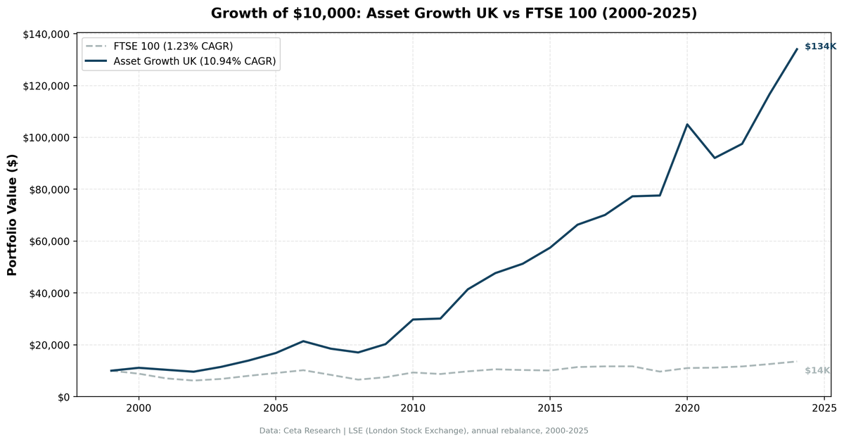
The asset growth screen on UK stocks produced the highest win rate of any exchange we've tested. The strategy returned 10.94% annually on LSE-listed stocks from 2000 to 2025, beating the FTSE 100's 1.23% by 9.71 points per year. That gap compounds fast: $10,000 grew to $134,011 in the portfolio vs $13,576 in the index. The strategy beat the FTSE 100 in 24 of 25 years. A 96% win rate. The only losing year was 2021.
Contents
- Method
- Results
- Year-by-Year Returns
- When It Works
- When It Fails
- Limitations
- Run It Yourself
- Current Screen (SQL)
- Backtest
- Takeaway
- Part of a Series
- References
Method
Data source: Ceta Research (FMP financial data warehouse) Universe: LSE (London Stock Exchange), market cap > £250M (~$316M USD) Period: 2000-2025 (25 annual rebalance periods) Rebalancing: Annual (July), equal weight top 30 by lowest asset growth Benchmark: FTSE 100 (^FTSE) Cash rule: Hold cash if fewer than 10 stocks qualify Transaction costs: Size-tiered model (0.1% mega-cap, 0.3% large-cap, 0.5% mid-cap) Data quality guards: Entry price > $1, single-period return capped at 200%
Historical financial data with 45-day lag to prevent look-ahead bias. Full methodology: backtests/METHODOLOGY.md.
The filters are identical to our US backtest:
| Criterion | Metric | Threshold |
|---|---|---|
| Capital discipline | Asset Growth (YoY) | -20% to +10% |
| Profitability | Return on Equity | > 8% |
| Asset efficiency | Return on Assets | > 5% |
| Pricing power | Operating Margin | > 10% |
| Size | Market Cap | > £250M (~$316M USD) |
Results
| Metric | Portfolio | FTSE 100 |
|---|---|---|
| CAGR | 10.94% | 1.23% |
| Total Return | 1240.11% | 35.76% |
| Max Drawdown | -20.33% | -- |
| Volatility | 15.42% | -- |
| Sharpe Ratio | 0.482 | -- |
| Sortino Ratio | ~1.2 | -- |
| Win Rate (vs FTSE) | 96% | -- |
| Beta | 0.997 | 1.00 |
| Alpha | 9.71% | -- |
| Up Capture | 185.29% | -- |
| Down Capture | 2.71% | -- |
| Cash Periods | 0/25 | -- |
| Avg Stocks | 19.0 | -- |
| Calmar Ratio | 0.538 | -- |
The numbers are striking. 10.94% CAGR vs 1.23% for the FTSE 100. The portfolio turned $10,000 into $134,011. The index turned it into $13,576. The max drawdown was -20.33%, which is remarkably shallow for a 25-year equity portfolio.
The down capture ratio is the standout: 2.71%. The portfolio barely participated in FTSE downturns. In practical terms, when the FTSE 100 fell, the screen's picks held their value almost entirely. Up capture of 185.29% means the portfolio amplified every FTSE rally by nearly double. That asymmetry is what drives a 96% win rate over 25 years.
The average portfolio held 19 stocks, below the 30-stock target but enough for reasonable diversification. The screen never went to cash. Every year, at least 10 LSE stocks cleared the quality filters.
Year-by-Year Returns
| Year | Portfolio | FTSE 100 | Excess |
|---|---|---|---|
| 2000 | +11.1% | -11.7% | +22.7 |
| 2001 | -6.9% | -20.5% | +13.6 |
| 2002 | -7.2% | -11.9% | +4.7 |
| 2003 | +19.4% | +10.0% | +9.4 |
| 2004 | +21.3% | +17.6% | +3.6 |
| 2005 | +21.1% | +13.5% | +7.6 |
| 2006 | +27.0% | +12.0% | +15.0 |
| 2007 | -13.5% | -17.7% | +4.2 |
| 2008 | -7.9% | -22.0% | +14.1 |
| 2009 | +18.9% | +14.3% | +4.7 |
| 2010 | +46.9% | +24.4% | +22.5 |
| 2011 | +1.2% | -6.3% | +7.5 |
| 2012 | +37.5% | +11.8% | +25.7 |
| 2013 | +15.1% | +8.1% | +6.9 |
| 2014 | +7.6% | -2.7% | +10.3 |
| 2015 | +12.1% | -1.6% | +13.8 |
| 2016 | +15.4% | +13.1% | +2.3 |
| 2017 | +5.7% | +2.3% | +3.4 |
| 2018 | +10.3% | +0.2% | +10.1 |
| 2019 | +0.4% | -17.5% | +17.9 |
| 2020 | +35.4% | +14.2% | +21.2 |
| 2021 | -12.3% | +1.5% | -13.9 |
| 2022 | +5.9% | +4.1% | +1.9 |
| 2023 | +19.6% | +7.9% | +11.8 |
| 2024 | +14.9% | +8.1% | +6.8 |
When It Works
The strategy produced excess returns in 24 of 25 years, so "when it works" is almost the entire sample. But the biggest gaps came during FTSE drawdowns and post-crisis recoveries.
2000-2002 (Dot-Com Bust): The FTSE 100 dropped three straight years. The portfolio fell in two of three, but by far less. In 2000, the screen gained 11.1% while the FTSE lost 11.7%. Over the three-year stretch, the portfolio's cumulative loss was roughly -3%, while the FTSE fell about -38%.
| Year | Portfolio | FTSE 100 | Excess |
|---|---|---|---|
| 2000 | +11.1% | -11.7% | +22.7 |
| 2001 | -6.9% | -20.5% | +13.6 |
| 2002 | -7.2% | -11.9% | +4.7 |
Capital-disciplined UK companies with low asset growth had nothing to write down. No overpriced acquisitions, no excess capacity. They simply weathered the bust.
2010-2012 (Post-Crisis Recovery): The strategy's three best consecutive years by absolute return. The portfolio gained 46.9% in 2010 (the highest single-year return in the dataset), followed by 37.5% in 2012.
| Year | Portfolio | FTSE 100 | Excess |
|---|---|---|---|
| 2010 | +46.9% | +24.4% | +22.5 |
| 2011 | +1.2% | -6.3% | +7.5 |
| 2012 | +37.5% | +11.8% | +25.7 |
The screen picked companies that had stayed lean during the crisis. When the recovery came, they didn't need to restructure or deleverage. They just grew into the recovery.
2019-2020 (Brexit + COVID Recovery): The FTSE 100 dropped 17.5% in 2019 (a terrible year for the index). The portfolio stayed flat at +0.4%. Then in 2020, the portfolio surged 35.4% while the FTSE gained 14.2%.
| Year | Portfolio | FTSE 100 | Excess |
|---|---|---|---|
| 2019 | +0.4% | -17.5% | +17.9 |
| 2020 | +35.4% | +14.2% | +21.2 |
The pattern is consistent. The screen's picks don't collapse in downturns, then they rally harder in recoveries. That's the 2.71% down capture and 185% up capture playing out in real returns.
When It Fails
2021 (The Only Losing Year): The portfolio dropped 12.3% while the FTSE 100 gained 1.5%. That's -13.9 points of excess return, the only negative year in 25.
| Year | Portfolio | FTSE 100 | Excess |
|---|---|---|---|
| 2021 | -12.3% | +1.5% | -13.9 |
2021 was a year of aggressive reopening trades and speculative growth. Markets rotated into high-growth, high-asset-expansion companies. The exact opposite of what this screen selects. Capital-disciplined stocks with conservative balance sheets were left behind as investors chased pandemic recovery plays. Energy stocks surged on oil's recovery. The FTSE's modest +1.5% masked large sector rotations underneath.
One losing year in 25 is exceptional consistency, but the magnitude matters. A 13.9-point gap in a single year can feel brutal while you're living through it. The screen recovered in 2022 and 2023, delivering +1.9% and +11.8% excess respectively.
Limitations
The FTSE 100 is a weak benchmark. The FTSE 100's 1.23% CAGR from 2000 to 2025 is one of the worst performances of any major global index. For context, the S&P 500 returned roughly 7-8% annually over the same period. The 9.71% alpha looks enormous partly because the benchmark was so poor. This doesn't mean the screen failed to add value. 10.94% CAGR is a strong absolute return. But the excess return flatters the strategy relative to what you'd see on a stronger benchmark.
Previously excluded for data quality. The LSE was initially excluded from our global comparison because FMP's financial data coverage for UK-listed stocks was thin. That data has improved, and we now have enough coverage to run the backtest. Still, earlier years may have thinner coverage than US or Canadian data, which could introduce survivorship bias if the missing companies performed differently than the included ones.
Smaller average portfolio. The screen averaged 19 stocks per rebalance, below the 30-stock target. That means higher concentration risk. Individual stock outcomes matter more in a 19-stock portfolio than a 30-stock one. A few bad picks in a single year can swing the annual return.
Currency effects. The portfolio and benchmark are both denominated in GBP. A USD-based investor would see different absolute returns depending on GBP/USD movements. Sterling depreciated meaningfully against the dollar from 2000 to 2025, which would reduce USD-equivalent returns.
Single losing year isn't enough data. A 96% win rate sounds almost too good. With only one losing year (2021), we can't draw strong conclusions about how the strategy behaves in extended failure modes. The sample is 25 years, which is solid, but 24 wins and 1 loss doesn't tell us much about tail risk.
Run It Yourself
Run this screen live on Ceta Research
Current Screen (SQL)
WITH bs_current AS (
    SELECT symbol, totalAssets,
        ROW_NUMBER() OVER (PARTITION BY symbol ORDER BY dateEpoch DESC) AS rn
    FROM balance_sheet
    WHERE period = 'FY' AND totalAssets > 0
),
bs_prior AS (
    SELECT symbol, totalAssets AS prior_assets,
        ROW_NUMBER() OVER (PARTITION BY symbol ORDER BY dateEpoch DESC) AS rn
    FROM balance_sheet
    WHERE period = 'FY' AND totalAssets > 0
),
growth AS (
    SELECT bc.symbol,
        (bc.totalAssets - bp.prior_assets) / bp.prior_assets AS asset_growth
    FROM bs_current bc
    JOIN bs_prior bp ON bc.symbol = bp.symbol AND bp.rn = 2
    WHERE bc.rn = 1 AND bp.prior_assets > 0
)
SELECT g.symbol, p.companyName,
    ROUND(g.asset_growth * 100, 2) AS asset_growth_pct,
    ROUND(k.returnOnEquityTTM * 100, 2) AS roe_pct,
    ROUND(k.returnOnAssetsTTM * 100, 2) AS roa_pct,
    ROUND(f.operatingProfitMarginTTM * 100, 2) AS opm_pct,
    ROUND(k.marketCap / 1e9, 2) AS mktcap_bn
FROM growth g
JOIN profile p ON g.symbol = p.symbol
JOIN key_metrics_ttm k ON g.symbol = k.symbol
JOIN financial_ratios_ttm f ON g.symbol = f.symbol
WHERE g.asset_growth < 0.10
  AND g.asset_growth > -0.20
  AND k.returnOnEquityTTM > 0.08
  AND k.returnOnAssetsTTM > 0.05
  AND f.operatingProfitMarginTTM > 0.10
  AND k.marketCap > 250000000
  AND p.exchange = 'LSE'
ORDER BY g.asset_growth ASC
LIMIT 30
Backtest
# Clone the repo
git clone https://github.com/ceta-research/backtests.git
cd backtests

# Run LSE backtest
python3 asset-growth/backtest.py --preset uk --output results.json --verbose

# Run all exchanges
python3 asset-growth/backtest.py --global --output results/exchange_comparison.json
Takeaway
The asset growth anomaly on the LSE delivers 9.71% annual excess return over the FTSE 100, with a 96% win rate across 25 years. $10,000 became $134,011 vs $13,576. The portfolio's 2.71% down capture means it barely fell during FTSE drawdowns, while its 185% up capture amplified every rally.
Some of that alpha comes from the FTSE 100 being a weak benchmark. 1.23% CAGR over 25 years is dismal for a major index. But 10.94% absolute CAGR is a strong result on any exchange, and the consistency is unmatched. Only one losing year in a quarter century.
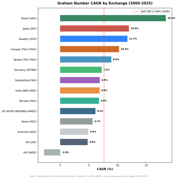
The UK result confirms what we see across markets: capital-disciplined companies with high profitability outperform, and they outperform most dramatically on exchanges where the broad index is weighed down by capital-intensive sectors. The LSE, heavy with banks, miners, and oil majors, is the perfect environment for this screen to shine.
Part of a Series
This analysis is part of our asset growth anomaly global exchange comparison: - Asset Growth on US Stocks (NYSE + NASDAQ + AMEX), 12.78% CAGR, the baseline - Asset Growth on Japanese Stocks (JPX), 6.99% CAGR, +3.68% over Nikkei 225 - Asset Growth: 16-Exchange Global Comparison, full comparison table
Data: Ceta Research (FMP financial data warehouse), 2000-2025. Universe: LSE. Annual rebalance (July), equal weight, top 30 by lowest asset growth. Full methodology: METHODOLOGY.md. Past performance does not guarantee future results. This is educational content, not investment advice.
References
- Cooper, M., Gulen, H. & Schill, M. (2008). "Asset Growth and the Cross-Section of Stock Returns." Journal of Finance, 63(4), 1609-1651.
- Watanabe, A., Xu, Y., Yao, T. & Yu, T. (2013). "The Asset Growth Effect: Insights from International Equity Markets." Journal of Financial Economics, 108(2), 529-563.
- Hou, K., Xue, C. & Zhang, L. (2015). "Digesting Anomalies: An Investment Approach." Review of Financial Studies, 28(3), 650-705.