EV/EBITDA Sector Discount on US Stocks: 25 Years of Data
We tested a sector-relative EV/EBITDA screen on 25 years of US stock data. When a profitable company's EV/EBITDA falls 30%+ below its sector peers, it tends to mean-revert. 10.88% CAGR vs 7.64% for the S&P 500, with 73.0% down capture and zero cash periods across 25 years.

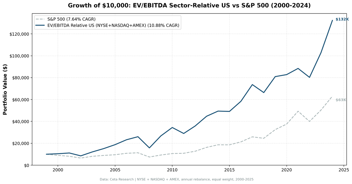
When a profitable company trades at a 30% discount to its sector peers on EV/EBITDA, something tends to happen. Either the business is genuinely broken, or the market has mispriced it. We built a screen to find the latter, ran it on 25 years of US stock data, and the results hold up: 10.88% CAGR vs 7.64% for the S&P 500, with down capture of 73.0%.
Contents
- Method
- The Screen
- What We Found
- Annual Returns
- The Early 2000s: Where the Gap Was Built
- Crisis Comparison
- The Growth Regime Problem: 2019-2021
- Limitations
- Conclusion
That's the short version. Here's the full picture.
Data: FMP financial data warehouse, 2000–2025. Updated August 2026.
Method
We screened NYSE, NASDAQ, and AMEX stocks from 2000 through 2025. Each January, we computed sector median EV/EBITDA and selected the 30 stocks trading at the deepest discount to their peers. We held for 12 months, then reset.
| Parameter | Value |
|---|---|
| Universe | NYSE + NASDAQ + AMEX |
| Market cap minimum | $1B USD |
| EV/EBITDA range | 0.5x to 25x |
| ROE filter | > 8% |
| D/E filter | < 2.0 |
| Sector discount required | ≥ 30% below sector median |
| Selection | Top 30 by deepest discount |
| Rebalancing | Annual (January) |
| Cash condition | If fewer than 10 qualify |
| Data source | Ceta Research (FMP financial data warehouse) |
| Filing lag | 45 days (point-in-time, avoids look-ahead) |
| Period | 2000-2025 (25 years) |
| Benchmark | S&P 500 (SPY, total return) |
| Execution | Next-day close after the January signal (market-on-close) |
| Transaction costs | Size-tiered one-way: 0.1% above $10B, 0.3% $2-10B, 0.5% below $2B |
Why EV/EBITDA instead of P/E?
P/E breaks in two situations: when companies carry heavy debt (earnings are depressed by interest), and when depreciation policies differ across firms. EV/EBITDA captures the full enterprise value against operating earnings before financing and accounting choices distort the picture. It's a cleaner signal for cross-company comparison, especially across capital-intensive sectors like energy and industrials where P/E becomes unreliable.
Why sector-relative?
A tech stock at 8x EV/EBITDA isn't the same as a utility at 8x. Technology companies typically trade at higher multiples because their growth profiles justify it. Comparing a tech name against the whole-market median creates false positives. By measuring discount relative to sector peers, we ask a narrower question: is this company unusually cheap compared to others doing similar things? The sector-relative approach adapts to prevailing valuation regimes. When tech runs hot at 30x, a name at 18x looks cheap. When industrials trade at 9x, an 8x name barely registers. The screen filters for genuine relative value rather than absolute level.
The academic foundation for this approach comes from Loughran and Wellman (2011), who showed EV/EBITDA predicts cross-sectional returns, and the sector-relative framing extends that by controlling for industry-level effects.
The Screen
Here's the current EV/EBITDA sector-relative screen running against the live warehouse. It finds profitable US companies trading at 30%+ below their sector median, with quality filters to exclude distressed names.
WITH universe AS (
    SELECT k.symbol, p.companyName, p.exchange, p.sector,
           k.evToEBITDATTM AS ev_ebitda, k.returnOnEquityTTM AS roe,
           fr.debtToEquityRatioTTM AS de, p.marketCap
    FROM key_metrics_ttm k
    JOIN financial_ratios_ttm fr ON k.symbol = fr.symbol
    JOIN profile p ON k.symbol = p.symbol
    WHERE k.evToEBITDATTM BETWEEN 0.5 AND 25
      AND k.returnOnEquityTTM > 0.08
      AND (fr.debtToEquityRatioTTM IS NULL OR (fr.debtToEquityRatioTTM >= 0 AND fr.debtToEquityRatioTTM < 2.0))
      AND p.marketCap > 1000000000
      AND p.sector IS NOT NULL
      AND p.exchange IN ('NYSE', 'NASDAQ', 'AMEX')
      AND p.isFund = false
      AND p.isEtf = false
      AND p.isActivelyTrading = true
    QUALIFY ROW_NUMBER() OVER (PARTITION BY COALESCE(p.cik, p.companyName)
                               ORDER BY p.averageVolume DESC) = 1
),
sector_medians AS (
    SELECT sector,
           PERCENTILE_CONT(0.5) WITHIN GROUP (ORDER BY ev_ebitda) AS median_ev_ebitda,
           COUNT(*) AS n_sector_stocks
    FROM universe GROUP BY sector HAVING COUNT(*) >= 5
)
SELECT u.symbol, u.companyName, u.exchange, u.sector,
       ROUND(u.ev_ebitda, 2) AS ev_ebitda_ttm,
       ROUND(sm.median_ev_ebitda, 2) AS sector_median_ev_ebitda,
       ROUND(u.ev_ebitda / sm.median_ev_ebitda, 3) AS ev_ratio_to_sector,
       ROUND((1 - u.ev_ebitda / sm.median_ev_ebitda) * 100, 1) AS discount_pct,
       ROUND(u.roe * 100, 1) AS roe_pct,
       ROUND(u.de, 2) AS debt_to_equity,
       ROUND(u.marketCap / 1e9, 2) AS mktcap_b
FROM universe u JOIN sector_medians sm ON u.sector = sm.sector
WHERE u.ev_ebitda / sm.median_ev_ebitda < 0.70
ORDER BY u.ev_ebitda / sm.median_ev_ebitda ASC LIMIT 30
Run this query on the live data: cetaresearch.com/data-explorer?q=_EmzQZXZQB
What We Found
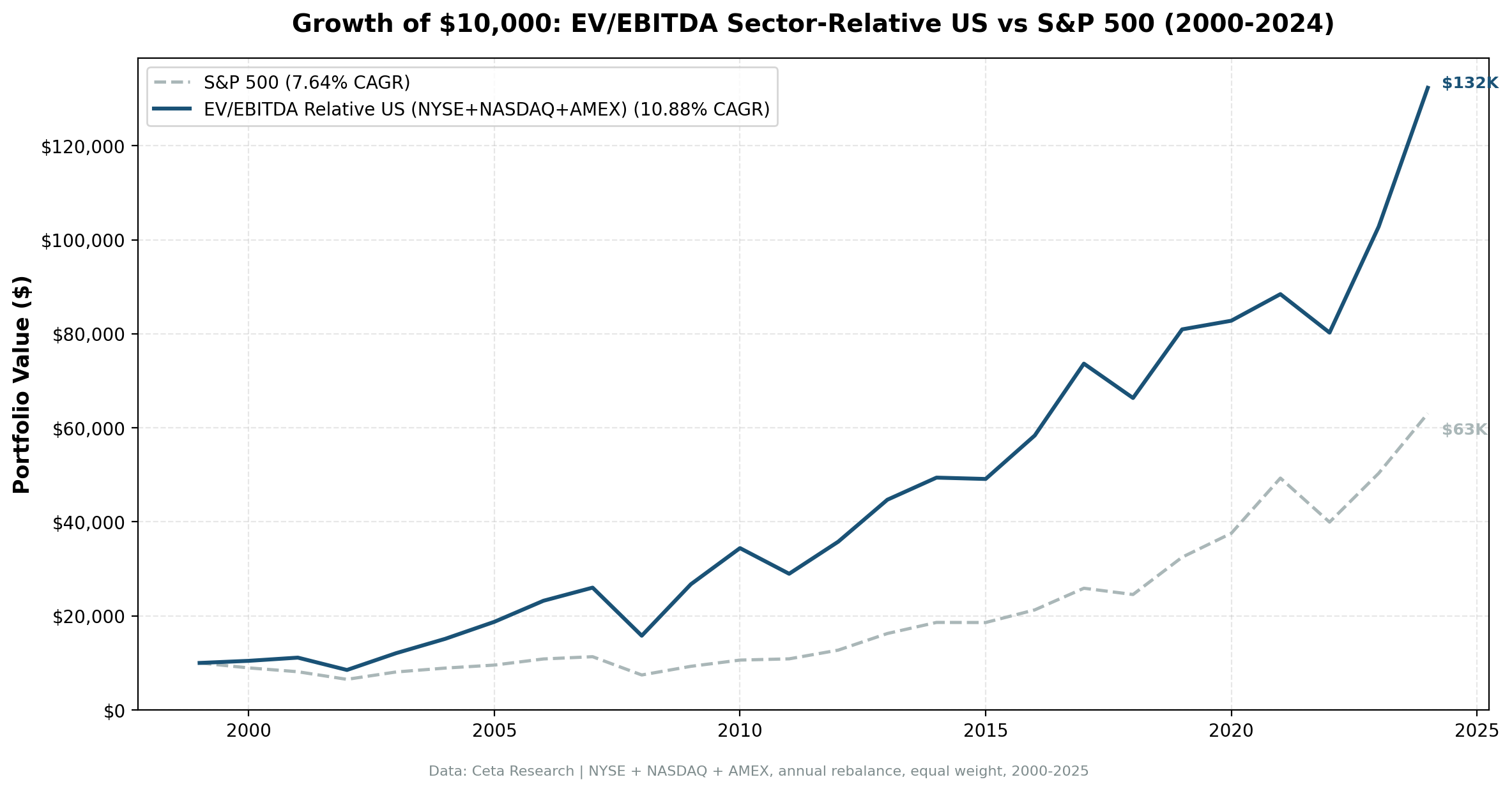
The headline number is 10.88% annualized over 25 years, turning $10,000 into $132,000. The S&P 500 returned 7.64% annualized over the same period, turning $10,000 into $63,000. The strategy held cash zero times across all 25 years. There was always a qualifying cohort.
| Metric | Strategy | S&P 500 |
|---|---|---|
| CAGR | 10.88% | 7.64% |
| Excess return | +3.24% | — |
| Total return | 1,223.29% | 530.71% |
| Sharpe ratio | 0.396 | — |
| Sortino ratio | 0.817 | — |
| Calmar ratio | 0.277 | — |
| Max drawdown | -39.31% | -34.9% |
| Down capture | 72.98% | 100% |
| Up capture | 122.69% | 100% |
| Win rate | 60% | — |
| Cash periods | 0 / 25 | — |
| Avg stocks held | 20.0 | — |
Down capture of 73.0% is the statistic we keep coming back to. When the S&P 500 drops 10%, this portfolio drops roughly 7.3%. You capture 123% of the upside and absorb 73% of the downside on average. That asymmetry is narrower than the raw CAGR gap suggests, and it's the part of the result most sensitive to which years you measure. It still compounds in your favour over 25 years, but it isn't a free lunch.
Annual Returns
| Year | Strategy | S&P 500 | Excess |
|---|---|---|---|
| 2000 | +4.5% | -10.5% | +15.0% |
| 2001 | +6.5% | -9.2% | +15.7% |
| 2002 | -23.6% | -19.9% | -3.7% |
| 2003 | +42.0% | +24.1% | +17.9% |
| 2004 | +25.3% | +10.2% | +15.0% |
| 2005 | +23.9% | +7.2% | +16.8% |
| 2006 | +23.9% | +13.7% | +10.2% |
| 2007 | +12.0% | +4.4% | +7.6% |
| 2008 | -39.3% | -34.3% | -5.0% |
| 2009 | +69.3% | +24.7% | +44.6% |
| 2010 | +28.8% | +14.3% | +14.4% |
| 2011 | -15.9% | +2.5% | -18.3% |
| 2012 | +23.6% | +17.1% | +6.5% |
| 2013 | +24.9% | +27.8% | -2.9% |
| 2014 | +10.5% | +14.5% | -4.0% |
| 2015 | -0.6% | -0.1% | -0.5% |
| 2016 | +18.8% | +14.4% | +4.4% |
| 2017 | +26.2% | +21.6% | +4.5% |
| 2018 | -9.9% | -5.2% | -4.8% |
| 2019 | +22.0% | +32.3% | -10.3% |
| 2020 | +2.3% | +15.6% | -13.4% |
| 2021 | +6.8% | +31.3% | -24.4% |
| 2022 | -9.2% | -19.0% | +9.7% |
| 2023 | +28.1% | +26.0% | +2.1% |
| 2024 | +28.7% | +25.3% | +3.5% |
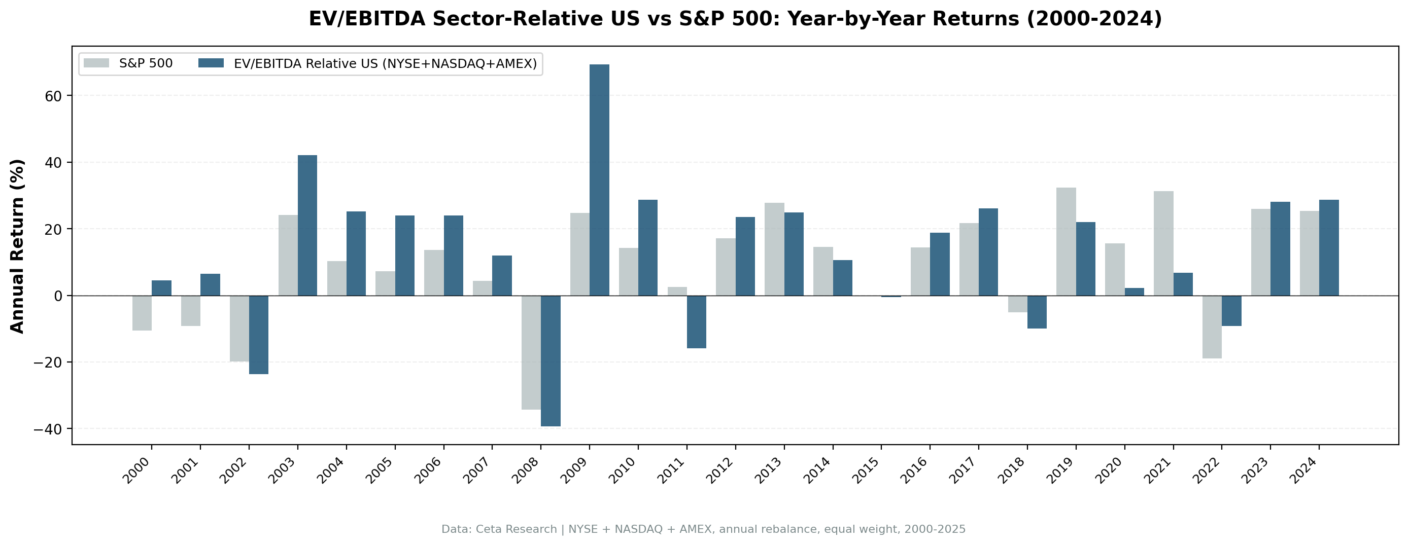
The Early 2000s: Where the Gap Was Built
The strategy's biggest structural advantage appeared in the dot-com bust. In 2000 and 2001, when the S&P 500 fell 10.5% and 9.2% respectively, this screen returned +4.5% and +6.5%. The 2007 bull year also stands out: +12.0% against the index's +4.4%, a 7.6 percentage point gap. The sector-relative signal naturally avoided the frothy tech and telecom names because those stocks weren't cheap relative to sector peers. They were the sector peers, trading at the high end of their cohorts.
Value names in industrials, financials, and consumer sectors absorbed almost none of the growth selloff. Then came the recovery: 2003 brought +42.0% against the index's +24.1%, and 2005-2006 extended the outperformance to +16.8% and +10.2% in excess.
That 2000-2010 decade was exceptional for this type of strategy. The market repeatedly repriced speculative assets downward while mean-reverting the genuinely undervalued.
Crisis Comparison
| Event | Strategy | S&P 500 | Excess |
|---|---|---|---|
| Dot-com bust (2000-2002) | -15.0% cumulative | -34.9% cumulative | +19.9% |
| GFC 2008 | -39.3% | -34.3% | -5.0% |
| COVID 2020 | +2.3% | +15.6% | -13.4% |
| Rate shock 2022 | -9.2% | -19.0% | +9.7% |
The GFC is telling. In 2008 the strategy fell -39.3% versus the index's -34.3%, so it did worse than the market in the one year downside protection mattered most. The sector-relative discount couldn't defend against forced selling when correlation goes to one, and cheap names carried more of the damage, not less.
Compare that to 2022, when the rate-shock selloff was valuation-driven rather than systemic. The strategy fell -9.2% while the index fell -19.0%. The companies in this screen, already cheap on EV/EBITDA, had less air to come out of valuations during a repricing regime.
The Growth Regime Problem: 2019-2021
The three years from 2019 to 2021 produced the worst sustained underperformance. The strategy returned +22.0%, +2.3%, and +6.8% against the index's +32.3%, +15.6%, and +31.3%. In aggregate, that's 48 percentage points of missed upside over three years.
This is the value trap risk: when growth stocks lead and narrow leadership drives index performance, a sector-relative value screen sits out the party. The names passing the EV/EBITDA filter in those years were disproportionately in sectors that lagged, while the mega-cap tech names inflating the index never qualified.
The strategy recovered. 2022 (+9.7% excess), 2023 (+2.1% excess), and 2024 (+3.5% excess) show the screen reasserting itself when valuation started mattering again, though the 2023 and 2024 margins are thin.
Limitations
Concentration risk. Averaging 20.0 stocks over 25 years means some individual company blowups can hit hard. The screen's quality filters (ROE > 8%, D/E < 2.0) reduce but don't eliminate this.
Sector concentration. In some years, the discount signal clusters in one or two sectors. You can end up with a portfolio that's effectively a sector bet, not a diversified value screen.
Systemic crashes aren't protected. 2008 demonstrates the ceiling on downside protection: the strategy fell further than the market that year. When credit markets freeze and forced selling dominates, EV/EBITDA relationships temporarily stop mattering. Down capture of 73.0% is a long-run average, not a guarantee in any specific crisis.
Execution costs. The backtest charges size-tiered transaction costs, 0.1% one-way above $10B market cap, 0.3% between $2B and $10B, and 0.5% below $2B, applied round-trip at each annual rebalance. Real spreads on the smaller names in this screen can be wider than that, so treat the tiers as a floor rather than a full accounting.
Growth regime risk. Three consecutive years of underperformance (2019-2021) require conviction in the strategy's long-run validity. Many investors would capitulate at year two.
Filing lag. We apply a 45-day filing lag to avoid look-ahead bias, but real-world data latency, restatements, and revisions add noise that backtests can't fully capture.
Financials are in the universe, and shouldn't be. Enterprise value doesn't describe a bank, whose liabilities are part of the operating business, and EBITDA skips net interest income entirely. Banks and insurers were ranked alongside industrials on a multiple that doesn't fit them. The live screen above keeps them for consistency with the backtest. A version of this strategy built from scratch would exclude the sector.
Conclusion
A sector-relative EV/EBITDA screen on US stocks produced 10.88% annualized over 25 years, 3.2 percentage points above the S&P 500, with partial downside protection (73.0% down capture) and zero cash periods. The mechanism is straightforward: companies that are cheap relative to sector peers on EV/EBITDA tend to mean-revert.
The honest caveats are equally clear. Systemic crises offer no protection at all, and 2008 was worse than the market. Growth regime years punish the screen. The approach requires patience through multi-year underperformance.
The strength of this screen isn't that it avoids drawdowns. Its max drawdown of -39.3% is deeper than the market's. It's that the upside captures more than the downside gives back across 25 years of varying market conditions.
What's your experience running sector-relative value screens? Do you adjust for sector weighting or just take the top-30 list straight?
Data: Ceta Research (FMP financial data warehouse). Backtest covers 2000-2025 using point-in-time financial data with 45-day filing lag. Results are hypothetical and do not reflect actual investment results. Past performance does not guarantee future results.
Past performance does not guarantee future results. This is educational content, not investment advice.