Interest Coverage Screen: What 25 Years of Data Shows About Debt-Servicing Ability

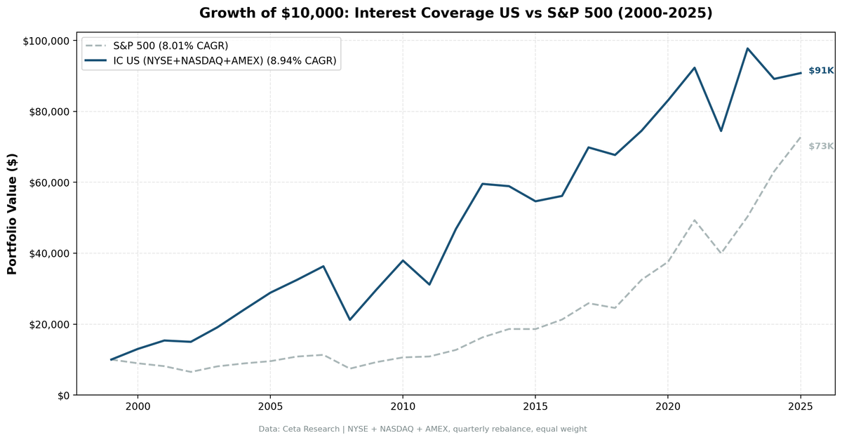
We backtested an interest coverage screen with quality filters across all US exchanges (NYSE, NASDAQ, AMEX) from 2000 to 2025, using next-day close execution to avoid same-bar entry bias. The portfolio returned 9.05% annually vs 8.02% for the S&P 500. That +1.03% annual excess isn't dramatic, but the pattern of when it outperforms is. During the dot-com bust (2000-2002), the portfolio produced +87 percentage points of cumulative excess return while the market lost a third of its value. This is a crisis protection signal, not an alpha machine.
Contents
- Method
- What Research Shows
- The Screen
- Filters
- Simple Screen (SQL)
- Advanced Screen (SQL)
- Results
- When It Works
- When It Fails
- The Real Story: Regime Dependence
- Full Annual Returns
- Key Thresholds
- Sector Concentration
- Limitations
- Global Results
- Run It Yourself
- Current Screen
- Backtest
- Takeaway
- References
Method
Data source: Ceta Research (FMP financial data warehouse) Universe: All US exchanges (NYSE, NASDAQ, AMEX), market cap > $1B Period: 2000-2025 (25.8 years, 103 quarterly periods) Rebalancing: Quarterly (January, April, July, October), equal weight top 30 by coverage Benchmark: S&P 500 Total Return (SPY) Cash rule: Hold cash if fewer than 10 stocks qualify Transaction costs: Size-tiered model (0.1% for mega-cap, 0.3% for large-cap, 0.5% for mid-cap)
Historical financial data with 45-day lag to prevent look-ahead bias. Full methodology: backtests/METHODOLOGY.md
What Research Shows
Edward Altman's 1968 study on bankruptcy prediction identified operating earnings relative to obligations as a key predictor of default. His Z-Score uses EBIT divided by total assets as one of five variables. Companies with weak ability to service their debt were significantly more likely to default.
Graham and Dodd made the same argument in Security Analysis (1934). They insisted that a company should earn several times its interest requirements to provide adequate margin of safety. Their fixed-charge coverage test was one of the earliest quantitative screens.
The intuition is simple: debt creates fixed obligations regardless of business conditions. A company must pay interest whether the quarter was good or bad. Coverage ratio quantifies how much cushion exists before those obligations become problematic.
The Screen
Filters
| Criterion | Metric | Threshold | Why |
|---|---|---|---|
| Debt-servicing ability | Interest Coverage Ratio | > 5x | Can absorb 80% earnings decline |
| Leverage control | Debt-to-Equity | 0 to 1.5 | Moderate debt, not no debt |
| Profitability | Return on Equity | > 8% | Business is worth owning |
| Size | Market Cap | > $1B | Reliable data, investable |
Simple Screen (SQL)
SELECT r.symbol, r.interestCoverageRatioTTM, k.marketCap
FROM financial_ratios_ttm r
JOIN key_metrics_ttm k ON r.symbol = k.symbol
WHERE r.interestCoverageRatioTTM > 5
  AND k.marketCap > 1000000000
ORDER BY r.interestCoverageRatioTTM DESC
LIMIT 50
This returns hundreds of stocks. Many have extreme coverage simply because they carry almost no debt. We need quality filters.
Advanced Screen (SQL)
SELECT
  r.symbol,
  r.interestCoverageRatioTTM,
  r.debtToEquityRatioTTM,
  k.returnOnEquityTTM,
  k.marketCap
FROM financial_ratios_ttm r
JOIN key_metrics_ttm k ON r.symbol = k.symbol
WHERE r.interestCoverageRatioTTM > 5
  AND r.debtToEquityRatioTTM < 1.5
  AND r.debtToEquityRatioTTM >= 0
  AND k.returnOnEquityTTM > 0.08
  AND k.marketCap > 1000000000
ORDER BY r.interestCoverageRatioTTM DESC
LIMIT 50
The D/E filter keeps companies that use debt strategically (not zero-debt companies gaming the ratio). ROE > 8% ensures the business generates real returns. The screen targets companies with strong balance sheets AND strong operations.
Results
| Metric | Portfolio | S&P 500 |
|---|---|---|
| CAGR | 9.05% | 8.02% |
| Total Return | 830% | 628% |
| Max Drawdown | -43.5% | -43.9% |
| Volatility | 19.8% | 16.7% |
| Sharpe Ratio | 0.356 | 0.361 |
| Sortino Ratio | 0.616 | 0.536 |
| Win Rate (vs SPY) | 52.4% | -- |
| Beta | 0.86 | 1.00 |
| Alpha | 1.90% | -- |
| Cash Periods | 0/103 | -- |
| Avg Stocks | 26.3 | -- |
The headline numbers are modest. +1.03% annual excess, virtually identical Sharpe ratio, slightly deeper volatility. If you stopped here, you'd call this a wash.
But the Sortino ratio tells a different story: 0.616 vs 0.536. The portfolio generates more return per unit of downside risk. And the up/down capture ratios explain why: 97.3% up capture, 79.5% down capture. It keeps most of the upside and avoids about a fifth of the downside.
The beta of 0.86 confirms this is a lower-risk portfolio. It doesn't swing as hard as the market in either direction.
When It Works
2000-2002 (Dot-Com Bust): This is the strategy's best period. While the market lost 35% over three years, the portfolio gained 51%.
| Year | Portfolio | S&P 500 | Excess |
|---|---|---|---|
| 2000 | +30.0% | -10.5% | +40.5% |
| 2001 | +19.0% | -9.2% | +28.2% |
| 2002 | -2.1% | -19.9% | +17.9% |
Companies with strong debt coverage were the last to crack during the tech bubble burst. While leveraged dot-coms collapsed, these firms kept generating earnings above their interest obligations.
2009 (Post-GFC Recovery): The portfolio returned +40.9% vs +24.7% for SPY. Financially healthy companies recovered faster because they could invest at distressed prices while weaker competitors were still deleveraging.
2012 (Post-Crisis Expansion): +55.6% vs +17.1% for SPY, the largest single-year outperformance. Companies that maintained coverage through 2008-2009 were positioned to benefit from the credit cycle turning positive.
When It Fails
2019 and 2021 (Momentum Bulls): The strategy significantly lagged during momentum-driven markets where leverage was rewarded.
| Year | Portfolio | S&P 500 | Excess |
|---|---|---|---|
| 2019 | +10.5% | +32.3% | -21.8% |
| 2021 | +10.5% | +31.3% | -20.8% |
When rates are low and credit is abundant, conservative balance sheets are a drag. Companies that borrow aggressively to fund growth outperform. The strategy misses these momentum-driven rallies.
2008 (GFC Crash): -41.5% vs -34.3% for SPY. This is counterintuitive. A debt-safety screen should protect during a financial crisis. But the 2008 crash was so systemic that even well-covered companies saw earnings collapse. The coverage ratio held up, but stock prices didn't care. Value stocks of all types were sold indiscriminately.
2024: -9.2% vs +25.3% for SPY. The worst relative year in the backtest. The AI/mega-cap rally left conservative, well-covered companies behind. This is a 35-point gap driven by market concentration in a handful of tech names.
The Real Story: Regime Dependence
The year-by-year returns show clear regime patterns:
Interest coverage outperforms during: - Credit stress (2000-2002, 2022-2023) - Early recovery phases (2009, 2012) - Periods when balance sheet quality matters
Interest coverage underperforms during: - Low-rate, leverage-friendly markets (2019, 2021) - Momentum-driven rallies (2024) - Late-cycle growth phases (2014-2016)
The cumulative effect: +1.03% annual alpha averaged across all regimes. But the alpha is highly concentrated. Most of it came from 2000-2005 and 2009-2012. The 2014-2024 decade was roughly flat to negative on a relative basis.
Full Annual Returns
| Year | Portfolio | S&P 500 | Excess |
|---|---|---|---|
| 2000 | +30.0% | -10.5% | +40.5% |
| 2001 | +19.0% | -9.2% | +28.2% |
| 2002 | -2.1% | -19.9% | +17.9% |
| 2003 | +28.0% | +24.1% | +3.9% |
| 2004 | +25.1% | +10.2% | +14.8% |
| 2005 | +20.3% | +7.2% | +13.1% |
| 2006 | +12.5% | +13.7% | -1.2% |
| 2007 | +12.2% | +4.4% | +7.8% |
| 2008 | -41.5% | -34.3% | -7.2% |
| 2009 | +40.9% | +24.7% | +16.1% |
| 2010 | +27.3% | +14.3% | +13.0% |
| 2011 | -17.5% | +2.5% | -20.0% |
| 2012 | +55.6% | +17.1% | +38.5% |
| 2013 | +27.0% | +27.8% | -0.8% |
| 2014 | -1.3% | +14.5% | -15.8% |
| 2015 | -7.0% | -0.1% | -6.9% |
| 2016 | +2.5% | +14.5% | -11.9% |
| 2017 | +23.0% | +21.6% | +1.3% |
| 2018 | -2.7% | -5.2% | +2.4% |
| 2019 | +10.5% | +32.3% | -21.8% |
| 2020 | +10.0% | +15.6% | -5.7% |
| 2021 | +10.5% | +31.3% | -20.8% |
| 2022 | -19.4% | -19.0% | -0.4% |
| 2023 | +31.3% | +26.0% | +5.3% |
| 2024 | -9.2% | +25.3% | -34.5% |
| 2025 | +1.9% | +15.5% | -13.5% |
Key Thresholds
| Coverage | Interpretation |
|---|---|
| Above 10x | Very strong, minimal debt risk |
| 5x to 10x | Healthy, comfortable margin |
| 3x to 5x | Adequate but watch carefully |
| Below 3x | Warning sign, limited flexibility |
| Below 1x | Distress, can't cover interest from operations |
Investment-grade bond covenants typically require coverage above 3x. We set the bar at 5x because we want healthy companies, not merely surviving ones.
Sector Concentration
Interest coverage isn't evenly distributed. The screen naturally overweights:
High-coverage sectors: Technology (cash-rich, asset-light), Healthcare (strong cash flows), Consumer staples (stable earnings)
Low-coverage sectors excluded: Financials (leverage IS the business model), Utilities (capital-intensive, debt-funded), Real estate (debt is inherent)
This creates implicit sector bets. During periods when financials and utilities lead (like 2016), the strategy underperforms because it can't hold them.
Limitations
Modest alpha on US stocks. +1.03% annual excess is within the range of noise over 25 years. The strategy's value is in risk-adjusted performance (Sortino, down capture), not raw alpha.
Regime dependent. Nearly all the alpha came from two periods (2000-2005, 2009-2012). If you started in 2013, the strategy would have underperformed.
Coverage can change fast. A company with 10x coverage can drop to 3x if earnings fall 70% while debt stays constant. Quarterly rebalancing catches major shifts, but rapid deterioration mid-quarter is a risk.
Doesn't capture refinancing risk. Coverage measures flow (earnings vs. interest), not stock (debt maturity schedule). A company might have strong coverage but face a maturity wall.
Higher volatility than the benchmark. 19.8% vs 16.7%. The portfolio swings more, even though the Sortino ratio is better. This matters for investors who care about total variance.
Point-in-time limitations. Exact earnings release dates vary. Our 45-day lag is conservative but not perfect.
Global Results
We tested this screen across 14 exchanges worldwide, using local benchmarks (Sensex for India, DAX for Germany, Hang Seng for Hong Kong, Nikkei for Japan, FTSE for the UK, OMX Stockholm 30 for Sweden, SET Index for Thailand, SMI for Switzerland):
| Exchange | CAGR | Excess vs Local | Sharpe | Avg Stocks |
|---|---|---|---|---|
| BSE (India) | 28.8% | +17.7% vs Sensex | 0.627 | 25 |
| SET (Thailand) | 20.2% | +16.4% vs SET Index | 0.062 | 28 |
| HKSE (Hong Kong) | 17.2% | +15.4% vs Hang Seng | 0.114 | 22 |
| NSE (India) | 17.3% | +6.2% vs Sensex | 0.469 | 25 |
| STO (Sweden) | 14.6% | +11.4% vs OMX Stockholm 30 | 0.549 | 26 |
| TSX (Canada) | 11.5% | +6.4% vs TSX Composite | 0.232 | 24 |
| US (NYSE+NASDAQ+AMEX) | 9.1% | +1.0% vs S&P 500 | 0.356 | 26 |
| SHH (Shanghai) | 7.8% | +3.6% vs SSE Composite | 0.180 | 22 |
| LSE (UK) | 6.4% | +5.1% vs FTSE 100 | 0.149 | 15 |
| SIX (Switzerland) | 6.4% | +4.3% vs SMI | 0.301 | 18 |
| JPX (Japan) | 6.0% | +2.6% vs Nikkei 225 | 0.345 | 27 |
| XETRA (Germany) | 6.0% | +0.8% vs DAX | 0.196 | 20 |
| TAI (Taiwan) | 5.6% | +1.2% vs TAIEX | 0.248 | 27 |
| KSC (Korea) | 5.4% | +0.6% vs KOSPI | 0.162 | 27 |
All 14 exchanges show positive excess returns vs their local benchmark. The strongest results came from emerging and mid-size markets where debt management is a more meaningful differentiator. See the comparison blog for the full cross-exchange analysis.
Run It Yourself
Current Screen
SELECT
  r.symbol,
  r.interestCoverageRatioTTM,
  r.debtToEquityRatioTTM,
  k.returnOnEquityTTM,
  k.marketCap
FROM financial_ratios_ttm r
JOIN key_metrics_ttm k ON r.symbol = k.symbol
WHERE r.interestCoverageRatioTTM > 5
  AND r.debtToEquityRatioTTM < 1.5
  AND r.debtToEquityRatioTTM >= 0
  AND k.returnOnEquityTTM > 0.08
  AND k.marketCap > 1000000000
ORDER BY r.interestCoverageRatioTTM DESC
LIMIT 50
Run this screen on Ceta Research →
Backtest
# Clone the repo
git clone https://github.com/ceta-research/backtests.git
cd backtests

# Run US backtest
python3 interest-coverage/backtest.py --preset us --output results.json --verbose

# Run all exchanges
python3 interest-coverage/backtest.py --global --output results/exchange_comparison.json
Takeaway
Interest coverage screening on US stocks produces modest overall alpha (+1.03% annually) but strong crisis protection. The strategy shines during credit stress and early recovery phases, then gives back gains during momentum-driven bulls.
The real insight from this backtest isn't the US alpha. It's that debt-servicing ability matters more in markets where credit risk is higher. When measured against local benchmarks, exchanges like BSE, HKSE, and SET show 15-18% annual excess returns using the same screen. All 14 exchanges tested beat their local benchmark. In markets where financial distress is more common, the gap between financially healthy and financially stressed companies is wider, and the screen captures it.
If you're using this screen, think of it as a risk filter, not an alpha generator. Combine it with other factors (value, momentum, quality) and understand that its biggest payoffs come during periods you can't predict in advance.
Data: Ceta Research (FMP financial data warehouse), 2000-2025. Universe: NYSE + NASDAQ + AMEX. Full methodology: METHODOLOGY.md. Past performance does not guarantee future results. This is educational content, not investment advice.
References
- Altman, E. (1968). "Financial Ratios, Discriminant Analysis and the Prediction of Corporate Bankruptcy." Journal of Finance, 23(4), 589-609.
- Graham, B. & Dodd, D. (1934). Security Analysis. McGraw-Hill.