Sector Mean Reversion on Canadian Stocks (TSX): 11.17% CAGR, +5.91% vs TSX Composite
Sector mean reversion on TSX large caps from 2000 to 2025: 8.41% CAGR vs 8.02% S&P 500. The strategy barely edges SPY (+0.38% annually in CAD) but with extreme volatility. 2013 excess was -48.61%, 2015 was -28.37%, 2016 was +37.26%. Energy drives most of the variance.

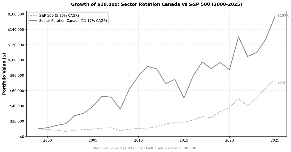
We tested sector mean reversion on TSX large caps from 2000 to 2025: at the start of each quarter, find the two worst-performing sectors by 12-month return and buy every qualifying stock in them. Quarterly rebalance, equal weight, 104 periods. The result was 11.17% annualized in CAD vs 5.26% for the TSX Composite, a +5.91% annual edge over 26 years. The strategy was fully invested in 101 of 104 quarters. The excess is real and meaningful. In practice, the ride is volatile enough that most investors wouldn't hold it.
Contents
- Method
- What is Sector Mean Reversion?
- The Screen
- What We Found
- 26 years. +5.91% annual edge vs TSX Composite.
- Year-by-year returns
- 2001-2003: Tech crash, Canadian commodities rise
- 2005-2006: The commodity supercycle
- 2009: The biggest year
- 2013: The single worst excess year
- 2015: Oil collapses
- 2016: The payoff
- 2019: Missing the growth rally
- Backtest Methodology
- Limitations
- Takeaway
- Part of a Series
- References
- Run This Screen Yourself
Data: FMP financial data warehouse, 2000–2025. Updated March 2026.
Method
Data source: Ceta Research (FMP financial data warehouse) Universe: TSX (Toronto Stock Exchange), market cap > CAD $500M Period: 2000-2025 (26 years, 104 quarterly periods) Rebalancing: Quarterly (January, April, July, October), equal weight all qualifying stocks in selected sectors Benchmark: TSX Composite (^GSPTSE), returns in CAD Cash rule: Hold cash if fewer than 5 stocks qualify across the bottom 2 sectors
What is Sector Mean Reversion?
At each quarterly rebalance, we rank all sectors by their equal-weighted 12-month trailing return. We buy every stock in the bottom 2 sectors. Next quarter, we re-rank and rotate.
The academic basis is Moskowitz and Grinblatt (1999), who showed that much of the momentum anomaly is explained at the industry level. The corollary: when industry-level momentum turns sufficiently negative, mean reversion tends to follow. Sectors that underperform for a full year carry suppressed valuations and depressed sentiment. Both tend to normalize.
On Canadian markets, the dynamic has a structural wrinkle. Canada's TSX is heavily weighted toward Energy, Basic Materials, and Financials. This isn't a diversified multi-sector index the way the US market is. When commodity cycles turn, they dominate sector rankings for years at a time. That changes the character of the strategy compared to markets with broader sector representation.
The most-selected sectors across 101 invested quarters:
| Sector | Quarters Selected (of 101) |
|---|---|
| Energy | 31 (31%) |
| Communication Services | 30 (30%) |
| Basic Materials | 28 (28%) |
Energy leads at 31% of all quarters. Communication Services and Basic Materials follow closely. These three sectors alone account for roughly half of all invested quarters. The TSX's commodity concentration doesn't just color the strategy — it defines it.
The Screen
The screen below runs live. It ranks TSX sectors by their current 12-month equal-weighted return across TSX large caps. The bottom rows are what the backtest would buy today.
WITH prices AS (
    SELECT e.symbol, e.adjClose, CAST(e.date AS DATE) AS trade_date
    FROM stock_eod e
    JOIN profile p ON e.symbol = p.symbol
    WHERE p.sector IS NOT NULL AND p.sector != ''
      AND p.marketCap > 500000000
      AND p.exchange IN ('TSX')
      AND CAST(e.date AS DATE) >= CURRENT_DATE - INTERVAL '400' DAY
      AND e.adjClose IS NOT NULL AND e.adjClose > 0
),
recent AS (
    SELECT symbol, adjClose AS recent_price
    FROM prices
    QUALIFY ROW_NUMBER() OVER (PARTITION BY symbol ORDER BY trade_date DESC) = 1
),
year_ago AS (
    SELECT symbol, adjClose AS old_price
    FROM prices
    WHERE trade_date <= CURRENT_DATE - INTERVAL '252' DAY
    QUALIFY ROW_NUMBER() OVER (PARTITION BY symbol ORDER BY trade_date DESC) = 1
),
stock_returns AS (
    SELECT r.symbol, pr.sector, (r.recent_price / ya.old_price - 1) * 100 AS return_12m
    FROM recent r
    JOIN year_ago ya ON r.symbol = ya.symbol
    JOIN profile pr ON r.symbol = pr.symbol
    WHERE ya.old_price > 0 AND r.recent_price > 0
      AND (r.recent_price / ya.old_price - 1) BETWEEN -0.99 AND 5.0
)
SELECT pr.sector,
    ROUND(AVG(sr.return_12m), 2) AS avg_return_12m_pct,
    COUNT(DISTINCT sr.symbol) AS n_stocks,
    ROW_NUMBER() OVER (ORDER BY AVG(sr.return_12m) ASC) AS rank_worst
FROM stock_returns sr
JOIN profile pr ON sr.symbol = pr.symbol
GROUP BY pr.sector
HAVING COUNT(DISTINCT sr.symbol) >= 5
ORDER BY avg_return_12m_pct ASC
What We Found
The strategy produced a clear edge over 26 years against the local benchmark, driven by big swings in both directions. The annual picture shows why most investors wouldn't hold it.
26 years. +5.91% annual edge vs TSX Composite.
| Metric | Strategy | TSX Composite |
|---|---|---|
| CAGR | 11.17% | 5.26% |
| Total Return | 1,467.74% | — |
| Max Drawdown | -46.75% | — |
| Sharpe Ratio | 0.346 | — |
| Avg Stocks per Period | 73.5 | — |
| Cash Periods | 3 of 104 | — |
The +5.91% annual excess against the TSX Composite is real and meaningful over the full period. The strategy captures more of the market's upside in commodity recovery years while the TSX Composite is weighed down by its own Energy and Materials exposure in drawdowns. With 73.5 stocks per quarter on average, this is a sector tilt across a relatively small universe, not a diversified factor portfolio.
Year-by-year returns
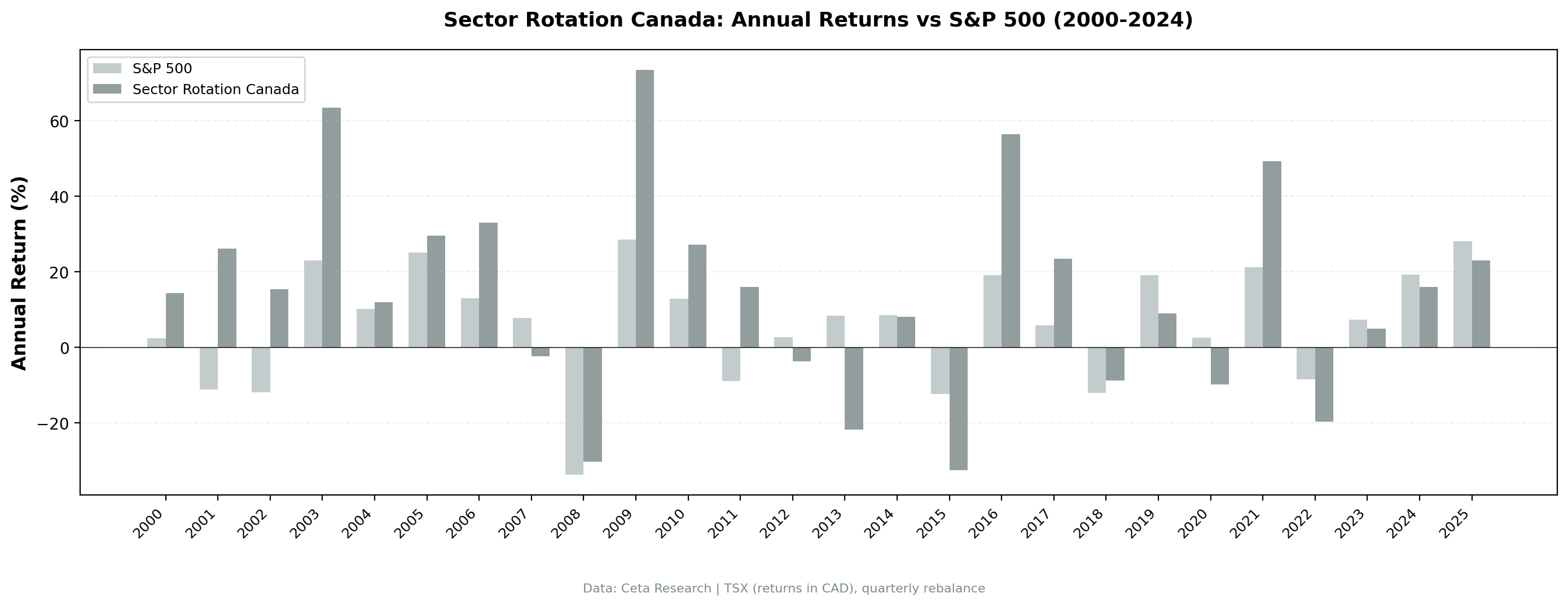
| Year | Strategy | TSX Composite | Excess |
|---|---|---|---|
| 2000 | +14.29% | +2.35% | +11.94% |
| 2001 | +26.14% | -11.20% | +37.35% |
| 2002 | +15.42% | -11.86% | +27.28% |
| 2003 | +63.51% | +23.05% | +40.46% |
| 2004 | +12.05% | +10.24% | +1.81% |
| 2005 | +29.64% | +25.14% | +4.50% |
| 2006 | +32.99% | +12.95% | +20.03% |
| 2007 | -2.32% | +7.76% | -10.08% |
| 2008 | -30.28% | -33.70% | +3.41% |
| 2009 | +73.46% | +28.51% | +44.95% |
| 2010 | +27.22% | +12.94% | +14.28% |
| 2011 | +16.07% | -8.91% | +24.98% |
| 2012 | -3.73% | +2.72% | -6.46% |
| 2013 | -21.76% | +8.40% | -30.16% |
| 2014 | +8.10% | +8.53% | -0.43% |
| 2015 | -32.45% | -12.38% | -20.07% |
| 2016 | +56.39% | +19.15% | +37.24% |
| 2017 | +23.40% | +5.89% | +17.52% |
| 2018 | -8.80% | -12.03% | +3.23% |
| 2019 | +8.93% | +19.19% | -10.26% |
| 2020 | -9.77% | +2.50% | -12.27% |
| 2021 | +49.29% | +21.16% | +28.13% |
| 2022 | -19.68% | -8.44% | -11.23% |
| 2023 | +4.91% | +7.35% | -2.43% |
| 2024 | +16.06% | +19.29% | -3.23% |
| 2025 | +23.07% | +28.06% | -4.98% |
2001-2003: Tech crash, Canadian commodities rise
The dot-com collapse hit Canada differently than the US. Canadian tech exposure was smaller, and the commodities that had been depressed through the late 1990s began to recover. The strategy loaded up on Energy and Basic Materials at a time when those sectors were genuinely cheap.
2001: +26.14% vs TSX -11.20%. The market was selling growth. The strategy was holding resource stocks. 2002: +15.42% vs TSX -11.86%. The portfolio outperformed through the decline. 2003: +63.51% vs TSX +23.05%. The commodity recovery accelerated hard. Beaten-down resource stocks surged as global demand picked back up. A 40-point excess return in a single year.
This is the strategy at its best: catching a sector rotation that the backward-looking momentum signal was correctly positioned for.
2005-2006: The commodity supercycle
By 2005-2006, the commodity supercycle was in full swing. China's infrastructure buildout was driving demand for everything Canada produces: oil, gas, copper, potash. The strategy's persistent tilt toward Energy and Basic Materials caught two consecutive years of strong outperformance.
2005: +29.64% vs TSX +25.14%, a 4.5-point gap. 2006: +32.99% vs TSX +12.95%, a 20-point gap.
Neither of these was a mean-reversion story in the traditional sense. The sectors the strategy was buying in 2004 had already started moving. The strategy rode the commodity boom as a structural feature of Canada's market, not just a sentiment normalization.
2009: The biggest year
2009 was +73.46% vs TSX's +28.51%, a 45-point gap. After the financial crisis, the strategy had loaded up on commodity and resource sectors that were destroyed in the crash. When commodity prices recovered alongside global growth expectations in 2009, the bounce was violent.
This is the same playbook as 2003: buy what was obliterated, wait for the recovery. On a resource-heavy exchange, the strategy's best years are almost always commodity recoveries.
2013: The single worst excess year
2013 was -30.16% excess vs TSX. The strategy returned -21.76% while the TSX delivered +8.40%.
The reason: the strategy was positioned in beaten-down commodity sectors during a year when markets were rewarding growth and momentum. Canadian resource stocks — already underperforming through 2012 — kept falling. The backward-looking signal kept buying them. The gap between what the strategy held and what the market rewarded was wide.
This single year erases multiple years of prior alpha accumulation.
2015: Oil collapses
By early 2015, Energy had been the worst or near-worst performing sector for 12 months. The signal bought it. Oil kept falling. WTI went from roughly $55 at the start of 2015 toward $35 by year-end.
2015: -32.45% vs TSX -12.38%. The strategy fell 20 points worse than the TSX, which itself was down 12%.
The commodity cycle created a structural trap. On the TSX, Energy underperforming for 12 months doesn't necessarily mean it's about to revert. It sometimes means the cycle is turning, and there's more downside ahead. The US strategy had the same 2015 problem, but Canada felt it harder because Energy is a bigger share of the investable universe.
2016: The payoff
2016 delivered +56.39% vs TSX +19.15%, a 37-point excess. Oil stabilized and recovered. Energy stocks — which the strategy had held through the pain of 2015 — surged. This is the mean reversion payoff that the strategy is built around.
But note the sequence: you had to absorb -20.07% excess in 2015 to earn +37.24% in 2016. Over the two years combined, the excess was roughly +17%. Depending on when you entered or exited, you may have caught the loss without the recovery.
2019: Missing the growth rally
2019 was +8.93% vs TSX +19.19%, a -10.26% excess. The TSX had a strong year while the strategy's Energy and Communication Services positions lagged. Energy drifted. Telecom underperformed.
2020 continued the weakness: -9.77% vs TSX +2.50%. Two consecutive years of underperformance followed the 2016-2017 highs.
Backtest Methodology
| Parameter | Choice |
|---|---|
| Universe | TSX, Market Cap > CAD $500M |
| Signal | Bottom 2 sectors by equal-weighted 12-month trailing return |
| Portfolio | All qualifying stocks in selected sectors, equal weight |
| Rebalancing | Quarterly (January, April, July, October) |
| Cash rule | Hold cash if < 5 stocks qualify |
| Benchmark | TSX Composite (^GSPTSE) |
| Period | 2000-2025 (26 years, 104 quarters) |
| Data | Ceta Research (FMP financial data warehouse) |
Limitations
Energy concentration. Energy showing up in 31% of quarters isn't mean reversion at work — it's commodity cycle exposure. The TSX's structural weighting toward resource sectors means the strategy often functions as a commodity cyclical tilt rather than a diversified sector rotation play. In markets where commodity cycles are multi-year, the "reversion" signal can stay wrong for extended periods.
Currency. Returns are in CAD. The strategy's comparison to the TSX Composite is clean on a local basis. For a non-Canadian investor, CAD/USD movements add another layer of variance.
Extreme single-year risk. The -30.16% excess in 2013 and -20.07% in 2015 are examples of extended drawdown periods. The overall positive excess is real but concentrated in commodity recovery cycles.
Small universe. With 73.5 stocks on average, the TSX portfolio is much smaller than US equivalents. That means individual sector performance has more impact on results. A single commodity price collapse (2015) can dominate an entire year's returns.
No transaction costs. The backtest doesn't include trading costs. Quarterly rebalancing across 71 stocks in a market with wider spreads than NYSE would meaningfully reduce net returns.
Survivorship bias. Exchange membership uses current profiles, not historical. Delisted companies aren't tracked over time.
Takeaway
Sector mean reversion on the TSX produced 11.17% CAGR in CAD over 26 years, +5.91% annually above the TSX Composite. The 1,467.74% total return over 26 years is a strong result. The ride to get there is not.
The max drawdown is -46.75%. In 2013, the strategy trailed the TSX by 30 points. In 2015, it underperformed by 20 points. The positive alpha is concentrated heavily in commodity recovery years: 2001-2003, 2009, 2016, 2021. Outside those periods, the strategy often trails badly.
The core issue is structural. Canada's economy is resource-heavy, and resource sectors don't follow the same mean-reversion dynamics as diversified markets. Energy underperforming for 12 months on the TSX might be the first year of a 3-year commodity downturn. Buying beaten-down oil and gas stocks when the oil cycle hasn't bottomed is a different bet than buying beaten-down utilities after a rate scare.
For investors who can size positions appropriately and stomach multi-year stretches of underperformance, the case is stronger here than the old SPY comparison suggested. The edge vs the local benchmark is real. Whether it survives realistic transaction costs and timing demands is the practical question.
Part of a Series
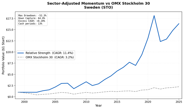
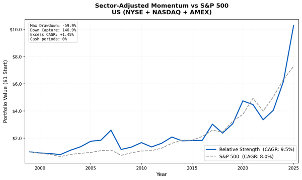
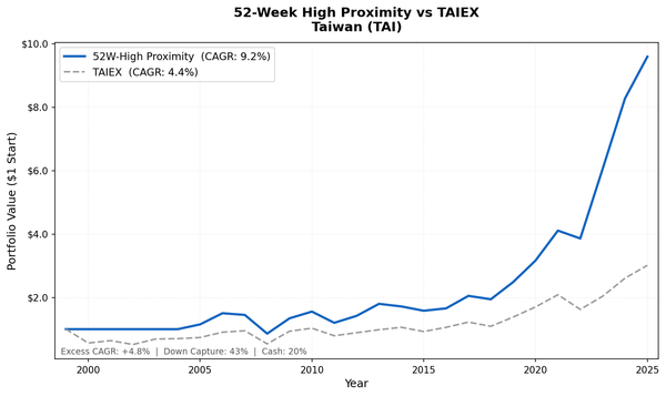
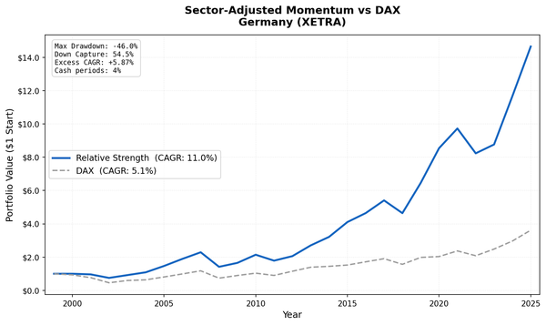
This analysis is part of our Sector Mean Reversion global exchange comparison. We tested the same strategy across multiple exchanges: - Sector Mean Reversion on US Stocks (NYSE + NASDAQ + AMEX) - Sector Mean Reversion on Indian Stocks (BSE + NSE) - Sector Mean Reversion on Korean Stocks (KSC) - Sector Mean Reversion on Taiwanese Stocks (TAI + TWO) - Sector Mean Reversion on Swedish Stocks (STO) - Sector Mean Reversion: Global Exchange Comparison
References
- Moskowitz, T. & Grinblatt, M. (1999). "Do Industries Explain Momentum?" Journal of Finance, 54(4), 1249-1290.
Run This Screen Yourself
Via web UI: Run the sector screen on Ceta Research. Paste the SQL above, set your exchange filter to TSX, and hit "Run" to see current sector rankings.
Via Python:
import requests, time

API_KEY = "your_api_key"  # get one at cetaresearch.com
BASE = "https://tradingstudio.finance/api/v1"

query = """
WITH prices AS (
    SELECT e.symbol, e.adjClose, CAST(e.date AS DATE) AS trade_date
    FROM stock_eod e
    JOIN profile p ON e.symbol = p.symbol
    WHERE p.sector IS NOT NULL AND p.sector != ''
      AND p.marketCap > 500000000
      AND p.exchange IN ('TSX')
      AND CAST(e.date AS DATE) >= CURRENT_DATE - INTERVAL '400' DAY
      AND e.adjClose IS NOT NULL AND e.adjClose > 0
),
recent AS (
    SELECT symbol, adjClose AS recent_price
    FROM prices
    QUALIFY ROW_NUMBER() OVER (PARTITION BY symbol ORDER BY trade_date DESC) = 1
),
year_ago AS (
    SELECT symbol, adjClose AS old_price
    FROM prices
    WHERE trade_date <= CURRENT_DATE - INTERVAL '252' DAY
    QUALIFY ROW_NUMBER() OVER (PARTITION BY symbol ORDER BY trade_date DESC) = 1
),
stock_returns AS (
    SELECT r.symbol, pr.sector,
        (r.recent_price / ya.old_price - 1) * 100 AS return_12m
    FROM recent r
    JOIN year_ago ya ON r.symbol = ya.symbol
    JOIN profile pr ON r.symbol = pr.symbol
    WHERE ya.old_price > 0 AND r.recent_price > 0
      AND (r.recent_price / ya.old_price - 1) BETWEEN -0.99 AND 5.0
)
SELECT pr.sector,
    ROUND(AVG(sr.return_12m), 2) AS avg_return_12m_pct,
    COUNT(DISTINCT sr.symbol) AS n_stocks,
    ROW_NUMBER() OVER (ORDER BY AVG(sr.return_12m) ASC) AS rank_worst
FROM stock_returns sr
JOIN profile pr ON sr.symbol = pr.symbol
GROUP BY pr.sector
HAVING COUNT(DISTINCT sr.symbol) >= 5
ORDER BY avg_return_12m_pct ASC
"""

resp = requests.post(f"{BASE}/data-explorer/execute", headers={
    "X-API-Key": API_KEY, "Content-Type": "application/json"
}, json={
    "query": query,
    "options": {"format": "json", "limit": 100},
    "resources": {"memoryMb": 16384, "threads": 6}
})
task_id = resp.json()["taskId"]

while True:
    result = requests.get(f"{BASE}/tasks/data-query/{task_id}",
                          headers={"X-API-Key": API_KEY}).json()
    if result["status"] in ("completed", "failed"):
        break
    time.sleep(2)

print("TSX sector rankings (worst to best, 12-month return):")
for r in result["result"]["rows"]:
    flag = " <-- BUY" if r["rank_worst"] <= 2 else ""
    print(f"#{r['rank_worst']} {r['sector']:30s} {r['avg_return_12m_pct']:+.1f}%  ({r['n_stocks']} stocks){flag}")
Get your API key at cetaresearch.com. The full backtest code (Python + DuckDB) is on GitHub.
Data: Ceta Research, FMP financial data warehouse. Universe: TSX, market cap > CAD $500M. Quarterly rebalance, equal weight, 2000-2025. Benchmark: TSX Composite (^GSPTSE).
Past performance does not guarantee future results. This is educational content, not investment advice.