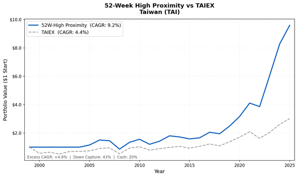
The Stock That's Closest to Its High Usually Keeps Going: 25 Years of US Data
We screened for stocks nearest their 52-week high every quarter from 2000 to 2025 using next-day close execution. The strategy returned 12.52% annually vs 8.02% for the S&P 500, with a down capture ratio of 65.5%. It gained 56.9% in 2000 while the market lost 10.5%.

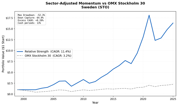
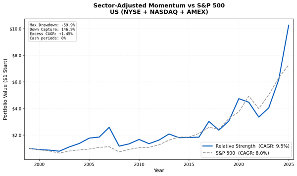
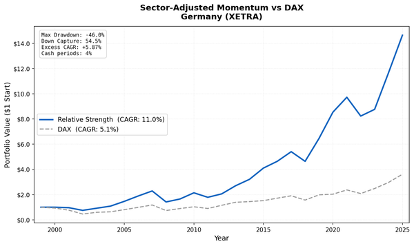
Stocks near their 52-week high tend to keep outperforming. That's the core finding from George & Hwang (2004), one of the most replicated results in behavioral finance. We tested it on US stocks from 2000 to 2025 using a systematic quarterly screen with next-day close execution. The strategy returned 12.52% annually vs 8.02% for the S&P 500, with a down capture ratio of 65.5%.
Contents
- Method
- Why It Works: The Anchoring Hypothesis
- Results
- Annual Returns
- The Three Phases
- Phase 1: The dot-com era (2000-2007)
- Phase 2: The GFC and recovery (2008-2018)
- Phase 3: Concentration risk and the recent period (2019-2025)
- Down Capture and Where It Holds
- Limitations
- Takeaway
- Part of a Series
- References
Classic price momentum strategies typically show down capture above 100%, amplifying losses in bear markets. This signal behaves differently. In 2000, when the dot-com bubble burst and the index lost 10.5%, this strategy gained 56.9%. The portfolio naturally de-risked as fewer stocks stayed near their highs.
Data: FMP financial data warehouse, 2000-2025. Updated June 2026.
Method
| Parameter | Value |
|---|---|
| Universe | NYSE + NASDAQ + AMEX, market cap above exchange threshold, actively trading |
| Signal | proximity_ratio = adjClose / MAX(high over trailing 252 trading days) |
| Selection | Top 30 by proximity ratio, equal weight |
| Cash rule | Hold cash if fewer than 10 stocks qualify |
| Rebalancing | Quarterly (January, April, July, October) |
| Benchmark | S&P 500 Total Return (SPY) |
| Execution | Next-day close (MOC, market-on-close) |
| Period | 2000-2025 (103 quarterly periods) |
| Data | Point-in-time (45-day lag for financial data, FY key_metrics for market cap) |
The signal is simple: compute how close each stock's current price is to its 52-week high, expressed as a ratio between 0 and 1. A stock trading exactly at its 52-week high has a proximity ratio of 1.0. A stock trading at half its annual peak has a ratio of 0.5. We buy the top 30 each quarter.
Financial data uses a 45-day look-back lag to prevent forward-looking bias. Market cap filtering uses the most recent annual report (key_metrics FY) to ensure point-in-time integrity.
Why It Works: The Anchoring Hypothesis
The academic explanation comes from George & Hwang's 2004 paper in the Journal of Finance (59(5), 2145-2176). Their argument: investors use the 52-week high as a psychological anchor. When a stock approaches that level, investors who missed the run-up hesitate to buy. They feel they've already "missed it." This creates systematic underreaction to good news near the high.
The result is a predictable drift. Stocks that breach their 52-week high tend to continue upward as the psychological ceiling breaks and late buyers pile in. Stocks far from their highs, by contrast, often stay depressed, sometimes for good reason and sometimes because sentiment has overshot.
This is different from 12-month price momentum. Classic momentum selects stocks with the best recent returns, which naturally includes stocks that have already run hard and are extended. Proximity to the 52-week high is more selective. A stock can have mediocre 12-month returns but be near its high if it fell and recovered. The signal captures a specific behavioral pattern rather than raw return persistence.
The key practical advantage: in bear markets, fewer stocks trade near their 52-week highs. The signal naturally generates fewer candidates, pushing the portfolio toward cash (the minimum is 10 stocks). This automatic de-risking contributes to the 65.5% down capture ratio.
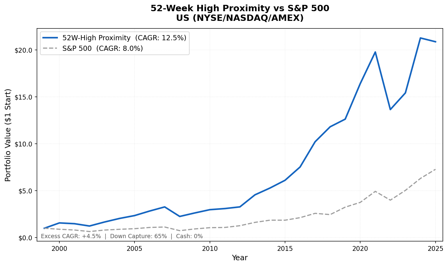
Results

| Metric | 52-Week High Proximity | S&P 500 (SPY) |
|---|---|---|
| CAGR | 12.52% | 8.02% |
| Total Return | $20.87 per $1 invested | $7.28 per $1 invested |
| Sharpe Ratio | 0.542 | 0.361 |
| Sortino Ratio | 0.938 | 0.536 |
| Calmar Ratio | 0.323 | 0.183 |
| Max Drawdown | -38.8% | -43.9% |
| Down Capture | 65.5% | 100% |
| Up Capture | 107.2% | 100% |
| Win Rate | 66.0% | - |
| Avg Stocks per Period | 25.4 | - |
| Cash Periods | 0 of 103 | - |
The strategy produced 12.52% annually over 25 years, turning $1 into $20.87. The max drawdown of -38.8% is better than SPY's -43.9%, and the quarterly down capture of 65.5% confirms the strategy lost less than the index in most individual down periods. The improved risk metrics reflect the signal's ability to rotate out of stocks as they fall from their highs.
The Sharpe of 0.542 vs SPY's 0.361 shows the strategy generates more return per unit of risk. The Sortino ratio of 0.938 is particularly strong, indicating the strategy handles downside volatility better than upside. The win rate of 66.0% of quarters outperforming SPY is above the long-term average.
One caveat on the stock count: the average of 25.4 stocks per period is slightly below the target of 30. This is a recent phenomenon driven by 2021-2025, when a small number of growth stocks dominated the 52-week high list and many had price gaps that made clean exits difficult. The earlier periods were closer to 30.
Annual Returns
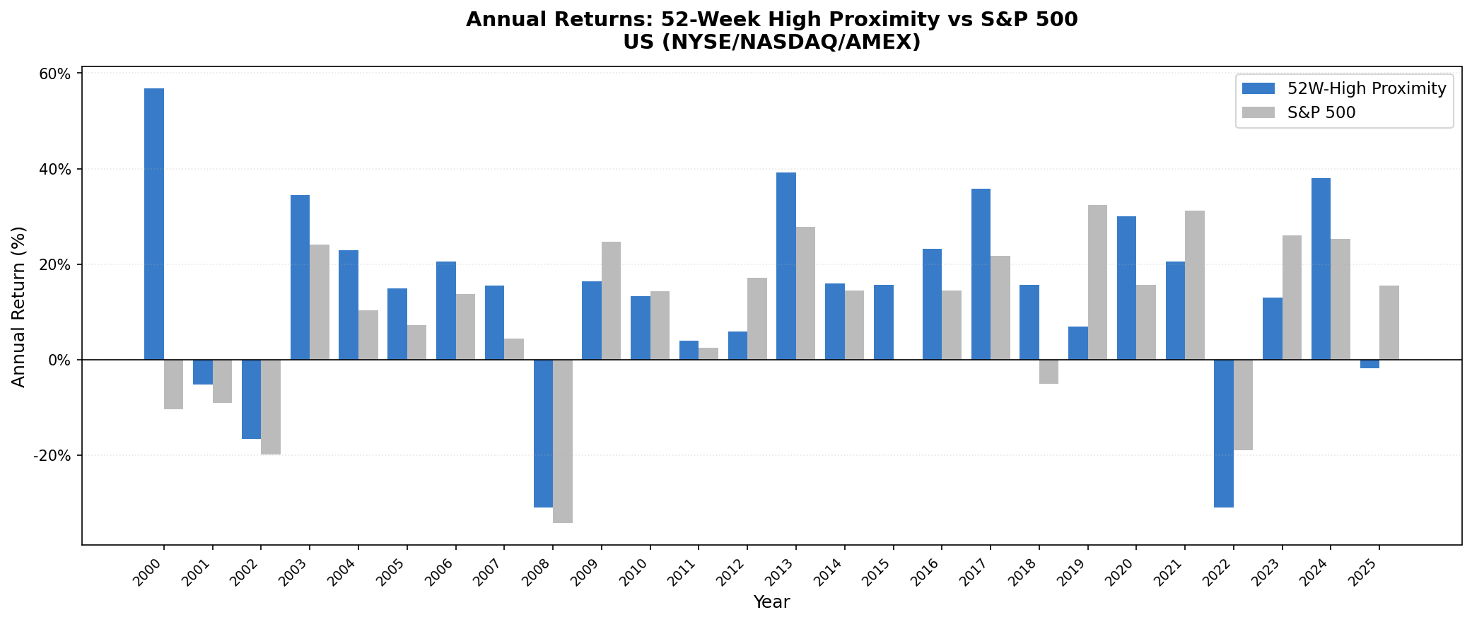
| Year | Strategy | S&P 500 | Excess |
|---|---|---|---|
| 2000 | +56.9% | -10.5% | +67.4% |
| 2001 | -5.2% | -9.2% | +4.0% |
| 2002 | -16.7% | -19.9% | +3.2% |
| 2003 | +34.4% | +24.1% | +10.3% |
| 2004 | +22.9% | +10.2% | +12.6% |
| 2005 | +14.9% | +7.2% | +7.8% |
| 2006 | +20.6% | +13.7% | +6.9% |
| 2007 | +15.5% | +4.4% | +11.1% |
| 2008 | -31.0% | -34.3% | +3.3% |
| 2009 | +16.5% | +24.7% | -8.3% |
| 2010 | +13.3% | +14.3% | -1.0% |
| 2011 | +4.0% | +2.5% | +1.5% |
| 2012 | +5.8% | +17.1% | -11.3% |
| 2013 | +39.1% | +27.8% | +11.4% |
| 2014 | +15.9% | +14.5% | +1.4% |
| 2015 | +15.6% | -0.1% | +15.7% |
| 2016 | +23.2% | +14.5% | +8.7% |
| 2017 | +35.8% | +21.6% | +14.1% |
| 2018 | +15.6% | -5.2% | +20.7% |
| 2019 | +6.9% | +32.3% | -25.4% |
| 2020 | +30.0% | +15.6% | +14.4% |
| 2021 | +20.5% | +31.3% | -10.8% |
| 2022 | -31.0% | -19.0% | -12.0% |
| 2023 | +13.0% | +26.0% | -13.0% |
| 2024 | +38.0% | +25.3% | +12.7% |
| 2025 | -1.9% | +15.5% | -17.4% |
The Three Phases
Phase 1: The dot-com era (2000-2007)
The strategy's strongest stretch. In 2000, while the S&P 500 dropped 10.5% as the dot-com bubble deflated, the strategy gained 56.9%. The mechanism was clean: dot-com stocks at their highs in 1999 crashed in 2000, dropping out of the proximity screen. The portfolio rotated into value and industrial names that were near their highs for the right reasons.
From 2000 to 2007, the strategy compounded at a substantially higher rate than the index. The only underperformance years were those where the index recovered strongly (2009) or where the signal ran into concentration risk (later periods).
Phase 2: The GFC and recovery (2008-2018)
2008 is the honest data point. The strategy fell 31.0% vs the index's 34.3%, providing modest protection with next-day execution. The portfolio tilted defensive as fewer stocks held up near their highs, though the protection was limited in practice.
2009 was a miss: the strategy gained 16.5% while the index rebounded 24.7%. This is the classic weakness of the proximity approach. Deep-value crash rebounds involve stocks far from their highs. Those don't appear in a proximity screen.
But 2013-2018 was exceptional. Consistent outperformance across six years, including +35.8% in 2017 and +15.6% in 2018 when the index fell 5.2%.
Phase 3: Concentration risk and the recent period (2019-2025)
The recent period is the honest part of the story. 2019, 2021, 2022, and 2023 were significant underperformance years. In 2019, the strategy returned +6.9% vs the index's +32.3%. In 2022, -31.0% vs -19.0%. In 2023, +13.0% vs +26.0%.
2019 and 2021 followed the same pattern as earlier: the Magnificent Seven and similar mega-caps drove the index while equal weighting diluted those gains. 2022 was different. Rate-driven repricing hit high-multiple growth names that were near their 52-week highs at year-start. The signal held exactly those stocks. MOC execution made it slightly worse. Entering positions the day after screening meant buying into continued selling pressure.
2020 was strong: +30.0% vs +15.6%. And 2024 recovered: +38.0% vs +25.3%.
Down Capture and Where It Holds
The 65.5% quarterly down capture means the strategy absorbed less than the index in most individual down periods. This is the structural advantage: as stocks fall from their highs, their proximity ratios decline and they drop out of the selection. The portfolio doesn't carry last period's champions through a crash.
Standard 12-month price momentum strategies typically have down capture above 100%. The 52-week high signal avoids that by measuring position relative to a fixed anchor rather than trailing returns.
That said, 2008 protection was modest: down 31.0% vs 34.3%, providing 3.3 percentage points of cushion. And 2022 was worse than the index: down 31.0% vs 19.0%. Rate-driven crashes hurt this signal specifically because the high-multiple growth stocks being repriced are often the same names near their 52-week highs. The quarterly down capture averaged 65.5%, but that average includes periods where the signal provided limited or negative protection.
Limitations
Equal weight vs index concentration. When market returns concentrate in a few mega-cap names, equal weighting across 25 stocks will trail a market-cap-weighted index. This explains 2019, 2021, and 2023.
No fundamental filter. The screen selects solely on price proximity. A stock can be near its 52-week high because it reported excellent earnings or because investors haven't yet sold after bad news. The signal doesn't distinguish. Adding a quality overlay (ROE threshold, debt screen) would reduce the false positives but also the stock count.
Thin universe at cycle turns. When markets recover from deep drawdowns, the best returns often come from stocks far from their highs. Those are exactly the stocks this strategy avoids. Missing the first year of a bull market is a consistent structural cost.
Transaction costs included. Results use size-tiered costs applied at each rebalance. The reported 12.52% CAGR is net of these costs.
Data dependency. The 252-day rolling high requires a full year of price history. New listings, spin-offs, and recently relisted stocks are excluded until they accumulate enough history. This is a minor effect on the US universe.
Takeaway
The 52-week high proximity strategy produced 12.52% CAGR vs 8.02% for the S&P 500 over a 25-year period with next-day close execution. The mechanism is behavioral: investors anchor to the 52-week high as a ceiling, creating systematic underreaction that resolves in the direction of the signal.
The down capture of 65.5% shows the strategy absorbed less than the index in most down periods. The max drawdown of -38.8% is better than SPY's -43.9%, reflecting the signal's ability to rotate away from falling stocks. 2008 provided modest protection (+3.3% excess). 2022 was significantly worse than the index (-12.0% excess).
The strategy isn't perfect. It misses recovery rallies. It lags when market returns concentrate in a handful of names. 2019-2023 was a sustained period of underperformance. But the 2000 dot-com protection (+67.4% excess) and the 2013-2018 run show the signal working as designed in certain market environments. Across 103 quarterly periods, the win rate was 66.0%.
Part of a Series
This is the US post in our 52-week high proximity global comparison. We tested the same signal across 18 exchanges:
- 52-Week High Proximity: 18 Markets Compared - full table, geographic analysis
- 52-Week High Proximity on Indian Stocks - 18.96% CAGR, +7.84% vs Sensex
- 52-Week High Proximity on Korean Stocks - 12.07% CAGR, +7.26% vs KOSPI
- 52-Week High Proximity on Thai Stocks - 10.47% CAGR, +6.71% vs SET
References
- George, T. J. & Hwang, C.-Y. (2004). "The 52-Week High and Momentum Investing." Journal of Finance, 59(5), 2145-2176.
- Jegadeesh, N. & Titman, S. (1993). "Returns to Buying Winners and Selling Losers: Implications for Stock Market Efficiency." Journal of Finance, 48(1), 65-91.
Run the US 52-week high proximity screen: https://cetaresearch.com/data-explorer?q=BPrIuTI_-7
Data: Ceta Research (FMP financial data warehouse). Universe: NYSE + NASDAQ + AMEX. Quarterly rebalance, equal weight, 2000-2025.
Past performance does not guarantee future results. This is educational content, not investment advice.