The Asset Growth Anomaly: Why Disciplined Companies Beat Aggressive Growers

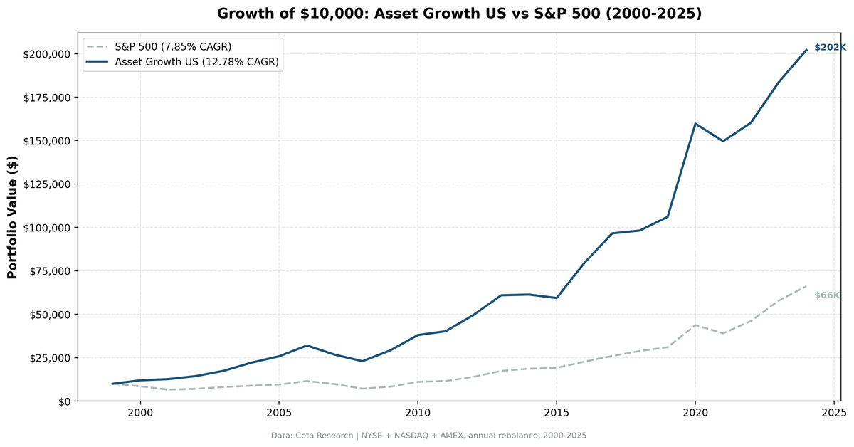
We backtested the asset growth anomaly with quality filters across all US exchanges (NYSE, NASDAQ, AMEX) from 2000 to 2025. The portfolio returned 12.78% annually vs 7.85% for the S&P 500. That +4.93% annual excess held up across multiple market cycles, with the strongest outperformance during corrections and the weakest during speculative rallies. Companies that grow their balance sheets slowly, while staying profitable, compound better than aggressive growers.
Contents
- Method
- What Research Shows
- The Screen
- Filters
- Simple Screen (SQL)
- Advanced Screen (SQL)
- Results
- When It Works
- When It Fails
- The Pattern: Defensive Alpha
- Full Annual Returns
- Limitations
- Global Results
- Run It Yourself
- Current Screen
- Backtest
- Takeaway
- References
Method
Data source: Ceta Research (FMP financial data warehouse) Universe: All US exchanges (NYSE, NASDAQ, AMEX), market cap > $500M Period: 2000-2025 (25 annual rebalance periods) Rebalancing: Annual (July), equal weight top 30 by lowest asset growth Benchmark: S&P 500 Total Return (SPY) Cash rule: Hold cash if fewer than 10 stocks qualify Transaction costs: Size-tiered model (0.1% mega-cap, 0.3% large-cap, 0.5% mid-cap) Data quality guards: Entry price > $1, single-period return capped at 200%
Historical financial data with 45-day lag to prevent look-ahead bias. Full methodology: backtests/METHODOLOGY.md
What Research Shows
Cooper, Gulen and Schill published the foundational study in the Journal of Finance in 2008. Using US stocks from 1968 to 2003, they sorted companies by year-over-year total asset growth and tracked subsequent returns. The spread between the lowest and highest deciles was roughly 20% per year.
This wasn't driven by a handful of years. The effect was persistent across sub-periods, survived controls for size, value, and momentum, and held up in international markets. Watanabe, Xu, Yao and Yu (2013) tested the signal across 43 countries. The international spread was smaller (6-8% per year) but statistically significant in both developed and emerging markets.
Why does it work? Two explanations compete. The behavioral view says companies that grow assets aggressively overinvest. Management teams pursue acquisitions for growth's sake, build excess capacity during booms, and expand into unprofitable markets. Investors initially reward the growth, then stocks underperform as reality catches up. The rational view (Hou, Xue and Zhang, 2015) says firms invest more when their cost of capital is low, so high asset growth mechanically predicts lower future returns.
Both have empirical support. The behavioral story explains why acquisition-driven growth produces the strongest effect. The rational story explains why the anomaly persists.
The Screen
Filters
| Criterion | Metric | Threshold | Why |
|---|---|---|---|
| Capital discipline | Asset Growth (YoY) | -20% to +10% | Low growth, not distressed |
| Profitability | Return on Equity | > 8% | Business generates real returns |
| Asset efficiency | Return on Assets | > 5% | Assets are productive |
| Pricing power | Operating Margin | > 10% | Operational efficiency |
| Size | Market Cap | > $500M | Reliable data, investable |
Simple Screen (SQL)
WITH bs_current AS (
    SELECT symbol, totalAssets,
        ROW_NUMBER() OVER (PARTITION BY symbol ORDER BY dateEpoch DESC) AS rn
    FROM balance_sheet
    WHERE period = 'FY' AND totalAssets > 0
),
bs_prior AS (
    SELECT symbol, totalAssets AS prior_assets,
        ROW_NUMBER() OVER (PARTITION BY symbol ORDER BY dateEpoch DESC) AS rn
    FROM balance_sheet
    WHERE period = 'FY' AND totalAssets > 0
)
SELECT bc.symbol,
    ROUND((bc.totalAssets - bp.prior_assets) / bp.prior_assets * 100, 1) AS asset_growth_pct,
    ROUND(k.marketCap / 1e9, 1) AS mktcap_bn
FROM bs_current bc
JOIN bs_prior bp ON bc.symbol = bp.symbol AND bp.rn = 2
JOIN key_metrics_ttm k ON bc.symbol = k.symbol
WHERE bc.rn = 1 AND bp.prior_assets > 0
  AND k.marketCap > 500000000
ORDER BY asset_growth_pct ASC
LIMIT 50
This returns 50 companies sorted from most negative to least asset growth. The problem: it includes companies shrinking because they're in distress, not because they're disciplined.
Advanced Screen (SQL)
WITH bs_current AS (
    SELECT symbol, totalAssets,
        ROW_NUMBER() OVER (PARTITION BY symbol ORDER BY dateEpoch DESC) AS rn
    FROM balance_sheet
    WHERE period = 'FY' AND totalAssets > 0
),
bs_prior AS (
    SELECT symbol, totalAssets AS prior_assets,
        ROW_NUMBER() OVER (PARTITION BY symbol ORDER BY dateEpoch DESC) AS rn
    FROM balance_sheet
    WHERE period = 'FY' AND totalAssets > 0
),
growth AS (
    SELECT bc.symbol,
        (bc.totalAssets - bp.prior_assets) / bp.prior_assets AS asset_growth
    FROM bs_current bc
    JOIN bs_prior bp ON bc.symbol = bp.symbol AND bp.rn = 2
    WHERE bc.rn = 1 AND bp.prior_assets > 0
)
SELECT g.symbol,
    ROUND(g.asset_growth * 100, 1) AS asset_growth_pct,
    ROUND(k.returnOnEquityTTM * 100, 1) AS roe_pct,
    ROUND(k.returnOnAssetsTTM * 100, 1) AS roa_pct,
    ROUND(f.operatingProfitMarginTTM * 100, 1) AS opm_pct,
    ROUND(k.marketCap / 1e9, 1) AS mktcap_bn
FROM growth g
JOIN key_metrics_ttm k ON g.symbol = k.symbol
JOIN financial_ratios_ttm f ON g.symbol = f.symbol
WHERE g.asset_growth < 0.10
  AND g.asset_growth > -0.20
  AND k.returnOnEquityTTM > 0.08
  AND k.returnOnAssetsTTM > 0.05
  AND f.operatingProfitMarginTTM > 0.10
  AND k.marketCap > 500000000
ORDER BY asset_growth_pct ASC
LIMIT 30
The quality filters separate capital discipline from financial distress. ROE and ROA confirm the company generates real returns. Operating margin confirms pricing power. The floor at -20% excludes companies in restructuring or forced shrinkage. The result is a portfolio of profitable, stable businesses that happen to be growing slowly by choice.
Results
| Metric | Portfolio | S&P 500 |
|---|---|---|
| CAGR | 12.78% | 7.85% |
| Total Return | 1,921% | 562% |
| Max Drawdown | -28.25% | -38.01% |
| Volatility | 15.47% | 16.63% |
| Sharpe Ratio | 0.697 | 0.352 |
| Sortino Ratio | 2.038 | 0.628 |
| Win Rate (vs SPY) | 64% | -- |
| Beta | 0.702 | 1.00 |
| Alpha | 6.67% | -- |
| Cash Periods | 0/25 | -- |
| Avg Stocks | 26.2 | -- |
The excess return is real and consistent. 16 out of 25 years beat the benchmark. The portfolio turned $10,000 into $202,100 while the S&P 500 turned it into $66,200.
The risk numbers tell a stronger story than the return numbers. Lower volatility (15.47% vs 16.63%), shallower max drawdown (-28.25% vs -38.01%), and a beta of 0.702. The Sortino ratio is over 3x the benchmark: 2.038 vs 0.628. This portfolio gets more return per unit of downside risk than the S&P 500 by a wide margin.
When It Works
2000-2001 (Dot-Com Bust): The strategy's best stretch. While the market dropped 34% over two years, the portfolio gained 26%.
| Year | Portfolio | S&P 500 | Excess |
|---|---|---|---|
| 2000 | +19.6% | -14.8% | +34.4% |
| 2001 | +5.7% | -22.4% | +28.1% |
Companies that had resisted the urge to chase dot-com expansion held up. Their balance sheets weren't stuffed with overpriced acquisitions or speculative capacity. When the bubble burst, they had nothing to write down.
2008-2009 (Financial Crisis and Recovery): The portfolio limited losses during the crash and participated fully in the recovery.
| Year | Portfolio | S&P 500 | Excess |
|---|---|---|---|
| 2008 | -14.1% | -26.9% | +12.8% |
| 2009 | +26.9% | +16.0% | +10.9% |
A -14.1% drawdown vs -26.9% for the index. Disciplined companies had less to unwind and recovered faster.
2016 and 2020 (Post-Correction Rebounds): +34.1% in 2016 (+15.5% excess) and +50.6% in 2020 (+9.6% excess). After market dislocations, the strategy's quality tilt captures the rebound in stable businesses.
When It Fails
2018 and 2022-2023 (Growth-Led Markets): The strategy underperforms when the market rewards aggressive asset expansion.
| Year | Portfolio | S&P 500 | Excess |
|---|---|---|---|
| 2018 | +1.7% | +11.2% | -9.5% |
| 2022 | +7.1% | +18.1% | -11.0% |
| 2023 | +14.5% | +25.4% | -10.9% |
2022 and 2023 saw concentrated mega-cap leadership. The Magnificent Seven drove most of the index returns. A diversified portfolio of 30 capital-disciplined companies can't compete when seven tech stocks account for a majority of market gains.
2014-2015 (Mid-Cycle Drift): +0.7% and -3.3% vs SPY's +7.2% and +2.7%. In calm, upward-trending markets with no stress to differentiate disciplined from reckless balance sheets, the screen doesn't add much.
The Pattern: Defensive Alpha
The year-by-year returns reveal a clear pattern:
Asset growth outperforms during: - Market corrections and bear markets (2000-2001, 2008) - Post-correction recoveries (2009, 2016, 2020) - Periods when balance sheet discipline matters
Asset growth underperforms during: - Mega-cap growth leadership (2022-2024) - Calm, momentum-driven markets (2014-2015) - Speculative bull markets
The alpha is real (+4.93% annually) and more evenly distributed than many factor strategies. The strategy had positive excess returns in 16 of 25 years. The largest single-year excess was +34.4% (2000), and the largest single-year shortfall was -11.0% (2022). The asymmetry is favorable: the best years more than offset the worst years.
Full Annual Returns
| Year | Portfolio | S&P 500 | Excess |
|---|---|---|---|
| 2000 | +19.6% | -14.8% | +34.4% |
| 2001 | +5.7% | -22.4% | +28.1% |
| 2002 | +13.8% | +6.9% | +6.9% |
| 2003 | +21.2% | +14.9% | +6.3% |
| 2004 | +26.8% | +8.9% | +17.9% |
| 2005 | +16.6% | +8.0% | +8.6% |
| 2006 | +24.0% | +21.0% | +3.0% |
| 2007 | -16.4% | -15.2% | -1.2% |
| 2008 | -14.1% | -26.9% | +12.8% |
| 2009 | +26.9% | +16.0% | +10.9% |
| 2010 | +30.5% | +33.5% | -3.0% |
| 2011 | +5.7% | +4.1% | +1.6% |
| 2012 | +23.2% | +20.7% | +2.5% |
| 2013 | +22.9% | +24.5% | -1.6% |
| 2014 | +0.7% | +7.2% | -6.5% |
| 2015 | -3.3% | +2.7% | -6.0% |
| 2016 | +34.1% | +18.6% | +15.5% |
| 2017 | +21.4% | +14.3% | +7.1% |
| 2018 | +1.7% | +11.2% | -9.5% |
| 2019 | +8.0% | +7.4% | +0.6% |
| 2020 | +50.6% | +41.0% | +9.6% |
| 2021 | -6.3% | -10.7% | +4.4% |
| 2022 | +7.1% | +18.1% | -11.0% |
| 2023 | +14.5% | +25.4% | -10.9% |
| 2024 | +10.1% | +14.4% | -4.3% |
Limitations
Recent underperformance. The last three years (2022-2024) lagged the benchmark by a combined 26 percentage points. This reflects mega-cap tech concentration, not a broken signal. But anyone starting the strategy in 2022 would be underwater on a relative basis.
Annual rebalancing creates lag. With yearly rebalancing in July, the portfolio can't respond to mid-year changes. A company's balance sheet could deteriorate between rebalances. Quarterly rebalancing would add trading costs without clearly improving the signal, since total assets change slowly.
The exceptions. Amazon, Alphabet, and Microsoft all had sustained high asset growth and massively outperformed. The anomaly works on average, but a pure low-asset-growth strategy would have excluded some of the best stocks of the last two decades.
Accounting noise. Goodwill impairments create artificial low asset growth. A company that overpaid for an acquisition might write down goodwill years later, appearing "disciplined" when it's recording a prior mistake.
Equal weighting. The portfolio holds 30 stocks equally weighted. This means a $500M company gets the same weight as a $500B company. Equal weighting tilts toward smaller names, which could create liquidity issues in practice.
Point-in-time limitations. We use a 45-day lag from the rebalance date to ensure financial data was available. Exact filing dates vary, and some filings may not have been publicly available at the assumed lag date.
Global Results
We tested this screen across 16 exchanges worldwide. With local benchmarks, 12 of 16 beat their local market. The UK and US lead on excess return and risk-adjusted metrics:
| Exchange | CAGR | Excess (vs local) | Sharpe | Avg Stocks |
|---|---|---|---|---|
| India (BSE+NSE) | 14.33% | +2.27% vs Sensex | 0.300 | 24.1 |
| US (NYSE+NASDAQ+AMEX) | 12.78% | +4.93% vs SPY | 0.697 | 26.2 |
| UK (LSE) | 10.94% | +9.71% vs FTSE | 0.482 | 19.0 |
| Brazil (SAO) | 10.59% | +1.89% vs Bovespa | 0.005 | 20.8 |
| Canada (TSX) | 7.59% | +3.63% vs TSX | 0.314 | 24.8 |
| Japan (JPX) | 6.99% | +3.68% vs Nikkei | 0.372 | 27.7 |
| Switzerland (SIX) | 6.58% | -1.27% vs SPY | 0.386 | 18.1 |
| Germany (XETRA) | 6.39% | +1.35% vs DAX | 0.269 | 20.6 |
| Sweden (STO) | 6.33% | -1.52% vs SPY | 0.260 | 22.6 |
| Australia (ASX) | 6.18% | +2.28% vs ASX 200 | 0.166 | 19.5 |
| Taiwan (TAI) | 5.62% | +1.53% vs TAIEX | 0.401 | 28.8 |
| Hong Kong (HKSE) | 5.48% | +3.84% vs HSI | 0.126 | 19.6 |
| Korea (KSC) | 5.38% | +0.03% vs KOSPI | 0.174 | 24.1 |
| China (SHZ+SHH) | 4.86% | +2.43% vs SSEC | 0.069 | 20.3 |
| Thailand (SET) | 3.25% | -4.60% vs SPY | 0.048 | 24.1 |
| Saudi Arabia (SAU) | 2.57% | -5.28% vs SPY | -0.058 | 23.6 |
Unlike interest coverage (where emerging markets show the strongest results), the asset growth anomaly works best in mature, liquid markets with strong corporate governance. The UK's 96% win rate and the US's 0.697 Sharpe lead. See the comparison blog for the full cross-exchange analysis.
Run It Yourself
Run this screen live on Ceta Research
Current Screen
WITH bs_current AS (
    SELECT symbol, totalAssets,
        ROW_NUMBER() OVER (PARTITION BY symbol ORDER BY dateEpoch DESC) AS rn
    FROM balance_sheet
    WHERE period = 'FY' AND totalAssets > 0
),
bs_prior AS (
    SELECT symbol, totalAssets AS prior_assets,
        ROW_NUMBER() OVER (PARTITION BY symbol ORDER BY dateEpoch DESC) AS rn
    FROM balance_sheet
    WHERE period = 'FY' AND totalAssets > 0
),
growth AS (
    SELECT bc.symbol,
        (bc.totalAssets - bp.prior_assets) / bp.prior_assets AS asset_growth
    FROM bs_current bc
    JOIN bs_prior bp ON bc.symbol = bp.symbol AND bp.rn = 2
    WHERE bc.rn = 1 AND bp.prior_assets > 0
)
SELECT g.symbol, p.companyName,
    ROUND(g.asset_growth * 100, 2) AS asset_growth_pct,
    ROUND(k.returnOnEquityTTM * 100, 2) AS roe_pct,
    ROUND(k.returnOnAssetsTTM * 100, 2) AS roa_pct,
    ROUND(f.operatingProfitMarginTTM * 100, 2) AS opm_pct,
    ROUND(k.marketCap / 1e9, 2) AS mktcap_bn
FROM growth g
JOIN profile p ON g.symbol = p.symbol
JOIN key_metrics_ttm k ON g.symbol = k.symbol
JOIN financial_ratios_ttm f ON g.symbol = f.symbol
WHERE g.asset_growth < 0.10
  AND g.asset_growth > -0.20
  AND k.returnOnEquityTTM > 0.08
  AND k.returnOnAssetsTTM > 0.05
  AND f.operatingProfitMarginTTM > 0.10
  AND k.marketCap > 500000000
  AND p.exchange IN ('NYSE', 'NASDAQ', 'AMEX')
ORDER BY g.asset_growth ASC
LIMIT 30
Backtest
# Clone the repo
git clone https://github.com/ceta-research/backtests.git
cd backtests

# Run US backtest
python3 asset-growth/backtest.py --preset us --output results.json --verbose

# Run all exchanges
python3 asset-growth/backtest.py --global --output results/exchange_comparison.json
Takeaway
The asset growth anomaly produces +4.93% annual excess return over 25 years with lower volatility and shallower drawdowns than the S&P 500. The signal is straightforward: buy profitable companies that grow their balance sheets slowly.
The strategy's value is defensive. It protects during corrections (2000-2001: +62% cumulative excess, 2008: +12.8% excess) and gives back some ground during speculative bull markets. The 64% win rate and 0.697 Sharpe ratio make it one of the more consistent factor screens we've tested.
Don't expect the 20% spread from Cooper et al. (2008). That was equal-weighted, no-cost, all-cap. A realistic quality-filtered large-cap version delivers about 5% annual excess. That's still meaningful when it compounds over decades with lower risk. Capital discipline works. It just doesn't make headlines.
Data: Ceta Research (FMP financial data warehouse), 2000-2025. Universe: NYSE + NASDAQ + AMEX. Full methodology: METHODOLOGY.md. Past performance does not guarantee future results. This is educational content, not investment advice.
References
- Cooper, M., Gulen, H. & Schill, M. (2008). "Asset Growth and the Cross-Section of Stock Returns." Journal of Finance, 63(4), 1609-1651.
- Watanabe, A., Xu, Y., Yao, T. & Yu, T. (2013). "The Asset Growth Effect: Insights from International Equity Markets." Journal of Financial Economics, 108(2), 529-563.
- Lipson, M., Mortal, S. & Schill, M. (2011). "On the Scope and Drivers of the Asset Growth Effect." Journal of Financial and Quantitative Analysis, 46(6), 1651-1682.
- Hou, K., Xue, C. & Zhang, L. (2015). "Digesting Anomalies: An Investment Approach." Review of Financial Studies, 28(3), 650-705.
- Moeller, S., Schlingemann, F. & Stulz, R. (2005). "Wealth Destruction on a Massive Scale? A Study of Acquiring-Firm Returns in the Recent Merger Wave." Journal of Finance, 60(2), 757-782.