P/E Compression in Canada: Crash-Resistant Returns at 8.75% CAGR

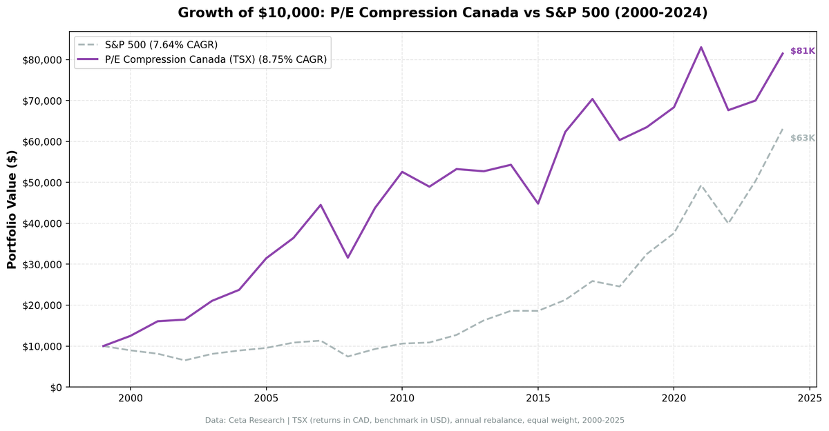
The Canadian version of our P/E compression screen produced 8.75% annually from 2000 to 2025, beating the S&P 500 by 1.11% per year. That's fine. What's more interesting: during down markets, this strategy absorbed only 23.7% of the S&P 500's losses.
Contents
- Method
- The Strategy
- Screen
- Results
- The Defensiveness Story
- When It Works
- When It Fails
- Why Canada Behaves Differently
- Full Annual Returns
- Limitations
- Run It Yourself
- Part of a Series
A beta of 0.48, roughly half the market. A max drawdown of -29% vs -35% for SPY. During 2000-2002, while the S&P 500 fell 33% over three years, this portfolio was up 58%. That's not a coincidence of timing. The same compression signal that identifies underpriced quality in the US appears to select for particularly resilient businesses when applied to Canadian equities.
Method
- Data source: Ceta Research (FMP financial data warehouse)
- Universe: Toronto Stock Exchange (TSX + TSXV), market cap > C$500M (~$362M USD)
- Period: 2000-2025 (25 annual rebalance periods)
- Rebalancing: Annual (January), equal weight top 30 by compression score
- Benchmark: S&P 500 Total Return (SPY)
- Cash rule: Hold cash if fewer than 10 stocks qualify
- Transaction costs: Size-tiered model
- Currency note: Returns in CAD (local currency). Benchmark in USD.
Historical financial data with 45-day lag. Full methodology: backtests/METHODOLOGY.md
The Strategy
Same screen as the US and UK versions: find TSX-listed stocks where the current annual P/E has compressed 15%+ below the company's own 5-year historical average, with ROE > 10% and D/E < 2.0 confirming business quality.
| Criterion | Threshold |
|---|---|
| P/E compression | Current P/E < 85% of 5-year average |
| P/E range | 5 – 40 |
| Return on equity | > 10% |
| Debt-to-equity | < 2.0 |
| Market cap | > C$500M (~$362M USD) |
| PE history | 3+ prior annual data points |
Screen
WITH fy_pe AS (
 SELECT r.symbol, r.priceToEarningsRatio AS pe, r.dateEpoch,
 ROW_NUMBER() OVER (PARTITION BY r.symbol ORDER BY r.dateEpoch DESC) AS rn,
 AVG(r.priceToEarningsRatio) OVER (
 PARTITION BY r.symbol ORDER BY r.dateEpoch
 ROWS BETWEEN 5 PRECEDING AND 1 PRECEDING
 ) AS avg_pe_5yr,
 COUNT(r.priceToEarningsRatio) OVER (
 PARTITION BY r.symbol ORDER BY r.dateEpoch
 ROWS BETWEEN 5 PRECEDING AND 1 PRECEDING
 ) AS n_prior
 FROM financial_ratios r
 JOIN profile p ON r.symbol = p.symbol
 WHERE r.period = 'FY' AND r.priceToEarningsRatio > 0 AND r.priceToEarningsRatio < 100
 AND p.exchange IN ('TSX', 'TSXV')
)
SELECT f.symbol, p.companyName, p.sector,
 ROUND(f.pe, 2) AS current_fy_pe,
 ROUND(f.avg_pe_5yr, 2) AS pe_5yr_avg,
 ROUND(f.pe / f.avg_pe_5yr, 3) AS pe_ratio_to_avg,
 ROUND((1 - f.pe / f.avg_pe_5yr) * 100, 1) AS compression_pct,
 ROUND(k.returnOnEquityTTM * 100, 1) AS roe_pct,
 ROUND(k.marketCap / 1e9, 2) AS mktcap_b
FROM fy_pe f
JOIN key_metrics_ttm k ON f.symbol = k.symbol
JOIN profile p ON f.symbol = p.symbol
WHERE f.rn = 1
 AND f.avg_pe_5yr IS NOT NULL
 AND f.n_prior >= 3
 AND f.pe > 5
 AND f.pe < 40
 AND f.pe / f.avg_pe_5yr < 0.85
 AND k.returnOnEquityTTM > 0.10
 AND k.marketCap > 500000000
ORDER BY f.pe / f.avg_pe_5yr ASC
LIMIT 30
Results
| Metric | Portfolio | S&P 500 |
|---|---|---|
| CAGR | 8.75% | 7.64% |
| Total Return | 730.3% | 530.7% |
| Max Drawdown | -28.99% | -34.90% |
| Volatility (ann.) | 18.01% | 17.51% |
| Sharpe Ratio | 0.347 | 0.322 |
| Sortino Ratio | 0.664 | — |
| Beta | 0.482 | 1.00 |
| Alpha | 3.77% | — |
| Up Capture | 85.6% | — |
| Down Capture | 23.7% | — |
| Win Rate (vs SPY) | 52.0% | — |
| Cash Periods | 0/25 | — |
| Avg Stocks | 23.2 | — |
The down capture is 23.7%. To translate: in years when the S&P 500 fell, this portfolio fell only 23.7% as much. The 2008 financial crisis, the S&P 500's worst single year at -34.3%, this portfolio lost only 29.0% in absolute terms, and that's the worst year in 25. Most down years were far shallower.
The trade-off is clear in the up capture: 85.6%. During bull markets, the strategy participates less than the index. That's the price of this defensive characteristic.
The Defensiveness Story
The 2000-2002 sequence shows the strategy's extreme bear market behavior most clearly.
| Year | Portfolio | S&P 500 | Excess |
|---|---|---|---|
| 2000 | +24.9% | -10.5% | +35.4% |
| 2001 | +28.6% | -9.2% | +37.7% |
| 2002 | +2.6% | -19.9% | +22.5% |
The S&P 500 fell 33% cumulative. This portfolio gained 58% cumulative. A 91 percentage point swing over three years.
This isn't explained by survival bias or cherry-picking. It's the consistent pattern across bear periods:
| Downturn | Portfolio | S&P 500 | Excess |
|---|---|---|---|
| 2000-2002 (dot-com) | +58% cumulative | -33% | +91pp |
| 2008 (financial crisis) | -29.0% | -34.3% | +5.3% |
| 2022 (rate shock) | -18.5% | -19.0% | +0.5% |
In all three major US bear markets of the last 25 years, this strategy lost less. In two of three, it was positive while the US market fell.
When It Works
2000-2007 (The Value Decade): Extraordinary.
| Year | Portfolio | S&P 500 | Excess |
|---|---|---|---|
| 2000 | +24.9% | -10.5% | +35.4% |
| 2001 | +28.6% | -9.2% | +37.7% |
| 2002 | +2.6% | -19.9% | +22.5% |
| 2003 | +27.8% | +24.1% | +3.6% |
| 2004 | +12.8% | +10.2% | +2.6% |
| 2005 | +32.6% | +7.2% | +25.4% |
| 2006 | +15.7% | +13.7% | +2.1% |
| 2007 | +22.1% | +4.4% | +17.7% |
Seven of eight years positive excess. The signal fires consistently in Canadian equities, the TSX's heavy weighting in energy, financials, and materials creates natural PE cycles.
2009-2010: +38.5% (+13.8%) and +20.1% (+5.8%). Recovery from crisis captured, with lower starting drawdown than the US version.
2016: +39.1% (+24.6%). Energy stocks compressed by the 2014-2015 oil crash had genuine mean reversion potential. 2016 was the year it materialized.
When It Fails
2013: -1.0% vs SPY +27.8% (-28.8% excess). The worst single year. The US equity market was in a pure growth/momentum phase. Compressed-P/E Canadian value names sat out a 28% market year.
2019: +5.2% vs SPY +32.3% (-27.1%). Another year the strategy missed a growth-led rally. The companies held were undervalued relative to their own history but the market was paying premium multiples for different kinds of businesses.
2015: -17.5%. Oil prices collapsed. TSX energy companies, a major source of compressed-P/E names given the 2014 selloff, fell further rather than reverting. When compression is caused by a genuine earnings cycle turn rather than sentiment, it doesn't revert quickly.
Why Canada Behaves Differently
Canadian equities behave more defensively under this screen for two structural reasons.
First, the TSX is less technology-heavy than the S&P 500. The US market's exceptional returns in 2019, 2021, and 2024 were driven by a handful of large-cap technology companies at expanding multiples. Canadian compressed-P/E screens don't compete with that concentration, but they also don't suffer from it.
Second, the energy and financials that dominate the TSX have genuinely cyclical PE patterns. A Canadian bank or oil producer at 60% of its historical P/E is often genuinely underpriced, not a value trap. The mean reversion mechanism works because the earnings cycle is real and well-understood.
The result: lower beta (0.48), lower drawdowns, and more defensive behavior during US-led selloffs, at the cost of missing US-led rallies.
Full Annual Returns
| Year | Portfolio | S&P 500 | Excess |
|---|---|---|---|
| 2000 | +24.9% | -10.5% | +35.4% |
| 2001 | +28.6% | -9.2% | +37.7% |
| 2002 | +2.6% | -19.9% | +22.5% |
| 2003 | +27.8% | +24.1% | +3.6% |
| 2004 | +12.8% | +10.2% | +2.6% |
| 2005 | +32.6% | +7.2% | +25.4% |
| 2006 | +15.7% | +13.7% | +2.1% |
| 2007 | +22.1% | +4.4% | +17.7% |
| 2008 | -29.0% | -34.3% | +5.3% |
| 2009 | +38.5% | +24.7% | +13.8% |
| 2010 | +20.1% | +14.3% | +5.8% |
| 2011 | -6.9% | +2.5% | -9.4% |
| 2012 | +8.8% | +17.1% | -8.3% |
| 2013 | -1.0% | +27.8% | -28.8% |
| 2014 | +3.0% | +14.5% | -11.5% |
| 2015 | -17.5% | -0.1% | -17.4% |
| 2016 | +39.1% | +14.4% | +24.6% |
| 2017 | +12.9% | +21.6% | -8.7% |
| 2018 | -14.3% | -5.2% | -9.1% |
| 2019 | +5.2% | +32.3% | -27.1% |
| 2020 | +7.7% | +15.6% | -8.0% |
| 2021 | +21.5% | +31.3% | -9.8% |
| 2022 | -18.5% | -19.0% | +0.5% |
| 2023 | +3.5% | +26.0% | -22.5% |
| 2024 | +16.4% | +25.3% | -8.9% |
Limitations
Currency mismatch. Returns are in CAD. The benchmark is in USD. CAD/USD fluctuations affect the comparison in ways unrelated to the strategy. In years when CAD weakens vs USD, Canadian stock returns look lower vs the USD-denominated S&P 500.
Energy concentration. The TSX's heavy energy weighting means this screen regularly loads up on energy companies when oil prices fall. That creates correlated risk. In 2015, compressed-P/E energy names kept compressing as oil went from $60 to $30.
The 2013-2015 hole. Three consecutive years of underperformance: -28.8%, -11.5%, -17.4%. The cumulative hit across those three years is significant for any real investor. The mid-decade stretch of underperformance is real.
Annual rebalancing lag. With January rebalancing, a company that looked compressed in January might see its earnings collapse mid-year without portfolio response until the following January.
Run It Yourself
git clone https://github.com/ceta-research/backtests.git
cd backtests

python3 pe-compression/backtest.py --preset canada --output results.json --verbose
python3 pe-compression/screen.py --preset canada
Part of a Series
- US analysis →. The flagship: 9.97% CAGR, +2.32% excess
- UK analysis →. First LSE backtest: +1.38% excess, 59.7% down capture
- Global comparison →, 19 markets, the East-West split
Run It Yourself
Explore the data behind this analysis on Ceta Research. Query our financial data warehouse with SQL, build custom screens, and run your own backtests across 70,000+ stocks on 20 exchanges.
Data: Ceta Research (FMP financial data warehouse), 2000-2025. Universe: TSX + TSXV. Returns in CAD. Benchmark: SPY (USD). Full methodology: METHODOLOGY.md. Past performance doesn't guarantee future results.