Earnings Yield Screen on US Stocks: 25 Years of Data, Modest Alpha
We backtested an earnings yield screen with quality filters on 25 years of US stock data (NYSE, NASDAQ, AMEX). 8.38% CAGR vs 8.02% for the S&P 500. Modest alpha, textbook value factor cyclicality.

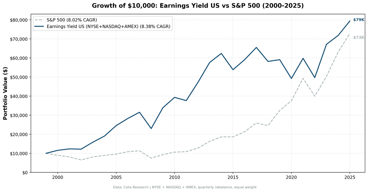
Earnings yield is the inverse of P/E. A stock with P/E of 10 has a 10% earnings yield. Joel Greenblatt made it famous as half of the Magic Formula. We tested it standalone on 25 years of US stock data with quality filters. The result: 8.38% CAGR vs 8.02% for the S&P 500. A +0.36% annual edge that took a wild ride to get there.
Contents
Data: FMP financial data warehouse, 2000–2025. Updated March 2026.
The Strategy
Earnings yield (E/P) measures how much a company earns relative to its stock price. High earnings yield means you're buying more earnings per dollar invested. It's the value investor's core metric.
We screen for profitable, financially stable companies with high earnings yield. The quality filters matter. Without them, you're buying every cheap stock including the ones that are cheap because the business is failing.
Filters: - Earnings yield > 0% (profitable companies only) - ROE > 12% (quality earnings, not just cheap) - Debt/Equity < 1.5 (manageable leverage) - Interest coverage > 3x (can service existing debt) - Market cap > $1B
Portfolio: Top 50 by highest earnings yield, equal weight, quarterly rebalance (January, April, July, October).
The quality bar is the key design choice. ROE > 12% and interest coverage > 3x are strict. They filter out cheap-but-struggling companies and heavily leveraged firms. The result is a portfolio of financially healthy companies trading at high earnings yields.
Method
Data source: Ceta Research (FMP financial data warehouse) Universe: All US stocks on NYSE, NASDAQ, and AMEX with market cap > $1B Period: 2000-2025 (103 quarterly rebalance periods) Signal: earningsYield from key_metrics (fiscal year), ranked descending Quality filters: returnOnEquity from key_metrics, debtToEquityRatio and interestCoverageRatio from financial_ratios Point-in-time data: 45-day lag after fiscal year end (only uses data that was actually available) Transaction costs: Size-tiered model (0.1-0.3% per trade depending on market cap) Benchmark: S&P 500 (SPY)
This is not an S&P 500 backtest. We screen the full US exchange universe, which captures opportunities outside the index that a constrained screen would miss.
For the full methodology, see METHODOLOGY.md.
Results
| Metric | Earnings Yield | S&P 500 |
|---|---|---|
| CAGR | 8.38% | 8.02% |
| Total Return | 694% | 628% |
| Max Drawdown | -52.3% | -43.9% |
| Volatility | 21.2% | 16.7% |
| Sharpe Ratio | 0.301 | 0.361 |
| Sortino Ratio | 0.436 | 0.536 |
| Win Rate (quarterly) | 50.5% | - |
| Avg Stocks per Quarter | 42.1 | - |
| Cash Quarters | 0/103 | - |
$10,000 invested in 2000 grew to roughly $79,400 in the earnings yield portfolio vs $72,800 in the S&P 500.
The headline: +0.36% annual excess return over 25 years. That's real but modest. And the risk-adjusted picture is less flattering. Sharpe ratio of 0.301 vs SPY's 0.361 means you took more risk per unit of return. Max drawdown was deeper (-52.3% vs -43.9%). Volatility was higher (21.2% vs 16.7%).
The strategy works. But the US results tell a story about the value factor itself, not about easy alpha.
When It Works
The earnings yield screen dominated during two distinct periods.
2000-2009 (Value decade): The screen crushed the S&P 500 in the early years. In 2000, the portfolio returned +15.5% while SPY fell -10.5%. The earnings yield filter naturally excluded overvalued tech stocks. Every year from 2000 through 2010, the screen beat or matched SPY except 2011.
| Year | Portfolio | S&P 500 | Excess |
|---|---|---|---|
| 2000 | +15.5% | -10.5% | +26.0% |
| 2001 | +6.7% | -9.2% | +15.9% |
| 2002 | -1.2% | -19.9% | +18.7% |
| 2003 | +29.9% | +24.1% | +5.8% |
| 2004 | +20.4% | +10.2% | +10.1% |
| 2005 | +28.8% | +7.2% | +21.6% |
| 2008 | -27.1% | -34.3% | +7.2% |
| 2009 | +47.5% | +24.7% | +22.7% |
The dot-com bust was the perfect environment. Expensive growth stocks collapsed. Cheap, profitable companies held up. Then the 2009 recovery rewarded cheap stocks that had been oversold during the financial crisis.
2022-2023 (Rate hike recovery): Rising interest rates in 2022 hit growth stocks harder than value. The screen held up better (-16.9% vs -19.0%). Then 2023 saw a strong bounce: +35.1% vs +26.0%.
When It Fails
2013-2021 (Growth decade): This is where earnings yield on US stocks struggled. Growth and momentum dominated the market. FAANG stocks drove index returns. The screen systematically excludes high-growth companies because they trade at low earnings yields (high P/E).
| Year | Portfolio | S&P 500 | Excess |
|---|---|---|---|
| 2013 | +22.1% | +27.8% | -5.7% |
| 2014 | +8.3% | +14.5% | -6.2% |
| 2015 | -13.7% | -0.1% | -13.6% |
| 2017 | +10.8% | +21.6% | -10.8% |
| 2019 | +1.6% | +32.3% | -30.7% |
| 2020 | -16.7% | +15.6% | -32.3% |
2019 and 2020 were the worst years. The portfolio returned just +1.6% in 2019 while SPY surged +32.3%. In 2020, it lost -16.7% while SPY gained +15.6%. Two consecutive years of 30+ percentage point underperformance.
This is textbook value factor cyclicality. Cheap stocks work when the market reprices from expensive to cheap. They struggle when expensive stocks keep getting more expensive.
The Honest Assessment
Earnings yield with quality filters produces a modest edge on US stocks. +0.36% annual excess over 25 years is real but not dramatic. The Sharpe ratio is lower than the benchmark. The drawdowns are deeper.
The value add is regime-dependent. If you'd started in 2000, you'd have loved this strategy through 2012. If you'd started in 2013, you'd have abandoned it by 2020. The 25-year number blends two very different stories.
This is consistent with academic research. Fama and French documented the value premium. Greenblatt popularized earnings yield. But the premium has compressed in recent decades, and standalone earnings yield captures only part of the picture. Greenblatt combined it with return on capital for a reason.
Run It Yourself
Simple screen (current qualifying US stocks):
WITH km AS (
  SELECT k.* FROM key_metrics_ttm k
  JOIN (SELECT symbol, MAX(fetchedAtEpoch) AS max_e FROM key_metrics_ttm GROUP BY symbol) lat
    ON k.symbol = lat.symbol AND k.fetchedAtEpoch = lat.max_e
),
fr AS (
  SELECT f.* FROM financial_ratios_ttm f
  JOIN (SELECT symbol, MAX(fetchedAtEpoch) AS max_e FROM financial_ratios_ttm GROUP BY symbol) lat
    ON f.symbol = lat.symbol AND f.fetchedAtEpoch = lat.max_e
)
SELECT
    k.symbol,
    ROUND(k.earningsYieldTTM * 100, 2) AS ey_pct,
    ROUND(r.priceToEarningsRatioTTM, 1) AS pe,
    ROUND(k.returnOnEquityTTM * 100, 1) AS roe_pct,
    ROUND(r.debtToEquityRatioTTM, 2) AS de,
    ROUND(r.interestCoverageRatioTTM, 1) AS ic,
    ROUND(k.marketCap / 1e9, 1) AS mktcap_bn,
    p.sector
FROM km k
JOIN fr r ON k.symbol = r.symbol
JOIN profile p ON k.symbol = p.symbol
WHERE k.earningsYieldTTM > 0.08
  AND r.priceToEarningsRatioTTM > 0
  AND r.priceToEarningsRatioTTM < 100
  AND k.returnOnEquityTTM > 0.12
  AND r.debtToEquityRatioTTM >= 0
  AND r.debtToEquityRatioTTM < 1.5
  AND r.interestCoverageRatioTTM > 3
  AND k.marketCap > 1000000000
  AND p.exchange IN ('NYSE', 'NASDAQ', 'AMEX')
ORDER BY k.earningsYieldTTM DESC
LIMIT 50
Run this screen on Ceta Research →
Backtest code: github.com/ceta-research/backtests/earnings-yield
Limitations
Value factor timing risk. The strategy can underperform for years at a time. The 2013-2020 stretch saw persistent negative excess returns. Most investors would have abandoned it.
Deeper drawdowns. -52.3% max drawdown is worse than SPY's -43.9%. You take more pain during crashes, not less.
Currency note. All returns are in USD. The US backtest doesn't have currency effects, but the strategy runs on other exchanges where returns are in local currency.
Survivorship bias. The universe is based on current exchange membership, not historical. Companies that delisted during the period are included if they had data, but the starting universe for each quarter uses the profile table as of the data snapshot.
No Piotroski filter. The Piotroski F-score is available for current TTM screening but not for historical backtesting. An advanced screen with Piotroski >= 6 would likely improve results, but we can't backtest that claim.
Data: Ceta Research (FMP financial data warehouse). Universe: NYSE + NASDAQ + AMEX, market cap > $1B. Backtest uses historical financial_ratios, key_metrics, and stock_eod tables with point-in-time methodology and 45-day reporting lag. Transaction costs: size-tiered (0.1-0.3% one-way based on market cap). FMP data has known limitations: coverage varies by company and time period, some historical records may contain errors or gaps, and delisted company data is less complete than active companies. Full methodology: METHODOLOGY.md. Past performance does not guarantee future results. This is educational content, not investment advice.
Part of a series: This is the US edition of our earnings yield backtest. See also: Earnings Yield India | Earnings Yield Global Comparison