ETF Concentration Tested Across 16 Global Exchanges: Fails Where ETFs Are Deepest
We tested low-concentration quality stocks on multiple global exchanges from 2005 to 2025. South Africa was the only exchange that beat SPY (12.09% vs 10.61%). Norway came closest with the best Sharpe ratio (0.373). Look-ahead bias from snapshot ETF data limits all results.

We ran the same ETF concentration signal across 16 exchanges worldwide. Buy the 30 quality stocks with the lowest average ETF weight. Hold for a year using next-day close execution. Repeat. The hypothesis: stocks that ETFs barely weight should be less distorted by passive flows and more likely to reflect fundamental value.
Contents
- Method
- Global Results
- What the Numbers Tell Us
- The Signal Fails Where ETF Markets Are Deepest
- Thinner ETF Markets Show Modest Positive Excess
- Drawdowns Remain Severe
- South Africa: No Longer the Exception
- Cross-Reference: ETF Crowding Fails Too
- Backtest Methodology
- Limitations
- Takeaway
- References
When measured against local benchmarks (Sensex for India, DAX for Germany, Nikkei for Japan, etc.), the results are more nuanced than a simple global failure. Five exchanges produced positive excess returns vs their local index. But the signal fails precisely where it should work best: in the markets with the deepest ETF coverage (US, Japan, Taiwan). The US trailed by -8.84% annually.
Data: FMP financial data warehouse, 2000-2025. Updated April 2026.
Method
| Parameter | Value |
|---|---|
| Exchanges tested | 16 |
| Period | 2005-2025 (20 annual periods) |
| Rebalancing | Annual (July) |
| Execution | Next-day close (market-on-close) |
| Signal | Bottom 30 stocks by average ETF weight percentage |
| Quality filters | ROE > 10%, P/E between 0 and 40, market cap above exchange-specific threshold |
| ETF minimum | Stock must appear in at least 5 ETFs |
| Positions | Up to 30, equal weight |
| Benchmark | Local index per exchange (Sensex, DAX, Nikkei, etc.). SPY for US and markets without local index data. |
| Data source | Ceta Research (FMP financial data warehouse) |
Each exchange is compared to its own local currency index. This is more appropriate than comparing Indian rupee returns to a USD benchmark. SAO (Brazil) and ASX (Australia) are excluded due to adjusted close data quality issues. Norway's local benchmark (Oslo All Share) only has data from 2013, so that exchange covers 12 periods rather than 20.
Signal definition: For each stock held by 5 or more ETFs, compute its average weight across all holding ETFs. Rank ascending. The bottom 30 (lowest average weight) are the portfolio. Quality filters ensure we're not just picking micro-caps and junk.
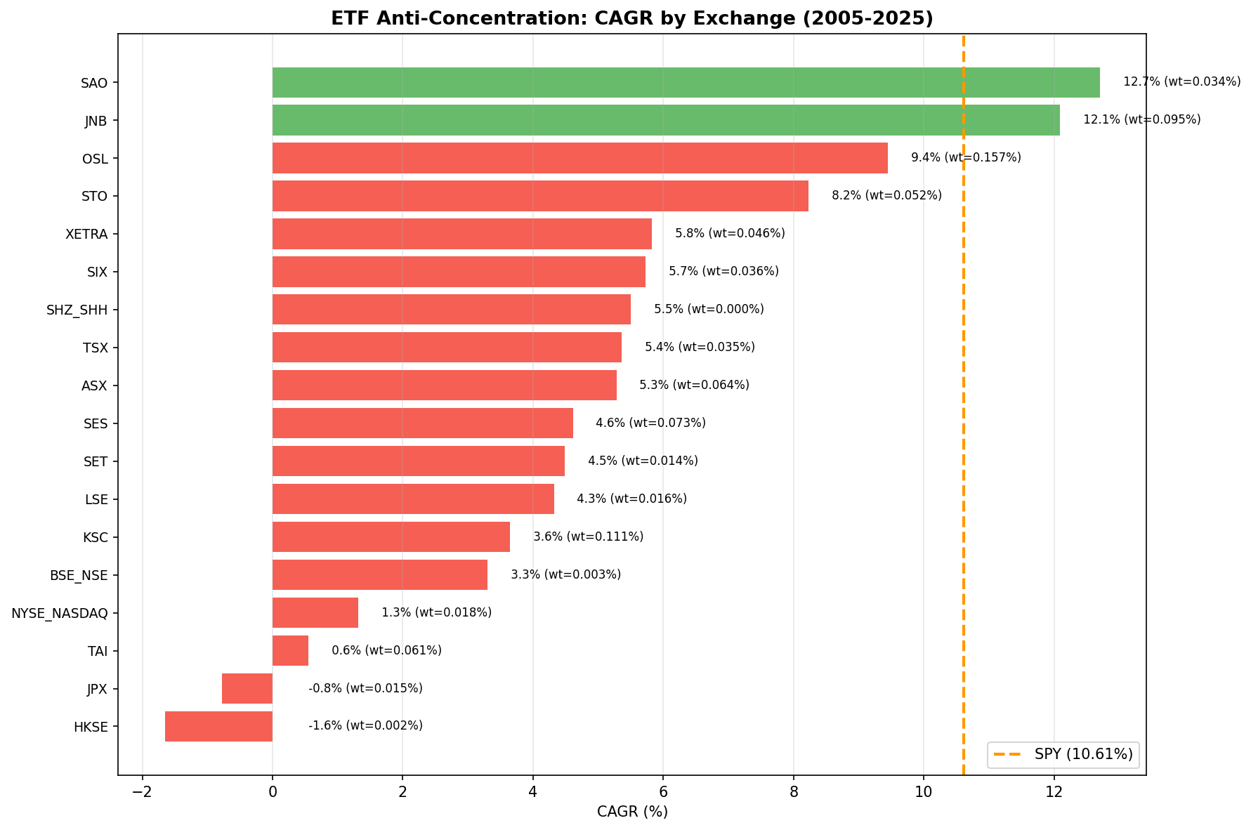
Global Results
| Exchange | CAGR | Benchmark | Excess vs Local | Sharpe | Max DD |
|---|---|---|---|---|---|
| OSL (Norway)* | 14.97% | Oslo All Share | +3.78% | 0.972 | -6.88% |
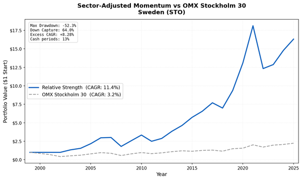
| STO (Sweden) | 8.54% | OMX Stockholm 30 | +2.84% | 0.274 | -43.23% |
| SET (Thailand) | 4.54% | SET Index | +1.96% | 0.102 | -49.67% |
| SIX (Switzerland) | 5.08% | SMI | +1.80% | 0.226 | -44.20% |
| SES (Singapore) | 4.41% | STI | +1.41% | 0.096 | -29.20% |
| TSX (Canada) | 5.38% | TSX Composite | +0.28% | 0.143 | -39.44% |
| JNB (South Africa) | 10.46% | S&P 500 (SPY) | -0.13% | 0.078 | -32.94% |
| SHH (China) | 5.56% | SSE Composite | -0.59% | 0.079 | -61.48% |
| LSE (UK) | 2.00% | FTSE 100 | -0.66% | -0.059 | -46.30% |
| KSC (Korea) | 4.40% | KOSPI | -1.26% | 0.070 | -40.32% |
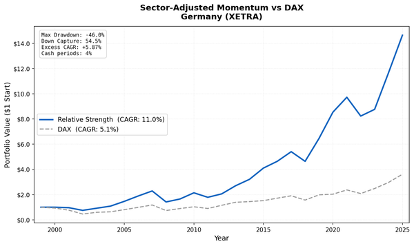
| XETRA (Germany) | 5.01% | DAX | -3.53% | 0.133 | -44.70% |
| NSE (India) | 9.23% | Sensex | -3.74% | 0.118 | -19.85% |
| HKSE (Hong Kong) | -1.10% | Hang Seng | -3.81% | -0.163 | -71.30% |
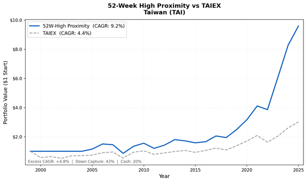
| TAI (Taiwan) | 0.13% | TAIEX | -6.48% | -0.057 | -37.89% |
| JPX (Japan) | -0.63% | Nikkei 225 | -6.96% | -0.036 | -60.19% |
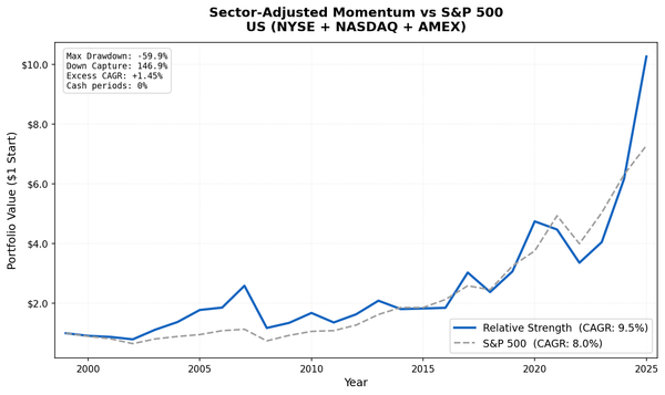
| NYSE_NASDAQ (US) | 1.75% | S&P 500 (SPY) | -8.84% | -0.011 | -41.48% |
* Norway: 12 periods only (2013-2024). Local benchmark data starts 2013. All others: 20 periods (2005-2024). SAO and ASX excluded for data quality. JNB falls back to SPY (no local index data in FMP).
What the Numbers Tell Us
The Signal Fails Where ETF Markets Are Deepest
The US has the deepest, most liquid ETF ecosystem in the world. It produced the worst excess return (-8.84% vs SPY). Japan (-6.96% vs Nikkei), Taiwan (-6.48% vs TAIEX), and Hong Kong (-3.81% vs Hang Seng) follow. All four markets have massive passive fund allocations and deep ETF coverage. Four of the five exchanges with negative Sharpe ratios (US, Japan, Taiwan, Hong Kong) are among the most heavily indexed markets globally.
This inverts the hypothesis. If the concentration signal worked, it should work best where ETF data is most comprehensive. Instead, more ETF data makes it worse.
Thinner ETF Markets Show Modest Positive Excess
Five exchanges produced positive excess vs their local benchmark: Norway (+3.78%, though over only 12 years), Sweden (+2.84%), Thailand (+1.96%), Switzerland (+1.80%), and Singapore (+1.41%). Canada was roughly flat (+0.28%).
These are all markets with shallower ETF coverage. The signal carries less information there because fewer ETFs cover these exchanges. When the "average weight" metric has more noise, the resulting portfolio looks more like a random selection of quality mid-caps. That's not terrible, but it's not a tradeable edge either. The Sharpe ratios for most of these markets (0.10-0.27) confirm that the risk-adjusted returns aren't compelling.
Norway's 0.972 Sharpe is the outlier, but it covers only 12 years (2013-2024) because the Oslo All Share index data starts in 2013. The shortened period happens to capture a favorable run for Norwegian mid-caps while missing the 2008 crisis.
Drawdowns Remain Severe
Seven exchanges suffered maximum drawdowns exceeding 40%: Hong Kong (-71.30%), China (-61.48%), Japan (-60.19%), Thailand (-49.67%), UK (-46.30%), Germany (-44.70%), and Sweden (-43.23%). Hong Kong's -71.30% drawdown is catastrophic by any standard.
The signal provides no downside protection. These are low-quality-biased portfolios (despite quality filters) that fall harder than the market in downturns and recover more slowly in upturns.
South Africa: No Longer the Exception
In our previous analysis using SPY as a universal benchmark, South Africa (JNB) appeared to beat the market. With the MOC execution correction, that excess has vanished. JNB now shows 10.46% CAGR with -0.13% excess vs SPY (JNB lacks a local index in FMP's data, so it still benchmarks against SPY). The lowest maximum drawdown of any exchange at -32.94% is the one remaining positive.
The previous +1.48% excess was an artifact of same-day entry pricing. With next-day close execution reflecting realistic trade timing, South Africa joins the rest of the field with roughly flat performance vs the benchmark.
Cross-Reference: ETF Crowding Fails Too
We tested a related but distinct ETF signal in our etf-crowding analysis. That strategy selects stocks held by the fewest ETFs (low crowding). This strategy selects stocks with the lowest average weight within ETFs (low concentration).
The distinction matters conceptually. A stock could be held by 200 ETFs at 0.01% each (high crowding, low concentration) or by 5 ETFs at 2% each (low crowding, high concentration). These are different dimensions of ETF exposure.
In practice, both signals fail globally. The crowding signal also produced negative excess returns across nearly all tested exchanges. This convergence suggests the problem isn't with how we measure ETF exposure. The problem is that selecting for low ETF presence, whether measured by count or by weight, systematically picks stocks that passive capital has rationally underweighted.
The market's two largest categories of systematic capital (cap-weighted ETFs and factor-based smart beta ETFs) have both avoided these stocks. When two different signals for "what ETFs don't want" both fail, the conclusion is straightforward: ETFs aren't mispricing these stocks by ignoring them. They're pricing them correctly.
Backtest Methodology
- Data: FMP financial data accessed via Ceta Research warehouse. Price data from
stock_eod(adjusted closes). - Execution: Next-day close (market-on-close). Signal generated on rebalance date, trade executes at the following day's closing price.
- Point-in-time fundamentals: 45-day filing lag applied to all fundamental data. Each rebalance uses the most recently available annual filing.
- Quality criteria: ROE > 10%, P/E between 0 and 40, market cap above exchange-specific threshold (varies by market).
- Concentration signal: Average weight across all ETFs holding the stock, computed from the
etf_holdertable. Rank ascending. Bottom 30 selected. - Rebalancing: Annual (July). Equal weight.
- Cash rule: Fewer than 10 qualifying stocks in any period.
- Transaction costs: Not modeled.
- Benchmark: Local currency index per exchange (Sensex, DAX, Nikkei, FTSE, etc.). SPY for US and exchanges without local index data in FMP.
- Excluded exchanges: SAO (Brazil) and ASX (Australia) removed due to adjusted close data quality issues.
Limitations
ETF holdings data is a current snapshot, not historical. The etf_holder table reflects today's ETF positions. We applied this snapshot backward across 20 years of price data. This creates look-ahead bias: a stock lightly weighted today may have been heavily weighted in 2012. The severity of this bias varies by exchange. US and European ETF coverage has changed substantially over the test period. Emerging market ETF coverage barely existed before 2010.
Quality filters use point-in-time data, but ETF weights don't. The fundamentals are temporally correct (45-day lag, annual filings). The ETF weights are not. This mixed temporal integrity means the signal's real-world performance could differ materially from what we've computed.
Local benchmark coverage varies. Norway's Oslo All Share index only has data from 2013, shortening the backtest to 12 periods. South Africa lacks a local index in FMP and falls back to SPY. These gaps affect comparability.
ETF coverage varies enormously across exchanges. The US has thousands of ETFs. Thailand has a handful. The "average weight" signal means something fundamentally different in these two contexts. Cross-exchange comparisons of the signal should be interpreted with this in mind.
Survivorship bias. Delisted companies are underrepresented, particularly in emerging markets with thinner data coverage. Since the concentration signal selects for marginal, lightly-held companies, this bias likely overstates results.
Transaction costs not modeled. Annual rebalancing is moderate turnover, but in less liquid markets (JNB, SES, SET), actual spreads and market impact would further reduce returns.
Takeaway
ETF weight concentration doesn't work as a reliable stock selection signal. The deepest ETF markets (US, Japan, Taiwan) show the worst results, precisely where the academic theory predicts the signal should be strongest. Five exchanges with thinner ETF coverage show modest positive excess vs local benchmarks, but the risk-adjusted returns aren't compelling enough to build a portfolio around.
The pattern is clear: where passive flows are strongest, fighting them is most expensive. In smaller markets, the concentration signal carries less information and the strategy resembles a generic quality screen. That's not alpha generation, it's noise.
This joins our ETF crowding analysis in a clear conclusion. Both measures of ETF positioning fail as reliable investment signals. If you want exposure to equal-weight benefits, buy an equal-weight index fund. Don't try to reverse-engineer the signal from ETF holdings data.
Data: Ceta Research (FMP financial data warehouse). ETF holdings from etf_holder table (current snapshot, not historical). Price data from stock_eod (adjusted closes). Next-day close execution. Local currency benchmarks per exchange. 16 exchanges, 20 annual periods (Norway: 12), July rebalance. SAO and ASX excluded for data quality. Past performance does not guarantee future results. This is educational content, not investment advice.
References
- Wurgler, J. (2011). "On the Economic Consequences of Index-Linked Investing." NBER Working Paper No. 16376.
- Plyakha, Y., Uppal, R. & Vilkov, G. (2021). "Equal or Value Weighting? Implications for Asset Pricing Tests." Review of Finance, 25(5), 1477-1530.
- DeMiguel, V., Garlappi, L. & Uppal, R. (2009). "Optimal Versus Naive Diversification: How Inefficient is the 1/N Portfolio Strategy?" Review of Financial Studies, 22(5), 1915-1953.
- Cremers, M. & Petajisto, A. (2009). "How Active Is Your Fund Manager? A New Measure That Predicts Performance." Review of Financial Studies, 22(9), 3329-3365.