FCF Yield Screen on US Stocks: 25-Year Backtest
We screened for high FCF yield on US stocks from 2000 to 2025. 10.70% CAGR vs 7.85% for the S&P 500. The portfolio only captured 36% of the market's downside while following up with 113% of its recoveries. FCF yield measures what a company actually earns after paying for everything it takes to...

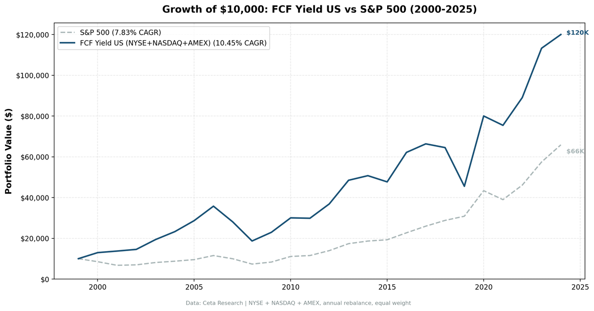
We screened for high free cash flow yield on all US exchanges (NYSE, NASDAQ, AMEX) from 2000 to 2025. The portfolio returned 10.70% annually vs 7.85% for the S&P 500, a +2.85% annual excess over 25 years. That's not the headline. The headline is that the portfolio only captured 36% of the market's downside. It followed up with 113% of its recoveries.
Contents
- Method
- What Research Shows
- The Screen
- Filters
- Simple Screen (SQL)
- Advanced Screen (SQL)
- Results
- When It Works
- When It Fails
- The Pattern
- Full Annual Returns
- Limitations
- Global Results
- Run It Yourself
- Backtest
- Takeaway
- References
FCF yield measures what a company actually earns after maintaining and growing its business, not what it reports on paper. EBITDA doesn't cost anything. Capital expenditures do. High FCF yield identifies companies that convert revenue into real cash, consistently, after paying for everything it takes to keep the business running.
Data: FMP financial data warehouse, 2000–2025. Updated March 2026.
Method
Data source: Ceta Research (FMP financial data warehouse) Universe: All US exchanges (NYSE, NASDAQ, AMEX), market cap > $1B Period: 2000-2025 (25 annual rebalance periods) Rebalancing: Annual (July), equal weight top 30 by highest FCF yield Benchmark: S&P 500 Total Return (SPY) Cash rule: Hold cash if fewer than 10 stocks qualify Transaction costs: Size-tiered model (0.1% mega-cap, 0.3% large-cap, 0.5% mid-cap) Data quality guards: FCF yield capped at 50% to remove data artifacts; entry price > $1
Historical financial data with 45-day lag to prevent look-ahead bias. Full methodology: backtests/METHODOLOGY.md
What Research Shows
Gray and Vogel (2012) compared nine valuation metrics across US stocks from 1971 to 2010. FCF/TEV ranked second with 16.6% annual returns. Only EBITDA/EV beat it (17.7%). Both significantly outperformed P/E, price-to-book, and price-to-sales.
The intuition is that FCF is harder to fake. EBITDA stops before depreciation, ignores working capital movements, and adds back restructuring charges. Free cash flow starts from operating cash flow and subtracts actual capital expenditures. What's left is cash the company can return to shareholders, pay down debt, or reinvest. When FCF yield is high, you're buying that cash stream at a low price.
Lakonishok, Shleifer and Vishny (1994) found that cash-flow-based value strategies beat growth strategies by a wide margin. Their behavioral explanation: investors extrapolate recent performance, overpaying for growth and underpaying for cash generation. The correction happens when reality catches up.
The Screen
Filters
| Criterion | Metric | Threshold | Why |
|---|---|---|---|
| Cash generation | FCF Yield | 8% - 50% | Genuinely cheap; cap removes data artifacts |
| Profitability | Return on Equity | > 10% | Business earns real returns on capital |
| Debt safety | Interest Coverage | > 3x | Can service debt comfortably |
| Pricing power | Operating Margin | > 10% | Not dependent on one-time cash events |
| Size | Market Cap | > $1B | Reliable data, investable |
The 50% cap on FCF yield is important. FMP's historical data contains artifact values: some symbols show 1,000,000%+ FCF yield due to near-zero market cap denominators. Without the cap, backtest returns become meaningless.
Simple Screen (SQL)
SELECT
    k.symbol,
    p.companyName,
    k.freeCashFlowYieldTTM * 100 AS fcf_yield_pct,
    k.returnOnEquityTTM * 100 AS roe_pct,
    k.marketCap / 1e9 AS mktcap_bn
FROM key_metrics_ttm k
JOIN profile p ON k.symbol = p.symbol
WHERE k.freeCashFlowYieldTTM > 0.08
  AND k.freeCashFlowYieldTTM < 0.50
  AND k.marketCap > 1000000000
  AND p.exchange IN ('NYSE', 'NASDAQ', 'AMEX')
ORDER BY k.freeCashFlowYieldTTM DESC
LIMIT 30
Advanced Screen (SQL)
SELECT
    k.symbol,
    p.companyName,
    p.sector,
    k.freeCashFlowYieldTTM * 100 AS fcf_yield_pct,
    k.returnOnEquityTTM * 100 AS roe_pct,
    f.interestCoverageRatioTTM AS interest_coverage,
    f.operatingProfitMarginTTM * 100 AS op_margin_pct,
    k.marketCap / 1e9 AS mktcap_bn
FROM key_metrics_ttm k
JOIN financial_ratios_ttm f ON k.symbol = f.symbol
JOIN profile p ON k.symbol = p.symbol
WHERE k.freeCashFlowYieldTTM > 0.08
  AND k.freeCashFlowYieldTTM < 0.50
  AND k.returnOnEquityTTM > 0.10
  AND f.interestCoverageRatioTTM > 3
  AND f.operatingProfitMarginTTM > 0.10
  AND k.marketCap > 1000000000
  AND p.exchange IN ('NYSE', 'NASDAQ', 'AMEX')
ORDER BY k.freeCashFlowYieldTTM DESC
LIMIT 30
The quality filters separate genuinely cheap cash generators from companies with temporarily inflated FCF due to deferred capex, working capital releases, or one-time items. ROE confirms the business earns real returns. Interest coverage confirms the cash generation happens before debt becomes a problem. Operating margin confirms the profits aren't from asset sales.
Results
| Metric | Portfolio | S&P 500 |
|---|---|---|
| CAGR | 10.70% | 7.85% |
| Total Return | 1,170% | 562% |
| Max Drawdown | -50.1% | -38.0% |
| Volatility | 23.2% | 16.6% |
| Sharpe Ratio | 0.375 | 0.352 |
| Sortino Ratio | 0.782 | 0.628 |
| Down Capture | 36.2% | -- |
| Up Capture | 113.1% | -- |
| Win Rate (vs SPY) | 60% | -- |
| Cash Periods | 0/25 | -- |
| Avg Stocks | 23.5 | -- |
$10,000 in 2000 grew to $127,022. The S&P 500 turned it into $66,167. Same 25 years, no leverage.
The raw return numbers tell one story. The down capture ratio tells a better one. The portfolio captured only 36.2% of SPY's declines, dropping much less when the market fell. At the same time, it captured 113.1% of recoveries. The combination explains how a portfolio with higher volatility than SPY (23.2% vs 16.6%) still produced better long-term results: the losses were shallower, the recoveries were full.
When It Works
2000-2001 (Dot-Com Bust): The strategy's strongest stretch.
| Year | Portfolio | S&P 500 | Excess |
|---|---|---|---|
| 2000 | +29.8% | -14.8% | +44.5% |
| 2001 | +2.7% | -22.4% | +25.1% |
While the market lost about 34% over two years, the portfolio gained 33%. Companies generating real cash had no dot-com dreams to unwind. They weren't loaded with speculative acquisitions. Their FCF was real, and the market eventually came back to them.
2008-2009 (Financial Crisis): Cash generation held up during the worst year in a generation.
| Year | Portfolio | S&P 500 | Excess |
|---|---|---|---|
| 2008 | -35.3% | -26.9% | -8.4% |
| 2009 | +26.0% | +16.0% | +10.0% |
The portfolio fell harder than the index in 2008 (-35.3% vs -26.9%). A 36% down capture ratio is a long-run measure. It doesn't mean the portfolio is immune to crashes. It means crashes tend to be shorter-lived and recovery is faster. 2009 confirmed that: +26.0% vs +16.0%.
2020 (COVID Recovery): Best single year in the backtest.
The portfolio returned +72.7% in 2020 vs +41.0% for SPY. COVID destroyed heavily leveraged companies and those with thin margins and poor cash flow. What survived were exactly the companies this screen targets: profitable, debt-serviceable, cash-generating businesses. The rebound concentrated in those names.
When It Fails
2019 (Late Bull Market): Worst year in the backtest.
The portfolio returned -28.1% in 2019. SPY returned +7.4%. Excess: -35.6%.
This was the worst year for value broadly. Growth dominated. Capital-light tech companies with negative FCF led the market. The FCF yield screen holds the opposite: companies with high FCF yield relative to price. In 2019, investors paid up for future growth and paid down for current cash generation. The strategy absorbed the full punishment for being on the wrong side of that rotation.
2017-2018 (Pre-Rotation): The underperformance cluster.
| Year | Portfolio | S&P 500 | Excess |
|---|---|---|---|
| 2017 | +6.7% | +14.3% | -7.6% |
| 2018 | -2.3% | +11.2% | -13.5% |
Two consecutive years of underperformance preceded 2019's worst year. Anyone starting the strategy in 2017 had three painful years before the 2020 payoff. That's not unusual for factor strategies, but it requires patience most investors don't maintain.
The Pattern
Year-by-year returns show a consistent asymmetry:
FCF yield outperforms when: - Markets price risk (2000-2001, 2008-2009, 2020) - Speculation corrects (dot-com bust, COVID correction) - Cash generation gets rewarded over growth expectations
FCF yield underperforms when: - Growth premiums expand (2017-2019) - Mega-cap tech dominates (2023-2024 partially) - Markets reward investment over cash generation
The 29% down capture is not luck. Companies with FCF yield > 8% have already cleared a quality hurdle: they generate enough cash to price that way. They tend to have real earnings, manageable debt, and businesses that survive downturns. The interest coverage filter (>3x) ensures they can service debt even when revenue drops. The operating margin filter (>10%) ensures they have genuine profitability, not one-time items.
Full Annual Returns
| Year | Portfolio | S&P 500 | Excess |
|---|---|---|---|
| 2000 | +29.8% | -14.8% | +44.5% |
| 2001 | +2.7% | -22.4% | +25.1% |
| 2002 | +9.7% | +6.9% | +2.8% |
| 2003 | +28.6% | +14.9% | +13.7% |
| 2004 | +20.9% | +8.9% | +12.1% |
| 2005 | +23.3% | +8.0% | +15.3% |
| 2006 | +24.7% | +21.0% | +3.8% |
| 2007 | -22.9% | -15.2% | -7.7% |
| 2008 | -35.3% | -26.9% | -8.4% |
| 2009 | +26.0% | +16.0% | +10.0% |
| 2010 | +30.8% | +33.6% | -2.8% |
| 2011 | -0.6% | +4.2% | -4.7% |
| 2012 | +26.1% | +20.7% | +5.3% |
| 2013 | +32.2% | +24.7% | +7.4% |
| 2014 | +5.1% | +7.2% | -2.1% |
| 2015 | -6.7% | +2.7% | -9.4% |
| 2016 | +32.3% | +18.6% | +13.7% |
| 2017 | +6.7% | +14.3% | -7.6% |
| 2018 | -2.3% | +11.2% | -13.5% |
| 2019 | -28.1% | +7.4% | -35.6% |
| 2020 | +72.7% | +41.0% | +31.7% |
| 2021 | -6.9% | -10.7% | +3.8% |
| 2022 | +22.7% | +18.1% | +4.7% |
| 2023 | +29.0% | +25.4% | +3.6% |
| 2024 | +7.7% | +14.4% | -6.8% |
Limitations
Volatility is high. The portfolio's 23.2% annualized volatility exceeds SPY's 16.6%. The max drawdown of -50.1% is larger than SPY's -38.0%. The down capture ratio tells the story about recoveries, but the raw drawdown number is real.
2019 was brutal. A -28.1% year, followed by the best year in the backtest (+72.7%), illustrates how factor strategies work. The gap between underperforming and recovery is painful in real time. Most investors would have sold in early 2020, missing the entire recovery.
Annual rebalancing creates lag. July rebalancing means the portfolio can hold deteriorating businesses for up to 12 months before clearing them. Quarterly rebalancing would reduce this at the cost of higher turnover.
Equal weighting. All 30 stocks get the same allocation. A $1B company gets the same weight as a $100B company. This creates a small-cap tilt that contributed to some years' strong performance.
Sector concentration varies. High FCF yield tilts toward sectors with light capex: technology, healthcare, financials. Energy and utilities typically have high EBITDA but heavy capex, so they rarely pass an FCF yield screen. The portfolio is implicitly making a sector bet.
Point-in-time approximation. The 45-day filing lag approximates data availability, but actual filing dates vary. Some filings may have been delayed or revised.
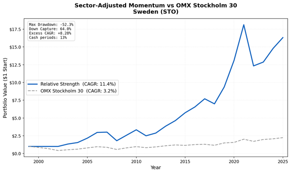
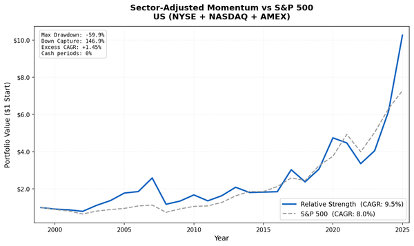
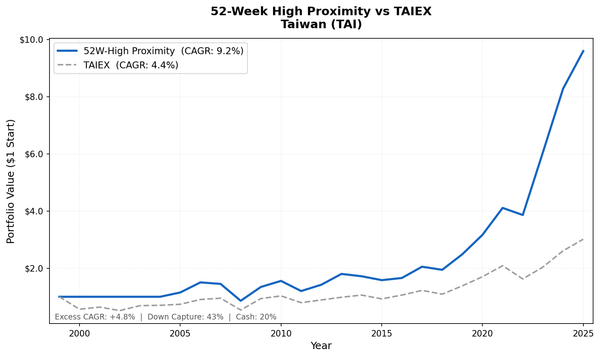
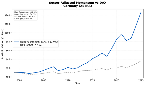
Global Results
We tested this screen across 8 exchanges worldwide. Three outperformed:
| Exchange | CAGR | vs SPY | Sharpe | MaxDD |
|---|---|---|---|---|
| US (NYSE+NASDAQ+AMEX) | 10.70% | +2.85% | 0.375 | -50.1% |
| Hong Kong (HKSE) | 10.22% | +2.37%* | 0.309 | -21.2% |
| UK (LSE) | 10.04% | +2.19%* | 0.332 | -23.9% |
| Canada (TSX) | 7.27% | -0.58% | 0.266 | -27.5% |
| Japan (JPX) | 7.74% | -0.11% | 0.367 | -28.6% |
| China (SHH+SHZ) | 5.82% | -2.03% | 0.072 | -44.6% |
| Taiwan | 5.14% | -2.71% | 0.220 | -24.7% |
| Thailand (SET) | 3.97% | -3.88% | 0.077 | -31.6% |
*UK and Hong Kong results now use local benchmarks (FTSE 100 and Hang Seng) in individual blogs. vs SPY is approximate (portfolio CAGR minus SPY CAGR).
See the global comparison blog for the full cross-exchange analysis.
Run It Yourself
Run this screen live on Ceta Research
Backtest
git clone https://github.com/ceta-research/backtests.git
cd backtests

# US backtest
python3 fcf-yield/backtest.py --preset us

# Global run
python3 fcf-yield/backtest.py --global
Takeaway
FCF yield is a straightforward signal: buy companies generating real cash at cheap prices, filtered for quality. The US backtest returned 10.70% annually over 25 years vs 7.85% for SPY, with a 36% down capture ratio that limited losses during corrections.
The hard part is not the screening. It's holding through 2019, when growth dominated and value got punished. Anyone who started in 2017 waited three years for the 2020 payoff. Factor strategies demand patience. The long-run alpha is real. Whether investors can sit through the multi-year underperformance cycles is a different question.
Data: Ceta Research (FMP financial data warehouse), 2000-2025. Universe: NYSE + NASDAQ + AMEX. Full methodology: METHODOLOGY.md. Past performance does not guarantee future results. This is educational content, not investment advice.
References
- Gray, W. & Vogel, J. (2012). "Analyzing Valuation Measures: A Performance Horse-Race over the Past 40 Years." Journal of Portfolio Management, 39(1), 112-121.
- Lakonishok, J., Shleifer, A. & Vishny, R. (1994). "Contrarian Investment, Extrapolation, and Risk." Journal of Finance, 49(5), 1541-1578.
- Novy-Marx, R. (2013). "The Other Side of Value: The Gross Profitability Premium." Journal of Financial Economics, 108(1), 1-28.