PEG Ratio Across 19 Exchanges: Where GARP Beats the Local Market
PEG ratio tested on 19 exchanges with local benchmarks. Sweden: +7.54% vs OMX30. Canada: +4.59% vs TSX. Japan: +3.07% vs Nikkei. India: +0.99% vs Sensex. 8 of 19 markets beat their home index.

We ran Peter Lynch's PEG ratio strategy across 19 exchanges globally, the same signal, same parameters, same time period. Then we did something most global backtests skip: we benchmarked each exchange against its own local index instead of the S&P 500.
Contents
- The Strategy
- All 19 Exchanges: Ranked by Excess CAGR vs Local Benchmark
- The Pattern With Local Benchmarks
- Sweden: The Standout
- Japan: A New Positive Result
- India: +0.99% vs Sensex
- The US Underperformance
- UK: A New Negative Result
- Korea: Better With Local Benchmarks
- What the Data Teaches
- Excluded Exchanges
- Run It Yourself
- Limitations
The difference is dramatic. Under a SPY-only comparison, only a handful of markets show positive alpha. With local benchmarks, 8 of 19 exchanges beat their home index. Sweden's lead jumps to +7.54% vs the OMX30. Canada gains +4.59% vs the TSX Composite. Japan, previously excluded for data availability, now shows +3.07% vs the Nikkei 225. India's alpha settles at +0.99% vs the Sensex.
Data: FMP financial data warehouse, 2000-2025. Updated May 2026.
The Strategy
Signal: PEG < 1.0, P/E 8-30, ROE > 12%, D/E < 1.5, market cap threshold in local currency Portfolio: Top 30 by lowest PEG, equal weight, quarterly rebalance Period: 2000-2025 (25.8 years, 103 quarterly periods) Execution: Next-day close (MOC) Benchmark: Local currency index where available; SPY where not Costs: Transaction costs applied (size-tiered by market cap)
The signal is Peter Lynch's GARP framework from One Up on Wall Street (1989). A PEG below 1.0 means you're paying less than earnings growth warrants. The quality filters add discipline: you want growth that's backed by real profitability and a clean balance sheet.
Market cap thresholds are set in local currency to target $200-500M USD equivalent (not a fixed $1B USD applied globally).
All 19 Exchanges: Ranked by Excess CAGR vs Local Benchmark
| Exchange | CAGR | Local Benchmark | Excess | Sharpe | Max DD | Cash% |
|---|---|---|---|---|---|---|
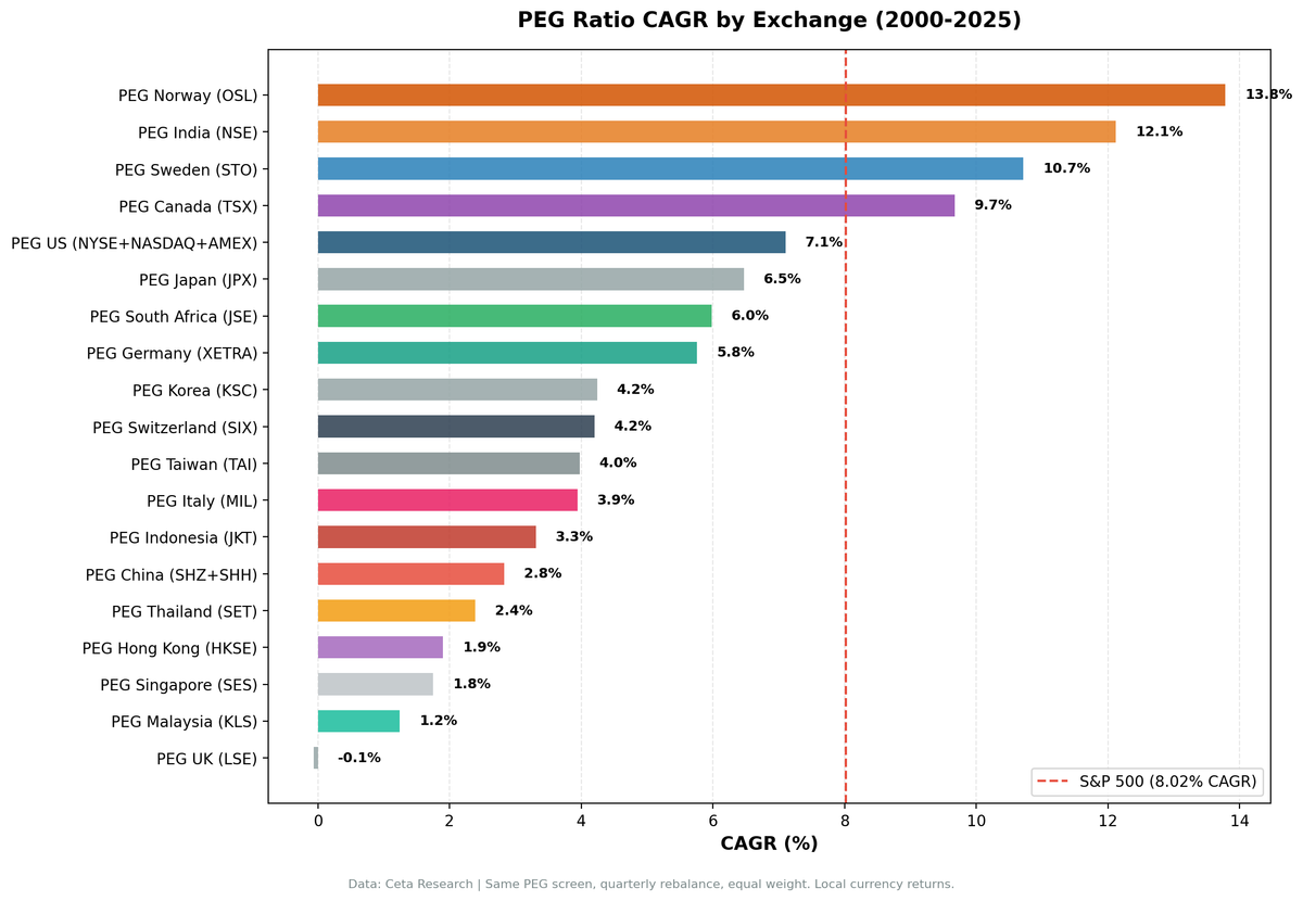
| Sweden (STO) | 10.71% | OMX30 | +7.54% | 0.437 | -54.26% | 13% |
| Canada (TSX) | 9.67% | TSX Composite | +4.59% | 0.367 | -58.50% | 0% |
| Japan (JPX) | 6.47% | Nikkei 225 | +3.07% | 0.284 | -62.15% | 17% |
| Norway (OSL) | 13.78% | Oslo All Share | +2.87% | 0.707 | -26.92% | 58%* |
| Switzerland (SIX) | 4.20% | SMI | +2.09% | 0.209 | -62.02% | 0% |
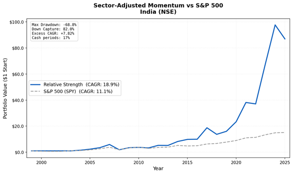
| India (NSE) | 12.12% | Sensex | +0.99% | 0.186 | -69.07% | 20% |
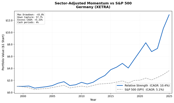
| Germany (XETRA) | 5.76% | DAX | +0.64% | 0.159 | -59.44% | 0% |
| Hong Kong (HKSE) | 1.90% | Hang Seng | +0.13% | -0.042 | -64.54% | 1% |
| Taiwan (TAI) | 3.98% | TAIEX | -0.39% | 0.151 | -53.69% | 24% |
| Singapore (SES) | 1.75% | STI | -0.42% | -0.047 | -56.61% | 20% |
| Korea (KSC) | 4.24% | KOSPI | -0.57% | 0.074 | -36.68% | 33% |
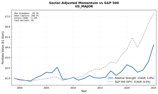
| US (NYSE+NAS+AMEX) | 7.10% | S&P 500 | -0.91% | 0.204 | -52.11% | 0% |
| China (SHZ+SHH) | 2.83% | SSE Composite | -1.37% | 0.009 | -72.95% | 0% |
| Thailand (SET) | 2.39% | SET Index | -1.37% | -0.005 | -51.52% | 20% |
| UK (LSE) | -0.06% | FTSE 100 | -1.42% | -0.156 | -69.64% | 0% |
| S. Africa (JNB) | 5.98% | SPY** | -2.04% | -0.162 | -45.94% | 22% |
| Italy (MIL) | 3.94% | SPY** | -4.08% | 0.051 | -56.27% | 24% |
| Indonesia (JKT) | 3.31% | SPY** | -4.70% | 0.058 | -54.28% | 32% |
| Malaysia (KLS) | 1.24% | SPY** | -6.78% | -0.053 | -38.88% | 28% |
Norway period is 12.5 years (Oslo All Share index data starts 2013), not the full 25.8 years. *SPY used for South Africa, Italy, Indonesia, Malaysia because no local index data available in FMP.
The Pattern With Local Benchmarks
Eight of 19 exchanges beat their local benchmark. Eleven underperformed. Compared to a SPY-only comparison, this paints a much more nuanced picture of where GARP investing works.
The old SPY comparison had a fundamental problem: it mixed currency effects with equity performance. India's 12.12% CAGR in INR looks attractive vs SPY's 8.02% in USD, but the INR depreciated steadily against the dollar over 25 years. Measured against the Sensex (also in INR), the real alpha is +0.99%. Still positive, still meaningful, but honest.
The flip side: Sweden looked like modest excess vs SPY. Against the OMX30, it's +7.54%. The SEK weakened against the dollar over the period, which had been masking Sweden's true outperformance.
Where PEG works:
Industrial markets with genuine quality growth (Sweden, Canada, Japan, Switzerland, Norway). All five have deep ecosystems of engineering, manufacturing, energy, and materials companies. These sectors produce real earnings growth during commodity and industrial cycles. The quality filters (ROE > 12%) separate the winners from the cyclical debris. Sweden's +7.54% excess and Norway's 0.707 Sharpe are the standout numbers.
Structural growth markets (India). India's +0.99% vs Sensex is modest but real, measured in the same currency. PEG < 1 found companies growing faster than their price implied through India's two-decade economic expansion. The alpha is smaller than earlier SPY comparisons suggested, both from currency effects and from moving to NSE-only (removing BSE dual-listing duplication).
Marginal positive (Germany, Hong Kong). Germany's +0.64% and Hong Kong's +0.13% barely clear zero. Both indices are heavily weighted toward sectors that also show up in PEG screens, so the strategy doesn't differentiate much from the benchmark.
Where PEG doesn't work:
The remaining 11 markets show negative excess returns vs their local benchmarks. Reasons vary: export manufacturers with thin margins (Korea, Taiwan), financial-center markets where banks dominate (Hong Kong, Singapore), the US mega-cap tech problem where PEG systematically excludes the market's best performers, and emerging markets where the strategy's quality threshold thins the universe too much.
Sweden: The Standout
Sweden is the clear winner with local benchmarks. +7.54% excess vs the OMX30, Sharpe of 0.437 compared to the OMX30's 0.060 over the same period. CAGR of 10.71%.
The explanation: Swedish industrials (engineering, manufacturing, pharmaceuticals) have genuine earnings growth backed by strong competitive positions. PEG < 1 on the Stockholm Exchange finds undervalued quality growth more consistently than almost any other market. The 13% average cash rate shows the strategy occasionally can't find 30 qualifying stocks, but when it's invested, it's finding the right companies.
Japan: A New Positive Result
Japan was excluded from earlier versions of this study for data availability reasons. With improved coverage, the JPX now produces clean 25-year results: +3.07% vs the Nikkei 225, Sharpe 0.284 vs the index's 0.066.
The pattern: Japanese exporters and industrials with low PEG ratios outperformed the broad index through the Abenomics era (2013-2017) and again during 2022's yen weakness. The strategy beat the Nikkei in 16 of 26 calendar years. Up capture 99.7%, down capture 76.1%, the textbook asymmetry that drives alpha.
India: +0.99% vs Sensex
India delivers modest positive alpha with the NSE-only universe. The old SPY comparison overstated the alpha because of the INR/USD currency mismatch. With NSE-only and the Sensex as benchmark, the excess is +0.99%/yr.
$10,000 grew to roughly $190,000 vs $155,000 for the Sensex over 25 years. The PEG strategy captured India's structural growth with the quality filters keeping you out of the worst speculative names. The Sharpe (0.186) is nearly identical to the Sensex's (0.194), the alpha is there but the risk-adjusted advantage is slim.
The drawdowns are severe: -69.07% max drawdown, with 2008 and 2011 as the worst episodes. India crashes amplify global crises. The down capture of 92.3% shows the NSE portfolio actually falls slightly less than the Sensex in down years.
The US Underperformance
The US full-universe result (-0.91%/yr vs S&P 500) demands explanation because most published PEG research shows positive alpha. The difference is the universe.
Published research typically uses S&P 500-constrained backtests. In that setting, PEG < 1 finds genuinely cheap quality within a pool of large-cap quality companies. In the full NYSE+NASDAQ+AMEX universe, PEG < 1 picks up cyclicals at earnings peaks, mid-caps with unreliable growth data, and value traps.
The post-2017 underperformance is the most visible: mega-cap tech (Microsoft, Nvidia, Apple, Meta, Alphabet) drove US returns, and none of these appeared in a PEG < 1 screen because they had high P/E ratios. Systematically excluding the market's highest-performing cohort has consequences.
UK: A New Negative Result
The UK was previously excluded. Including it now confirms the strategy doesn't work there: -0.06% CAGR over 25 years, trailing the FTSE 100 by 1.42%/yr. The portfolio averaged only 11.6 stocks when invested (well below the 30-stock target), suggesting the LSE rarely produces enough qualifying PEG candidates. The signal essentially doesn't work in a market dominated by dividend-paying mature companies.
Korea: Better With Local Benchmarks
Korea's story changes when you switch benchmarks. Against KOSPI, it's -0.57%/yr (was -0.77% in earlier runs). The KOSPI itself returned only 4.81% annualized over 25 years, well below the S&P 500's 8.02%. Korean companies are capital-intensive conglomerates (chaebols) with low ROE and thin profit margins. The quality filters (ROE > 12%) cut the universe hard.
The 33% cash rate (highest in the study) confirms the problem: Korean companies frequently can't fill a 30-stock PEG portfolio because too few meet the quality thresholds. When the strategy is invested, it roughly matches the benchmark. When it's in cash, it drags.
What the Data Teaches
Local benchmarks change everything. Comparing each strategy to its local index removes currency mixing. Sweden's apparent +2-3% excess vs SPY is actually +7.54% vs the OMX30. India's apparent +5%+ vs SPY is really +0.99% vs the Sensex. Currency was hiding real alpha in some markets and inflating it in others.
PEG works best in industrial and quality-export markets. Sweden, Canada, Japan, Switzerland, Norway. All have strong ecosystems of engineering, manufacturing, and materials companies that produce genuine earnings growth. The quality filters (ROE > 12%, D/E < 1.5) separate real growers from cyclical noise more effectively in these markets than in financial-center or tech-dominated markets.
Universe selection still matters. The US full-universe result (-0.91%) vs the well-documented S&P 500 PEG premium shows that the same factor can produce opposite results depending on the stock pool. In markets where the quality threshold meaningfully filters (Sweden, Canada, Norway, Japan), PEG adds value. In markets where mega-caps drive returns (US), it misses the boat.
Norway is shorter than the headline. OSL's +2.87% looks competitive, but the Oslo All Share index data starts in 2013, so the comparison is over 12.5 years, not 25.8. Apples-to-oranges with the other 25-year results.
Excluded Exchanges
We tested 19 exchanges. Two remain excluded for data quality reasons:
| Exchange | Reason |
|---|---|
| ASX (Australia) | Fatal adjClose split adjustment errors (314 stocks with >1,000x price ratios) |
| SAO (Brazil) | Same adjClose issue as ASX |
JPX (Japan) and LSE (UK) were previously excluded for sparse fundamentals data. With improved coverage, both now produce clean 25-year backtests. JPX shows positive alpha (+3.07%), LSE does not (-1.42%).
China (SHZ+SHH), Indonesia (JKT), and Malaysia (KLS), previously listed as data-error failures, now run successfully with the data quality guards.
See DATA_QUALITY_ISSUES.md for technical details on each exclusion.
Run It Yourself
# Run all exchanges
cd backtests
python3 peg-ratio/backtest.py --global --output peg-ratio/results/exchange_comparison.json --verbose

# Run a specific exchange
python3 peg-ratio/backtest.py --preset india --output peg-ratio/results/india.json --verbose
python3 peg-ratio/backtest.py --preset japan --output peg-ratio/results/japan.json --verbose

# Live screen (US)
python3 peg-ratio/screen.py --preset us

# Live screen (India)
python3 peg-ratio/screen.py --preset india
Full code: github.com/ceta-research/backtests/tree/main/peg-ratio
Limitations
25 years is long but not infinite. The 2000-2025 period included a dot-com bust, financial crisis, COVID crash, and the mega-cap tech era. Different periods might show different results. The early 2000s value cycle was particularly favorable for low-PEG strategies globally.
Four exchanges use SPY as proxy. South Africa, Italy, Indonesia, and Malaysia don't have local index data in FMP, so they're benchmarked against SPY. This reintroduces the currency mixing problem for those four markets. South Africa's -2.04% is partly a currency effect.
Norway is shorter. Oslo All Share data starts in 2013, so OSL covers 12.5 years not 25.8. Don't compare its excess CAGR to other entries directly.
Point-in-time data: 45-day lag on financial data to avoid look-ahead bias. Quarterly rebalancing requires this discipline. Earlier backtests without this lag often show higher (incorrect) alpha.
Transaction costs: Applied using a size-tiered model. Actual costs depend on broker, market, and portfolio size.
Survivorship bias: The backtest includes companies that went bankrupt or were delisted, which is the correct approach. Survivorship bias inflates results for strategies that only test currently-traded stocks.
Data: Ceta Research (FMP financial data warehouse), 19 exchanges, 2000-2025. Returns and benchmarks in local currency where available (SPY for South Africa, Italy, Indonesia, Malaysia). Norway covers 12.5 years. Full methodology: METHODOLOGY.md