R&D Efficiency Across 11 Exchanges: UK Beats FTSE by +6.12%, India Trails Sensex
We reran the R&D efficiency screen across 11 exchanges with local benchmarks. The UK beats the FTSE 100 price index by +6.12% annually, the strongest result globally. India underperforms the Sensex by 5.27pp. And two positive results turn out to rest on foreign companies' secondary listings.

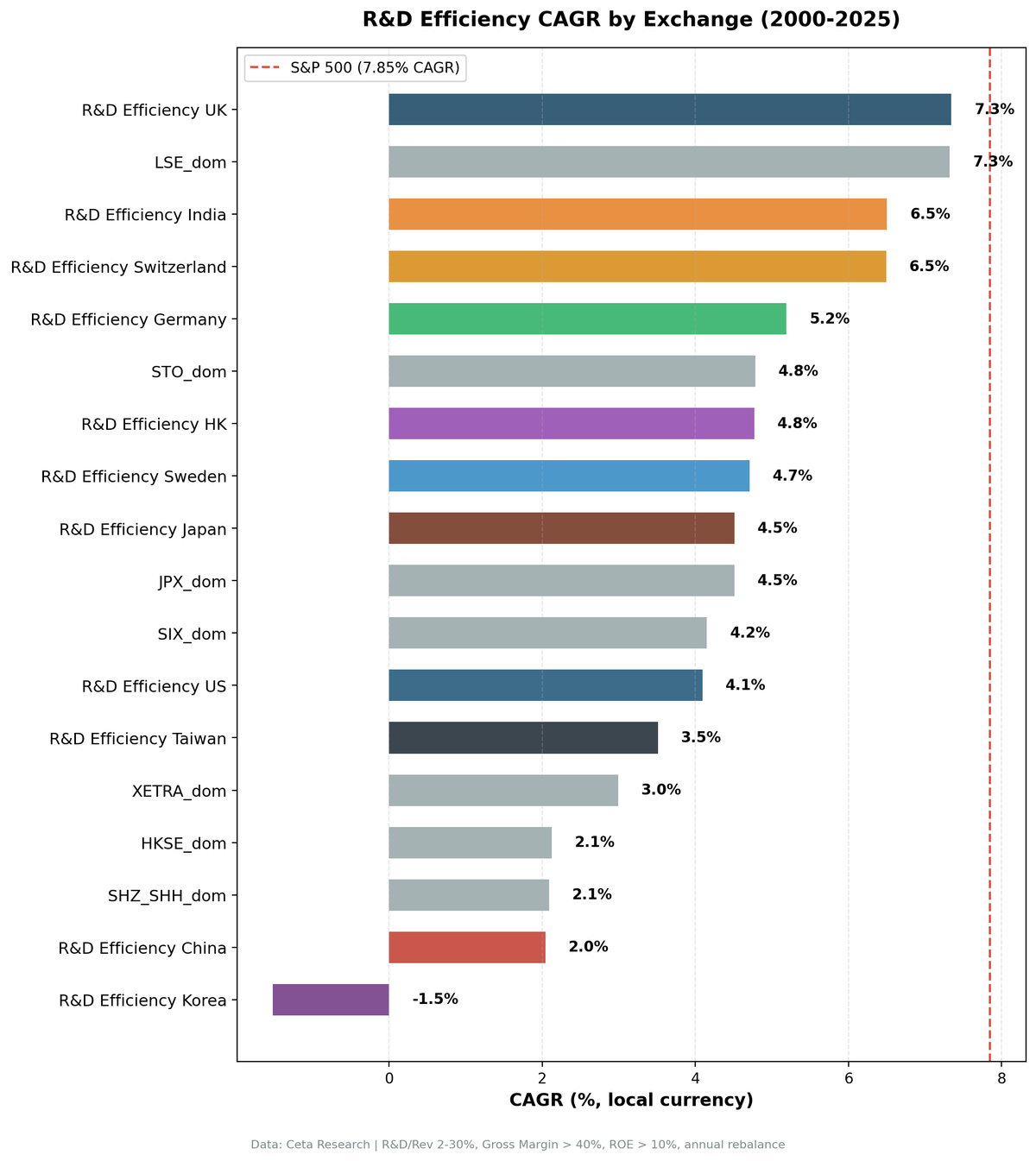
We ran the same R&D efficiency screen, gross profit per R&D dollar, filtered by R&D/Revenue 2-30%, gross margin >40%, ROE >10%, across 11 exchanges over 25 years. Each exchange is measured against its own local index, not against the S&P 500.
Contents
- Results With Local Benchmarks
- The Listing Trap: Which Results Are Really Local
- What Changed From the Previous Version
- Why Sector Composition Determines the Result
- The UK Story: FTSE 100's 25-Year Failure
- Japan: We Had This Backwards
- Switzerland: Half the Result Is a Listing Artifact
- The Screen
- Limitations
- Takeaway
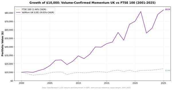
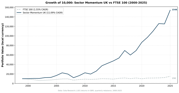
That choice does most of the work. Benchmarked to SPY, India looked like the standout winner because its absolute INR returns beat a USD index. Against its own market it isn't close: the Sensex compounded at 12.06% while the NSE screen returned 6.50%. The UK inverts the same way. Against SPY the LSE screen looked ordinary, but the FTSE 100 returned 1.23% on a price basis over 25 years, which makes the screen's 7.34% the best relative result in the study.
A second correction runs through this version. Screens select every company listed on an exchange, and outside the US a lot of that is foreign companies' secondary listings. Where we tested for it, that turns out to matter more than the benchmark choice did.
Data: FMP financial data warehouse, 2000–2025. Updated August 2026.
Results With Local Benchmarks
| Exchange | CAGR | Local Benchmark | Bench CAGR | Excess | Sharpe | Max DD | Cash% |
|---|---|---|---|---|---|---|---|
| UK (LSE) | 7.34% | FTSE 100 (price) | 1.23% | +6.12% | 0.248 | -21.74% | 0% |
| Switzerland (SIX) | 6.49% | SMI (price) | 1.74% | +4.75% | 0.354 | -30.62% | 0% |
| HK (HKSE) | 4.77% | Hang Seng | 1.64% | +3.13% | 0.084 | -56.50% | 16% |
| Sweden (STO) | 4.71% | OMX Stockholm 30 (price) | 2.55% | +2.15% | 0.219 | -11.29% | 68% |
| Japan (JPX) | 4.51% | Nikkei 225 | 3.31% | +1.20% | 0.255 | -45.63% | 20% |
| Germany (XETRA) | 5.19% | DAX | 5.04% | +0.15% | 0.187 | -40.16% | 0% |
| China (SHH/SHZ) | 2.04% | SSE Composite | 2.43% | -0.39% | -0.029 | -42.93% | 32% |
| Taiwan (TAI) | 3.51% | TAIEX | 4.09% | -0.58% | 0.129 | -42.18% | 36% |
| US (NYSE/NASDAQ/AMEX) | 4.09% | S&P 500 | 7.85% | -3.76% | 0.114 | -39.75% | 0% |
| India (NSE) | 6.50% | Sensex | 12.06% | -5.56% | 0.000 | -17.85% | 56% |
| Korea (KSC) | -1.52% | KOSPI | 5.35% | -6.87% | -0.486 | -43.14% | 80% |
Period: 2000–2024, 25 annual rebalance periods. Local benchmark for each exchange. Returns are in each market's own currency, so the CAGR column is not comparable across rows without a currency adjustment; the Excess column is.
Benchmark note: The FTSE 100 (^FTSE), SMI (^SSMI), and OMX Stockholm 30 (^OMXS30) are price-return indices, dividends excluded. The portfolio uses dividend-adjusted prices (adjClose). This inflates portfolio excess by approximately the index's dividend yield, 2-4% annually for the FTSE and SMI. True excess against total-return benchmarks is roughly 2-3pp for the UK and 1-2pp for Switzerland.
Sorted by excess vs local benchmark. Four markets beat their local index by more than two points (UK, Switzerland, Hong Kong, Sweden), two are marginally positive (Japan at +1.20%, Germany at +0.15%), and five underperform (China, Taiwan, US, India, Korea).
The Listing Trap: Which Results Are Really Local
Some of the positive results above are not what they look like.
The screen takes every company listed on an exchange. Outside the US, much of a listed universe can be foreign companies' secondary lines rather than domestic businesses. We re-ran all seven non-US markets that show a positive or near-zero excess, restricted to companies actually domiciled in the home country:
| Market | Listed universe (published) | Domiciled companies only | Invested periods |
|---|---|---|---|
| UK (LSE) | +6.12% excess, 7.34% CAGR | +6.09% excess, 7.32% CAGR | 25 of 25 becomes 24 of 25 |
| Sweden (STO) | +2.15% excess, 4.71% CAGR | +2.22% excess, 4.78% CAGR | 8 of 25 unchanged |
| Germany (XETRA) | +0.15% excess, 5.19% CAGR | -2.05% excess, 2.99% CAGR | 25 of 25 becomes 17 of 25 |
| Hong Kong (HKSE) | +3.13% excess, 4.77% CAGR | +0.48% excess, 2.12% CAGR | 21 of 25 becomes 15 of 25 |
| Switzerland (SIX) | +4.75% excess, 6.49% CAGR | +2.41% excess, 4.15% CAGR | 25 of 25 becomes 11 of 25 |
| Japan (JPX) | +1.20% excess, 4.51% CAGR | +1.20% excess, 4.51% CAGR | 20 of 25 unchanged |
| China (SHH/SHZ) | -0.39% excess, 2.04% CAGR | -0.34% excess, 2.09% CAGR | 17 of 25 unchanged |
Germany's excess flips sign. Hong Kong keeps its sign but loses 85% of its excess. Switzerland, the second-best result in the study, halves. In each of those three the invested-period count collapses, which is the tell: the screen was filling its book from foreign listings, and once those are gone there often aren't 10 qualifying domestic companies. Switzerland is the starkest case, holding a portfolio in 11 of 25 years rather than all 25, so the alpha that survives there rests on a very thin domestic book.
The UK, Sweden, Japan and China survive. All four hold their excess to within a tenth of a point, Japan's is unchanged to two decimals, and the UK stays invested in 24 of 25 years with an 84% win rate. That distinction matters for how the headline result should be read: the UK, the best result in the study, is a claim about British companies. Switzerland is substantially a claim about high-quality companies that happen to trade in Zurich. Every number elsewhere in this post uses the listed universe, which is the standard construction and the one all our market results use.
What Changed From the Previous Version
Three things. This run applies data quality guards that had been written into the backtest code in April 2026 but never actually run against results. The vendor has restated five months of historical fundamentals since the last run. And an audit of this package found that the screen had no one-slot-per-company guard, so a single business could occupy several of the 30 portfolio slots through its share classes.
The guards remove price rows where the adjusted close spikes and then reverts within a day or two, which are phantom holiday rows and broken split adjustments rather than real moves, and they drop individual positions with entry prices below $1 equivalent or single-period returns above 200%.
Most markets moved less than a point of excess. The exceptions worth naming:
- UK: +7.22% becomes +6.12%. Still the best result, and now with no cash years at all.
- Japan: cash periods collapsed from 52% to 20%, and max drawdown went from -18.11% to -45.63%. This inverts the story we told last time (see below).
- Switzerland: +3.61% becomes +4.75%, but see the listing trap above.
- India: cash goes to 56%, because the dedup guard pushes 2011 back below the 10-company floor.
The dedup guard specifically moved the US and Germany most. Becton Dickinson had been taking three of the thirty US slots for six consecutive years and Ziff Davis two slots for most of the last decade, so the US CAGR falls from 4.62% to 4.09% and its max drawdown deepens from -35.74% to -39.75%, which is now worse than the S&P 500's. Germany's excess falls from +1.00% to +0.15% and China's tips from +0.14% to -0.39%. The guard also means the 10-stock cash floor now counts distinct companies rather than listings, which is why several thin markets sit in cash more often than before.
Why Sector Composition Determines the Result
The gross margin filter (>40%) is the most discriminating constraint in the screen. That single filter shapes which sectors can appear in the portfolio.
Sectors that pass the 40% gross margin threshold: pharmaceuticals, software, financial data services, specialty chemicals, luxury goods. Sectors that fail: semiconductors (20-50% gross margins, highly variable), hardware (20-40%), manufacturing (10-30%), energy (variable).
The UK outperforms because its qualifying universe is concentrated in sectors with genuinely defensive demand: medical devices, scientific instruments and information services. Counting the 25 annual LSE screens, the recurring names are Smith & Nephew, Smiths Group, Waters Corporation, Vitec, Stryker and Hikma, not the large-cap pharma the intuition reaches for. AstraZeneca and GSK each qualify in only 4 of 25, because the ratio penalises their 20%-plus research budgets. Switzerland looks like the same story and isn't, as the domicile check above shows.
India underperforms despite a favorable sector mix. Indian pharma (Sun Pharma, Dr. Reddy's, Cipla) and IT services (TCS, Infosys) have exactly the right economics for this screen. The problem is universe thinness: on NSE-only, fewer than 10 companies pass all filters at once in most years before 2014. When the screen does invest, the record is volatile, with spectacular years (2014, 2023) offset by three consecutive losing years from 2016 to 2018 and a bad 2021.
US underperforms because the S&P 500 from 2013 onward was dominated by mega-cap tech companies that either fail the 30% R&D cap or rank mid-tier on efficiency. The strategy finds the right kind of company; the index moved away from those companies.
Korea fails completely. Samsung, SK Hynix, LG, semiconductors and consumer electronics. Gross margins in the 20-35% range. The 80% cash rate means the screen rarely finds qualifying Korean companies.
The UK Story: FTSE 100's 25-Year Failure
The FTSE 100's 1.23% CAGR over 25 years is a well-documented underperformance. The index is heavily weighted toward energy, mining, banks, and consumer staples, sectors that underperformed global equities from 2000-2024. The UK market's returns came from dividends, not capital appreciation.
The screen's healthcare and information-services focus naturally avoided the FTSE's weakest sectors. Its recurring holdings are medical devices and instruments companies such as Smith & Nephew and Waters, not the index's banks, miners and oil majors, and that composition difference is most of the excess.
This creates a valid but caveat-laden conclusion: the strategy genuinely outperformed what UK investors experienced in the price of their holdings. But comparing to a total-return FTSE would show a smaller excess, roughly 2-3pp annually. The screen also ran fully invested in all 25 years on the LSE, on an average book of just 13.0 names, so this is a concentrated bet rather than a diversified one. It gets thinner than the average suggests: the held book was under 10 names in 6 of the 25 years and as low as 4 in 2002, which is worth knowing before leaning on the early-period wins.
Japan: We Had This Backwards
The previous version of this comparison called Japan's 52% cash rate the most interesting result in the dataset, and argued the screen could rarely fill 10 positions because Japanese R&D spenders sit in sectors with sub-40% gross margins.
That was an artifact. With the data quality guards applied, Japan's cash rate is 20%, not 52%, and the only cash years are 2000 through 2004. From 2005 onward the screen filled a book every single year, averaging 22.8 names, the second-deepest of any market here.
The corrected picture is less flattering in a different way. Japan returned 4.51% against the Nikkei's 3.31%, an excess of +1.20%, with a max drawdown of -45.63%. That's the second-worst drawdown in the study. The old claim that Japan's risk profile was "quite good when invested" was measuring five years of cash, not five years of risk control. 2007 and 2008 cost 26.96% and 25.56% back to back.
The gross margin observation still holds as a description of why the pre-2005 universe was thin, and Toyota, Panasonic and Sony do fail the 40% filter. It just doesn't describe the last twenty years.
The genuine thin-universe cases in this study are Sweden (68% cash) and Korea (80%).
Switzerland: Half the Result Is a Listing Artifact
On the listed universe Switzerland is the second-best result here: 6.49% CAGR, Sharpe 0.354, max drawdown -30.62%, +4.75% excess vs the SMI price return, no cash years. Roche and Novartis both list on the SIX and both pass the screen, which makes the result easy to believe.
Restricted to Swiss-domiciled companies the excess halves, to +2.41%, and the invested-period count drops from 25 to 11. Roughly half the alpha was coming from foreign companies that list in Zurich, and once they're excluded the SIX can only supply 10 qualifying Swiss businesses in 11 of the 25 years.
Two further caveats compound. The SMI is price-only, like the FTSE 100, and Swiss blue chips pay roughly 3% a year, so the total-return excess on the listed universe is nearer 1-2pp before the domicile question is even raised. And the book averages 11.0 names, the thinnest of any continuously invested market here.
The earlier version of this post suggested Switzerland deserved a dedicated backtest. What survives the domicile check is real but thin, resting on a book that exists in fewer than half the years. That is a caveat, not a headline.
The Screen
Run this globally to see today's top R&D efficiency stocks across all exchanges:
WITH inc AS (
    SELECT symbol, revenue, grossProfit, researchAndDevelopmentExpenses,
           ROW_NUMBER() OVER (PARTITION BY symbol ORDER BY dateEpoch DESC) AS rn
    FROM income_statement
    WHERE period = 'FY'
      AND revenue > 0
      AND grossProfit > 0
      AND researchAndDevelopmentExpenses > 0
)
SELECT
    inc.symbol,
    p.companyName,
    p.exchange,
    p.sector,
    ROUND(inc.researchAndDevelopmentExpenses / inc.revenue * 100, 1) AS rd_ratio_pct,
    ROUND(inc.grossProfit / inc.revenue * 100, 1) AS gross_margin_pct,
    ROUND(inc.grossProfit / inc.researchAndDevelopmentExpenses, 2) AS rd_efficiency,
    ROUND(k.returnOnEquityTTM * 100, 1) AS roe_pct,
    ROUND(p.marketCap / 1e9, 2) AS mktcap_b
FROM inc
JOIN profile p ON inc.symbol = p.symbol
JOIN key_metrics_ttm k ON inc.symbol = k.symbol
WHERE inc.rn = 1
  AND inc.researchAndDevelopmentExpenses / inc.revenue > 0.02
  AND inc.researchAndDevelopmentExpenses / inc.revenue < 0.30
  AND inc.grossProfit / inc.revenue > 0.40
  AND k.returnOnEquityTTM > 0.10
  AND p.marketCap > 1000000000
  AND p.isFund = false
  AND p.isEtf = false
  AND p.isActivelyTrading = true
  -- Exclude non-operating lines: warrants, rights, units and preferred shares.
  -- isFund is false for a closed-end fund's preferred line, so GAM-PB (which reports
  -- investment income as revenue at a 100% gross margin) otherwise ranks 3rd here.
  AND p.symbol NOT LIKE '%-WT'
  AND p.symbol NOT LIKE '%-RT'
  AND p.symbol NOT LIKE '%-U'
  AND p.symbol NOT LIKE '%-UN'
  AND p.symbol NOT LIKE '%-P_'
QUALIFY ROW_NUMBER() OVER (PARTITION BY p.companyName
                           ORDER BY p.averageVolume DESC) = 1
ORDER BY rd_efficiency DESC
LIMIT 30
Run this query on Ceta Research
Limitations
Price-return vs total-return benchmark mismatch. FTSE 100, SMI, and OMX Stockholm 30 are price-return indices. Portfolio stocks use dividend-adjusted prices. This inflates the apparent excess for UK, Switzerland, and Sweden by approximately their dividend yields. True excess vs total-return local indices is lower.
Currency effects are embedded. Returns for each exchange are in the local currency. The comparisons across exchanges absorb currency return components that may be positive or negative depending on the period. INR returns look different in USD terms after 3-4% annual depreciation.
India universe correction. The previous version used BSE+NSE (producing 15.74% CAGR vs SPY, +7.91% excess). This version uses NSE-only and Sensex as the benchmark. NSE-only has a thinner qualifying universe and more cash periods. The Sensex is the correct local benchmark. Both corrections reduce the apparent India result.
Data coverage varies by exchange. FMP's R&D data coverage varies by market and has improved over time. Early backtest years for Japan and the LSE run on thinner universes, which affects historical cash rates. Japan's cash years are all in the 2000 to 2004 window for exactly this reason.
Cash periods are mechanically determined. High cash rates (Korea 80%, Sweden 68%, India 56%) reflect genuine universe thinness for this screen's filter combination, measured in distinct companies rather than listings. They reduce the ability to distinguish the signal's predictive power from noise, because the sample of invested years is small.
Domicile is checked for the seven non-US markets that could plausibly claim an edge. Restricting to home-domiciled companies flips Germany's sign, cuts Hong Kong's excess by 85% and halves Switzerland's, while the UK, Sweden, Japan and China are unaffected. Taiwan, India and Korea were not tested, since a domicile check would only matter there if it rescued a losing result. Every row in the results table is a listed-universe result.
These numbers are vintage-dependent. The vendor restates historical fundamentals continuously. Between the March 2026 run and this one, with identical code, several markets moved by half a point of excess or more from restatements alone. Any excess figure under about 2 points should be read as approximate.
Takeaway
With local benchmarks, the UK is the standout: +6.12% annual excess vs FTSE 100 price return, -21.74% max drawdown against the index's -38.07%, and an 80% win rate. Even adjusting for the price-only benchmark issue, which puts true excess nearer 2-3pp, it's the strongest and most consistent result across all 11 markets. It's also the European result that survives a domicile check most cleanly, at +6.09% excess on UK-domiciled companies alone.
India's old top ranking was an artifact of comparing INR returns to a USD index and of running BSE+NSE instead of NSE-only. Against the Sensex on NSE-only data, the strategy underperforms by 5.56pp annually. The screen does find India's most R&D-efficient companies, and its invested years compound at 15.38% against the Sensex's 11.24%. But it's only invested for 11 of 25 years, and the cash drag through the 2003 to 2006 boom is what the full-period number is really measuring.
The sector story holds: this screen works where the qualifying universe is naturally concentrated in pharma and software with defensive demand. The UK passes that test. India's NSE has the right sector composition but not enough qualifying companies to stay consistently invested. Korea and Taiwan have the wrong sector composition entirely, since semiconductor and electronics gross margins sit below the 40% filter.
The finding we didn't expect is the listing one. Of the seven non-US markets we checked, three lean substantially on foreign companies' secondary listings: Germany reverses sign when you strip those out, Hong Kong loses 85% of its excess, and Switzerland halves. The UK, Sweden, Japan and China are unaffected. Anyone running a factor screen on a non-US exchange should check what's actually in the universe before concluding anything about that market, because reading the exchange name as a proxy for the country is wrong nearly half the time.
Full backtest code: github.com/ceta-research/backtests
Data: Ceta Research (FMP financial data warehouse). Each market is measured against its own local index, and returns are in that market's own currency. The S&P 500 is the benchmark for the US row only. FTSE 100, SMI and OMX Stockholm 30 are price-return indices, so true excess against total-return versions would be lower. All rows use the listed universe, not domicile-restricted. Past performance does not guarantee future results.
Past performance does not guarantee future results. This is educational content, not investment advice.