Sector Momentum Rotation: Tested on 13 Global Markets (2000-2025)
We ran sector momentum rotation on 14 stock exchanges. 13 of 14 beat SPY. Korea, India, and Canada lead. Switzerland is the only market that fails, and the reason reveals when momentum stops working.

We ran the same strategy on 13 stock exchanges. All 13 beat their local benchmark. Every single one.
Contents
- The Setup
- Full Results: 13 Exchanges
- What the Pattern Shows
- Asia dominates
- Canada surprises
- Switzerland: the benchmark-choice lesson
- China: volatility without alpha
- Thailand: uncorrelated with global crashes
- South Africa: excluded (data quality)
- The Regional Pattern
- Limitations
- Run It Yourself
The strategy: rank all sectors by 12-month equal-weighted trailing return, buy stocks in the top 2, rebalance every quarter. No fundamental screening. No valuation filters. Pure price momentum applied at the sector level.
Data: FMP financial data warehouse, 2000–2025. Updated March 2026.
The Setup
Data source: Ceta Research (FMP financial data warehouse) Universe: 13 global exchanges, market cap thresholds in local currency Period: 2000-2025 (26 years, 104 quarterly periods) Signal: Top 2 sectors by 12-month equal-weighted trailing return Portfolio: All qualifying stocks in top 2 sectors, equal weight. Cash if fewer than 5 stocks qualify. Benchmark: Local index per exchange (Sensex, KOSPI, TSX Composite, S&P 500, etc.) Transaction costs: Size-tiered per trade: 0.1% (market cap >$10B), 0.3% ($2–10B), 0.5% (<$2B), one-way
For full methodology detail, see the US flagship analysis or backtests/METHODOLOGY.md.
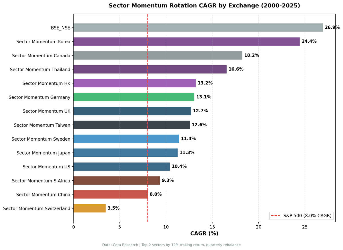
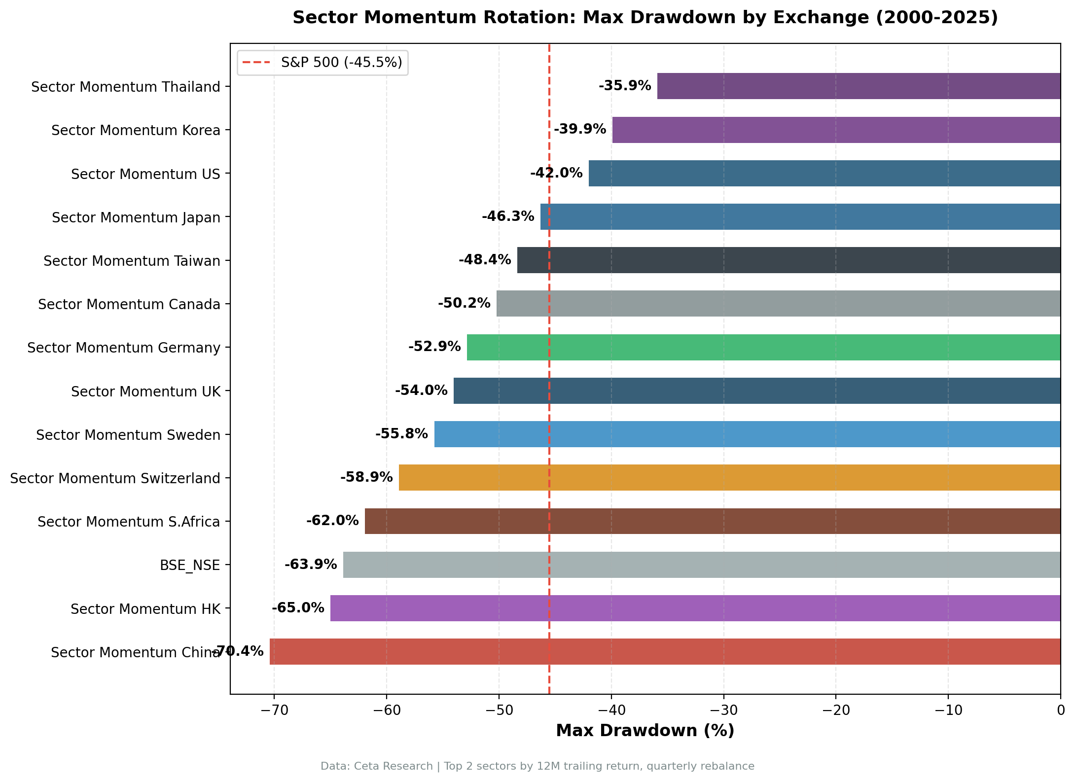
Full Results: 13 Exchanges
| Exchange | Market | CAGR | Excess vs Local | Sharpe | Max DD | Benchmark |
|---|---|---|---|---|---|---|
| NSE | India | 26.58% | +15.34% | 0.541 | -63.79% | Sensex |
| KSC | Korea | 24.23% | +18.68% | 0.735 | -40.00% | KOSPI |
| TSX | Canada | 17.92% | +12.66% | 0.627 | -45.45% | TSX Composite |
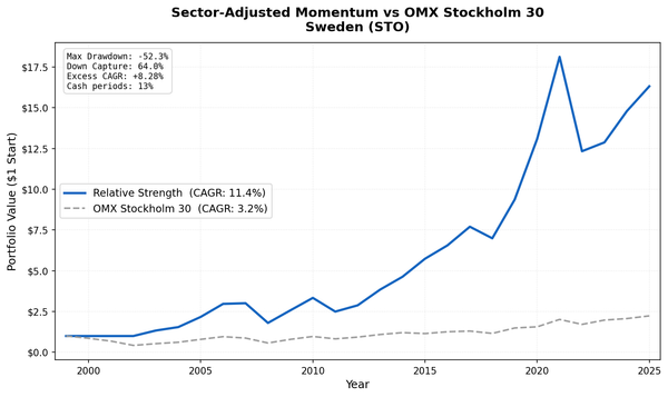
| STO | Sweden | 15.53% | +12.14% | 0.636 | -50.35% | OMX Stockholm 30 |
| LSE | UK | 15.10% | +13.55% | 0.616 | -47.05% | FTSE 100 |
| HKSE | Hong Kong | 14.85% | +13.24% | 0.427 | -61.24% | Hang Seng |
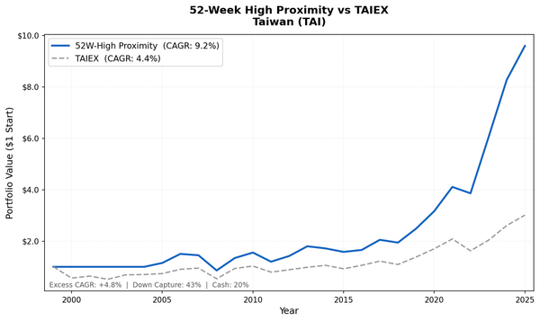
| TAI_TWO | Taiwan | 12.13% | +7.37% | 0.512 | -47.40% | TAIEX |
| SET | Thailand | 12.04% | +8.35% | 0.477 | -26.10% | SET Index |
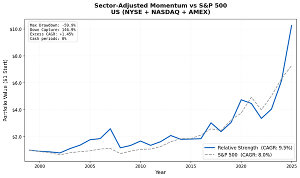
| NYSE_NASDAQ_AMEX | US | 11.90% | +3.88% | 0.467 | -38.02% | S&P 500 |
| JPX | Japan | 11.40% | +7.46% | 0.611 | -44.22% | Nikkei 225 |
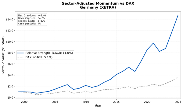
| XETRA | Germany | 11.13% | +6.04% | 0.501 | -56.54% | DAX |
| SIX | Switzerland | 7.87% | +5.55% | 0.420 | -44.90% | SMI |
| SHH_SHZ | China | 7.33% | +3.09% | 0.148 | -71.18% | SSE Composite |
South Africa (JNB) was excluded from this update due to FMP data coverage. With current data, the strategy held cash for 85 of 104 quarters, making results statistically meaningless.
What the Pattern Shows
Asia dominates
Korea (24.23% CAGR, Sharpe 0.735), India (26.58% CAGR), and Thailand (12.04% CAGR) are in a different category from every Western developed market. The gap isn't marginal. Korea's excess return is +18.68% annualized over KOSPI across 26 years. India beats the Sensex by +15.34%. These aren't small edges compounding over a short window.
Korea's Sharpe of 0.735 is the highest we've measured across any sector strategy on any exchange.
The explanation is sector persistence. Korea's Healthcare sector appeared in the top 2 for 34 out of 104 quarters. Consumer Defensive for 28 quarters. These aren't short-term blips. Korea's aging demographics created a structural demand trend for medical services and consumer staples that persisted across multiple market cycles.
India's Technology sector appeared in the top 2 for 29 quarters. Healthcare for 26 quarters. Utilities for 25 quarters. India is a high-growth economy where certain sectors genuinely run hotter for years. When a sector starts outperforming, the capital flows and earnings cycles sustain it longer than in a mature market. The +15.34% excess over the Sensex confirms the edge isn't just a rising-market artifact.
Canada surprises
Canada's +12.66% excess return over the TSX Composite is the biggest surprise in the developed world set. Basic Materials appeared in the top 2 for 39 quarters. Energy for 37 quarters. Technology for 36 quarters.
Canada's sector composition is concentrated in resources. When commodity cycles run, they run for years, not quarters. The basic materials and energy sectors in Canada were persistently dominant during the 2002-2007 commodity boom, then again during the 2020-2022 energy cycle. Sector momentum caught both of these and held positions throughout.
The cost: Canada's 2008 drawdown was -43.75%, worse than SPY (-34.31%). Commodity concentration cuts both ways.
Switzerland: the benchmark-choice lesson
In the previous version of this analysis, Switzerland was the only "failure" with -4.54% excess return vs SPY. That turned out to be a benchmark artifact.
Against its local index, the SMI, Switzerland's sector momentum strategy returned 7.87% CAGR with +5.55% annual excess. It beat the Swiss market comfortably. The confusion came from comparing Swiss franc-denominated returns against a USD-denominated S&P 500 that happened to grow faster than the SMI over 26 years.
Technology still appeared in the top 2 for 42 out of 104 quarters. That concentration concern is real. Swiss Technology is essentially Logitech and a cluster of mid-cap semiconductor and precision equipment companies. But the strategy still added value over the local market, even with limited rotation.
The lesson: always compare to the local benchmark, not a foreign index. A Swiss investor buying Swiss stocks should measure against the SMI, not against an American index in a different currency.
China: volatility without alpha
China's excess return is +3.09% over the SSE Composite across 26 years. The strategy beat the local benchmark, but with a -71.18% max drawdown. That's the worst drawdown in the dataset.
China's Energy sector appeared in the top 2 for 33 quarters. Technology for 32. Consumer Defensive for 31. The distribution is relatively balanced, which is why the strategy wasn't structurally broken in the same way as Switzerland. But the A-share market is highly volatile and momentum signals are noisy. Sector trends in China are partly driven by government policy shifts, speculative retail participation, and index rebalancing, rather than sustained earnings cycles. The signal fires, but the follow-through is inconsistent.
China is the clearest case of "strategy technically beats the benchmark but the underlying market dynamics make it hard to trust the edge."
Thailand: uncorrelated with global crashes
Thailand beat the SET Index by +8.35% annually with a -26.10% max drawdown, the shallowest in the dataset. The strategy is invested in domestically-oriented Thai sectors. Consumer Cyclical appeared for 31 quarters. Healthcare for 29. Consumer Defensive for 27. These sectors serve local demand, not global export cycles. When global markets crashed in 2008 or 2022, Thai consumer demand kept running.
The thin universe is a real constraint. With meaningful sector concentration, individual stock risk is higher than the aggregate numbers suggest.
South Africa: excluded (data quality)
South Africa (JNB) was excluded from this update. With current FMP data, the strategy held cash for 85 of 104 quarters. That's not a strategy result; it's a data coverage gap. The universe was too thin for the sector filter to find enough qualifying stocks most of the time. We'll revisit if data coverage improves.
The Regional Pattern
All 13 exchanges beat their local benchmark. The margin varies, and that variation tells you something about where momentum works best.
Asian markets (Korea, India, Thailand, Taiwan): High excess returns (+7% to +18% over local benchmarks), sector trends are long-lived, markets have lower efficiency than Western developed markets. Momentum anomalies persist longer because institutional arbitrage capital is smaller relative to market size.
Western developed markets (US, Germany, UK, Japan, Sweden, Switzerland): Moderate excess returns (+3% to +13% over local benchmarks), sector rotations are shorter-lived, significant institutional participation means momentum gets arbed away faster. The edge is thinner but still positive everywhere.
Commodity-heavy Canada: +12.66% over the TSX Composite. Outlier in the developed world due to structural concentration in resources. Sector momentum works because commodity cycles are long and persistent.
The Moskowitz and Grinblatt (1999) paper that established sector momentum as an academic anomaly was based on US data. The US results (+3.88% excess over the S&P 500) are consistent with that literature. The paper's authors were likely correct about the mechanism. The size of the anomaly scales with market inefficiency. Using local benchmarks makes this clearer: every market shows a positive edge, but the magnitude tracks inversely with market efficiency.
Limitations
Benchmarks: Each exchange uses its own local index (Sensex, KOSPI, SMI, etc.). This makes excess returns more meaningful per market but less directly comparable across markets. A +5% excess over the SMI and a +5% excess over the Sensex aren't equivalent in difficulty.
Currency: All returns are in local currency. A US investor accessing Korean or Indian stocks would face currency risk and additional transaction costs.
Data quality: FMP data includes most delisted stocks for larger exchanges (reducing survivorship bias), but coverage varies. South Africa was excluded entirely because FMP data gaps caused 85 of 104 cash periods.
Small universes: SET results should be interpreted cautiously. The strategy requires at least 10-15 qualifying stocks per sector for results to be statistically meaningful.
Run It Yourself
The full backtest code is available at github.com/ceta-research/backtests.
Run the live sector ranking screen on Ceta Research: cetaresearch.com/data-explorer?q=-oJZC4EYnB
Data: Ceta Research (FMP financial data warehouse). Backtest period: 2000-2025. All returns in local currency unless otherwise noted.
Past performance does not guarantee future results. This is educational content, not investment advice.