Revenue Market Share Gainers in Canada: +2.73% Annual Edge Over TSX
Canadian market-share gainers returned 6.7% annually with the shallowest drawdown of any exchange tested (-26.6%). The signal underperforms the benchmark but offers unusually good downside protection.

The strategy beats the TSX Composite by 2.73 percentage points per year over 25 years. It won 60% of calendar years against its local benchmark, held a max drawdown of -26.62% vs the TSX's -31.44%, and fell only 55 cents for every dollar the TSX dropped in down markets. For a rules-based screen with no macro overlay, that's a consistent result.
Contents
- Method
- Key Finding
- Results Summary
- Annual Returns (2000-2024)
- When It Worked
- When It Failed
- Why Canada Is Different
- Simple Screen
- Limitations
- Takeaway
- References
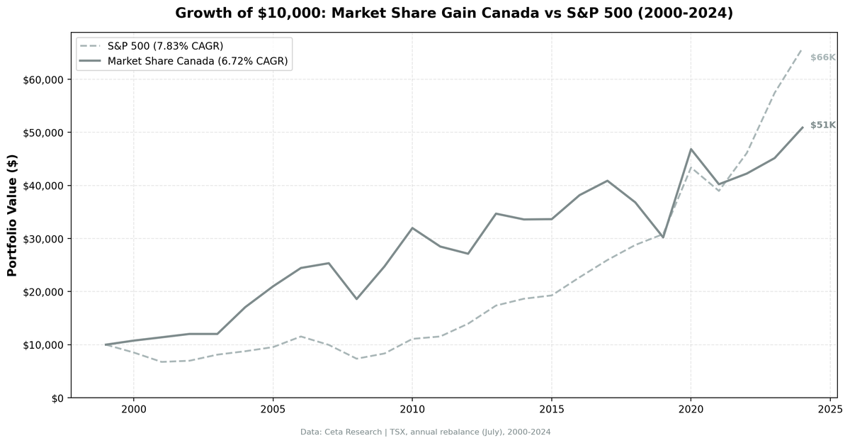
$10,000 invested in 2000 grew to $50,400 on the strategy vs $26,500 on the TSX Composite. CAGR of 6.68% vs 3.95%.
Data: FMP financial data warehouse, 2000–2025. Updated March 2026.
Method
We screened the TSX universe for companies whose revenue grew at least 10 percentage points faster than their sector median year-over-year. To qualify, a company also needed ROE above 8% and operating profit margin above 5%. This filters out companies growing revenues by burning cash or pricing aggressively at thin margins.
- Signal: YoY revenue growth exceeds sector median by ≥ 10 percentage points
- Quality filters: ROE > 8%, operating profit margin > 5%
- Universe: TSX, market cap > CAD 1B
- Portfolio: Equal weight, top 30 by revenue growth outperformance
- Rebalancing: Annual, July (45-day lag for point-in-time data)
- Cash rule: Hold cash if fewer than 10 names qualify
- Data quality guards: Entry price > $1, single-period return capped at 200%
- Benchmark: TSX Composite (^GSPTSE, price index)
- Period: 2000-2024 (25 years)
The 45-day lag is important. Annual reports filed in March/April for the prior fiscal year won't appear in July screens. This prevents look-ahead bias.
Note: the TSX Composite is a price-only index and does not include dividends. This is the standard Canadian equity benchmark for price performance comparisons.
Key Finding
The strategy posted a CAGR of 6.68% vs the TSX Composite's 3.95%, a +2.73% annual edge. The Sharpe ratio is 0.220, and the down capture vs the TSX is 55.06%.
Down capture of 55.06% means that in years when the TSX fell, this portfolio fell roughly 55 cents for every dollar the index lost. That's meaningfully defensive for a fully invested equity screen. The TSX's heavy weighting in energy, mining, and financials creates sharp drawdowns during commodity cycles. The sector-relative filter tends to exclude companies riding broad commodity tailwinds, which is where the TSX takes its worst hits.
The win rate of 60% (15 of 25 years) against the TSX is the other headline. More than half of calendar years, this portfolio outperformed its local market. That's a meaningful consistency signal for a factor screen.
Only 1 cash period in 25 years (2003). The TSX had enough qualifying companies in almost every year, meaning the sector-relative growth signal was consistently findable.
Results Summary
| Metric | Strategy | TSX Composite |
|---|---|---|
| CAGR (2000-2024) | 6.68% | 3.95% |
| Total Return | +403.96% | +165% (approx.) |
| Max Drawdown | -26.62% | -31.44% |
| Sharpe Ratio | 0.220 | — |
| Win Rate vs TSX | 60% (15/25 years) | — |
| Down Capture | 55.06% | — |
| Up Capture | 119.17% | — |
| Beta | 0.953 | — |
| Avg Stocks Held | 22.2 | — |
| Cash Periods | 1/25 years | — |
Annual Returns (2000-2024)
| Year | Strategy | TSX Comp | Excess |
|---|---|---|---|
| 2000 | +7.66% | -24.12% | +31.78% |
| 2001 | +5.27% | -9.35% | +14.62% |
| 2002 | +6.45% | -0.33% | +6.78% |
| 2003 | 0.0% (cash) | +21.42% | -21.42% |
| 2004 | +42.22% | +17.14% | +25.08% |
| 2005 | +23.04% | +18.02% | +5.02% |
| 2006 | +16.48% | +19.87% | -3.40% |
| 2007 | +3.66% | -0.22% | +3.88% |
| 2008 | -26.62% | -26.99% | +0.38% |
| 2009 | +33.11% | +9.27% | +23.84% |
| 2010 | +29.14% | +19.56% | +9.57% |
| 2011 | -10.90% | -11.49% | +0.58% |
| 2012 | -4.75% | +2.78% | -7.53% |
| 2013 | +27.83% | +24.89% | +2.94% |
| 2014 | -3.14% | -3.76% | +0.62% |
| 2015 | +0.15% | -2.59% | +2.74% |
| 2016 | +13.45% | +6.11% | +7.34% |
| 2017 | +5.46% | +7.49% | -2.03% |
| 2018 | -9.98% | +1.28% | -11.26% |
| 2019 | -17.91% | -5.15% | -12.76% |
| 2020 | +55.03% | +29.47% | +25.56% |
| 2021 | -14.12% | -5.92% | -8.20% |
| 2022 | +5.00% | +6.18% | -1.18% |
| 2023 | +6.91% | +8.66% | -1.75% |
| 2024 | +12.72% | +22.39% | -9.67% |
Returns are July-to-July. The max drawdown of -26.62% is a peak-to-trough figure across the full period, spanning the 2008-2009 crisis window.
When It Worked
2004 was the best single year: +42.22% vs TSX's +17.14% (+25.08% excess). Canada's resource boom was in full swing. The sector-relative filter identified energy and materials companies genuinely outpacing their peers, not just riding commodity prices. Companies taking real market share showed up clearly in relative revenue growth.
2000-2002: the strategy stayed positive through the TSX's worst stretch. The TSX dropped -24.12%, -9.35%, and -0.33% in those three years. The strategy returned +7.66%, +5.27%, and +6.45%. That's the defensive filter working as intended: quality companies with durable demand holding up while the broader market repriced.
2009: +33.11% vs +9.27% (+23.84% excess). The bounce year validated the thesis. A portfolio that held at -26.62% maximum had less ground to recover. Companies with continued revenue share gains recovered quickly when credit conditions normalized.
2020: +55.03% vs +29.47% (+25.56% excess). The largest single-year excess in the dataset. Post-lockdown recovery disproportionately rewarded companies already taking market share before the pandemic disrupted competitors.
When It Failed
2003: cash period (-21.42% excess). The screen found fewer than 10 qualifying names, triggering the cash rule. The TSX recovered +21.42% that year. Sitting in cash during a recovery is the main structural risk of any cash-holding screen.
2018-2019: two consecutive underperformance years (-11.26%, -12.76% excess). The strategy turned negative both years while the TSX fell only modestly. This was concentrated sector positioning: energy names that appeared to be taking share in 2017-2018 faced a commodity reversal, and the defensive quality filters weren't enough to avoid the sector-level selloff.
2024: +12.72% vs +22.39% (-9.67% excess). The TSX had a strong 2024, driven largely by financials and energy rebounding. The sector-relative filter, which tends to exclude pure commodity plays, missed that tailwind.
The up capture of 119.17% vs TSX is worth noting: when the TSX rises, this strategy typically rises more. That's consistent with the 60% win rate. The losses come from specific sector and timing mismatches, not from a systematic lag.
Why Canada Is Different
The TSX's sector composition creates the conditions for this pattern. Energy and mining are inherently cyclical. When oil is at $120, almost every energy company shows revenue growth. The sector-relative filter cuts through that noise: it only selects companies outpacing their own sector, not just riding the commodity cycle.
The result is a portfolio that tends to hold companies with durable demand. When commodity prices fall and drag the TSX down, those companies hold up better than the index. Down capture of 55.06% reflects this. The portfolio still falls with the TSX in bad years, but it falls less.
The other factor is market cap concentration. The TSX is dominated by large financials (the major banks) and large resource companies. The MCap > CAD 1B filter further concentrates the portfolio in established operators with stable margins. Small-cap speculative names, which cause the most volatility in the TSX broadly, are largely excluded.
Beta of 0.953 vs the TSX means this isn't a low-correlation bet on Canadian equities. It moves with the market. The edge comes from systematic quality and relative growth selection within that market, not from diversifying away from it.
Simple Screen
This is the core screen, adapted for TSX. Run it in July, after June-end filings are available.
WITH profile_data AS (
    SELECT DISTINCT symbol, sector
    FROM profile
    WHERE sector IS NOT NULL AND sector != ''
      AND exchange IN ('TSX')
),
rev_current AS (
    SELECT symbol, revenue,
        ROW_NUMBER() OVER (PARTITION BY symbol ORDER BY dateEpoch DESC) AS rn
    FROM income_statement
    WHERE period = 'FY' AND revenue IS NOT NULL AND revenue > 0
),
rev_prior AS (
    SELECT symbol, revenue AS prior_revenue,
        ROW_NUMBER() OVER (PARTITION BY symbol ORDER BY dateEpoch DESC) AS rn
    FROM income_statement
    WHERE period = 'FY' AND revenue IS NOT NULL AND revenue > 0
),
growth AS (
    SELECT rc.symbol, pd.sector,
        (rc.revenue - rp.prior_revenue) / rp.prior_revenue AS rev_growth,
        k.returnOnEquityTTM, k.marketCap, f.operatingProfitMarginTTM
    FROM rev_current rc
    JOIN rev_prior rp ON rc.symbol = rp.symbol AND rp.rn = 2
    JOIN key_metrics_ttm k ON rc.symbol = k.symbol
    JOIN financial_ratios_ttm f ON rc.symbol = f.symbol
    JOIN profile_data pd ON rc.symbol = pd.symbol
    WHERE rc.rn = 1 AND rp.prior_revenue > 0
      AND k.returnOnEquityTTM > 0.08
      AND f.operatingProfitMarginTTM > 0.05
      AND k.marketCap > 1000000000
),
sector_stats AS (
    SELECT sector,
        PERCENTILE_CONT(0.5) WITHIN GROUP (ORDER BY rev_growth) AS median_growth
    FROM growth GROUP BY sector HAVING COUNT(*) >= 3
)
SELECT g.symbol, g.sector,
    ROUND(g.rev_growth * 100, 1) AS rev_growth_pct,
    ROUND((g.rev_growth - ss.median_growth) * 100, 1) AS excess_growth_pct,
    ROUND(g.returnOnEquityTTM * 100, 1) AS roe_pct,
    ROUND(g.operatingProfitMarginTTM * 100, 1) AS opm_pct,
    ROUND(g.marketCap / 1e9, 1) AS mktcap_bn
FROM growth g
JOIN sector_stats ss ON g.sector = ss.sector
WHERE (g.rev_growth - ss.median_growth) >= 0.10
ORDER BY excess_growth_pct DESC
LIMIT 30
The excess_growth >= 0.10 condition is the 10 percentage point excess threshold. Adjust the MCap floor for currency changes over time.
Limitations
Currency. TSX returns here are in USD terms (converted from CAD). A strengthening CAD boosts returns, a weakening one hurts them. The 2000s resource boom coincided with a CAD appreciation cycle, which inflated some of the early outperformance years.
Concentration. Averaging 22.2 stocks is reasonable, but down years in Canada often saw the portfolio cluster in two or three sectors (energy, materials). Sector diversification within the screen isn't guaranteed.
Benchmark. The TSX Composite is a price-only index and does not include dividends. A total-return TSX benchmark would show a higher index CAGR, which would reduce the strategy's excess return figure. The +2.73% annual edge cited here is against the price index only.
Down capture context. A down capture of 55.06% means the portfolio falls less than the TSX in bad years. But it still falls. In a severe downturn with no commodity sector safe havens, the results could look different.
Takeaway
Against the local benchmark, the Canada market share screen delivers. It beat the TSX Composite by +2.73% per year across 25 years, won 60% of calendar years, and held its maximum drawdown to -26.62% vs the TSX's -31.44%.
The signal works in Canada because the TSX's sector structure creates a real distinction between companies riding commodity cycles and companies genuinely outperforming their peers. The sector-relative filter identifies the latter. The quality filters (ROE > 8%, margin > 5%) exclude the most fragile names.
The one honest caveat: this benchmark is a price index. A total-return comparison would narrow the gap. But even accounting for that, a 60% win rate and better drawdown control over 25 years is a durable result.
Data: Ceta Research (FMP financial data warehouse), 2000-2024. Full methodology: METHODOLOGY.md. Past performance does not guarantee future results. This is educational content, not investment advice.
References
- Jegadeesh, N. & Livnat, J. (2006). "Revenue Surprises and Stock Returns." Journal of Accounting and Economics, 41(1-2), 147-171.
- Piotroski, J. & So, E. (2012). "Identifying Expectation Errors in Value/Glamour Strategies." Review of Financial Studies, 25(9), 2841-2875.