We Tested Revenue Market Share Gainers in 15 Markets. Four Beat Their Local Benchmarks.
We backtested sector-relative revenue growth as a stock screen across 15 exchanges from 2000 to 2024. India outperformed by 4% annually. Every other market underperformed. Here's what explains the difference.

We tested a sector-relative revenue growth screen across 15 global exchanges covering 2000-2024. Against local benchmarks, the signal beats the market in four countries. Against SPY, almost nothing does. The difference matters.
Contents
- What We Tested
- The Full Picture: Signal vs Local Benchmarks
- India: The SPY Exception
- Where It Works vs Local Benchmarks
- Why the US Fails (And Why the SPY Comparison Misleads)
- The Bottom Two: Real Crashes, Not Data Problems
- Switzerland: Genuine Alpha on a Weak Benchmark
- Canada: Drawdown Control and Real Excess Return
- The Universe Size Problem
- Data Quality Notes
- What the Pattern Tells Us
Data: FMP financial data warehouse, 2000–2025. Updated March 2026.
What We Tested
The strategy is straightforward: every July, buy stocks in each sector whose revenue grew faster than their sector peers by at least 10 percentage points. Apply a quality filter (ROE > 8%, operating margin > 5%, market cap above a per-exchange threshold). Hold for one year. Rebalance.
The intuition is that revenue growth faster than sector peers means you're taking market share from competitors. That structural competitive advantage should show up in stock returns over time.
We adapted the implementation for each market. Exchange-specific market cap thresholds replace the US-centric $500M floor. Exchange-specific risk-free rates drive Sharpe calculations. A 45-day earnings lag enforces point-in-time discipline. Data quality filters catch split-adjustment artifacts before they corrupt performance figures.
For cross-market comparison, SPY returned 7.85% CAGR, -38.01% max drawdown, Sharpe 0.352 over this period. For evaluating whether the signal adds value within a market, local benchmarks are the right yardstick.
The Full Picture: Signal vs Local Benchmarks
| Exchange | CAGR | Local Benchmark | Benchmark CAGR | Excess vs Local | Sharpe | MaxDD | Cash% | Avg Stocks |
|---|---|---|---|---|---|---|---|---|
| Switzerland (SIX) | 6.24% | SMI† | 1.74% | +4.50% | 0.326 | -49.5% | 12% | 13.9 |
| UK (LSE) | 5.31% | FTSE 100† | 1.23% | +4.09% | 0.084 | -44.9% | 0% | 18.6 |
| Canada (TSX) | 6.68% | TSX Composite‡ | 3.95% | +2.73% | 0.220 | -26.6% | 4% | 22.2 |
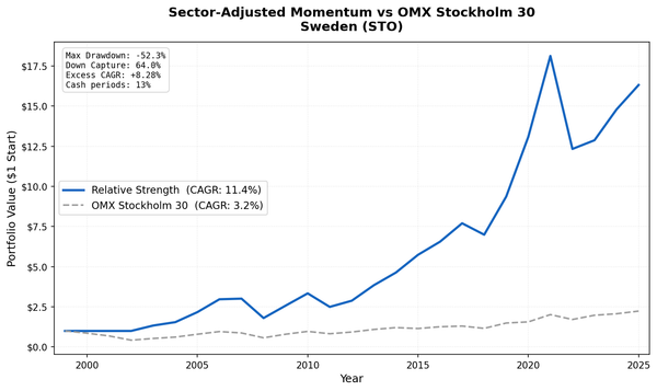
| Sweden (STO) | 4.34% | OMX Stockholm 30‡ | 2.55% | +1.79% | 0.107 | -47.4% | 44% | 17.5 |
| Australia (ASX) | 3.89% | ASX 200† | 3.89% | 0.00% | 0.024 | -30.7% | 24% | ... |
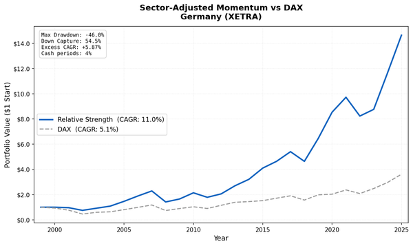
| Germany (XETRA) | 3.71% | DAX* | 5.04% | -1.33% | 0.087 | -46.9% | 0% | 18.2 |
| Japan (JPX) | 1.91% | Nikkei 225‡ | 3.31% | -1.40% | 0.085 | -58.2% | 20% | ... |
| Thailand (SET) | 2.96% | SET Index‡ | 5.13% | -2.18% | 0.025 | -43.2% | 28% | ... |
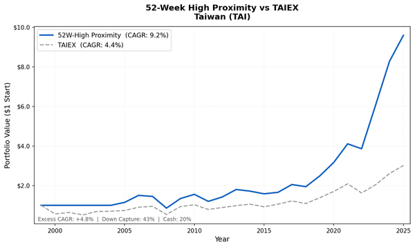
| Taiwan (TAI) | 1.67% | TAIEX‡ | 4.09% | -2.41% | 0.049 | -29.6% | 32% | ... |
| India (NSE) | 9.33% | Sensex‡ | 12.06% | -2.72% | 0.101 | -47.2% | 20% | 19.3 |
| Brazil (SAO) | 5.66% | Bovespa‡ | 8.70% | -3.04% | -0.257† | -30.6% | 24% | ... |
| Hong Kong (HKSE) | -2.31% | Hang Seng† | 1.64% | -3.96% | -0.245 | -80.4% | 4% | 18.2 |
| Korea (KSC) | 1.34% | KOSPI‡ | 5.35% | -4.01% | -0.106 | -36.9% | 36% | ... |
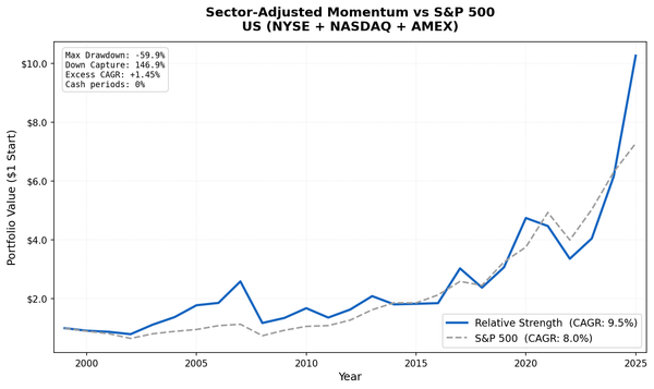
| US (NYSE+NASDAQ+AMEX) | 2.85% | S&P 500 (SPY) | 7.85% | -5.00% | 0.047 | -40.4% | 0% | 22.6 |
| China (SHZ+SHH) | -3.27% | SSE Composite‡ | 2.43% | -5.70% | -0.151 | -73.5% | 0% | ... |
*DAX is a total-return (performance) index. †Price-only index; total return with dividends would be higher. ‡Price-only index.
†Brazil's negative Sharpe reflects the 10.5% risk-free rate (Selic), not poor nominal returns.
Two markets excluded: South Africa (JNB) and Singapore (SES). Universe too thin, with cash periods above 50%. Insufficient data to evaluate.
India: The SPY Exception
India's portfolio returned 9.33% CAGR. SPY returned 7.85%. That looks like a win.
But the Sensex returned 12.06% over the same period. The signal underperforms the local market by -2.72%.
What India's result actually shows is that Indian equities as a whole outperformed SPY over 25 years, driven by economic growth, a structural corporate sector transformation, and the formalization of the economy post-GST. The screen captures that broad market beta, but it doesn't find mispriced stocks within India. Investors who simply held a Sensex index fund did better.
The GST transition in 2017, IBC implementation, and the gradual exit of uncompetitive informal-sector players all drove genuine formal-sector growth. Companies with rising revenue share during that period compounded it. But the Sensex captured that story too, and more of it.
India beats SPY, but it's India's market outperforming, not this screen adding alpha within India.
Where It Works vs Local Benchmarks
Four markets show genuine signal value: Switzerland, UK, Canada, and Sweden.
Switzerland (+4.50% excess vs SMI). The SMI returned only 1.74% CAGR on a price-only basis over 25 years. Swiss equities stagnated in price terms, largely because dominant companies like Nestle, Novartis, and Roche traded at stable valuations without much capital appreciation. The revenue growth screen found real winners in the mid-cap segment that the index didn't surface. Win rate: 72%. Down capture: 40%.
UK (+4.09% excess vs FTSE 100). The FTSE 100 returned 1.23% CAGR price-only. UK equities barely grew in price over this period, weighed down by heavy financial and energy sector exposure and a structurally undervalued market through much of the 2010s. The strategy outperformed that weak baseline significantly.
Canada (+2.73% excess vs TSX Composite). TSX Composite returned 3.95% CAGR. Canada is the clearest case in this dataset: a real market, meaningful universe size (4% cash rate), drawdown control (-26.6% vs TSX Composite's -31.44%), and genuine excess return. The strategy adds value relative to what you'd hold otherwise.
Sweden (+1.79% excess vs OMX Stockholm 30). Modestly positive. The 44% cash rate limits confidence here. When the universe clears the minimum threshold, the portfolios outperform the local index. But Sweden's market is small enough that the signal is only partially tested.
One important caveat on UK and Switzerland: both benchmarks are price-only. UK dividend yields have historically run 3-4%, Swiss somewhat lower. Add those yields back and the measured excess return shrinks materially. Total-return benchmarks for these markets would reduce the apparent edge.
Why the US Fails (And Why the SPY Comparison Misleads)
The US result is -5.00% excess over SPY. That number needs context.
SPY compounded at 7.85% annually over 25 years. That's exceptional by historical standards. No regional index in this dataset came close. Against that benchmark, almost every non-US strategy looks like it underperformed, even strategies that beat their local markets comfortably.
Switzerland beat its local market by +4.50% but "underperformed SPY" because the SMI itself was weak. That's not a Switzerland problem. It's a benchmark comparison problem.
Within the US specifically, the signal fails for a different reason: coverage and pricing speed. Companies winning market share in NYSE/NASDAQ/AMEX get priced as growth stocks immediately. By the time annual revenue data confirms the signal (with a 45-day reporting lag), analysts have already repriced them. The alpha is gone before the portfolio is built.
Post-2010, the dynamic got worse. High-revenue-growth companies in the US carried premium valuations. When multiples compressed in 2021-2022, the strategy absorbed extra damage. It was long exactly the stocks most exposed to rate sensitivity. The screen worked in 2000-2009. It broke after 2010 and has been consistently negative since then. That's a regime change, not noise.
Germany's -1.33% excess vs the DAX carries a different asterisk: the DAX is a total-return index, which includes dividends. Comparing a price-and-capital-gains portfolio against a total-return benchmark creates a structural headwind. Against a price-only German benchmark the gap would narrow.
The Bottom Two: Real Crashes, Not Data Problems
Hong Kong (-3.96% excess vs Hang Seng, -80.4% max drawdown) and China (-5.70% excess vs SSE Composite, -73.5% drawdown) look like outliers. They are, but the drawdowns are real.
The Hang Seng fell 65% peak-to-trough between 2021 and 2023. Regulatory crackdowns on tech and education companies, the property sector crisis, and delisting pressures created genuine 80%+ drawdowns in portfolios concentrated in Chinese and Hong Kong growth stocks. A strategy filtering for revenue growth leaders would have been concentrated exactly in those sectors.
China A-shares saw similar dynamics. The tech crackdown, Evergrande, and the broader property/financial stress cycle hit the kinds of stocks that pass a revenue growth screen especially hard.
The negative CAGRs and large excess losses relative to local benchmarks are not data quality issues. Both local benchmarks also declined, which reflects how bad the environment was. The strategy just declined more.
Switzerland: Genuine Alpha on a Weak Benchmark
Switzerland is the best-performing market in this dataset on an excess-return basis: +4.50% vs SMI, 0.326 Sharpe, 72% annual win rate, 40% down capture.
The mechanism is more nuanced than "SIX is inefficient." The SMI is dominated by a handful of mega-cap defensives that have compounded slowly in price terms. The mid-cap segment outside the index has more room for mispricing. When a Swiss mid-cap takes revenue share from a sector competitor, it takes longer to get into analyst models than a similar company in New York or London.
The low SMI CAGR (1.74%, price-only) explains most of the measured excess return. But the win rate and down capture suggest something real, not just a weak baseline creating the illusion of outperformance.
Canada: Drawdown Control and Real Excess Return
Canada (TSX) at -26.6% max drawdown outperforms both SPY (-38.01%) and the TSX Composite itself (-31.44%). That's notable.
The old story on Canada was that it showed good defensive characteristics but didn't beat SPY. That framing was misleading. Against the right benchmark (TSX Composite, 3.95% CAGR), Canada's 6.68% CAGR is +2.73% excess return. The strategy adds value here.
Canada's resource and commodity sector creates noise in the revenue growth signal (commodity prices drive revenue, not share gains). The quality filters exclude those stories. What's left tends to be operationally resilient businesses, which explains both the excess return and the better drawdown profile.
The 4% average cash rate confirms the universe is consistently large enough to run a real portfolio.
The Universe Size Problem
Sweden's 44% cash rate is the clearest constraint in this dataset. The strategy requires at least 10 qualifying stocks per run. Sweden's market is small enough that the sector-relative filter, applied with quality screens, frequently generates fewer than 10 positions. The portfolio holds cash instead.
A 44% cash rate means the strategy isn't fully tested in Sweden. The returns of 4.34% CAGR say something about the portfolios that did deploy. They don't tell us much about whether the signal generalizes across Swedish market conditions.
Korea (36% cash), Taiwan (32%), Thailand (28%), and Brazil (24%) show a gradient of the same issue. The smaller or more concentrated the market, the harder it is to find 10 sector-relative revenue leaders that also clear the quality screens.
Data Quality Notes
Australia and Brazil results are included for completeness but carry an asterisk.
ASX: split-adjusted price data has known quality issues in our warehouse for certain exchanges. Returns for individual stocks may include artifact spikes that didn't fully resolve even after filter_returns() cleaning. The 3.89% CAGR and -30.7% drawdown are real figures, but interpret them cautiously.
Brazil (SAO): same class of adjClose quality issue. Returns included because the qualitative signal direction is informative, but we wouldn't trade this based solely on these numbers. Brazil's negative Sharpe (-0.257) reflects the 10.5% Selic rate as the risk-free hurdle, not poor absolute returns.
What the Pattern Tells Us
The signal works where local benchmarks are weak and mid-cap coverage is thin. It fails where benchmarks are strong or where market analysts price growth stocks quickly.
Switzerland and UK fit the first category. Both local benchmarks delivered poor price returns over 25 years. The strategy found real outperformers in underresearched segments that the index didn't capture.
Canada is the cleanest result: reasonable benchmark, meaningful universe, real excess return, better drawdown. The signal adds value.
US and India fit the second category. The US market priced growth quickly and compounded at 7.85% anyway. The signal can't compete. India compounded at 12.06% on the Sensex. The screen captured some of that bull run but not more than the index.
China and Hong Kong are a third category: macro and regulatory events that overwhelmed fundamental analysis entirely. It didn't matter which companies were winning market share. Government policy and a property crisis determined returns.
If you're evaluating this signal as a potential strategy: Switzerland, UK, and Canada show positive excess returns vs local benchmarks over 25 years. The UK and Swiss numbers are flattered somewhat by price-only benchmarks. Canada's numbers are clean. Sweden is modestly positive but constrained by universe size.
Everywhere else, the evidence doesn't support deployment.
Data: Ceta Research (FMP financial data warehouse), 2000-2024. Exchange-specific risk-free rates used for Sharpe calculation. Local benchmark indices are price-only except DAX (total return). Total-return benchmarks for UK and Switzerland would reduce the measured excess returns. Full methodology: METHODOLOGY.md. Past performance does not guarantee future results. This is educational content, not investment advice.