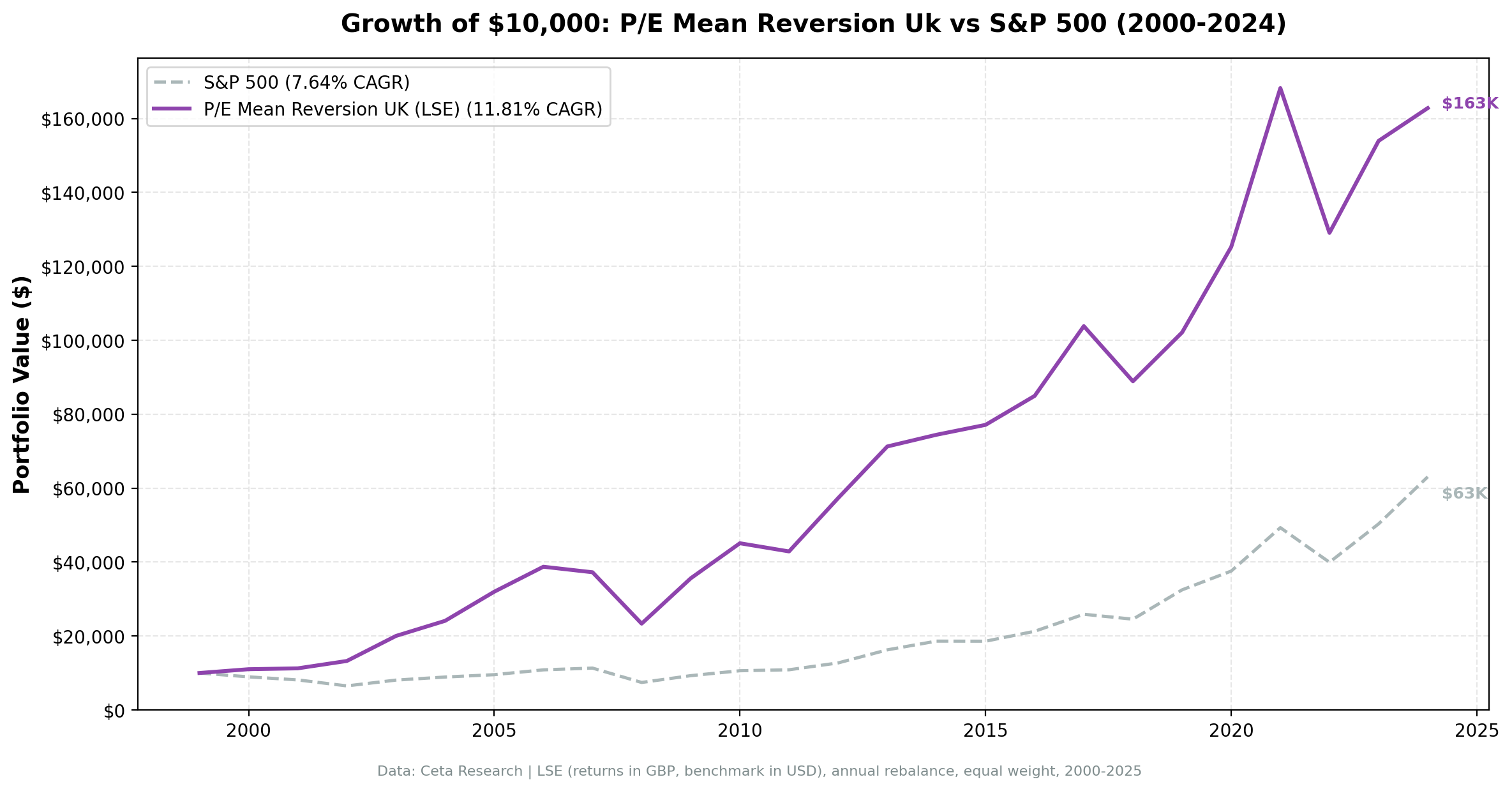
P/E Mean Reversion (Sector-Relative): 11.81% CAGR Over UK Stock Data


We tested a sector-relative P/E mean reversion screen on 25 years of UK stock data from the London Stock Exchange. The signal buys stocks trading at a deep discount to sector peers: stock P/E below 60% of its sector median, filtered for quality. The strategy returned 11.81% annually vs 7.64% for the S&P 500, with 4.16% excess return, 42% down-capture, and strong asymmetric returns (118% up-capture).
Contents
- Method
- What Is Sector-Relative P/E Mean Reversion?
- The Screen
- Sector-Relative P/E Screen. UK (LSE)
- What We Found
- 25 years. 4.16% annual alpha. Exceptional downside protection.
- Year-by-year returns
- 2000-2006: where the alpha was built
- 2002 and 2009: the standout defensive years
- 2012 and 2021: value rotation wins
- 2019 and 2024: growth regime drag
- Backtest Methodology
- Limitations
- Conclusion
Of all 13 exchanges tested, the UK delivered the highest absolute excess return.
Method
- Data source: Ceta Research (FMP financial data warehouse)
- Universe: London Stock Exchange (LSE), market cap > £500M
- Period: 2000-2024 (25 years, 0 cash periods)
- Rebalancing: Annual (January), equal weight, top 30 by deepest P/E discount to sector
- Benchmark: S&P 500 Total Return (SPY)
- Cash rule: Hold cash if fewer than 10 stocks qualify
Financial data sourced from financial_ratios_ttm for P/E ratios, key_metrics_ttm for ROE and market cap. 45-day lag on all financial statements to prevent look-ahead bias. Returns in GBP (local currency). S&P 500 used as global reference benchmark, not a local UK index.
What Is Sector-Relative P/E Mean Reversion?
This strategy is different from comparing a stock's P/E to its own history. Instead, it compares each stock's P/E to the current median P/E of its sector peers. A stock trading at a 40%+ discount to where similar companies are priced is what triggers the buy.
If Healthcare stocks on the LSE trade at a median P/E of 18x and a specific company trades at 10x, that's a 44% discount. The bet: if fundamentals are sound (profitable, not overleveraged), the gap will close. Either the stock re-rates upward, or it gets acquired, or earnings growth reduces the denominator.
The cross-sectional framing matters. You're not asking "is this cheap vs its own history?" You're asking "is this cheap vs everything else in its industry right now?" That question is sharper, especially in a market like the UK where sectors are structurally different from each other.
Signal: - P/E range: 3-50 (exclude extreme valuations and negative earnings) - Stock P/E < 60% of sector median P/E (40%+ discount to peers) - Minimum 5 stocks in sector required to compute a valid median
Quality filters:
| Criterion | Metric | Threshold |
|---|---|---|
| Profitable | Return on Equity | > 8% |
| Manageable debt | Debt-to-Equity | < 2.0 |
Size:
| Criterion | Metric | Threshold |
|---|---|---|
| Institutional grade | Market Cap | > £500M |
Stocks must pass all filters. Top 30 by deepest discount (lowest P/E ratio-to-sector) are selected each year, equal weighted.
The Screen
Sector-Relative P/E Screen. UK (LSE)
WITH universe AS (
 SELECT k.symbol, p.companyName, p.exchange, p.sector,
 fr.priceToEarningsRatioTTM AS pe_ttm, k.returnOnEquityTTM AS roe,
 fr.debtToEquityRatioTTM AS de, k.marketCap
 FROM key_metrics_ttm k
 JOIN financial_ratios_ttm fr ON k.symbol = fr.symbol
 JOIN profile p ON k.symbol = p.symbol
 WHERE fr.priceToEarningsRatioTTM BETWEEN 3 AND 50
 AND k.returnOnEquityTTM > 0.08
 AND (fr.debtToEquityRatioTTM IS NULL OR (fr.debtToEquityRatioTTM >= 0 AND fr.debtToEquityRatioTTM < 2.0))
 AND k.marketCap > 500000000
 AND p.sector IS NOT NULL
 AND p.exchange IN ('LSE')
),
sector_medians AS (
 SELECT exchange, sector,
 PERCENTILE_CONT(0.5) WITHIN GROUP (ORDER BY pe_ttm) AS median_pe,
 COUNT(*) AS n_sector_stocks
 FROM universe GROUP BY exchange, sector HAVING COUNT(*) >= 5
)
SELECT u.symbol, u.companyName, u.sector,
 ROUND(u.pe_ttm, 2) AS pe_ttm, ROUND(sm.median_pe, 2) AS sector_median_pe,
 ROUND(u.pe_ttm / sm.median_pe, 3) AS pe_ratio_to_sector,
 ROUND((1 - u.pe_ttm / sm.median_pe) * 100, 1) AS discount_pct,
 ROUND(u.roe * 100, 1) AS roe_pct, ROUND(u.de, 2) AS debt_to_equity,
 ROUND(u.marketCap / 1e6, 0) AS mktcap_m_gbp
FROM universe u JOIN sector_medians sm ON u.exchange = sm.exchange AND u.sector = sm.sector
WHERE u.pe_ttm / sm.median_pe < 0.60
ORDER BY u.pe_ttm / sm.median_pe ASC LIMIT 30
Run this query on Ceta Research
What We Found
25 years. 4.16% annual alpha. Exceptional downside protection.
| Metric | P/E Mean Reversion (UK) | S&P 500 |
|---|---|---|
| CAGR | 11.81% | 7.64% |
| Total Return | 1,527.54% | 530.71% |
| Sharpe Ratio | 0.397 | 0.322 |
| Sortino Ratio | 0.781 | 0.556 |
| Max Drawdown | -39.74% | -34.90% |
| Up Capture | 118.45% | 100% |
| Down Capture | 42.08% | 100% |
| Win Rate | 56% | - |
| Avg Stocks per Year | 15.6 | - |
| Cash Periods | 0 of 25 | - |
The result is striking. £10,000 grew to £162,754 vs £63,071 for the S&P 500, more than 3x the benchmark's terminal value. The Sharpe ratio improved from 0.322 to 0.397, and the Sortino ratio jumped from 0.556 to 0.781.
The number that stands out is the 42% down-capture. When the S&P 500 fell 10%, this UK portfolio fell only 4.2% on average. That's not typical for a long-only stock strategy. The sector-relative signal does most of the work: stocks bought at a 40%+ discount to peers have less room to fall on sentiment alone.
Zero cash periods across 25 years. The UK's sector diversity, spanning Financials, Consumer Staples, Healthcare, Materials, and Industrials, means the screen always finds qualifying stocks even in elevated markets.
Year-by-year returns
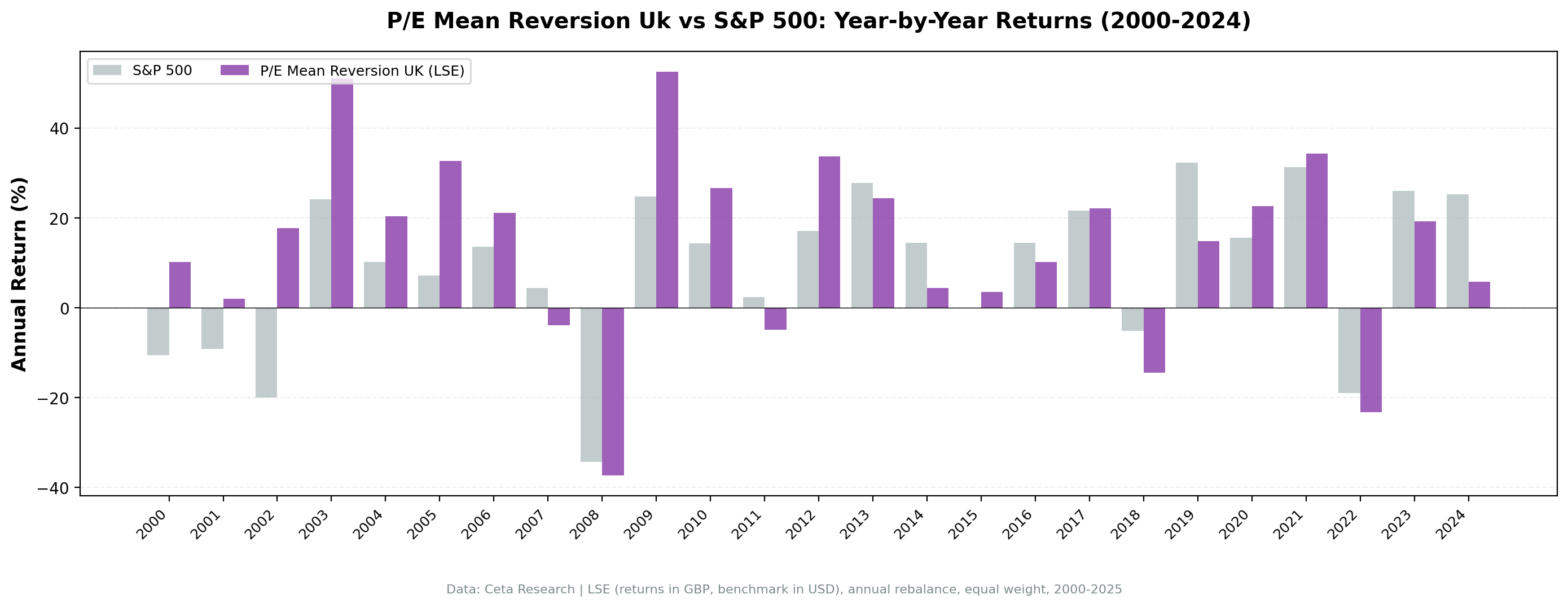
| Year | P/E Mean Reversion (UK) | S&P 500 | Excess |
|---|---|---|---|
| 2000 | +10.2% | -10.5% | +20.8% |
| 2001 | +2.1% | -9.2% | +11.3% |
| 2002 | +17.7% | -19.9% | +37.6% |
| 2003 | +51.1% | +24.1% | +27.0% |
| 2004 | +20.4% | +10.2% | +10.2% |
| 2005 | +32.6% | +7.2% | +25.5% |
| 2006 | +21.1% | +13.7% | +7.5% |
| 2007 | -3.9% | +4.4% | -8.3% |
| 2008 | -37.3% | -34.3% | -3.0% |
| 2009 | +52.6% | +24.7% | +27.8% |
| 2010 | +26.6% | +14.3% | +12.3% |
| 2011 | -4.9% | +2.5% | -7.4% |
| 2012 | +33.6% | +17.1% | +16.6% |
| 2013 | +24.4% | +27.8% | -3.4% |
| 2014 | +4.4% | +14.5% | -10.1% |
| 2015 | +3.6% | -0.1% | +3.7% |
| 2016 | +10.2% | +14.4% | -4.3% |
| 2017 | +22.2% | +21.6% | +0.6% |
| 2018 | -14.4% | -5.2% | -9.2% |
| 2019 | +14.9% | +32.3% | -17.5% |
| 2020 | +22.6% | +15.6% | +7.0% |
| 2021 | +34.3% | +31.3% | +3.0% |
| 2022 | -23.3% | -19.0% | -4.3% |
| 2023 | +19.3% | +26.0% | -6.7% |
| 2024 | +5.8% | +25.3% | -19.5% |
2000-2006: where the alpha was built
The first seven years were extraordinary. During the dot-com bust, UK value stocks held firm. In 2002, the portfolio gained +17.7% while the S&P 500 fell -19.9%, a 37.6% gap. Then the recovery (2003-2006) compounded heavily, with the strategy averaging +29% per year against +12% for the index.
The reason: the UK entered the 2000s with a structurally value-heavy market. Financials, energy, and defensives made up most of the LSE by weight. These sectors had depressed P/E ratios early in the decade, and the sector-relative signal found the best names within each group.
By the time the credit bubble was fully inflated in 2007-2008, those early gains had built a large buffer.
2002 and 2009: the standout defensive years
| Event | P/E Mean Reversion (UK) | S&P 500 | Gap |
|---|---|---|---|
| Dot-com bust (2000-2002) | +32.7% | -35.1% | +67.8% |
| Financial crisis (2008) | -37.3% | -34.3% | -3.0% |
| Post-crisis recovery (2009-2010) | +92.8% | +43.1% | +49.7% |
| Euro crisis recovery (2012) | +33.6% | +17.1% | +16.5% |
2002 stands out. Most markets fell hard; this portfolio gained 17.7%. That's not luck. Stocks already at a deep discount to sector peers had little multiple compression left. They fell less because the pessimism was already priced in.
2008 was the exception. The portfolio fell -37.3%, nearly identical to the S&P 500's -34.3%. Correlated global deleveraging doesn't respect valuation discounts. When banks need to sell everything, the cheapest stocks go too.
The recovery, however, was sharp. 2009 delivered +52.6%, more than double the S&P 500's +24.7%. Sector-relative discount stocks benefit most from the snapback because the re-rating has further to go.
2012 and 2021: value rotation wins
Two more years are worth flagging: 2012 (+33.6% vs +17.1%) and 2021 (+34.3% vs +31.3%).
2012 was a UK-specific value moment. After the European sovereign debt crisis hammered UK Financials, Materials, and Industrials disproportionately, those sectors recovered hard. The sector-relative screen was concentrated in the cheapest names within each group going into 2012. It captured most of the recovery.
2021 was the post-COVID reopening value rotation. Growth stocks had dominated in 2020. By early 2021, UK cyclicals and value stocks were trading at extreme discounts to their sector peers globally. The rotation into these names was powerful, and the strategy was fully positioned for it.
2019 and 2024: growth regime drag
| Year | P/E Mean Reversion (UK) | S&P 500 | Excess |
|---|---|---|---|
| 2019 | +14.9% | +32.3% | -17.5% |
| 2024 | +5.8% | +25.3% | -19.5% |
These two years represent the strategy's structural weakness. In growth-dominated regimes, the S&P 500 is pulled higher by a small number of high-multiple tech and platform companies. The sector-relative UK screen has no mechanism to capture that. It holds cheap-relative-to-peers UK stocks, and those stocks don't reprice in a US tech bull market.
2024 was particularly sharp. The strategy returned +5.8%, not a bad absolute return, but the S&P 500's +25.3% meant a -19.5% excess gap. Same dynamic as US value strategies: growth dominance makes relative P/E screens look broken until the cycle turns.
Backtest Methodology
Full methodology documentation: backtests/METHODOLOGY.md
| Parameter | Choice |
|---|---|
| Universe | LSE, Market Cap > £500M |
| Signal | Stock P/E < 60% of sector median P/E, P/E 3-50, ROE > 8%, D/E < 2.0 |
| Portfolio | Top 30 by lowest P/E ratio-to-sector, equal weight |
| Rebalancing | Annual (January) |
| Cash rule | Hold cash if < 10 qualify |
| Benchmark | S&P 500 Total Return (SPY) |
| Period | 2000-2024 (25 years) |
| Currency | GBP (local) |
| Data | Point-in-time (45-day lag on FY financial statements) |
| Transaction costs | 0.1% one-way (size-tiered by market cap) |
Limitations
2008 was a full drawdown year. The 42% down-capture is a 25-year average. In 2008 the portfolio fell -37.3%, nearly in line with the S&P 500's -34.3%. Systemic selloffs eliminate valuation-based protection. The metric describes normal market conditions, not crisis conditions.
Smaller portfolio than US. The average holding is 15.6 stocks per year. That's above the 10-stock minimum, but it's concentrated. A bad year for two or three sectors can dominate returns. The US strategy ran with 25+ stocks on average.
Currency exposure. Returns are in GBP. For non-GBP investors, sterling movements against their home currency add a layer of risk not captured in this backtest. GBP/USD has moved ±20% in single years (2016 Brexit shock, for instance).
Win rate is 56%. The strategy beat the S&P 500 in 14 of 25 years. That's a slim majority. Investors need patience for the years when growth dominates, and those stretches can last 2-3 years in a row.
2024 was severe. The -19.5% excess gap in 2024 is a reminder that growth regime drag can be painful. The absolute return was fine (+5.8%), but relative to the benchmark the strategy looks poor in any growth-dominated year.
Survivorship bias. Exchange membership uses current profiles, not historical. Delistings, bankruptcies, and acquisitions aren't fully tracked, which is a standard limitation of this backtest approach.
Conclusion
Sector-relative P/E mean reversion on UK stocks delivered 4.16% annual alpha over 25 years, the strongest excess return of any exchange in the 13-market test. The down-capture of 42% is exceptional for a long-only strategy. £10,000 grew to £162,754 vs £63,071 for the S&P 500.
The UK's sector diversity is part of the explanation. Financials, Healthcare, Consumer Staples, Materials, and Industrials are all large enough on the LSE to produce meaningful sector medians. When one sector cheapens relative to peers, the signal finds it. That cross-sectional comparison is sharper than comparing a stock to its own history.
The strategy has clear failure modes: correlated crises (2008), growth regime dominance (2019, 2024), and sector concentration in a thin universe. But over a full cycle, the asymmetry holds. You capture more of the up and less of the down, and that compounds well over 25 years.
Part of a Series: Global | US | India | Germany
Run It Yourself
Explore the data behind this analysis on Ceta Research. Query our financial data warehouse with SQL, build custom screens, and run your own backtests across 70,000+ stocks on 20 exchanges.
Data: Ceta Research (FMP financial data warehouse). Returns in GBP. S&P 500 used as global reference benchmark. Past performance doesn't guarantee future results. See full methodology at github.com/ceta-research/backtests.