Rising Dividend Yield: Separating Compounders from Value Traps on 25 Years of US Data
We screened for stocks with 3 consecutive years of rising dividend yield driven by dividend growth, then backtested on all US exchanges from 2000 to 2025. 9.54% CAGR, +1.69% alpha, zero cash periods.

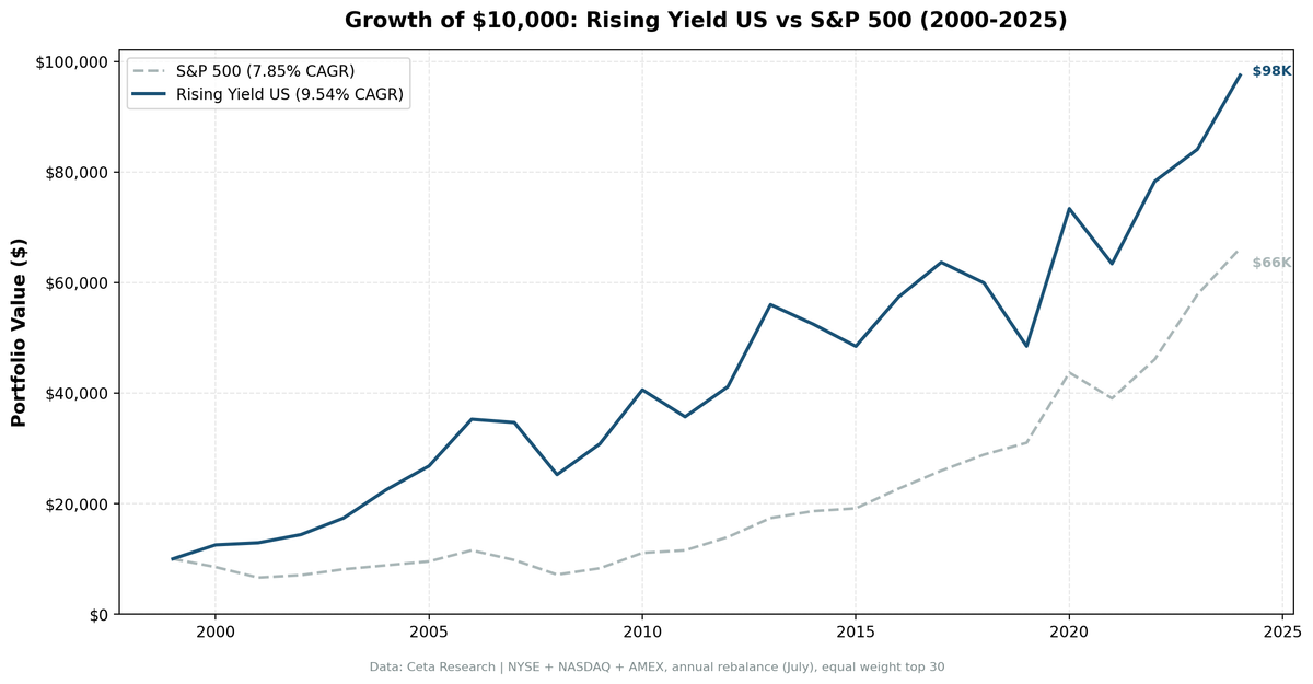
We screened for stocks with 3 consecutive years of rising dividend yield, filtered for cases where the increase came from dividend growth (not falling prices), and backtested the strategy on all US exchanges from 2000 to 2025. The portfolio returned 9.54% annually vs 7.85% for the S&P 500, with zero cash periods and an average of 27 stocks per rebalance. The signal works, but it's the driver classification that makes the difference.
Contents
- Method
- The Concept
- The Screens
- Rising Yield Screen (SQL)
- What We Found
- 25 years of data. +1.69% annual alpha over the S&P 500.
- Year-by-year returns
- The early 2000s: the strategy's best stretch
- The 2018-2019 gap
- Pre/Post-GFC split
- Backtest Methodology
- Historical Research
- When It Works
- When It Struggles
- Limitations
- Takeaway
- Part of a Series
- References
- Run This Screen Yourself
Data: FMP financial data warehouse, 2000–2025. Updated March 2026.
Method
Data source: Ceta Research (FMP financial data warehouse) Universe: All US exchanges (NYSE, NASDAQ, AMEX), market cap > $1B USD Period: 2000-2025 (25 years, 25 annual periods) Rebalancing: Annual (July), equal weight top 30 by 2-year yield expansion Benchmark: S&P 500 Total Return (SPY) Cash rule: Hold cash if fewer than 10 stocks qualify Transaction costs: Size-tiered (0.1% for >$10B, 0.3% for $2-10B, 0.5% for <$2B, one-way)
For the full methodology, metrics definitions, and data quality procedures, see our public methodology.
The Concept
Dividend yield is a ratio: annual dividend per share divided by stock price. When yield rises over multiple years, one of two things happened.
Scenario A: The dividend grew faster than the price. Management raised the payout. The stock held steady or rose, but not as fast as the dividend. This is the bullish signal. The company is confident enough in cash flows to keep raising the distribution.
Scenario B: The price dropped. The dividend stayed flat or declined less than the price. Yield expanded mechanically. This might signal undervaluation, but more often the market is pricing in future trouble.
The distinction matters. A screen that just sorts by "yield went up" mixes both groups together. You get a portfolio that's half quality compounders and half falling knives.
This is not the same as dividend growth. A company can grow its dividend 10% per year and still see its yield fall if the stock price rises 15%. That's great for shareholders but it won't show up in a rising yield screen. Dividend growth tracks absolute payments. Rising yield tracks the trajectory of the yield ratio itself.
Caveat on driver classification: The binary split (DPS grew vs. didn't) can mask mixed scenarios. A stock might fall 5% while DPS rises 2%. Yield goes up, DPS went up, so it shows "Dividend Growth." But the price decline is doing most of the work. Our backtest requires consecutive DPS growth across both years to mitigate this, but it doesn't eliminate the ambiguity entirely.
The Screens
Rising Yield Screen (SQL)
WITH yearly_yield AS (
    SELECT r.symbol, r.date,
        r.fiscalYear AS yr,
        r.dividendYield,
        r.dividendPerShare,
        r.dividendPayoutRatio,
        LAG(r.dividendYield, 1) OVER (PARTITION BY r.symbol ORDER BY r.fiscalYear) AS yield_1yr,
        LAG(r.dividendYield, 2) OVER (PARTITION BY r.symbol ORDER BY r.fiscalYear) AS yield_2yr,
        LAG(r.dividendPerShare, 1) OVER (PARTITION BY r.symbol ORDER BY r.fiscalYear) AS dps_1yr,
        LAG(r.dividendPerShare, 2) OVER (PARTITION BY r.symbol ORDER BY r.fiscalYear) AS dps_2yr
    FROM financial_ratios r
    WHERE r.period = 'FY' AND r.dividendYield > 0
),
screened AS (
    SELECT y.symbol, y.date, y.yr,
        y.dividendYield, y.dividendPerShare, y.dividendPayoutRatio,
        (y.dividendYield - y.yield_2yr) AS yield_change_2yr,
        CASE
            WHEN y.dividendPerShare > y.dps_1yr AND y.dps_1yr > y.dps_2yr THEN 'Consecutive DPS Growth'
            WHEN y.dividendPerShare > y.dps_1yr THEN 'Partial DPS Growth'
            ELSE 'Price Decline Driver'
        END AS yield_driver
    FROM yearly_yield y
    WHERE y.yield_2yr IS NOT NULL
      AND y.dividendYield > y.yield_1yr AND y.yield_1yr > y.yield_2yr
      AND y.dividendPerShare > y.dps_1yr
      AND y.dividendPayoutRatio > 0 AND y.dividendPayoutRatio < 0.75
      AND y.dividendYield < 0.25  -- drop data-artifact yields (funds, mis-annualized specials)
    QUALIFY ROW_NUMBER() OVER (PARTITION BY y.symbol ORDER BY y.date DESC) = 1
)
SELECT s.symbol, p.companyName,
    ROUND(s.dividendYield * 100, 2) AS yield_pct,
    ROUND(s.yield_change_2yr * 100, 2) AS yield_expansion_2yr_pct,
    s.yield_driver,
    ROUND(s.dividendPayoutRatio * 100, 1) AS payout_pct,
    ROUND(k.returnOnEquityTTM * 100, 1) AS roe_pct,
    ROUND(k.marketCap / 1e9, 1) AS market_cap_b
FROM screened s
JOIN key_metrics_ttm k ON s.symbol = k.symbol
JOIN profile p ON s.symbol = p.symbol
WHERE k.returnOnEquityTTM > 0.10
  AND k.marketCap > 1e9
  AND p.exchange IN ('NYSE', 'NASDAQ', 'AMEX')
  AND p.isFund = false AND p.isEtf = false AND p.isActivelyTrading = true
ORDER BY s.yield_change_2yr DESC
LIMIT 30
Run this query on Ceta Research
The LAG window functions pull the previous two fiscal years of dividendYield for each stock. The WHERE clause enforces the monotonic increase: current > 1yr ago > 2yr ago. The yield_driver column classifies whether DPS grew consecutively. We rank by 2-year yield expansion and take the top 30.
What We Found

25 years of data. +1.69% annual alpha over the S&P 500.
| Metric | Rising Yield (US) | S&P 500 |
|---|---|---|
| CAGR | 9.54% | 7.85% |
| Total Return | 875% | 562% |
| Volatility | 19.2% | 16.6% |
| Max Drawdown | -28.42% | -38.01% |
| Sharpe Ratio | 0.392 | 0.352 |
| Sortino Ratio | 0.848 | 0.628 |
| Win Rate (annual) | 52% | - |
| Avg Stocks per Period | 26.5 | - |
| Cash Periods | 0 of 25 | - |
The strategy turned $10,000 into roughly $98,000. The S&P 500 turned it into roughly $66,000. The portfolio was fully invested every single year, averaging 27 stocks per rebalance.
The drawdown story: -28.42% vs -38.01%. The rising yield screen, by filtering for companies actively growing their dividends, avoided the worst of major sell-offs. The Sharpe ratio confirms this: 0.392 vs 0.352. More return per unit of risk.
Year-by-year returns
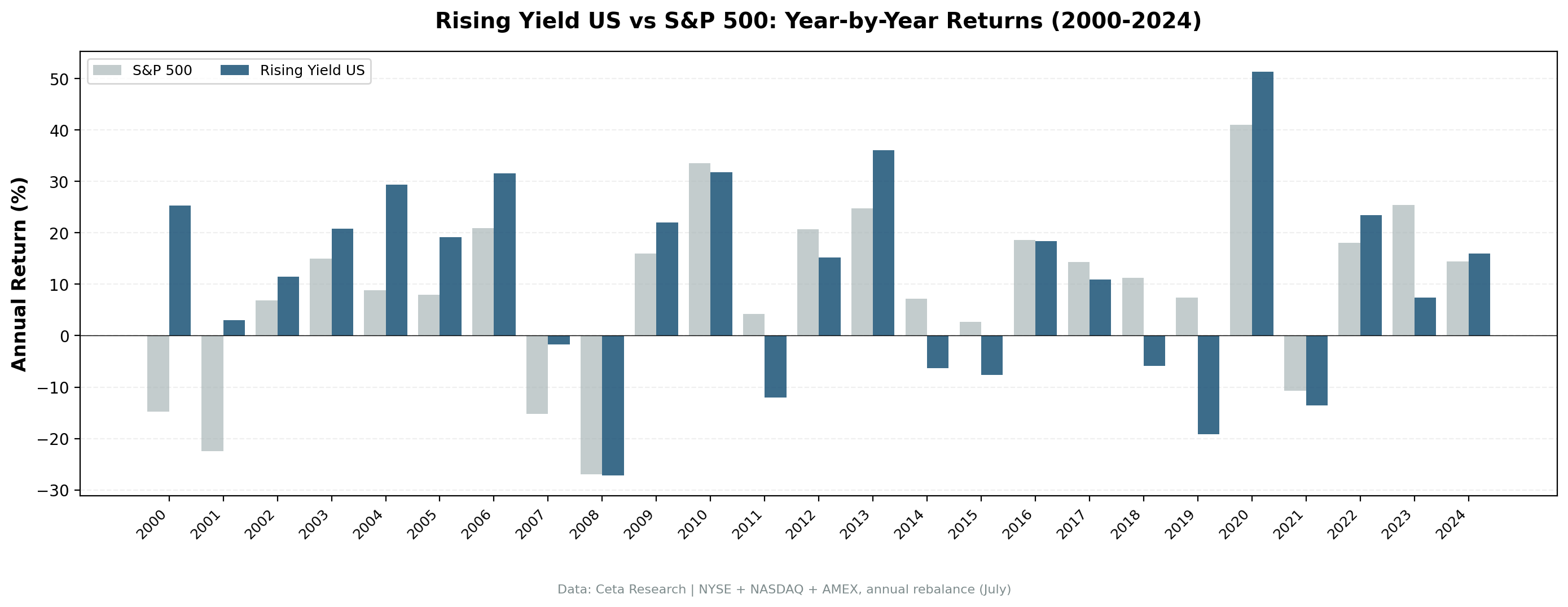
| Year | Rising Yield | S&P 500 | Excess |
|---|---|---|---|
| 2000 | +25.3% | -14.8% | +40.1% |
| 2001 | +3.1% | -22.5% | +25.5% |
| 2002 | +11.4% | +6.9% | +4.6% |
| 2003 | +20.9% | +14.9% | +5.9% |
| 2004 | +29.4% | +8.9% | +20.6% |
| 2005 | +19.1% | +8.0% | +11.1% |
| 2006 | +31.6% | +21.0% | +10.7% |
| 2007 | -1.7% | -15.2% | +13.5% |
| 2008 | -27.2% | -26.9% | -0.3% |
| 2009 | +22.0% | +16.0% | +6.0% |
| 2010 | +31.8% | +33.6% | -1.7% |
| 2011 | -12.0% | +4.2% | -16.2% |
| 2012 | +15.3% | +20.7% | -5.5% |
| 2013 | +36.1% | +24.7% | +11.3% |
| 2014 | -6.3% | +7.2% | -13.5% |
| 2015 | -7.6% | +2.7% | -10.4% |
| 2016 | +18.4% | +18.6% | -0.2% |
| 2017 | +11.0% | +14.3% | -3.4% |
| 2018 | -5.9% | +11.2% | -17.1% |
| 2019 | -19.1% | +7.4% | -26.5% |
| 2020 | +51.3% | +41.0% | +10.4% |
| 2021 | -13.6% | -10.7% | -2.9% |
| 2022 | +23.5% | +18.1% | +5.4% |
| 2023 | +7.4% | +25.4% | -18.0% |
| 2024 | +15.9% | +14.4% | +1.5% |
The early 2000s: the strategy's best stretch
| Year | Rising Yield | S&P 500 | Excess |
|---|---|---|---|
| 2000 | +25.3% | -14.8% | +40.1% |
| 2001 | +3.1% | -22.5% | +25.5% |
| Cumulative (2000-01) | +29.1% | -33.9% | +63.0% |
While the S&P 500 lost 34% during the dot-com bust, the rising yield portfolio gained 29%. Dividend growers were insulated from the tech bubble. Companies raising their dividends weren't the ones trading at 100x earnings.
2004-2007 was also strong. The screen loaded up on mature companies growing dividends through the mid-2000s expansion. Even in 2007, the portfolio held nearly flat (-1.7%) while the market dropped 15.2%.
The 2018-2019 gap
2018 and 2019 were the worst two years: -5.9% and -19.1% vs the S&P 500's +11.2% and +7.4%. Growth stocks dominated. Companies with fast-growing yields tend to be mature, cash-rich businesses. They don't participate in momentum-driven markets. The 2020 bounce (+51.3%) recovered most of the damage, but anyone holding through 2019 would have been tested.
Pre/Post-GFC split
The strategy has a clear structural break around the Global Financial Crisis:
| Period | Avg Annual Excess |
|---|---|
| 2000-2010 | +12.4% |
| 2011-2019 | -9.0% |
| 2020-2024 | -0.7% |
The first decade was the best: dividend growers outperformed massively during both the dot-com bust and the GFC recovery. The 2011-2019 stretch was tough as growth stocks dominated. Post-2020 is mixed. The pattern suggests the strategy's edge is strongest during market stress and value rotations.
Backtest Methodology
| Parameter | Choice |
|---|---|
| Universe | NYSE + NASDAQ + AMEX, Market Cap > $1B USD |
| Signal | 3yr rising dividendYield, DPS growth driver, ROE > 10%, Payout < 75% |
| Portfolio | Top 30 by 2-year yield expansion, equal weight |
| Rebalancing | Annual (July) |
| Cash rule | Hold cash if < 10 qualify |
| Benchmark | S&P 500 Total Return (SPY) |
| Period | 2000-2025 (25 years) |
| Transaction costs | Size-tiered (0.1-0.5% one-way) |
| Data | Point-in-time (FY filings, no look-ahead bias) |
Historical Research
Campbell and Shiller (1988) decomposed the dividend-price ratio into expected future dividends and expected future returns. Their key finding: a high dividend-price ratio predicts higher future stock returns. Cochrane (2008) extended this and argued that virtually all variation in dividend-price ratios reflects changing expected returns, not changing expected dividend growth.
For this strategy, the implication is straightforward. When we filter for rising yield driven by DPS growth, we're capturing the quality end of the spectrum. The academic evidence says dividend-price ratios carry predictive power. Our screen isolates the subset where that predictive power comes from improving fundamentals, not deteriorating prices.
When It Works
After market corrections. The strategy's biggest wins came in 2000-2001, 2004, 2007, and 2020. Dividend growers tend to be overlooked during crashes and are repriced upward during recoveries.
In value-oriented markets. When investors rotate from growth to value, companies with rising dividend yields attract capital. They offer income plus growth potential.
Mature sectors with pricing power. Utilities, consumer staples, industrials. Companies in these sectors grow dividends because they have predictable cash flows.
When It Struggles
During growth rallies. 2018-2019 was painful. The market rewarded revenue growth and momentum, not dividend trajectories. Rising yield stocks are, by definition, not the fastest-growing names.
In falling rate environments. Lower rates benefit growth stocks disproportionately through lower discount rates. Dividend yield becomes a smaller component of total return.
Limitations
Driver classification is imperfect. The binary DPS growth check doesn't account for mixed scenarios where both price decline and DPS growth contribute to yield expansion. Consecutive DPS growth requirement mitigates this but can't eliminate it.
FY data lag. We use annual fiscal year data. There's a gap between the fiscal year end and when filings become available. July rebalancing gives companies time to file, but some data may still be stale.
No dividend cut prediction. The screen finds stocks with rising yield trajectories. It can't predict if the next announcement is a cut. Payout ratio and ROE filters reduce this risk.
Survivorship bias. Exchange membership uses current profiles, not historical. IPOs and delistings aren't tracked over time.
Recent underperformance. The strategy trailed the S&P 500 in 10 of the last 14 years (2011-2024). Factor cyclicality is real.
Takeaway
Rising dividend yield works as a US stock selection signal. 9.54% CAGR, +1.69% annual alpha, zero cash periods, 27 stocks per rebalance. The driver classification is what makes it work: filtering for DPS growth removes the falling-knife stocks that would otherwise pollute the signal.
The cost is clear. You'll lag during growth-driven markets. 2018-2019 was a combined -24% gap vs the benchmark. The strategy requires patience through these cycles. Over 25 years, the math works. Over any given 3-year stretch, it might not.
Part of a Series
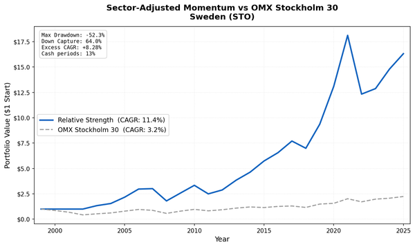
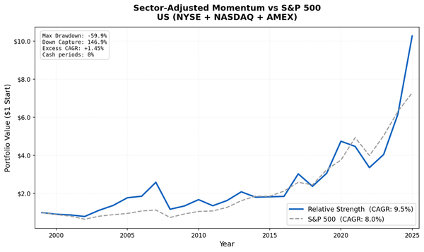
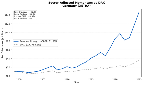
This analysis is part of our rising dividend yield global exchange comparison. We tested the same signal on 15 exchanges worldwide: - Rising Yield on Indian Stocks (BSE + NSE) - 13.44% CAGR, the standout performer - Rising Yield on German Stocks (XETRA) - 8.94% CAGR, +3.90% vs DAX - Rising Yield on Canadian Stocks (TSX) - 8.48% CAGR, zero cash periods - Rising Yield on Japanese Stocks (JPX) - 8.94% CAGR, highest Sharpe of all markets - Rising Yield on UK Stocks (LSE) - 6.56% CAGR, +5.34% vs FTSE 100 - Rising Yield: 15-Exchange Global Comparison - full comparison table
References
- Campbell, John Y., and Robert J. Shiller. "The Dividend-Price Ratio and Expectations of Future Dividends and Discount Factors." Review of Financial Studies 1, no. 3 (1988): 195-228.
- Cochrane, John H. "The Dog That Did Not Bark: A Defense of Return Predictability." Review of Financial Studies 21, no. 4 (2008): 1533-1575.
Run This Screen Yourself
Via web UI: Run the Rising Yield screen on Ceta Research. The query is pre-loaded. Hit "Run" and see what passes today.
Via Python:
import requests, time

API_KEY = "your_api_key"  # get one at cetaresearch.com
BASE = "https://tradingstudio.finance/api/v1"

resp = requests.post(f"{BASE}/data-explorer/execute", headers={
    "X-API-Key": API_KEY, "Content-Type": "application/json"
}, json={
    "query": """
        WITH yearly_yield AS (
            SELECT r.symbol, r.date, r.fiscalYear AS yr,
                r.dividendYield, r.dividendPerShare, r.dividendPayoutRatio,
                LAG(r.dividendYield, 1) OVER (PARTITION BY r.symbol ORDER BY r.fiscalYear) AS yield_1yr,
                LAG(r.dividendYield, 2) OVER (PARTITION BY r.symbol ORDER BY r.fiscalYear) AS yield_2yr,
                LAG(r.dividendPerShare, 1) OVER (PARTITION BY r.symbol ORDER BY r.fiscalYear) AS dps_1yr
            FROM financial_ratios r
            WHERE r.period = 'FY' AND r.dividendYield > 0
        )
        SELECT y.symbol,
            ROUND(y.dividendYield * 100, 2) AS yield_pct,
            ROUND((y.dividendYield - y.yield_2yr) * 100, 2) AS expansion_pct
        FROM yearly_yield y
        JOIN key_metrics_ttm k ON y.symbol = k.symbol
        JOIN profile p ON y.symbol = p.symbol
        WHERE y.yield_2yr IS NOT NULL
            AND y.dividendYield > y.yield_1yr AND y.yield_1yr > y.yield_2yr
            AND y.dividendPerShare > y.dps_1yr AND y.dividendYield < 0.25
            AND k.returnOnEquityTTM > 0.10 AND k.marketCap > 1e9
            AND p.exchange IN ('NYSE', 'NASDAQ', 'AMEX')
            AND p.isFund = false AND p.isEtf = false AND p.isActivelyTrading = true
        QUALIFY ROW_NUMBER() OVER (PARTITION BY y.symbol ORDER BY y.date DESC) = 1
        ORDER BY (y.dividendYield - y.yield_2yr) DESC LIMIT 30
    """,
    "options": {"format": "json", "limit": 100}
})
task_id = resp.json()["taskId"]

while True:
    result = requests.get(f"{BASE}/tasks/data-query/{task_id}",
                          headers={"X-API-Key": API_KEY}).json()
    if result["status"] in ("completed", "failed"):
        break
    time.sleep(2)

for r in result["result"]["rows"][:10]:
    print(f"{r['symbol']:8s} Yield={r['yield_pct']}% Expansion={r['expansion_pct']}%")
Get your API key at cetaresearch.com. The full backtest code (Python + DuckDB) is on GitHub.
Data: Ceta Research, FMP financial data warehouse. Universe: NYSE + NASDAQ + AMEX. Annual rebalance (July), equal weight top 30, 2000-2025.
Past performance does not guarantee future results. This is educational content, not investment advice.