Small-Cap Growth UK: Beats a Benchmark That Went Nowhere
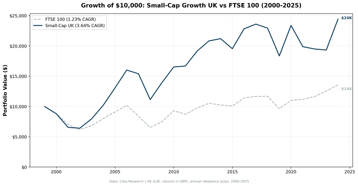
UK small-cap growth returned 3.64% CAGR and beat the FTSE 100 by 2.41 points a year. The FTSE 100 returned 1.23%, which is the only reason that was possible.

CAGR: 3.64% | Excess: +2.41%/yr vs FTSE 100 | Sharpe: 0.008 | Max Drawdown: -35.89% | Win Rate: 60%
Contents
- The Method
- What We Found
- Annual Returns
- Why the Premium Has Eroded in the UK
- When It Works
- When It Fails
- Limitations
- Run It Yourself
- Takeaway
- References
The UK result is the clearest illustration of why local excess return can be misleading.
Over 25 years the strategy returned 3.64% a year and beat the FTSE 100 by +2.41%/yr, winning 15 of 25 years. That reads like a win. Then you look at the absolute numbers: $10,000 became $24,435, a Sharpe ratio of 0.008, and eleven negative years out of twenty-five. The FTSE 100 turned the same $10,000 into $13,561, which is why beating it by two and a half points a year was possible without making much money.
Twenty-five years of UK equity risk for roughly what a savings account would have paid. That's the honest summary.
Data: FMP financial data warehouse, 2000-2025. Updated August 2026.
The Method
We screened LSE-listed stocks each July for:
- Market cap between £25M and £1B
- Revenue growth >15% year-over-year (most recent fiscal year)
- Positive net income
- Debt/equity ratio below 2.0
Top 30 by revenue growth, equal-weight, rebalanced annually in July with a 45-day filing lag, entering at the next-day close. The portfolio was fully invested all 25 years with no cash periods, averaging 16.3 holdings.
The framework follows Fama & French (1993) and Banz (1981) on the small-cap size premium, with profitability and growth screens to filter out distressed names.
What We Found
The excess is front-loaded. From 2000 to 2009 the strategy beat the FTSE 100 in 7 of 10 years by an average of 7.3 percentage points. From 2010 to 2017 it won 6 of 8, but the average margin fell to 1.0 point. From 2018 to 2024 it won 2 of 7 and the average excess turned negative at -0.7 points. The premium didn't collapse in one year, it decayed.
137% up capture, 86% down capture. Against the FTSE 100 the portfolio amplified gains and absorbed most of the losses, with a beta of 1.17. That's not a defensive profile, it's a higher-beta bet on UK equities that happened to pay off because the index was so weak.
The drawdown is worse than the index in a useful sense. -35.89% against the FTSE 100's -38.07% is only marginally better, and it came on a portfolio with 17.5% annualised volatility against a benchmark that itself lost money in risk-adjusted terms (Sharpe -0.176). Nobody should feel protected by this.
2008 and 2019 were the bad ones. The worst absolute year was 2008 (-27.69%), and 2019 (-20.00%) came as Brexit uncertainty peaked before the December election resolved the deadlock. The worst excess year was 2021 (-16.52%), when the strategy lost 14.99% while the FTSE 100 gained 1.54%.
2024 was the standout. +26.41% against the FTSE 100's +8.05%, an 18.4 point excess and the best relative year in the sample.
Annual Returns
| Year | Strategy | FTSE 100 | Excess vs FTSE 100 |
|---|---|---|---|
| 2000 | -12.00% | -11.65% | -0.35% |
| 2001 | -25.56% | -20.46% | -5.10% |
| 2002 | -2.14% | -11.87% | +9.73% |
| 2003 | +23.92% | +10.00% | +13.92% |
| 2004 | +28.45% | +17.63% | +10.82% |
| 2005 | +28.08% | +13.50% | +14.58% |
| 2006 | +22.61% | +12.00% | +10.61% |
| 2007 | -3.89% | -17.67% | +13.78% |
| 2008 | -27.69% | -21.97% | -5.72% |
| 2009 | +25.21% | +14.26% | +10.95% |
| 2010 | +18.53% | +24.38% | -5.85% |
| 2011 | +0.97% | -6.26% | +7.23% |
| 2012 | +14.79% | +11.76% | +3.03% |
| 2013 | +8.74% | +8.13% | +0.61% |
| 2014 | +1.81% | -2.73% | +4.54% |
| 2015 | -7.84% | -1.63% | -6.20% |
| 2016 | +16.86% | +13.11% | +3.75% |
| 2017 | +3.38% | +2.31% | +1.06% |
| 2018 | -2.80% | +0.15% | -2.95% |
| 2019 | -20.00% | -17.45% | -2.55% |
| 2020 | +27.42% | +14.15% | +13.27% |
| 2021 | -14.99% | +1.54% | -16.52% |
| 2022 | -1.95% | +4.07% | -6.02% |
| 2023 | -0.89% | +7.89% | -8.78% |
| 2024 | +26.41% | +8.05% | +18.36% |
Return years run July to July, matching the rebalance date. Best year: 2004 (+28.45%). Worst year: 2008 (-27.69%).
Why the Premium Has Eroded in the UK
The small-cap premium documented by Banz (1981) and Fama & French (1993) was strongest in earlier data. In developed European markets like the UK, institutional capital has systematically priced out that gap over the past two decades, and the decay pattern in the table above is what that looks like.
Brexit. The 2016 referendum created sustained uncertainty. The pound fell, international capital pulled back from UK small-caps, and domestic companies with primarily UK revenue faced headwinds. The 2019 loss of 20.00% came as that uncertainty peaked. The economic overhang outlasted the political resolution.
UK market composition. The LSE small-cap space is dominated by financial services, property, and domestically-focused consumer companies. These aren't high-growth sectors by nature, and revenue growth above 15% is harder to sustain in them. The screen concentrates into a narrow set of industries, which creates concentration risk on top of everything else.
Currency effects. The backtest uses local currency returns. The pound weakened substantially post-2016, so an international investor holding UK small-caps in dollar terms would have faced currency drag on top of the return shortfall.
When It Works
Recovery years from sharp drawdowns. 2003, 2009 and 2020 were all strong. The strategy participates meaningfully when markets bounce back hard from dislocations, because the companies growing revenues above 15% tend to be the ones with genuine business momentum.
Bear markets in UK large caps. 2002, 2007 and 2011 all beat the FTSE 100 while the index fell. Losing 3.89% in 2007 while the FTSE 100 lost 17.67% is real relative capital preservation, even though the absolute return is nothing to celebrate.
When It Fails
When the FTSE 100 does well. 2010, 2021, 2022 and 2023 all saw the index gain while the strategy lagged or lost. The excess return depends on a weak benchmark, and when the benchmark isn't weak the edge disappears.
Late-cycle and political risk. 2019 was bad in absolute terms and only slightly worse than the FTSE 100. Political risk concentrated in a single country's small-cap universe is hard to diversify away.
Limitations
The 60% win rate against the FTSE 100 looks strong, but the benchmark returned 1.23% a year over 25 years and had a negative Sharpe ratio. Beating a bad benchmark doesn't make a strategy good. In absolute terms the strategy delivered 3.64% a year with a -35.89% maximum drawdown and eleven losing years.
The universe is companies listed on the LSE, not UK companies. A large share of LSE listings are foreign secondary lines, many of them thinly traded with days of zero volume. We didn't run the domicile-restricted variant for the UK, so treat the composition of this universe as an open question.
Excluding closed-end funds and ETFs from the universe, which report investment income as revenue and so can rank on a revenue-growth screen, raises the UK result from 3.64% to 4.87% CAGR. The UK is one of the two markets where this makes a material difference. See the US post for the full analysis.
Transaction costs and liquidity spreads at the £25M-£1B range are real. The thin absolute return doesn't give much buffer before fees erase the value proposition.
FMP restates and backfills financial history. The identical code run in March 2026 produced 5.26% CAGR, a -23.15% maximum drawdown and a Sharpe of 0.114. This run produces 3.64%, -35.89% and 0.008. That's a large move from data revisions alone, and it means the earlier claim that the UK had the shallowest drawdown of any market we tested no longer holds.
Run It Yourself
The full SQL and methodology for the small-cap growth screen are in our US flagship post. The UK version applies the same screen to LSE with £25M-£1B market cap bounds.
Query the underlying data at Ceta Research.
Takeaway
UK small-cap growth beat the FTSE 100 by 2.41 percentage points a year over 25 years and won 60% of them. Both facts are true and neither is a reason to run this strategy.
The FTSE 100 compounded at 1.23% a year, with a negative Sharpe ratio, over a quarter century. Against that, a portfolio that returned 3.64% with a beta of 1.17 looks like alpha and is mostly just equity exposure with a higher beta. The excess also decayed steadily: 7.3 points a year in the 2000s, 1.0 in the 2010s, negative since 2018.
If you have a mandate that forces you into UK equities and benchmarks you against the FTSE 100, this screen has a defensible record. If you're choosing where to put money, the more useful takeaway from 25 years of UK data is about the FTSE 100, not about small-caps.
References
- Banz, R. (1981). "The Relationship Between Return and Market Value of Common Stocks." Journal of Financial Economics, 9(1), 3-18.
- Fama, E. & French, K. (1992). "The Cross-Section of Expected Stock Returns." Journal of Finance, 47(2), 427-465.
- Fama, E. & French, K. (1993). "Common Risk Factors in the Returns on Stocks and Bonds." Journal of Financial Economics, 33(1), 3-56.
- Van Dijk, M. (2011). "Is size dead? A review of the size effect in equity returns." Journal of Banking & Finance, 35(12), 3263-3274.
Data: Ceta Research (FMP financial data warehouse), 2000-2025. Full methodology: METHODOLOGY.md. Past performance does not guarantee future results. This is educational content, not investment advice.