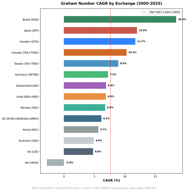
DCF Discount on Australian Stocks: 6.08% CAGR Over 25 Years, +2.41% Excess vs ASX 200


Australia tested the DCF discount strategy with a local currency market cap threshold. Over 25 years, the strategy returned 6.08% CAGR with a -62.36% max drawdown. The Sharpe ratio of 0.108 and 1 cash period reflect a concentrated portfolio averaging 20.3 stocks when invested. Against the ASX 200, the portfolio delivered +2.41% annual excess return, with a down capture of 91.76%.
Contents
- Method
- The Screen
- Results
- Year-by-Year
- Key Observations
- The cash block (2000)
- 2016: The best single year (+38.2%)
- 2019: The worst year (-30.4%)
- The 56% win rate
- The smallest portfolio in the dataset
- Limitations
- Takeaway
- Part of a Series
Method
Signal: FCF/MarketCap >= 8.78% (equivalent to a 20% DCF discount). Gordon Growth Model: g=2.5%, r=10%, multiple=13.67x. Top 50 by FCF yield, equal weight. Universe: ASX (Australian Securities Exchange). Market cap > A$500M (~$323M USD). Period: 2000-2025 (25 years, annual rebalancing in April). Transaction costs: Size-tiered model applied. Benchmark: ASX 200 (^AXJO), the local Australian benchmark. Data: Ceta Research (FMP financial data warehouse).
Full methodology: DCF Discount US (flagship post with model details, academic references, and limitations of DCF-based screening).
Returns are in AUD (Australian Dollar). AUD/USD ranged from roughly 0.60 to 1.10 over the backtest period, settling into a 0.65-0.75 corridor for most of the last decade. That's more stable than emerging market currencies like the BRL or INR. For USD-based investors, currency adds some annual uncertainty, but it doesn't erase the structural edge.
The Screen
SELECT
    k.symbol,
    p.companyName,
    p.exchange,
    ROUND(k.freeCashFlowYieldTTM * 100, 2) AS fcf_yield_pct,
    ROUND(k.marketCap / 1e9, 2) AS mktcap_b,
    ROUND(k.returnOnEquityTTM * 100, 1) AS roe_pct
FROM key_metrics_ttm k
JOIN profile p ON k.symbol = p.symbol
WHERE k.freeCashFlowYieldTTM >= 0.0878
  AND k.marketCap > 500000000
  AND p.exchange = 'ASX'
ORDER BY k.freeCashFlowYieldTTM DESC
LIMIT 50
Run this screen live on Ceta Research
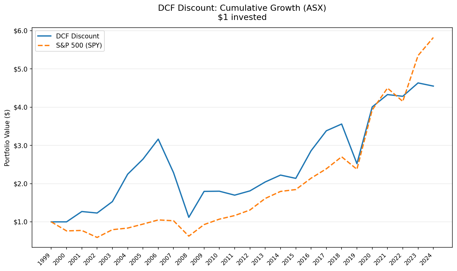
Results
The ASX version of this strategy with the A$500M local currency threshold shows different characteristics than the US run.
| Metric | DCF Discount (ASX) | ASX 200 |
|---|---|---|
| Total Return | 343.33% | 143.38% |
| CAGR | 6.08% | 3.67% |
| Excess CAGR | +2.41% | -- |
| Max Drawdown | -62.36% | -44.11% |
| Annualized Volatility | 24.42% | 18.35% |
| Sharpe Ratio | 0.108 | 0.043 |
| Sortino Ratio | 0.182 | -- |
| Calmar Ratio | 0.097 | -- |
| Win Rate | 56% | -- |
| Beta | 1.043 | 1.0 |
| Alpha | 0.0% | -- |
| Up Capture | 110.96% | -- |
| Down Capture | 91.76% | -- |
| Information Ratio | -0.009 | -- |
| Tracking Error | 18.48% | -- |
| Cash Periods | 1/25 | 0 |
| Avg Stocks (invested) | 20.3 | -- |
With A$500M as the threshold, the strategy runs a tighter portfolio averaging 20.3 stocks. The portfolio beat the ASX 200 by +2.41% annually, with a down capture of 91.76%, meaning it avoided a portion of the benchmark's losses.
Year-by-Year
| Year | Portfolio | ASX 200 | Excess |
|---|---|---|---|
| 2000 | +0.0% | +0.1% | -0.1% |
| 2001 | +23.2% | +6.0% | +17.1% |
| 2002 | -0.6% | -14.9% | +14.3% |
| 2003 | +24.1% | +19.3% | +4.8% |
| 2004 | +45.9% | +19.8% | +26.1% |
| 2005 | +18.9% | +25.7% | -6.9% |
| 2006 | +19.9% | +14.2% | +5.7% |
| 2007 | -24.7% | -7.0% | -17.7% |
| 2008 | -50.0% | -33.1% | -16.9% |
| 2009 | +56.6% | +34.6% | +22.0% |
| 2010 | +0.4% | -1.4% | +1.8% |
| 2011 | -6.6% | -11.4% | +4.8% |
| 2012 | +6.6% | +15.2% | -8.6% |
| 2013 | +13.9% | +8.4% | +5.5% |
| 2014 | +8.6% | +9.2% | -0.5% |
| 2015 | -4.2% | -15.3% | +11.1% |
| 2016 | +38.2% | +17.6% | +20.7% |
| 2017 | +18.3% | -2.1% | +20.3% |
| 2018 | +5.8% | +8.5% | -2.7% |
| 2019 | -30.4% | -17.4% | -12.9% |
| 2020 | +47.5% | +33.6% | +13.9% |
| 2021 | +7.5% | +9.1% | -1.6% |
| 2022 | -1.7% | -3.9% | +2.2% |
| 2023 | +8.2% | +9.2% | -1.0% |
| 2024 | -2.5% | -0.4% | -2.1% |
Key Observations
The cash block (2000)
One cash period in the backtest. FMP's coverage of ASX stocks above A$500M with reliable FCF data was thin in the earliest years. The strategy couldn't find enough qualifying names to build a portfolio.
2016: The best single year (+38.2%)
Commodity prices bottomed in late 2015 and recovered through 2016. Iron ore doubled from its January 2016 lows. Australian miners and resource companies, which frequently populate the high-FCF-yield screen, surged.
The 20.7 percentage point excess return over the ASX 200 came from the screen's structural tilt toward materials and resources. When commodities bounce, these stocks bounce hard. The DCF screen had loaded up on names with strong trailing cash flows from the commodity supercycle, and those cash flows proved durable enough to support the rebound.
2019: The worst year (-30.4%)
This is the portfolio's max drawdown year, and it deserves scrutiny. The ASX 200 fell -17.4%, so the market was broadly weak. But the portfolio dropped -30.4%, nearly doubling the benchmark's loss.
Mining and resource stocks drove most of the damage. Several names that had generated strong FCF in prior years faced commodity price declines and margin compression. The screen picks stocks based on trailing cash flows. When those flows were cyclically peak, the "discount" was illusory, and the correction hit hard.
With only 20.3 stocks on average, concentration risk is real. A few bad picks in a 20-stock portfolio can pull the whole year into deep negative territory. The small portfolio size is both the strength (high conviction) and the vulnerability.
The 56% win rate
Australia won 14 of 25 years against the ASX 200. The strategy beat its local benchmark by +2.41% CAGR annually.
The math: the wins were bigger than the losses. In the years Australia beat the ASX 200, the average excess was solid. The cash year was neutral (2000), with the ASX 200 returning just +0.1% that period.
The smallest portfolio in the dataset
Averaging 20.3 stocks when invested, the ASX version runs a tighter portfolio than any other market. Canada averaged 37.7, Taiwan 44.4, the US 50. The A$500M market cap filter on Australia's smaller listed universe narrows the eligible pool.
This concentration explains the high single-year volatility in bad years. With fewer stocks, the portfolio can swing more on individual company outcomes. But those companies tend to be large, liquid ASX names. Banks (CBA, Westpac, ANZ), miners (BHP, Rio Tinto, Fortescue), and diversified industrials. The quality of what gets through the screen is high, even if the quantity is low.
Limitations
Cash drag. One year of zero returns dilutes the 25-year CAGR. The invested-only CAGR would be slightly higher than the reported 6.08%.
Concentration risk. With only 20.3 stocks on average, individual company outcomes matter more than in broader portfolios. A single bad position can move annual returns by 2-5%. Sector concentration toward materials and financials amplifies this.
Model sensitivity. The Gordon Growth Model uses fixed assumptions: 2.5% terminal growth, 10% discount rate. A 1% shift in either parameter moves fair value by 15-25%. The 20% margin of safety absorbs some of this, not all.
Benchmark choice. We compare against the ASX 200 as the local Australian benchmark. The +2.41% annual excess captures the strategy's performance relative to the broad Australian market.
No transaction costs beyond size-tiered estimates. We apply 0.1-0.5% per trade depending on market cap, but don't model bid-ask spreads, market impact, or Australian-specific costs like franking credit effects or withholding taxes for foreign investors.
Takeaway
Australia's DCF discount portfolio with the A$500M local currency threshold returned 6.08% CAGR, beating the ASX 200's 3.67% over 25 years. The -62.36% max drawdown is deeper than the ASX 200's -44.11%. The 24.42% volatility is higher than the benchmark's 18.35%.
The 6.08% CAGR turned $10,000 into $44,333. The excess return of +2.41%/yr shows the DCF screen adds value relative to Australia's local market, even if absolute returns are modest.
The trade-off is portfolio size. Twenty stocks is a concentrated bet. When it works (2016: +38.2%, 2009: +56.6%), the returns are excellent. When it doesn't (2019: -30.4%), the pain is sharp. The ASX version runs a tight portfolio with sector concentration toward resources and financials, and the 56% win rate provides a slight edge.
Part of a Series
This analysis is part of our DCF Discount global exchange comparison:
- DCF Discount on US Stocks (NYSE + NASDAQ + AMEX)
- DCF Discount on Indian Stocks (BSE + NSE)
- DCF Discount on Taiwan Stocks (TAI + TWO)
- DCF Discount on Canadian Stocks (TSX)
- DCF Discount on Korean Stocks (KSC)
- DCF Discount on German Stocks (XETRA)
- DCF Discount on Brazilian Stocks (SAO)
- DCF Discount on Australian Stocks (ASX)
- DCF Discount on Swedish Stocks (STO)
- DCF Discount: Global Exchange Comparison
Data: Ceta Research (FMP financial data warehouse), ASX, 2000-2025. Returns in AUD. Gordon Growth Model: g=2.5%, r=10%, 13.67x FCF multiple. Universe: ASX stocks >A$500M market cap with positive FCF. Size-tiered transaction costs applied. Full methodology: METHODOLOGY.md. Backtest code: backtests/dcf-discount/.