DCF Discount on Canadian Stocks: 11.45% CAGR With +7.40% Excess vs TSX Composite
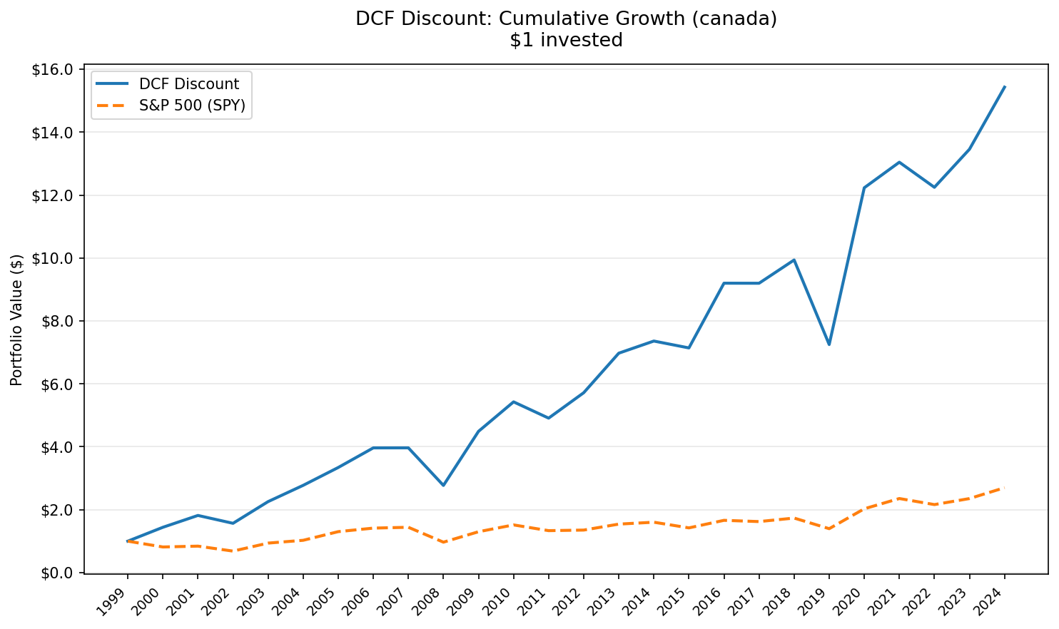
Canada's TSX delivered 11.45% CAGR with zero cash periods over 25 years. The portfolio captured 149.12% of upside and only 36.79% of downside vs the TSX Composite. Max drawdown stayed at -33.59%. 68% annual win rate.


Canada produced one of the best risk/reward profiles of any developed market we tested. 11.45% CAGR over 25 years, a shallow -33.59% max drawdown, and zero cash periods. The portfolio captured 149.12% of upside while absorbing only 36.79% of downside vs the TSX Composite. $10,000 became roughly $150,000.
Contents
- Method
- The Screen
- Results
- Year-by-Year
- Key Observations
- 2000: The Best Single Year (+47.5%)
- Why the Drawdown Stayed Shallow
- The Resource Economy Advantage
- 2019: The Worst Year (-29.7%)
- The Quiet Middle Years (2011-2015, 2017-2018)
- Currency Considerations
- Limitations
- Takeaway
- Part of a Series
For a strategy that buys stocks trading below computed DCF fair value, the TSX is close to ideal. Resource-heavy sectors generate real cash flow. Valuations stay grounded. The screening criteria found qualifying stocks in every single year from 2000 to 2025.
Data: FMP financial data warehouse, 2000-2025. Updated May 2026 (post bias fix).
Method
Full methodology is covered in the US DCF Discount blog. This post applies the same approach to the Toronto Stock Exchange.
Universe: TSX-listed stocks, market cap > C$500M (~$362M USD), positive free cash flow Period: 2000-2025 (25 years, annual rebalancing in April) Execution: Next-day close (MOC). Signal generated at rebalance date, executed at the following trading day's close. DCF model: Gordon Growth Model. g = 2.5%, r = 10%, multiple = 13.67x FCF Screen: FCF/MarketCap >= 8.78% (equivalent to a 20% DCF discount). Top 50 by FCF yield, equal weight Costs: Size-tiered transaction costs (0.1% for >$10B, 0.3% for $2-10B, 0.5% for <$2B) Benchmark: TSX Composite (^GSPTSE) Data: Ceta Research (FMP financial data warehouse)
Returns are in CAD (Canadian Dollar). CAD/USD ranged from ~0.62 to ~1.07 over this period. For USD-based investors, currency adds roughly 1-2% annual uncertainty in either direction. The CAD is relatively stable compared to emerging market currencies, so the core signal holds.
The Screen
The same computed DCF logic, filtered to the TSX:
WITH latest_cfs AS (
    SELECT * FROM cash_flow_statement
    WHERE period = 'FY' AND freeCashFlow > 0 AND reportedCurrency = 'CAD'
    QUALIFY ROW_NUMBER() OVER (PARTITION BY symbol ORDER BY date DESC) = 1
),
latest_km AS (
    SELECT * FROM key_metrics
    WHERE period = 'FY' AND marketCap > 500000000
    QUALIFY ROW_NUMBER() OVER (PARTITION BY symbol ORDER BY date DESC) = 1
)
SELECT
    cfs.symbol,
    p.companyName,
    p.sector,
    ROUND(cfs.freeCashFlow / 1e6, 0) AS fcf_mm,
    ROUND(km.marketCap / 1e9, 2) AS mktcap_bn,
    ROUND(cfs.freeCashFlow / km.marketCap * 100, 2) AS fcf_yield_pct,
    ROUND((1 - km.marketCap / (cfs.freeCashFlow * 13.67)) * 100, 1) AS discount_pct
FROM latest_cfs cfs
JOIN latest_km km ON cfs.symbol = km.symbol
JOIN profile p ON cfs.symbol = p.symbol
WHERE p.exchange = 'TSX'
    AND p.isFund = false
    AND p.isEtf = false
    AND p.isActivelyTrading = true
    AND cfs.freeCashFlow / km.marketCap BETWEEN 0.0878 AND 0.50
ORDER BY fcf_yield_pct DESC
LIMIT 30
Run this screen live on Ceta Research
The 8.78% FCF yield threshold corresponds to a 20% discount from the Gordon Growth fair value. At a 13.67x multiple, a stock needs to generate at least $0.0878 of free cash flow per dollar of market cap to qualify.
Results
Three things stand out before we get to the numbers.
Zero cash periods. The TSX DCF discount screen found qualifying stocks in all 25 years. No gaps. No years sitting on the sideline. The portfolio averaged 35.3 stocks when invested, well-distributed across sectors.
Shallow drawdown. The worst peak-to-trough loss was -33.59%. Compare that to the US version of this strategy at -59.79%, or India at -57.94%. Canada's resource-weighted market kept losses contained.
Capture ratio is lopsided. Up capture: 149.12%. Down capture: 36.79%. The portfolio grabbed roughly 1.5x the benchmark's upside while dodging nearly two-thirds of its losses. That's the kind of asymmetry most strategies promise and few deliver.
Summary metrics:
| Metric | DCF Discount (TSX) | TSX Composite |
|---|---|---|
| Total Return | 1,403.16% | 169.95% |
| CAGR | 11.45% | 4.05% |
| Excess CAGR | +7.40% | - |
| Max Drawdown | -33.59% | -32.86% |
| Annualized Volatility | 24.79% | 18.89% |
| Sharpe Ratio | 0.361 | 0.082 |
| Sortino Ratio | 0.849 | 0.138 |
| Calmar Ratio | 0.341 | 0.123 |
| VaR 95% | -29.72% | -19.47% |
| Win Rate | 68% | - |
| Beta | 1.033 | 1.0 |
| Alpha (Jensen) | 7.35% | - |
| Up Capture | 149.12% | - |
| Down Capture | 36.79% | - |
| Information Ratio | 0.545 | - |
| Tracking Error | 15.31% | - |
The Sharpe of 0.361 is among the best of all exchanges we tested, in the same tier as Switzerland and Taiwan. For a developed market with deep liquidity and straightforward market access, that's a strong result. The 68% annual win rate is solid, the portfolio beat the TSX Composite in 17 of 25 years.
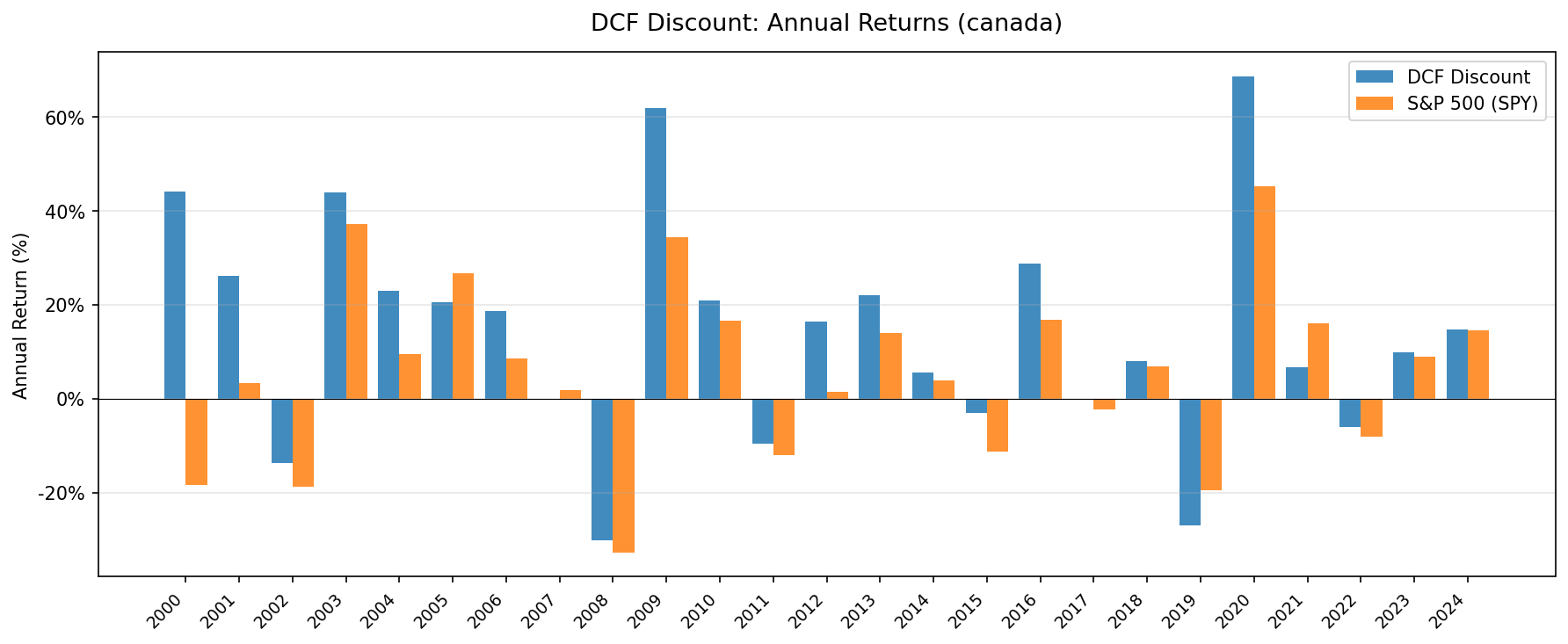
Year-by-Year
| Year | Portfolio | TSX Composite | Excess |
|---|---|---|---|
| 2000 | +47.5% | -18.5% | +66.0% |
| 2001 | +26.9% | +3.3% | +23.6% |
| 2002 | -11.5% | -18.8% | +7.3% |
| 2003 | +43.4% | +37.2% | +6.2% |
| 2004 | +25.8% | +9.5% | +16.3% |
| 2005 | +19.7% | +26.8% | -7.1% |
| 2006 | +13.2% | +8.6% | +4.6% |
| 2007 | +0.7% | +1.9% | -1.1% |
| 2008 | -33.6% | -32.9% | -0.7% |
| 2009 | +56.2% | +34.3% | +21.9% |
| 2010 | +23.1% | +16.7% | +6.5% |
| 2011 | -5.0% | -12.0% | +7.1% |
| 2012 | +13.0% | +1.4% | +11.6% |
| 2013 | +23.1% | +14.0% | +9.1% |
| 2014 | +6.5% | +3.9% | +2.6% |
| 2015 | -5.2% | -11.3% | +6.1% |
| 2016 | +29.4% | +16.9% | +12.5% |
| 2017 | +0.5% | -2.4% | +2.9% |
| 2018 | +10.8% | +6.9% | +3.9% |
| 2019 | -29.7% | -19.5% | -10.3% |
| 2020 | +74.7% | +45.3% | +29.4% |
| 2021 | +10.4% | +16.1% | -5.7% |
| 2022 | -8.5% | -8.2% | -0.3% |
| 2023 | +6.8% | +8.9% | -2.1% |
| 2024 | +13.2% | +14.6% | -1.4% |
Key Observations
2000: The Best Single Year (+47.5%)
The dot-com bust crushed stocks broadly. The TSX Composite fell -18.5%. Canadian value stocks didn't care. High-FCF-yield names in energy, mining, and financials surged. The result: a 66.0 percentage point spread in a single year.
This isn't a repeatable pattern. It's a reminder that value screens shine brightest when growth stocks crater. The TSX's sector composition amplified the effect.
Why the Drawdown Stayed Shallow
The -33.59% max drawdown is among the mildest of any market that beat its benchmark on absolute returns. Two structural reasons.
First, the TSX is dominated by financials, energy, and materials. These sectors generate real, tangible cash flows. They don't carry the same valuation compression risk as growth-heavy markets during sell-offs. When the screen selects for high FCF yield on the TSX, it's picking companies with physical assets and contractual revenue streams.
Second, the down capture of 36.79% means the portfolio absorbed only about a third of the benchmark's losses during down-market periods, even though beta is close to 1.0. The asymmetry comes from selection rather than from dampened market sensitivity.
The Resource Economy Advantage
Canada's stock market is built on resources. Energy companies (Suncor, Canadian Natural Resources, Cenovus), miners (Barrick, Teck, Nutrien), and pipeline operators (Enbridge, TC Energy) dominate the TSX by weight. These companies tend to generate strong free cash flow during commodity upcycles and trade at modest multiples.
For a DCF discount strategy, this creates a natural supply of qualifying candidates. Resource companies don't get Silicon Valley growth premiums. Their cash flows are visible and often contractual. When commodity prices are stable or rising, they throw off the kind of FCF that makes a Gordon Growth model look conservative. The screen picks them up at exactly the right time.
2019: The Worst Year (-29.7%)
The portfolio's worst year deserves attention. In 2019, the strategy lost -29.7% while the TSX Composite fell -19.5%. Two factors likely drove this.
Oil prices fell sharply in late 2018 and stayed volatile through 2019. Canadian energy stocks, which frequently appear in the high-FCF-yield screen, got hit hard. The strategy doubled down on names that had generated strong FCF in prior years, right as the commodity cycle turned against them.
This is the core risk of any backward-looking FCF screen. It selects based on trailing cash flows. If those cash flows were cyclically inflated, the "discount" is temporary and the market's price decline was correct.
The Quiet Middle Years (2011-2015, 2017-2018)
From 2011 to 2015 and again in 2017-2018, the strategy and the TSX Composite both produced mixed results. The portfolio beat its benchmark in most of these years, though the absolute returns were modest.
The strategy still returned positive in most of those years. The TSX Composite's modest returns during this stretch kept the excess return positive.
Currency Considerations
Returns are denominated in CAD. For USD-based investors, currency fluctuation matters.
The CAD/USD rate ranged from approximately 0.62 (2002) to 1.07 (2007) over the backtest period. Long-term, the rate has hovered in the 0.70-0.80 range for most of the past decade. That makes the currency drag modest compared to, say, the Indian rupee or South Korean won.
A rough rule of thumb: if CAD depreciated 1% annually against USD over the full period, the USD-adjusted CAGR would drop from 11.45% to roughly 10.4%. Still a strong result. Currency is a consideration, not a deal-breaker.
Limitations
Benchmark is price-only. The TSX Composite (^GSPTSE) is a price-only index and doesn't include dividends. The strategy returns use total-return data (adjusted close, which incorporates dividends). Canadian equities yield roughly 2.5% on average. The true alpha vs a total-return TSX is narrower than the headline by approximately that amount, putting the realistic excess closer to +5% than +7.40%.
Model sensitivity. The Gordon Growth Model uses fixed assumptions: 2.5% terminal growth, 10% discount rate. A 1% shift in either parameter moves fair value by 15-25%. The 20% margin of safety absorbs some of this, but not all.
Resource concentration. The TSX is structurally tilted toward energy, mining, and financials. The FCF screen amplifies this tilt by selecting the highest-yielding names. When commodity prices fall (2015, 2019), the portfolio is exposed to concentrated sector risk.
Small universe. With 320 qualifying TSX stocks (vs 1,700 on NYSE alone), the screen draws from a smaller pool. The C$500M market cap floor and portfolio construction produce less diversification by default. The average of 35.3 stocks is adequate, but sector concentration is higher than in broader markets.
No transaction costs beyond size-tiered estimates. We apply 0.1-0.5% per trade depending on market cap, but don't model bid-ask spreads, market impact, or Canadian-specific costs like withholding taxes for foreign investors.
Survivorship bias. Zero missing exits across 25 years for the C$500M+ universe. The TSX's large-cap focus limits delisting risk. This isn't a concern for this test.
Takeaway
Over 25 years, buying TSX stocks trading below computed DCF fair value returned 11.45% CAGR. That turned $10,000 into roughly $150,000, far ahead of the TSX Composite's $26,995. The edge came with better risk characteristics: a shallow drawdown, a 68% annual win rate, and a capture ratio that heavily favored the upside.
After accounting for the price-only benchmark's missing ~2.5% dividend yield, the realistic excess return is closer to +5% per year. That's still substantial. The Sharpe of 0.361 sits among the best of all exchanges tested, and the drawdown never breached -34%.
The TSX's resource-heavy composition is both the opportunity and the risk. Commodity producers generate the cash flows that make this screen work. They're also vulnerable to cyclical downturns that can produce years like 2019 (-29.7%). The strategy is best suited for investors who accept that trade-off.
Part of a Series
This analysis is part of our DCF Discount global exchange comparison:
- DCF Discount on US Stocks (NYSE + NASDAQ + AMEX)
- DCF Discount on Indian Stocks (NSE)
- DCF Discount on Taiwan Stocks (TAI + TWO)
- DCF Discount on Canadian Stocks (TSX)
- DCF Discount on Korean Stocks (KSC)
- DCF Discount on German Stocks (XETRA)
- DCF Discount on Swedish Stocks (STO)
- DCF Discount: Global Exchange Comparison
Data: Ceta Research (FMP financial data warehouse), TSX, 2000-2025. Returns in CAD. Next-day close (MOC) execution. Benchmark: TSX Composite (^GSPTSE), price-only index, no dividends. Gordon Growth Model: g=2.5%, r=10%, 13.67x FCF multiple. Universe: TSX stocks >C$500M market cap with positive FCF. Size-tiered transaction costs applied. Full methodology: METHODOLOGY.md. Not investment advice.