Dividend Coverage: Screening for Cash-Backed Dividends on 25 Years of US Data
We screened US stocks for companies whose free cash flow comfortably covers dividend payments. 11.56% CAGR over 25 years vs 7.85% for the S&P 500. Zero cash periods.

We screened US stocks (NYSE, NASDAQ, AMEX) for companies whose free cash flow comfortably covers their dividend payments. Coverage between 1.5x and 20x, yield above 2%, annual rebalance. The result: 11.56% CAGR over 25 years vs 7.85% for the S&P 500. The portfolio was fully invested every single period, averaging 24 stocks. During the 2008 crisis, coverage stocks fell less than the benchmark. During 2020, they returned +67%.
Contents
- Method
- What is Dividend Coverage?
- The Screen (SQL)
- What We Found
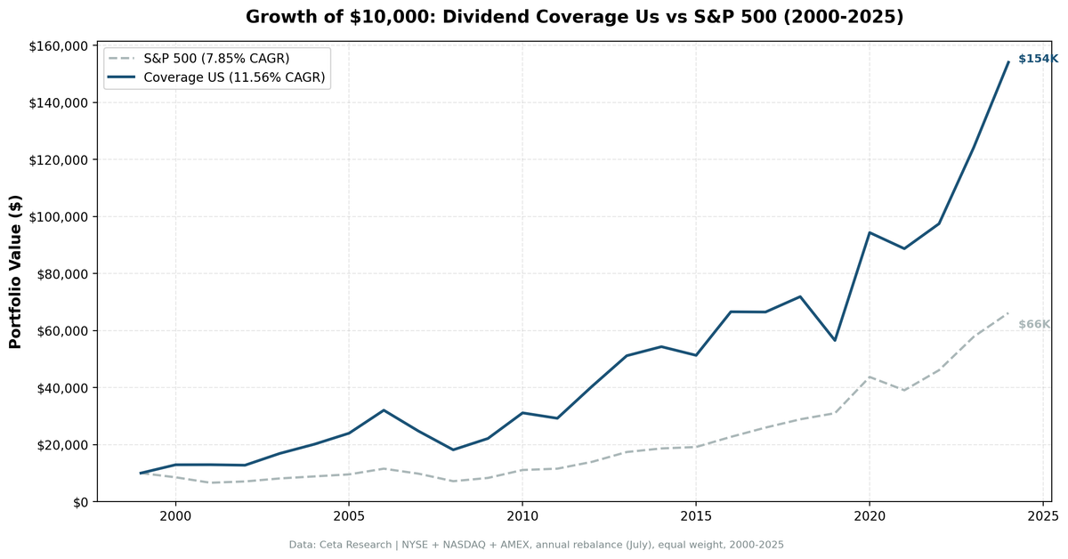
- 25 years of data. 3.71% annual alpha over the S&P 500.
- Year-by-year returns
- The dot-com era: coverage stocks thrived
- 2008 financial crisis: marginal protection
- 2020: the comeback year
- Where the strategy struggles
- Backtest Methodology
- Limitations
- Takeaway
- Part of a Series
- References
- Run This Screen Yourself
Data: FMP financial data warehouse, 2000–2025. Updated March 2026.
Method
Data source: Ceta Research (FMP financial data warehouse) Universe: All US exchanges (NYSE, NASDAQ, AMEX), market cap > $1B USD Period: 2000-2025 (25 years, 25 annual periods) Rebalancing: Annual (July), equal weight top 30 by coverage descending Benchmark: S&P 500 Total Return (SPY) Cash rule: Hold cash if fewer than 10 stocks qualify Transaction costs: Size-tiered model (0.1-0.5% one-way based on market cap)
Financial data uses a 45-day lag to prevent look-ahead bias. July rebalance ensures fiscal year filings are available.
What is Dividend Coverage?
Coverage measures whether a company can afford its dividend from cash, not earnings. The formula:
FCF Coverage = Free Cash Flow / ABS(Common Dividends Paid)
Earnings can be manipulated through depreciation, amortization, and stock-based compensation. Free cash flow is harder to fake. A company with 3x coverage generates three dollars of free cash for every dollar it sends to shareholders. Below 1x, the company is borrowing or drawing down reserves to maintain its dividend.
GE paid dividends for 119 years before cutting by 92% in 2018. By 2016, GE's free cash flow turned negative while the company paid $8.8B in annual dividends. In 2017, FCF recovered to $2.5B but still covered less than 30% of the $8.65B annual dividend commitment. The coverage ratio flagged this deterioration years before the cut.
Screen Filters:
| Criterion | Metric | Threshold |
|---|---|---|
| Dividend safety | FCF / ABS(Dividends Paid) | 1.5x to 20x |
| Meaningful yield | Dividend Yield | > 2% |
| Institutional grade | Market Cap | > $1B USD |
Coverage below 1.5x is too thin. Above 20x usually means a token dividend (tech companies paying pennies). The yield filter removes companies paying negligible dividends despite high coverage. Combined, these three filters isolate companies with meaningful, well-funded dividend payments.
Academic basis: Benartzi, Michaely & Thaler (1997) documented that managers resist dividend cuts until they have no remaining options. Dividend cuts signal genuine distress that has been building for years, not a sudden shock. They stretch, borrow, and defer capex to maintain payments. Coverage catches this slow deterioration: when FCF drops below dividends paid, the company is funding shareholders from something other than operations.
The Screen (SQL)
WITH latest_cf AS (
    SELECT c.symbol, c.freeCashFlow, c.commonDividendsPaid, c.date,
        ROW_NUMBER() OVER (PARTITION BY c.symbol ORDER BY c.date DESC) AS rn
    FROM cash_flow_statement c
    JOIN profile p ON c.symbol = p.symbol
    WHERE c.period = 'FY'
      AND c.commonDividendsPaid < 0
      AND c.freeCashFlow > 0
      AND p.exchange IN ('NYSE', 'NASDAQ', 'AMEX')
),
latest_ratios AS (
    SELECT symbol, dividendYield, date,
        ROW_NUMBER() OVER (PARTITION BY symbol ORDER BY date DESC) AS rn
    FROM financial_ratios
    WHERE period = 'FY' AND dividendYield IS NOT NULL
),
latest_metrics AS (
    SELECT symbol, marketCap, date,
        ROW_NUMBER() OVER (PARTITION BY symbol ORDER BY date DESC) AS rn
    FROM key_metrics
    WHERE period = 'FY' AND marketCap IS NOT NULL
)
SELECT
    cf.symbol,
    ROUND(cf.freeCashFlow / NULLIF(ABS(cf.commonDividendsPaid), 0), 2) AS coverage,
    ROUND(r.dividendYield * 100, 2) AS yield_pct,
    ROUND(cf.freeCashFlow / 1e9, 2) AS fcf_bn,
    ROUND(km.marketCap / 1e9, 1) AS mktcap_bn
FROM latest_cf cf
JOIN latest_ratios r ON cf.symbol = r.symbol AND r.rn = 1
JOIN latest_metrics km ON cf.symbol = km.symbol AND km.rn = 1
WHERE cf.rn = 1
  AND cf.freeCashFlow / NULLIF(ABS(cf.commonDividendsPaid), 0) BETWEEN 1.5 AND 20
  AND r.dividendYield > 0.02
  AND km.marketCap > 1e9
ORDER BY coverage DESC
LIMIT 30
Run this query on Ceta Research
What We Found

25 years of data. 3.71% annual alpha over the S&P 500.
| Metric | Coverage (US) | S&P 500 |
|---|---|---|
| CAGR | 11.56% | 7.85% |
| Total Return | 1,441% | 562% |
| Volatility | 22.4% | 16.6% |
| Max Drawdown | -43.32% | -38.01% |
| Sharpe Ratio | 0.427 | 0.352 |
| Win Rate (annual) | 64% | - |
| Avg Stocks per Period | 23.6 | - |
| Cash Periods | 0 of 25 | - |
$10,000 invested in 2000 grew to roughly $154,000. The same amount in the S&P 500 grew to $66,000. The portfolio was fully invested every single year. 24 stocks on average, zero cash drag.
The Sharpe ratio (0.427 vs 0.352) shows the strategy delivered more return per unit of risk, though the max drawdown was larger (-43.32% vs -38.01%). The higher volatility comes from concentrated positions in high-coverage dividend payers.
Year-by-year returns
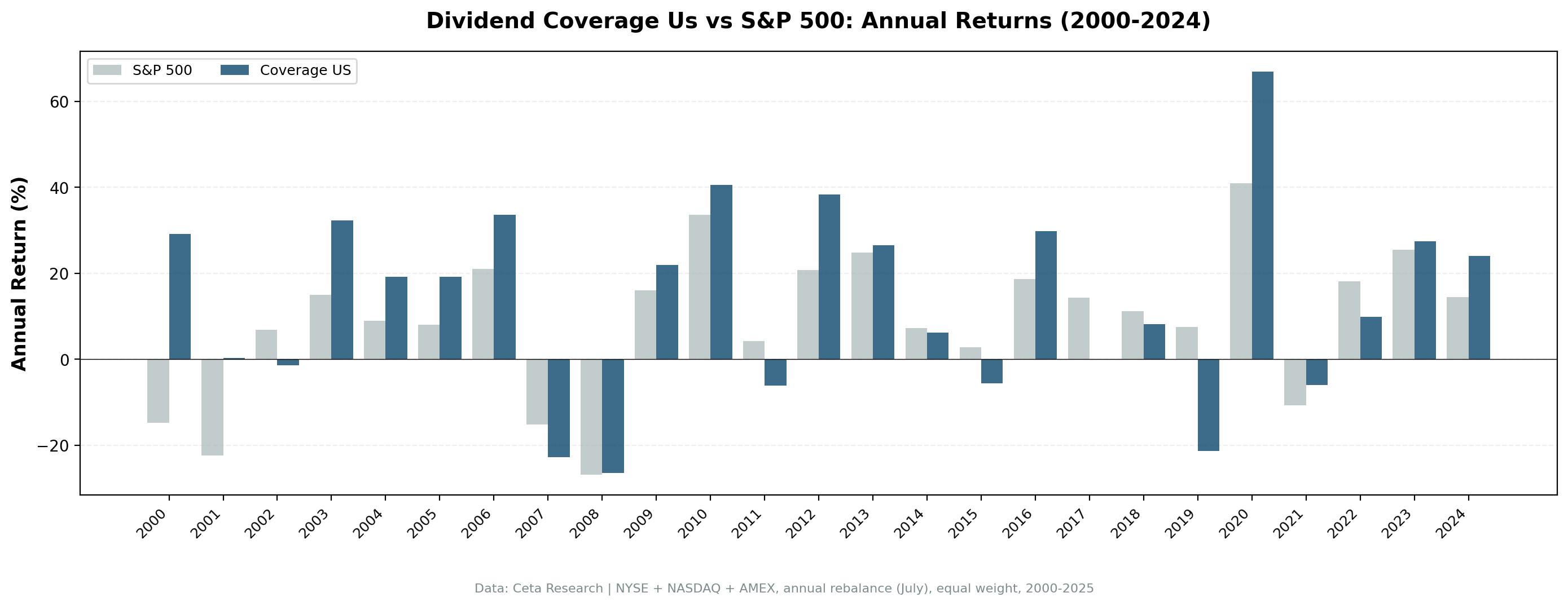
| Year | Coverage | S&P 500 | Excess |
|---|---|---|---|
| 2000 | +29.1% | -14.8% | +43.9% |
| 2001 | +0.2% | -22.4% | +22.7% |
| 2002 | -1.4% | +6.9% | -8.2% |
| 2003 | +32.3% | +14.9% | +17.4% |
| 2004 | +19.2% | +8.9% | +10.3% |
| 2005 | +19.2% | +8.0% | +11.2% |
| 2006 | +33.6% | +20.9% | +12.6% |
| 2007 | -22.8% | -15.2% | -7.6% |
| 2008 | -26.6% | -26.9% | +0.3% |
| 2009 | +21.9% | +16.0% | +5.9% |
| 2010 | +40.6% | +33.5% | +7.0% |
| 2011 | -6.1% | +4.2% | -10.3% |
| 2012 | +38.4% | +20.7% | +17.6% |
| 2013 | +26.5% | +24.7% | +1.8% |
| 2014 | +6.2% | +7.2% | -1.0% |
| 2015 | -5.6% | +2.7% | -8.3% |
| 2016 | +29.8% | +18.6% | +11.2% |
| 2017 | -0.1% | +14.3% | -14.4% |
| 2018 | +8.1% | +11.2% | -3.1% |
| 2019 | -21.4% | +7.4% | -28.8% |
| 2020 | +66.9% | +41.0% | +25.9% |
| 2021 | -6.0% | -10.7% | +4.7% |
| 2022 | +9.9% | +18.1% | -8.2% |
| 2023 | +27.5% | +25.4% | +2.0% |
| 2024 | +24.0% | +14.4% | +9.6% |
The dot-com era: coverage stocks thrived
| Year | Coverage | S&P 500 | Excess |
|---|---|---|---|
| 2000 | +29.1% | -14.8% | +43.9% |
| 2001 | +0.2% | -22.4% | +22.7% |
While the S&P 500 lost about 34% over two years, coverage stocks gained 29% in 2000 and held flat in 2001 (+0.2%). Companies generating real cash flow with comfortable dividend coverage were exactly what investors fled to when dot-com dreams collapsed. The screen naturally excluded companies without free cash flow or those paying unsustainable dividends.
2008 financial crisis: marginal protection
Coverage stocks dropped 26.6% vs 26.9% for the S&P 500. A slim 0.3% cushion. Banks that cut dividends in 2008-2009 failed the coverage screen at the preceding rebalance. The screen shed them before the worst of it, but the financial crisis hit dividend payers broadly.
2020: the comeback year
+66.9% vs +41.0% for the S&P 500. The biggest single-year alpha (+25.9%). Beaten-down dividend payers with strong cash flows were loaded into the July 2019 and July 2020 rebalances. When the market snapped back from COVID lows, these stocks recovered harder than the broad market.
Where the strategy struggles
2019 and 2017 were the worst years: -28.8% and -14.4% excess respectively. Growth-oriented markets where high-flying tech stocks drive index returns are the strategy's weakness. Coverage stocks are boring by design: utilities, consumer staples, industrials with steady cash flows. They don't keep up when NVIDIA and Apple are doing 40% years.
Backtest Methodology
| Parameter | Choice |
|---|---|
| Universe | NYSE + NASDAQ + AMEX, Market Cap > $1B USD |
| Signal | FCF / ABS(Dividends Paid) between 1.5x and 20x |
| Filters | Dividend Yield > 2%, Market Cap > $1B |
| Portfolio | Top 30 by coverage descending, equal weight |
| Rebalancing | Annual (July) |
| Cash rule | Hold cash if < 10 qualify |
| Benchmark | S&P 500 Total Return (SPY) |
| Period | 2000-2025 (25 years) |
| Data | Point-in-time (45-day lag for annual filings) |
| Costs | Size-tiered transaction costs applied |
Limitations
Higher drawdown than the benchmark. -43.32% vs -38.01%. The concentrated portfolio (30 stocks max) amplifies swings in both directions. The extra return comes with extra volatility.
Annual rebalancing is slow. A company's coverage can deteriorate between July rebalances. Monthly or quarterly rebalancing would catch problems faster but increase turnover and costs.
Coverage is backward-looking. The ratio uses last fiscal year's cash flow statement. A company with 5x coverage today could have a business downturn tomorrow. Coverage measures what happened, not what will happen.
Sector concentration. The screen doesn't balance sectors. Some years skew heavily toward utilities, energy, or consumer staples. When those sectors sell off, the portfolio has no diversification buffer.
Survivorship bias. Exchange membership uses current company profiles. Companies that delisted, went bankrupt, or were acquired aren't fully captured.
The 20x cap is arbitrary. Companies with coverage above 20x are excluded to filter out token dividends. Some legitimate high-coverage companies get dropped. The threshold could be 15x or 30x and produce different results.
Takeaway
The dividend coverage screen works on US stocks. 11.56% CAGR over 25 years, 3.71% annual alpha, zero cash periods. The strategy captures companies with meaningful dividends backed by real cash flow. It's not the cheapest-dividend screen or the highest-yield screen. It's the "can you actually afford this?" screen.
The edge comes from filtering out companies that stretch to maintain dividends. When FCF coverage drops, dividend cuts follow. By selecting companies with comfortable coverage (1.5x to 20x) and meaningful yield (above 2%), the screen builds a portfolio of sustainable dividend payers.
The cost: higher volatility than the benchmark and multi-year stretches of underperformance during growth rallies. 2017 and 2019 were painful. Factor strategies are cyclical. The 25-year track record suggests the math works, but you have to sit through the bad years to collect the alpha.
Part of a Series
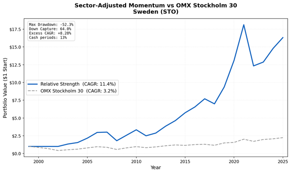
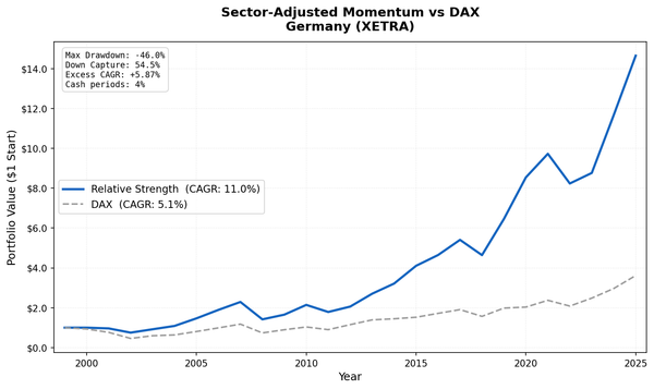
This analysis is part of our dividend coverage global exchange comparison. We tested the same screen on 12 exchanges worldwide: - Dividend Coverage on Indian Stocks (NSE) - 17.24% CAGR, the standout - Dividend Coverage on German Stocks (XETRA) - 12.83% CAGR, best European result - Dividend Coverage on UK Stocks (LSE) - 9.38% CAGR, highest win rate - Dividend Coverage on Swedish Stocks (STO) - 10.74% CAGR, excellent Sharpe - Dividend Coverage: 12-Exchange Global Comparison - full comparison table
References
- Benartzi, S., Michaely, R. & Thaler, R. (1997). "Do Changes in Dividends Signal the Future or the Past?" Journal of Finance, 52(3), 1007-1034.
- DeAngelo, H., DeAngelo, L. & Skinner, D. (1996). "Reversal of Fortune: Dividend Signaling and the Disappearance of Sustained Earnings Growth." Journal of Financial Economics, 40(3), 341-371.
Run This Screen Yourself
Via web UI: Run the coverage screen on Ceta Research. The query is pre-loaded. Hit "Run" and see what passes today.
Via Python:
import requests, time

API_KEY = "your_api_key"  # get one at cetaresearch.com
BASE = "https://tradingstudio.finance/api/v1"

resp = requests.post(f"{BASE}/data-explorer/execute", headers={
    "X-API-Key": API_KEY, "Content-Type": "application/json"
}, json={
    "query": """
        WITH latest_cf AS (
            SELECT c.symbol, c.freeCashFlow, c.commonDividendsPaid, c.date,
                ROW_NUMBER() OVER (PARTITION BY c.symbol ORDER BY c.date DESC) AS rn
            FROM cash_flow_statement c
            WHERE c.period = 'FY' AND c.commonDividendsPaid < 0 AND c.freeCashFlow > 0
        ),
        latest_ratios AS (
            SELECT symbol, dividendYield,
                ROW_NUMBER() OVER (PARTITION BY symbol ORDER BY date DESC) AS rn
            FROM financial_ratios WHERE period = 'FY' AND dividendYield IS NOT NULL
        ),
        latest_metrics AS (
            SELECT symbol, marketCap,
                ROW_NUMBER() OVER (PARTITION BY symbol ORDER BY date DESC) AS rn
            FROM key_metrics WHERE period = 'FY' AND marketCap IS NOT NULL
        )
        SELECT cf.symbol,
            ROUND(cf.freeCashFlow / NULLIF(ABS(cf.commonDividendsPaid), 0), 2) AS coverage,
            ROUND(r.dividendYield * 100, 2) AS yield_pct,
            ROUND(km.marketCap / 1e9, 1) AS mktcap_bn
        FROM latest_cf cf
        JOIN latest_ratios r ON cf.symbol = r.symbol AND r.rn = 1
        JOIN latest_metrics km ON cf.symbol = km.symbol AND km.rn = 1
        WHERE cf.rn = 1
          AND cf.freeCashFlow / NULLIF(ABS(cf.commonDividendsPaid), 0) BETWEEN 1.5 AND 20
          AND r.dividendYield > 0.02 AND km.marketCap > 1e9
        ORDER BY coverage DESC LIMIT 30
    """,
    "options": {"format": "json", "limit": 100}
})
task_id = resp.json()["taskId"]

while True:
    result = requests.get(f"{BASE}/tasks/data-query/{task_id}",
                          headers={"X-API-Key": API_KEY}).json()
    if result["status"] in ("completed", "failed"):
        break
    time.sleep(2)

for r in result["result"]["rows"][:10]:
    print(f"{r['symbol']:8s} coverage={r['coverage']:.1f}x yield={r['yield_pct']:.1f}%")
Get your API key at cetaresearch.com. The full backtest code (Python + DuckDB) is on GitHub.
Data: Ceta Research, FMP financial data warehouse. Universe: NYSE + NASDAQ + AMEX. Annual rebalance (July), equal weight top 30, 2000-2025. Past performance does not guarantee future results. This is research, not investment advice.