This Portfolio Absorbed Only 13% of Market Downturns Over 25 Years
We tested working capital efficiency as a stock selection signal across all US exchanges from 2000 to 2025. The result: 11.07% CAGR vs 7.64% for the S&P 500, with a down capture ratio of just 13%. The portfolio lost 13 cents for every dollar the market lost in downturns.

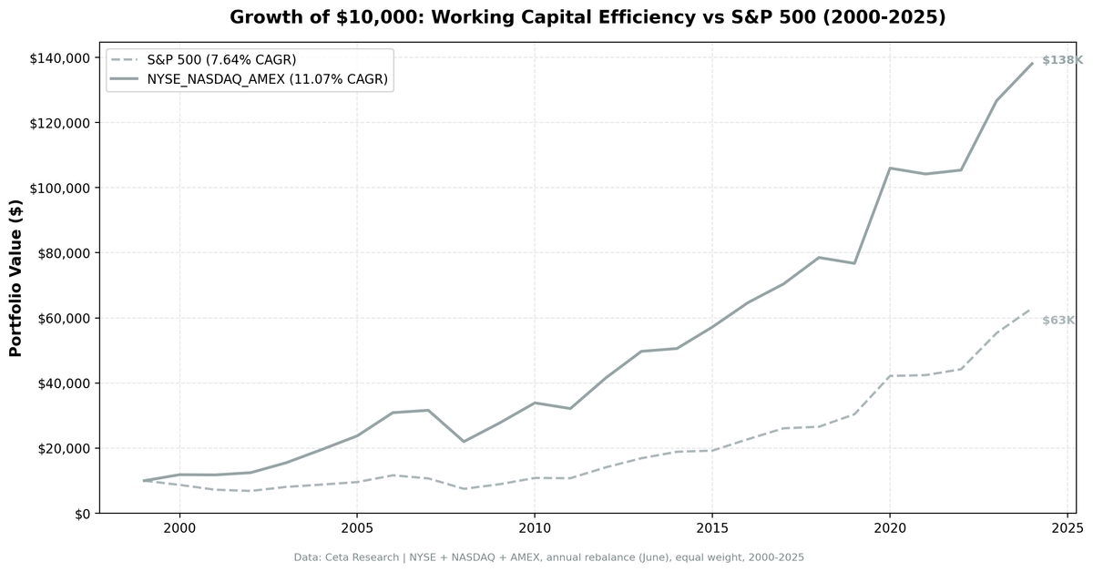
We tested working capital efficiency as a stock selection signal across the full US equity universe from 2000 to 2025. The result: 11.07% CAGR vs the S&P 500's 7.64%, with a down capture ratio of just 13%. For every dollar the market lost in a downturn, this portfolio lost 13 cents.
Contents
- The Strategy
- Methodology
- What We Found
- When It Works
- When It Struggles
- Run It Yourself
- Limitations
- Part of a Series
The strategy picks companies that run lean operations, converting revenue to cash without tying up capital in receivables and inventory. It's not a value screen or a momentum screen. It's an operational quality screen built on Richard Sloan's 1996 accrual anomaly research.
Data: FMP financial data warehouse, 2000–2025. Updated April 2026.
The Strategy
Working capital is the difference between current assets and current liabilities. Our signal is the ratio of working capital to revenue. A company with $500M in working capital and $10B in revenue has a ratio of 0.05. It needs 5 cents of working capital per dollar of revenue. Lower is better.
The screen:
- WC/Revenue < 50% (lean operations)
- Revenue growth > 0 (year-over-year, avoids shrinking companies)
- ROE > 8% (adequate returns on equity)
- Operating margin > 10% (pricing power and cost discipline)
- Market cap > $500M (liquid stocks)
- Positive working capital only (excludes negative WC companies like Apple, Amazon)
We rank by WC/Revenue ascending and take the top 30. Equal weight, annual rebalance in June, with a 45-day filing lag to avoid look-ahead bias. Size-tiered transaction costs applied.
The academic backing: Sloan (1996) showed that earnings dominated by accruals (the non-cash component, driven by working capital changes) predict underperformance. Hirshleifer, Hou, Teoh and Zhang (2004) extended this to cumulative balance sheet bloat. Companies with lean balance sheets relative to revenue outperformed by over 10% per year from 1964 to 2002.
Methodology
Universe: NYSE + NASDAQ + AMEX (full exchange, no index constraints) Period: 2000-2025 (25 years, 25 annual periods) Portfolio: Top 30 by WC/Revenue ASC, equal weight. Cash if fewer than 10 qualify. Rebalancing: Annual (June) Costs: Size-tiered transaction cost model by market cap Point-in-time: 45-day lag on financial data Data: Ceta Research (FMP financial data warehouse)
Signal SQL:
WITH bs AS (
  SELECT b.* FROM balance_sheet b
  JOIN (SELECT symbol, MAX(date) AS max_d
        FROM balance_sheet WHERE period = 'FY' GROUP BY symbol) lat
    ON b.symbol = lat.symbol AND b.date = lat.max_d
  WHERE b.period = 'FY'
),
inc AS (
  SELECT i.* FROM income_statement i
  JOIN (SELECT symbol, MAX(date) AS max_d
        FROM income_statement WHERE period = 'FY' GROUP BY symbol) lat
    ON i.symbol = lat.symbol AND i.date = lat.max_d
  WHERE i.period = 'FY'
),
km AS (
  SELECT k.* FROM key_metrics_ttm k
  JOIN (SELECT symbol, MAX(fetchedAtEpoch) AS max_e
        FROM key_metrics_ttm GROUP BY symbol) lat
    ON k.symbol = lat.symbol AND k.fetchedAtEpoch = lat.max_e
),
fr AS (
  SELECT f.* FROM financial_ratios_ttm f
  JOIN (SELECT symbol, MAX(fetchedAtEpoch) AS max_e
        FROM financial_ratios_ttm GROUP BY symbol) lat
    ON f.symbol = lat.symbol AND f.fetchedAtEpoch = lat.max_e
)
SELECT bs.symbol, p.companyName, p.exchange,
    ROUND((bs.totalCurrentAssets - bs.totalCurrentLiabilities)
        / inc.revenue, 3) AS wc_to_revenue,
    ROUND(km.returnOnEquityTTM * 100, 1) AS roe_pct,
    ROUND(fr.operatingProfitMarginTTM * 100, 1) AS opm_pct,
    ROUND(km.marketCap / 1e9, 2) AS mktcap_b
FROM bs
JOIN inc ON bs.symbol = inc.symbol
JOIN profile p ON bs.symbol = p.symbol
JOIN km ON bs.symbol = km.symbol
JOIN fr ON bs.symbol = fr.symbol
WHERE bs.totalCurrentAssets > bs.totalCurrentLiabilities
  AND (bs.totalCurrentAssets - bs.totalCurrentLiabilities)
      / inc.revenue < 0.50
  AND inc.revenue > 0
  AND km.returnOnEquityTTM > 0.08
  AND fr.operatingProfitMarginTTM > 0.10
  AND km.marketCap > 500000000
  AND p.exchange IN ('NYSE', 'NASDAQ', 'AMEX')
ORDER BY wc_to_revenue ASC
LIMIT 30
What We Found
The headline number is not the CAGR. It's the down capture.
During the calendar years when the S&P 500 lost money, this portfolio captured only 13% of the downside. The market fell, and the portfolio barely moved. In 2000, the S&P 500 dropped 12.9% while the portfolio gained 18.5%. In 2001, the market fell 17.0% and the portfolio lost just 0.6%.
That asymmetry compounds. If you lose less in drawdowns, you need less to recover. And when the market rallied, the portfolio kept up: 106% up capture.
Full 25-year summary:
| Metric | WC Efficiency | S&P 500 |
|---|---|---|
| CAGR | 11.07% | 7.64% |
| Excess CAGR | +3.44% | -- |
| Sharpe Ratio | 0.614 | 0.360 |
| Sortino Ratio | 1.343 | 0.671 |
| Max Drawdown | -30.42% | -35.60% |
| Annualized Volatility | 14.77% | 15.64% |
| Total Return | 1,281% | 529% |
| Beta | 0.726 | 1.0 |
| Down Capture | 13% | -- |
| Up Capture | 106% | -- |
| Win Rate | 48% | -- |
Zero cash periods. The portfolio was fully invested in all 25 years, averaging 23.6 stocks.
Annual returns:
| Year | Portfolio | S&P 500 | Excess |
|---|---|---|---|
| 2000 | +18.5% | -12.9% | +31.4% |
| 2001 | -0.6% | -17.0% | +16.4% |
| 2002 | +5.8% | -5.1% | +11.0% |
| 2003 | +24.5% | +18.1% | +6.4% |
| 2004 | +26.1% | +8.8% | +17.3% |
| 2005 | +21.4% | +8.7% | +12.7% |
| 2006 | +30.0% | +21.7% | +8.3% |
| 2007 | +2.3% | -8.1% | +10.5% |
| 2008 | -30.4% | -29.9% | -0.5% |
| 2009 | +25.8% | +18.6% | +7.2% |
| 2010 | +22.4% | +21.8% | +0.7% |
| 2011 | -5.2% | -0.7% | -4.4% |
| 2012 | +29.3% | +31.1% | -1.8% |
| 2013 | +19.6% | +19.7% | -0.1% |
| 2014 | +1.7% | +11.7% | -10.0% |
| 2015 | +13.1% | +1.9% | +11.2% |
| 2016 | +13.1% | +18.2% | -5.1% |
| 2017 | +8.8% | +14.7% | -5.9% |
| 2018 | +11.6% | +1.8% | +9.7% |
| 2019 | -2.3% | +14.5% | -16.8% |
| 2020 | +38.1% | +38.6% | -0.5% |
| 2021 | -1.7% | +0.6% | -2.3% |
| 2022 | +1.1% | +4.3% | -3.1% |
| 2023 | +20.2% | +25.1% | -4.9% |
| 2024 | +9.0% | +13.7% | -4.7% |
The strategy's strongest stretch: 2000-2007. Eight consecutive years of positive excess returns, including the dotcom bust where the portfolio returned +18.5%, -0.6%, and +5.8% while the market was negative. That's the accrual anomaly working at its best. Companies with cash-backed earnings held value when speculative growth collapsed.
When It Works
Bear markets and corrections (2000-2002, 2007, 2015, 2018). The strategy's core strength. Companies with lean working capital tend to have earnings backed by actual cash flows. When market sentiment shifts from growth narratives to earnings quality, these stocks hold up. The dotcom bust was the clearest case: +18.5% in 2000 while the S&P 500 fell 12.9%, followed by two more years of outperformance.
Post-crash recoveries (2009, 2020). The portfolio held quality companies that survived downturns. When markets recovered, these companies bounced. 2020's +38.1% matched the S&P 500's +38.6%.
Moderate growth environments (2003-2006, 2015-2016, 2018). The strategy compounds steadily when growth isn't concentrated in a handful of mega-cap names. It works best when breadth is wide and earnings quality matters.
When It Struggles
Growth-led bull markets (2014, 2017, 2019-2024). When mega-cap tech (FAANG, then the Magnificent 7) drove index returns, the strategy lagged. The worst single year: 2019 at -16.8% excess. The portfolio held quality mid-cap industrials and healthcare companies while Apple, Google, and Facebook powered the S&P 500.
2019 was the worst year. -2.3% vs the S&P 500's +14.5%. The market rallied on Fed rate cuts and trade deal optimism, favoring growth over quality.
The late-2010s drought. From 2014 through 2024, the strategy had mostly negative excess returns (with exceptions in 2015 and 2018). An investor following this approach needed to tolerate extended stretches of relative underperformance versus a simple index fund. The down capture advantage shows up in crash years, but between crashes, the portfolio lagged.
Run It Yourself
# Live screen (current US stocks)
python3 working-capital/screen.py --preset us

# Historical backtest
python3 working-capital/backtest.py --preset us --output results/us.json --verbose
Limitations
Annual rebalancing is slow. Working capital changes gradually, so annual rebalancing makes sense conceptually. But it also means the portfolio can't react to deteriorating fundamentals mid-year. A company whose working capital spikes in Q2 stays in the portfolio until the next June.
Positive working capital only. Some of the best operators (Apple, Amazon, Costco) run negative working capital. They collect from customers before paying suppliers. Our screen excludes them because negative ratios create ranking problems. This is a practical compromise that misses excellent companies.
Financials are included in the backtest. The live screen excludes financial services companies (banks, insurance) because their working capital is structurally different. The historical backtest doesn't exclude them because consistent sector classification data isn't available across the full 25-year history. This means the backtest portfolio may have included some financials in earlier years.
The accrual anomaly has decayed. Green, Hand and Soliman (2011) documented that the accrual premium weakened after publication. Hedge fund capital trading the anomaly compressed the spread. Our +3.44% annual excess is consistent with a diminished but persistent signal.
Sector concentration. The screen overweights asset-light businesses in technology and healthcare. If these sectors underperform for structural reasons, the portfolio will underperform too.
Part of a Series
This is the flagship post in the Working Capital Efficiency series. We tested the same strategy across 14 exchanges globally:
- Working Capital Efficiency in Sweden (+6.5%/yr vs OMX30, best excess)
- Working Capital Efficiency in Canada (lowest drawdown, -21.0%)
- Working Capital Efficiency in the UK (+5.0%/yr vs FTSE 100)
- Working Capital Efficiency in India (+2.8%/yr vs Sensex)
- 14-Exchange Global Comparison
Data: Ceta Research (FMP financial data warehouse), 2000-2025. Full methodology: METHODOLOGY.md
Past performance does not guarantee future results. This is educational content, not investment advice.