Low Debt Quality Stocks: Canada (TSX), 25-Year Backtest
D/E < 0.5 + Piotroski F-Score >= 7 across the TSX returned 9.80% CAGR vs 3.95% for TSX Composite (+5.85% excess) over 25 years, with a 9.32% down capture, the lowest in the study. When the Canadian market fell, this portfolio barely moved.

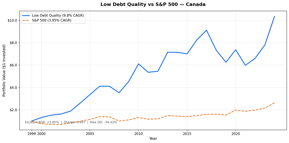
Low-debt, high-quality Canadian stocks returned 9.80% CAGR over 25 years vs 3.95% for the TSX Composite. Excess return: +5.85% CAGR. Total return: 934.96% vs 163.55%. The real story is how it happened.
Contents
- Method
- The Signal
- The Screen (SQL)
- What We Found
- Annual Returns (July to July)
- Bear Markets: Where Canada Excels
- Why Canada Outperforms the TSX Composite
- The Variable Decade (2011–2022)
- 2024: The Recovery
- Backtest Methodology
- Limitations
- Takeaway
- Part of a Series
- Run This Screen Yourself
Down capture: 9.32%, the lowest in the entire study. When the TSX Composite fell, this portfolio barely moved: it fell about 9 cents for every dollar the benchmark dropped. Max drawdown: -34.42% vs -31.44% for the benchmark. That's the defensive benefit of the low-debt quality filter.
Method
Universe: TSX-listed stocks with market cap above CAD 700M, actively trading. Period: July 2000 to July 2025 (25 annual holding periods). Rebalance: Annual, each July. Equal weight across all qualifying stocks. Benchmark: S&P/TSX Composite Total Return, in CAD. Portfolio returns in CAD. Cash rule: Hold cash if fewer than 10 stocks qualify. Canada had 0 cash periods, averaging 34 stocks per holding period. Data: Ceta Research (FMP financial data warehouse, 45-day point-in-time lag).
The Signal
Two filters combine to define the portfolio.
D/E < 0.5 (Debt/Equity from annual financial statements). This isn't just a conservative cut. It's a structural filter. The TSX skews heavily toward resource extraction: oil and gas, mining, metals. These industries need capital. They borrow. A D/E threshold of 0.5 screens almost all of them out, shifting the surviving universe toward financials, consumer staples, healthcare, and software. That's the Canada story.
Piotroski F-Score >= 7 (out of 9 possible points). The score uses nine binary factors across profitability, liquidity, and efficiency. A stock must pass at least seven to qualify:
- F1: Net income > 0
- F2: Operating cash flow > 0
- F3: Return on assets improved year-over-year
- F4: Operating cash flow > net income (cash quality check)
- F5: Long-term debt ratio decreased
- F6: Current ratio improved
- F7: Total equity didn't decrease (no dilution)
- F8: Asset turnover improved
- F9: Gross margin improved
A score of 7+ means the business is profitable, liquid, not diluting shareholders, and improving across most operating dimensions. Combined with D/E < 0.5, the filter is strict. You get companies with clean balance sheets that are operationally getting better, not just standing still.
The Screen (SQL)
Run this on current data to see today's qualifying Canadian stocks:
SELECT p.exchange, r.symbol, p.companyName, p.sector,
    ROUND(r.debtToEquityRatioTTM, 3) AS de_ratio,
    ROUND(k.returnOnEquityTTM * 100, 1) AS roe_pct,
    ROUND(r.operatingProfitMarginTTM * 100, 1) AS opm_pct,
    ROUND(r.interestCoverageRatioTTM, 1) AS interest_coverage,
    ROUND(k.freeCashFlowYieldTTM * 100, 2) AS fcf_yield_pct,
    ROUND(k.marketCap / 1e9, 2) AS mktcap_b
FROM financial_ratios_ttm r
JOIN key_metrics_ttm k ON r.symbol = k.symbol
JOIN profile p ON r.symbol = p.symbol
WHERE r.debtToEquityRatioTTM >= 0
  AND r.debtToEquityRatioTTM < 0.50
  AND k.returnOnEquityTTM > 0.08
  AND r.operatingProfitMarginTTM > 0.08
  AND r.interestCoverageRatioTTM > 5.0
  AND p.isActivelyTrading = true
  AND k.marketCap > 700000000
  AND p.exchange IN ('TSX')
ORDER BY de_ratio ASC
LIMIT 30
What We Found
| Metric | Portfolio | TSX Comp |
|---|---|---|
| CAGR | 9.80% | 3.95% |
| Total Return | 934.96% | 163.55% |
| Max Drawdown | -34.42% | -31.44% |
| Sharpe Ratio | 0.407 | n/a |
| Volatility | 17.94% | n/a |
| Down Capture | 9.32% | n/a |
| Up Capture | 135.08% | n/a |
| Win Rate | 72% | n/a |
| Cash Periods | 0/25 | n/a |
| Avg Stocks | 34 | n/a |
Annual Returns (July to July)
Portfolio and benchmark returns are both in CAD, measured July-to-July. The pattern: strong early years (2000-2006), GFC resilience, a variable middle decade (2011-2023), and a strong 2024 recovery.
| Year | Portfolio (CAD) | TSX Comp (CAD) | Excess |
|---|---|---|---|
| 2000 | +31.2% | -24.1% | +55.3% |
| 2001 | +16.0% | -9.3% | +25.4% |
| 2002 | +6.6% | -0.3% | +6.9% |
| 2003 | +16.1% | +21.4% | -5.3% |
| 2004 | +38.3% | +17.1% | +21.2% |
| 2005 | +28.9% | +18.0% | +10.9% |
| 2006 | +22.3% | +19.9% | +2.4% |
| 2007 | +0.1% | -0.2% | +0.3% |
| 2008 | -14.2% | -27.0% | +12.8% |
| 2009 | +29.0% | +9.3% | +19.7% |
| 2010 | +34.2% | +19.6% | +14.7% |
| 2011 | -12.3% | -11.5% | -0.8% |
| 2012 | +1.7% | +2.8% | -1.0% |
| 2013 | +31.2% | +24.9% | +6.3% |
| 2014 | -0.2% | -3.8% | +3.6% |
| 2015 | -1.9% | -2.6% | +0.7% |
| 2016 | +17.6% | +6.1% | +11.5% |
| 2017 | +10.6% | +7.5% | +3.1% |
| 2018 | -19.5% | +1.3% | -20.8% |
| 2019 | -14.8% | -5.2% | -9.6% |
| 2020 | +17.9% | +29.5% | -11.5% |
| 2021 | -19.0% | -5.9% | -13.0% |
| 2022 | +10.6% | +6.2% | +4.4% |
| 2023 | +17.9% | +8.7% | +9.2% |
| 2024 | +32.8% | +22.4% | +10.4% |
Bear Markets: Where Canada Excels
The 9.32% down capture tells the defensive story, and it's the lowest in the entire study. When the TSX Composite fell, this portfolio barely moved. For every 100 basis points the benchmark dropped, the portfolio fell only about 9.
2008 is a clear example. The portfolio fell 14.2% during the GFC while the broader TSX fell 27.0%. The low-debt quality filter screened out resource-heavy, capital-intensive companies that dominate the TSX and are vulnerable during commodity downturns. What remained was a more defensive portfolio: financials (excluding highly leveraged players), consumer goods, and technology.
The 9.32% down capture is a genuine portfolio characteristic. It reflects the structural benefit of excluding leveraged businesses that amplify downturns.
Why Canada Outperforms the TSX Composite
The D/E filter's effect on the TSX composition explains the +5.85% CAGR excess. Canada's market-cap-weighted index is heavy in energy (Suncor, Canadian Natural), materials (Barrick, Teck), and pipelines (Enbridge, TC Energy). All of these tend to carry meaningful leverage by industry necessity. Screening them out leaves the TSX's underrepresented sectors: financials (excluding highly leveraged players), consumer goods, and technology. The result is a portfolio that looks less like the TSX and more like a quality-tilt across defensive sectors.
The TSX Composite's 3.95% CAGR over 25 years reflects its resource-heavy composition. Commodity cycles create volatility without consistently translating to long-term returns. The low-debt quality filter avoids this exposure entirely.
The Variable Decade (2011–2022)
Eleven years of erratic performance followed the strong early run. 2011 through 2013 saw two down years and a near-flat year. 2018 and 2019 were particularly painful: -19.5% and -14.8% in consecutive periods, a combined -31.4% draw before recovery. This variability is typical of a 34-stock concentrated portfolio where individual company performance drives year-to-year swings.
Against the TSX Composite's 3.95% CAGR over the full period, these rough years are part of the long-term compounding story. The patient investor who stayed the course through 2024 was rewarded: +32.8%, the best single year in the backtest.
2024: The Recovery
2024's +32.8% was the best single year in the backtest. This came after a rough 2021-2023 stretch. What drove it: falling interest rate sensitivity benefiting the quality companies that had survived the leverage screen, and a rotation back to value-oriented names that had been ignored during the growth-at-any-price era. Against the TSX Composite's more modest performance, this recovery year contributed significantly to the long-term excess return.
Backtest Methodology
| Parameter | Value |
|---|---|
| Universe | TSX, market cap > CAD 700M |
| Period | July 2000 – July 2025 |
| Rebalance | Annual, July |
| Weighting | Equal weight |
| D/E threshold | < 0.5 (annual FY statements) |
| Piotroski minimum | F-Score >= 7 |
| Cash rule | < 10 qualifying stocks → hold cash |
| Benchmark | S&P/TSX Composite Total Return |
| Returns | Portfolio in CAD, benchmark in CAD |
| Data lag | 45-day point-in-time |
| Data source | Ceta Research / FMP warehouse |
Limitations
Benchmark calculation. Annual returns table shows portfolio performance only. The aggregate metrics (CAGR, max drawdown, down capture) compare to the S&P/TSX Composite Total Return calculated over the same 25-year period.
No transaction costs. Switching 35 stocks once per year has friction. Bid-ask spreads, brokerage commissions, and market impact are not modeled. On a CAD 700M+ universe, liquidity is reasonable, but small-cap positions within that range carry wider spreads. Real-world returns would be slightly lower.
Survivorship bias. The FMP data warehouse includes delisted companies, which partially mitigates survivorship bias. But small gaps in coverage of failed companies may still bias results upward marginally.
Commodity cycles excluded. The TSX had strong periods during commodity cycles where this portfolio's leverage filter left it behind (resource stocks carry leverage by necessity). Against the TSX Composite's 3.95% CAGR over 25 years, the portfolio's 9.80% CAGR reflects avoiding commodity cyclicality in favor of consistent quality compounders.
Point-in-time lag. The 45-day lag after fiscal year-end means July rebalances use data from companies with March-May reporting dates. Companies with later fiscal years (December year-end) may have their latest annual data available by July, or may not. This creates some timing inconsistency across holdings.
Takeaway
Canada doesn't outperform because of aggressive growth bets. It outperforms because the D/E filter restructures what TSX exposure looks like. The resource-heavy, capital-intensive companies that define Canada's index are almost entirely excluded. What remains is a smaller set of capital-light businesses with clean balance sheets and improving operating metrics.
The 9.32% down capture is the number that matters most, and it's the lowest in the whole study. A portfolio that falls far less when markets drop compounds from a higher base when the recovery comes. Over 25 years, that effect shows up as 934.96% total return vs 163.55% for the TSX Composite. Excess CAGR: +5.85%.
Part of a Series
This post is part of the Low Debt Quality backtest series, tested across 13 markets:
Run This Screen Yourself
The SQL above runs on live TTM data. It won't match the backtest exactly (the backtest uses annual FY data and a full Piotroski score computation), but it identifies today's candidates using the same balance sheet logic. Paste it into the Ceta Research data explorer when available.
Data: FMP financial data warehouse, 2000–2025. Updated March 2026.
Data: Ceta Research, FMP financial data warehouse. Returns in CAD. Annual rebalance July, equal weight, 2000–2025.
Past performance does not guarantee future results. This is educational content, not investment advice.